AI-generated Key Takeaways
-
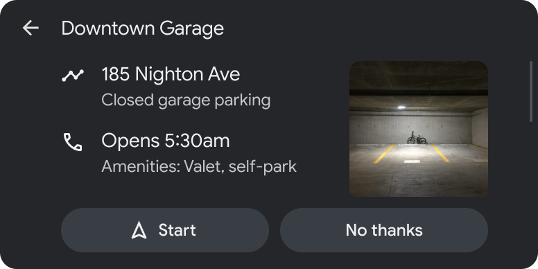
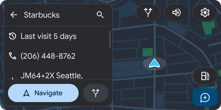
The Pane template displays detailed information and prominent actions, ideal for presenting non-editable metadata and taking action based on that data.
-
This template is limited to a maximum of 4 actions and 4 information rows for easy scanning.
-
The Pane template can be embedded within the Tab template or the Map + Content template for enhanced functionality.
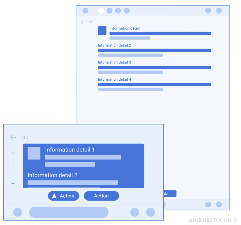
The Pane template presents detailed information and prominent actions.
For easy scanning, actions and information rows are limited to 4 each. This template is useful for presenting non-editable metadata, such as location and reservation details, and for taking action based on data. For a version of this template with a map and no image, navigation apps can use the Map + Content template.
This template can be embedded in the Tab template to provide tabbed navigation.
This template can be included in the Map + Content template to provide a pane on a map.
Includes:
Pane template examples
Pane template UX requirements
App developers:
| MUST | Include at least one row of information. |
| SHOULD | Designate a primary action when providing 2 actions. |
| SHOULD | Make navigation the primary action, when it's included as one of the actions. |
| SHOULD | Provide icons for all actions. |
| SHOULD | Include a header with an optional title and primary and secondary actions. |
| MAY | Include up to 4 rows of information and 2 actions. |