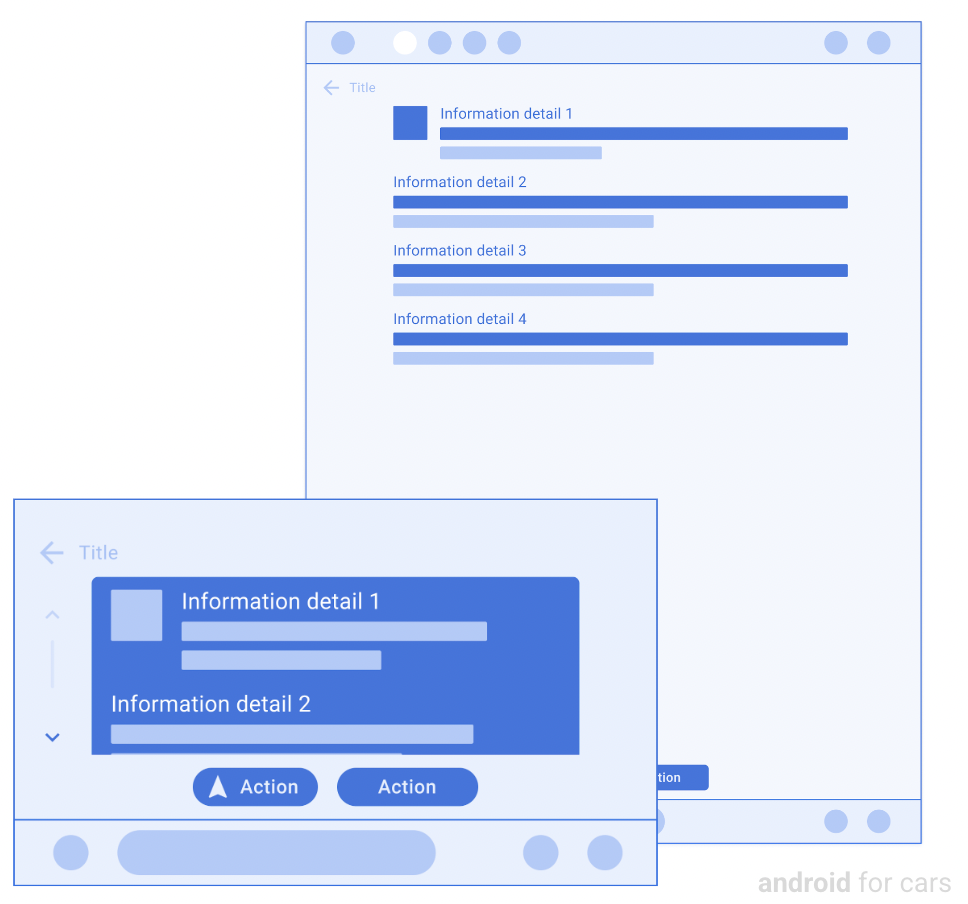
पैनल का टेंप्लेट
संग्रह की मदद से व्यवस्थित रहें
अपनी प्राथमिकताओं के आधार पर, कॉन्टेंट को सेव करें और कैटगरी में बांटें.
पैनल टेंप्लेट में, ज़्यादा जानकारी और अहम कार्रवाइयां दिखती हैं.
आसानी से स्कैन करने के लिए, कार्रवाइयों और जानकारी वाली लाइनों में ज़्यादा से ज़्यादा चार लाइनें हो सकती हैं. यह टेंप्लेट, जगह और बुकिंग की जानकारी जैसे बदलाव न किए जा सकने वाले मेटाडेटा को पेश करने और डेटा के आधार पर कार्रवाई करने के लिए फ़ायदेमंद है. मैप और बिना इमेज वाले इस टेंप्लेट के वर्शन के लिए, नेविगेशन ऐप्लिकेशन मैप + कॉन्टेंट टेंप्लेट का इस्तेमाल कर सकते हैं.
इस टेंप्लेट को टैब टेंप्लेट में एम्बेड किया जा सकता है, ताकि टैब पर नेविगेट किया जा सके.
मैप पर पैनल दिखाने के लिए, इस टेंप्लेट को मैप + कॉन्टेंट टेंप्लेट में शामिल किया जा सकता है.
ज़्यादा से ज़्यादा दो बटन, जिनमें एक को प्राइमरी के तौर पर दिखाया जा सकता है (ज़रूरी नहीं)
ज़्यादा से ज़्यादा चार गैर-कार्रवाई करने लायक
पंक्तियां
(एक पंक्ति ज़रूरी है)
वैकल्पिक बड़ी इमेज (उदाहरण देखें)
पैनल के टेंप्लेट के उदाहरण
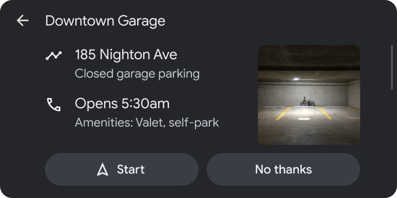
दो मिलती-जुलती कार्रवाइयों के साथ पार्किंग ऐप्लिकेशन की जगह की जानकारी
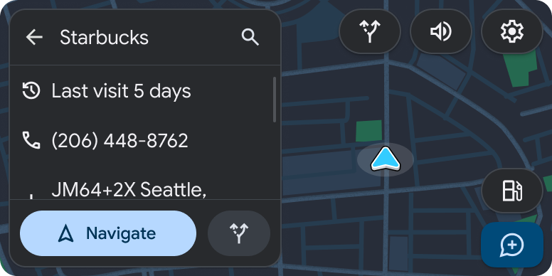
(Android Auto का उदाहरण)कैफ़े की जगह की जानकारी, जिसमें दो कार्रवाइयां शामिल हैं. दूसरे ऐक्शन बटन से जुड़े टेक्स्ट को साइज़ की कमी की वजह से, आइकॉन की मदद से छोटा कर दिया जाता है.
(Android Auto का उदाहरण)