AI-generated Key Takeaways
-
Designing browsing content for apps requires planning view content, as styling and navigation are handled by Google and the car maker.
-
Considerations for browsing views include the number of content levels, whether to use a grid or list format, and whether to group content into subcategories.
-
Implementing search capability is recommended for driving apps to help users quickly find content.
-
App developers must provide subheader text for subcategories, should avoid more than three levels of browsing content, and may determine the display format (grid or list).
When designing an app for browsing content, you'll need to plan what's in each view, as styling and navigation for browsing are handled by Google and the car maker. Here are some considerations:
Layers
How many levels of content do you want within your app?
To minimize cognitive load, limit the total number of levels. Use subheaders to group content into subcategories within a view, which flattens hierarchy and improves navigation.Format
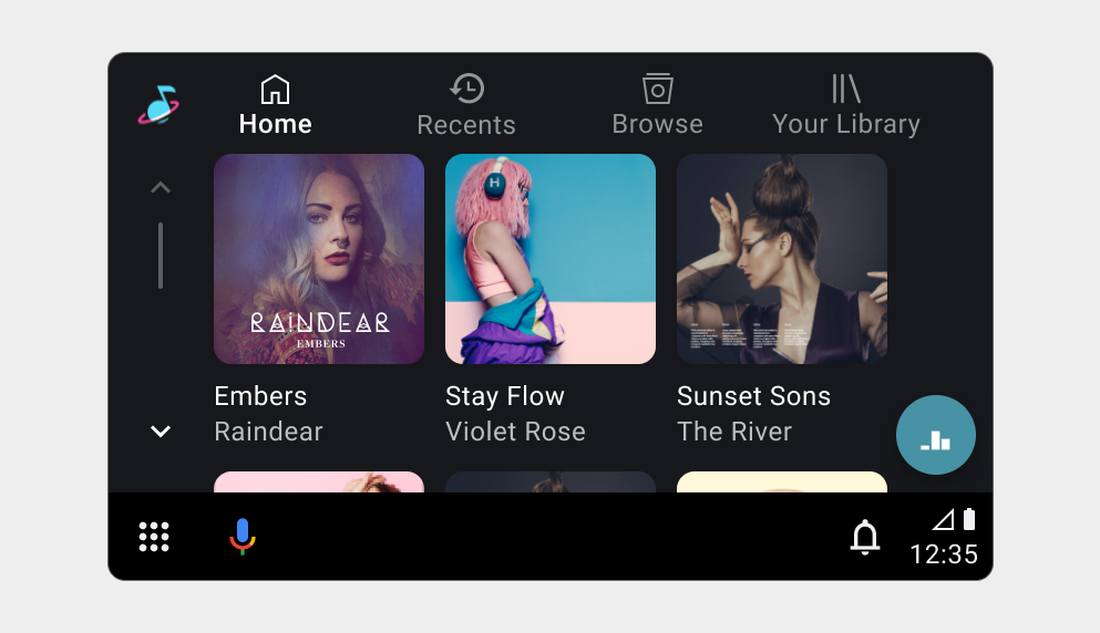
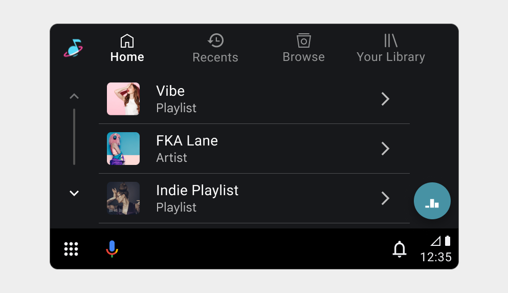
Do you want to display each level of content in either a grid format or a list format? A grid format displays multiple items displayed simultaneously in a grid-like arrangement, whereas, a list format (displays items vertically in a list).Grouping
Within each browsing view, do you want to group content into subcategories? This can help organize large amounts of content and make it easier for users to find what they're looking for.Searchability
When designing an app for driving, it is recommended to implement search capability. This allows users to quickly find specific content without having to navigate through multiple levels of browsing views.
How you define the root media item and its descendants establishes your app's content hierarchy. You can apply content styles to browsable media items to determine whether their children are displayed in grid or list views and whether they are organized under titles.
If you implement in-app search, you won't need to design the voice and keyboard search interface, as car makers design both the voice search affordance and the keyboards.
For more details, see Supporting voice actions and Displaying search results.
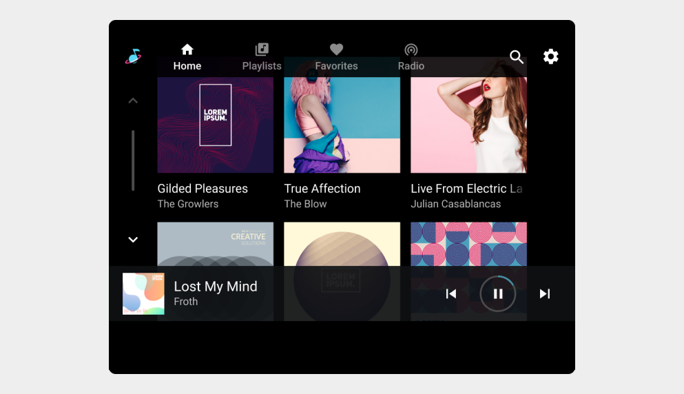
Browsing view examples


Browsing view requirements
Keep in mind the following requirements and recommendations:
| Requirement level | Requirements |
|---|---|
| MUST | App developers must:
|
| SHOULD | App developers should:
|
| MAY | App developers may:
|