AI-generated Key Takeaways
-
While car makers and Google provide basic playback controls, adding features like a queue or custom actions requires design decisions on layout, icons, and control replacement.
-
App developers need to decide whether to show elements like thumbnails, now playing indicators, previously played items, and custom actions in the queue and control bar.
-
Maintaining consistent design for custom actions and maximizing text within icons is crucial for user experience and readability in media apps.
-
The playback view is a critical design element for media apps.
-
Providing users a way to browse audio sources through a queue is important.
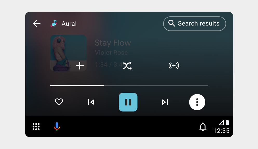
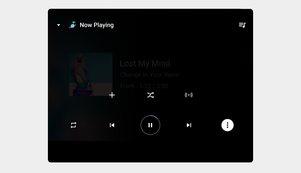
Car makers and Google provide a basic set of playback controls like Play/Pause, Next, Previous, and Overflow. If you want additional features, like queue or custom actions, you need to make design decisions regarding layout, icons, and which (if any) provided controls to replace.
To go beyond the playback actions provided by car makers and offer users a queue or additional playback actions, you need to decide whether to show the following:
- Thumbnails for items in the queue
- An icon or elapsed time for the now playing item
- Previously played items in the queue
- Custom actions on the control bar and whether to replace the car maker's Next and Previous controls
- Visual representations of each action's relevant states (for example, available or disabled)
App developers must maintain a consistent design for custom actions in media apps to align with user expectations and maximize text within icons to ensure readability.
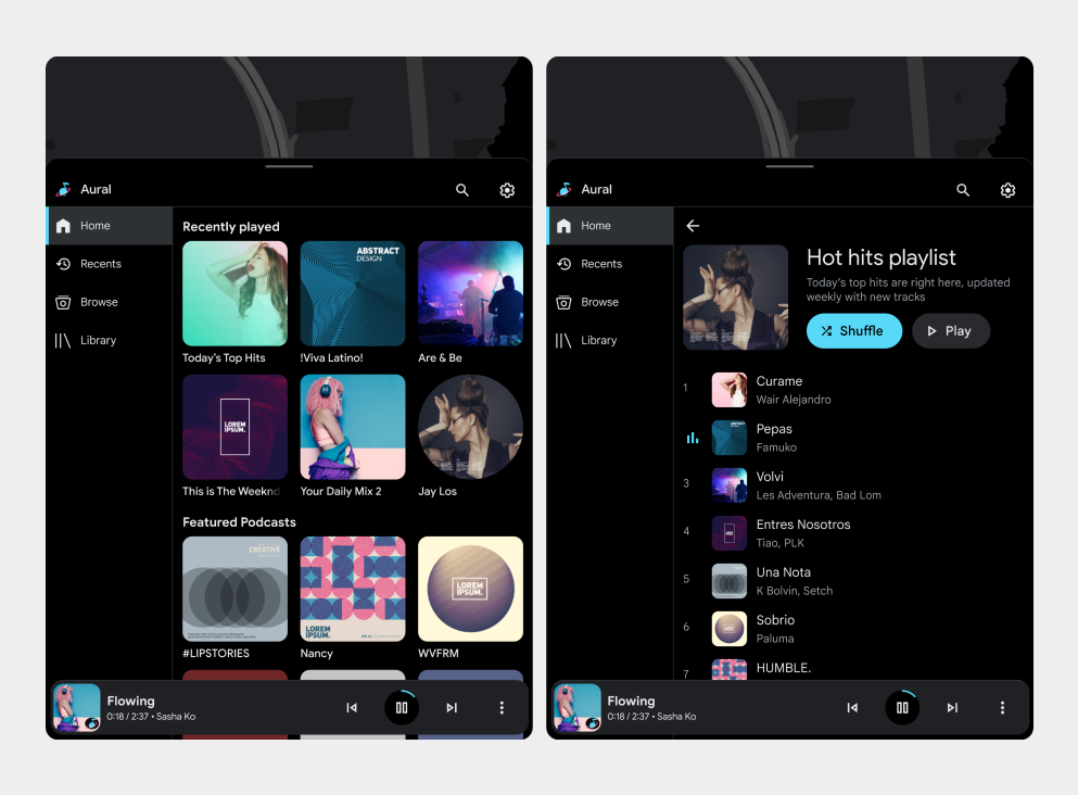
Playback view
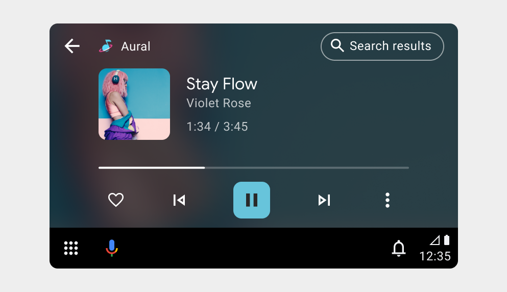
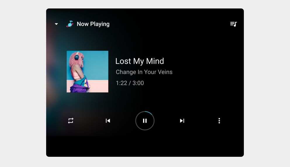
One of the most important features to design for a media app is the playback view.
Playback view examples
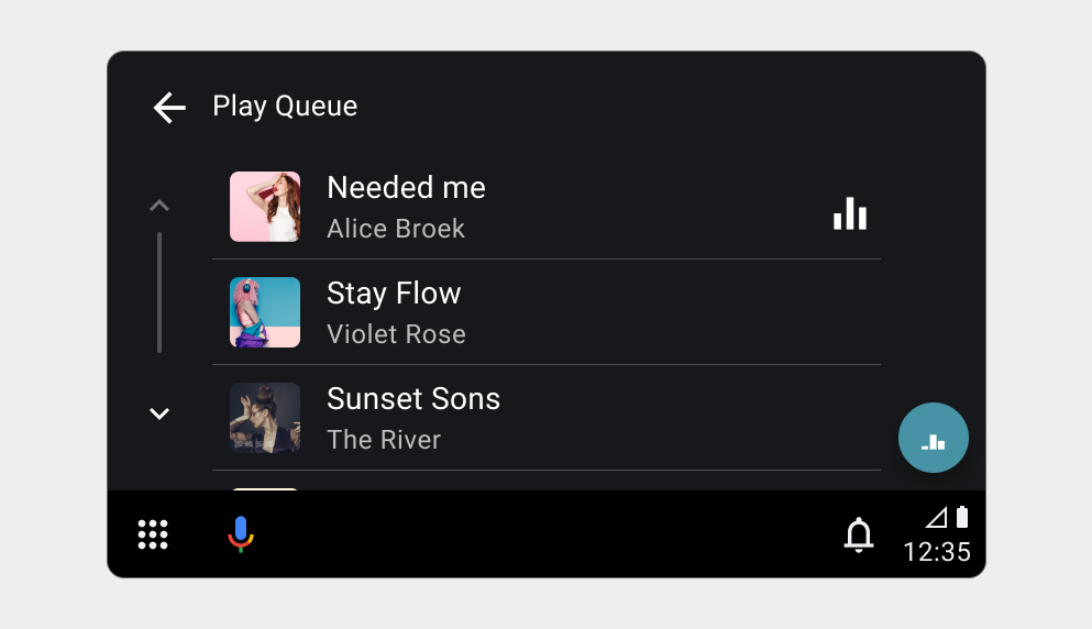
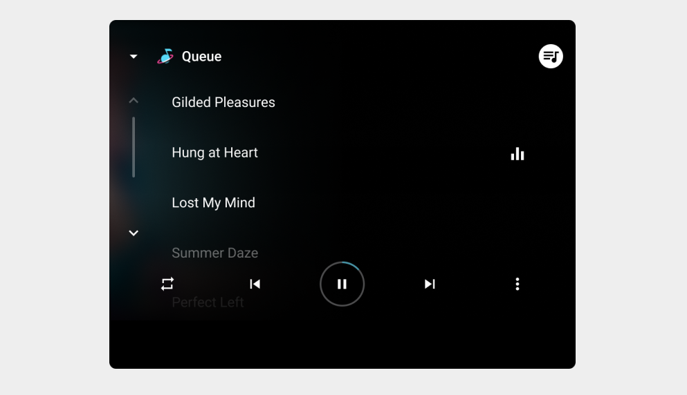
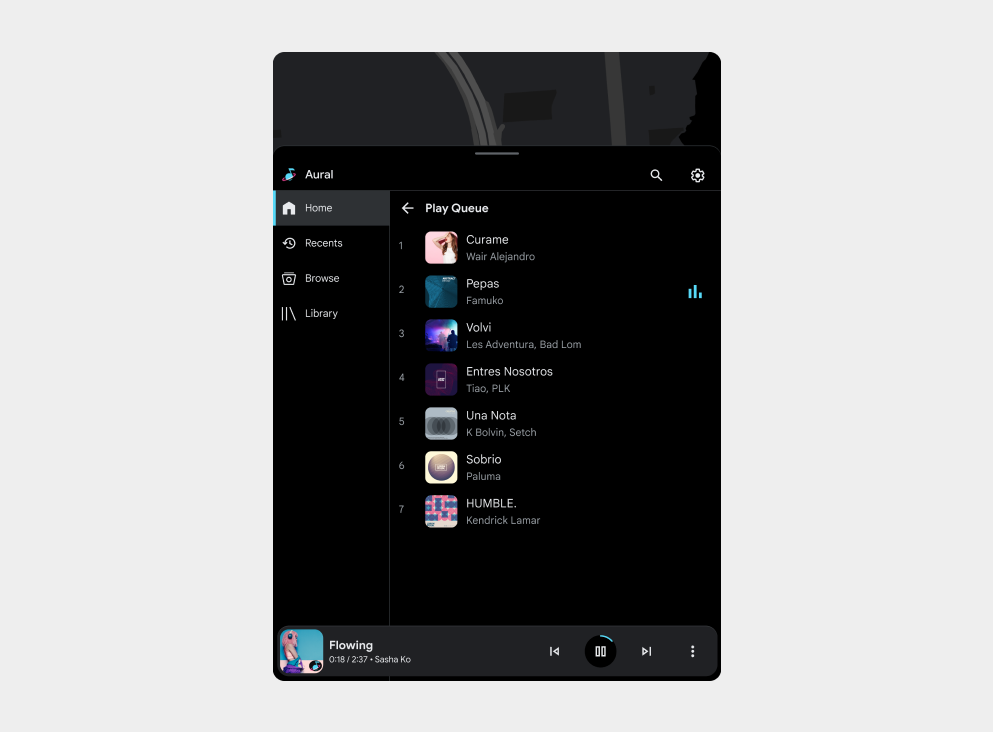
Queue
Provide the users a way to browse the list of audio sources.
Queue examples
Requirements
Keep in mind the following requirement and recommendations:
| Requirement level | Queue Requirements | Playback control requirements |
|---|---|---|
| Must | -- | App developers must:
|
| Should | App developers should:
|
App developers should:
To learn more about progress indicators and the queue, review Enable playback control. |
| May | App developers may:
|
App developers may:
|