AI-generated Key Takeaways
-
Structuring a media app begins by deciding on top-level content categories for the app bar.
-
Top-level content categories should showcase tailored content that is easily browsable while driving.
-
App developers must implement no more than 4 tabs for AAOS and provide a label and a monochrome icon for each tab.
-
Tab labels should be kept short to prevent truncation and accommodate different screen sizes.
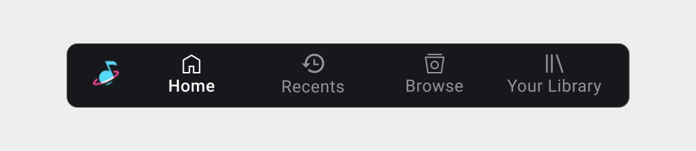
The first step in structuring your media app is determining which content categories you want to appear as top-level navigation options on the app bar.
Car makers and Google take care of implementing the app bar and determining most aspects of its appearance.
Basically, you need to decide the following:
- Which top-level content categories you want represented as tabs on the app bar
- What icons and labels you will supply for each tab
Categories should showcase tailored content, rather than broad categories that will be too large to browse easily while driving.
Tailored content might include content that is:
- Frequently used – for example, playlists or channels
- Preferred – for example, favorite artists
- Timely – for example, recent songs
- Curated – for example, “recommended for you”
Navigation tab example
Navigation tab requirements
Keep in mind the following requirements and recommendation:
| Requirement level | Requirements |
|---|---|
| MUST | App developers must:
|
SHOULD
| App developers should:
|
|
Rationale
- Simplify UX: Support a consistent navigation model for media apps.
- Accommodate all screens: Allow car makers to use only labels when both icons and labels won’t fit.