
開發人員可透過 Material 元件 (MDC) 實作 Material Design。MDC 由 Google 的工程師和 UX 設計師團隊建立,提供數十種美觀實用的 UI 元件,適用於 Android、iOS、網頁和 Flutter。 material.io/develop |

什麼是 Material Design 和 Material Components for the Web?
Material Design 是一套系統,可協助您打造大膽且美觀的數位產品。只要在一致的原則和元件下整合樣式、品牌、互動和動態效果,產品團隊就能發揮最大的設計潛力。
在電腦和行動版網站上,Material Components Web (MDC Web) 結合設計和工程,提供元件庫,讓您在應用程式和網站中建立一致性。MDC Web 元件各自位於自己的節點模組中,因此隨著 Material Design 系統演進,這些元件可以輕鬆更新,確保實作方式完全一致,並符合 Google 的前端開發標準。MDC 也適用於 Android、iOS 和 Flutter。
在本程式碼研究室中,您將使用多個 MDC Web 元件建構登入頁面。
建構項目
本程式碼研究室是三部系列的第一部,將引導您建構名為「Shrine」的應用程式,這是一個販售服飾和居家用品的電子商務網站。並說明如何使用 MDC Web 自訂元件,反映任何品牌或風格。
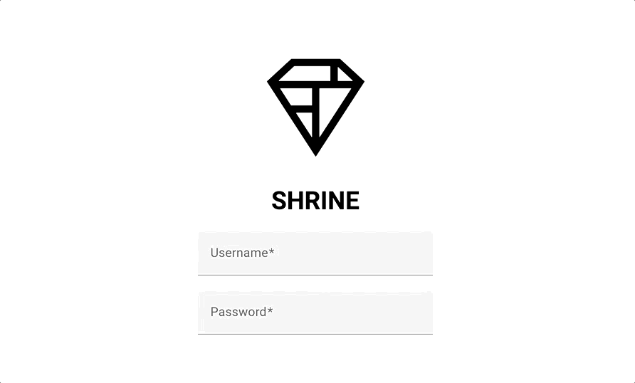
在本程式碼研究室中,您將建構 Shrine 的登入頁面,其中包含:
- 兩個文字欄位,一個用於輸入使用者名稱,另一個用於輸入密碼
- 兩個按鈕,分別是「取消」和「下一步」
- 網站名稱 (Shrine)
- Shrine 標誌的圖片
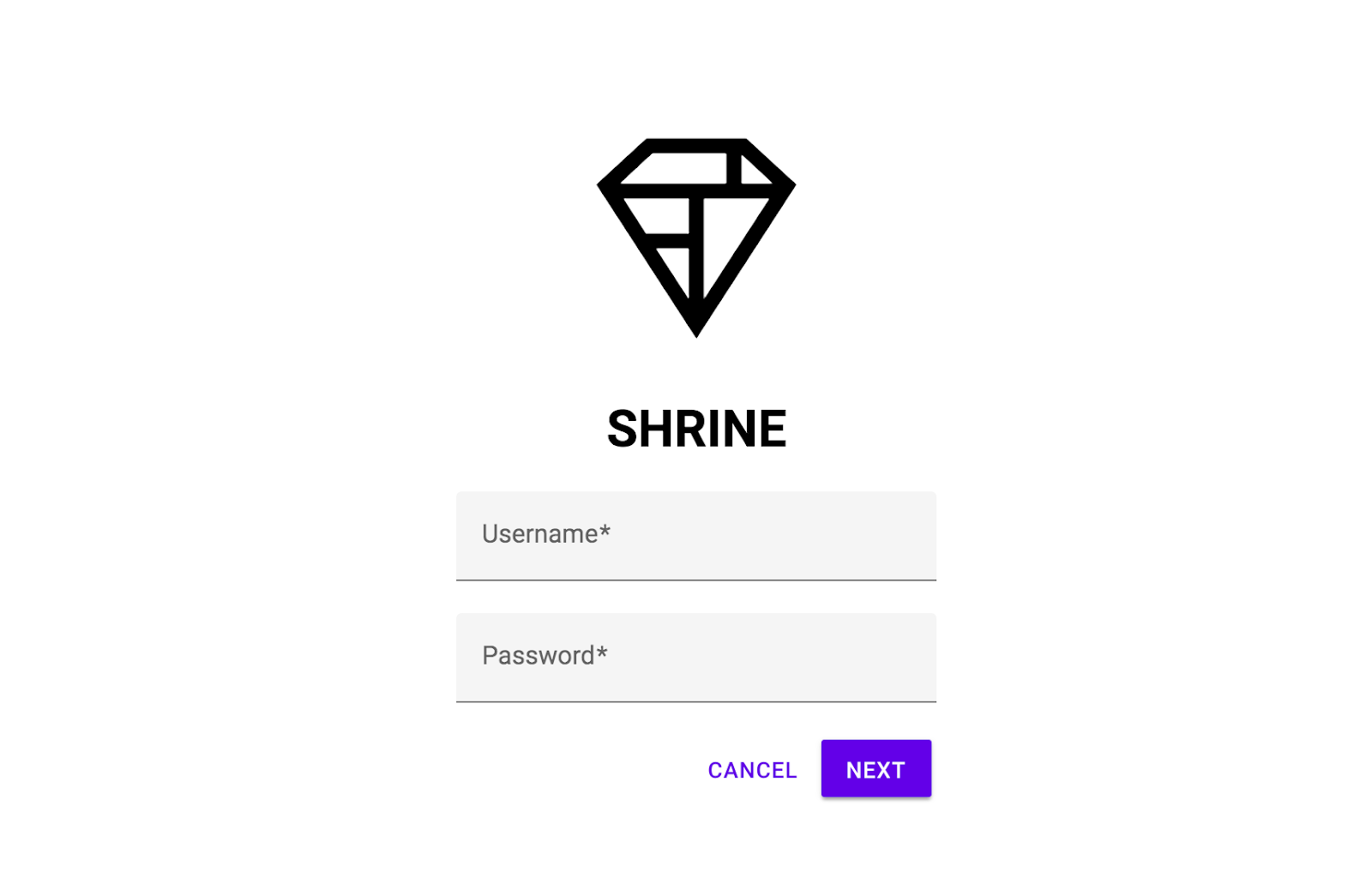
本程式碼研究室中的 MDC Web 元件
- 文字欄位
- 按鈕
- 漣漪
軟硬體需求
我們一直致力於提升教學課程品質,您對網頁開發的經驗程度為何?
下載程式碼研究室範例應用程式
入門應用程式位於 material-components-web-codelabs-master/mdc-101/starter 目錄中。開始前,請務必 cd 進入該目錄。
...或從 GitHub 複製
如要從 GitHub 複製本程式碼研究室,請執行下列指令:
git clone https://github.com/material-components/material-components-web-codelabs
cd material-components-web-codelabs/mdc-101/starter
安裝專案依附元件
從入門目錄執行下列指令:
npm install
您會看到許多活動,最後終端機應該會顯示安裝成功:

如果沒有,請執行 npm audit fix。
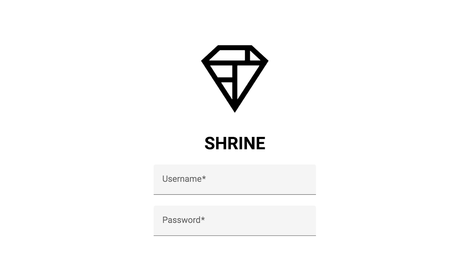
執行範例應用程式
在相同目錄中執行下列指令:
npm start
webpack-dev-server就會開始。將瀏覽器設為指向 http://localhost:8080/,即可查看網頁。
大功告成!瀏覽器應正在執行 Shrine 登入頁面的入門程式碼。您應該會看到「Shrine」名稱,以及下方的 Shrine 標誌。
查看程式碼
index.html 中的中繼資料
在起始目錄中,使用慣用的程式碼編輯器開啟 index.html。其中應包含下列項目:
<!doctype html>
<html lang="en">
<head>
  <meta charset="utf-8">
  <meta http-equiv="x-ua-compatible" content="ie=edge">
  <title>Shrine (MDC Web Example App)</title>
  <meta name="viewport" content="width=device-width, initial-scale=1">
  <link rel="icon" sizes="192x192" href="https://material.io/static/images/simple-lp/favicons/components-192x192.png">
  <link rel="shortcut icon" href="https://material.io/static/images/simple-lp/favicons/components-72x72.png">

  <link rel="stylesheet"
        href="https://cdnjs.cloudflare.com/ajax/libs/normalize/6.0.0/normalize.min.css">
  <link href="https://fonts.googleapis.com/css?family=Roboto:300,400,500,700" rel="stylesheet">
  <link rel="stylesheet" href="bundle-login.css">
</head>
<body class="shrine-login">
  <section class="header">
    <svg class="shrine-logo" ...>
      ...
    </svg>
    <h1>SHRINE</h1>
  </section>

  <form action="home.html">
  </form>

  <script src="bundle-login.js" async></script>
</body>
</html>
這裡使用 <link> 標記載入 webpack 產生的 bundle-login.css 檔案,而 <script> 標記則包含 bundle-login.js 檔案。此外,我們還納入 normalize.css,確保跨瀏覽器轉譯作業一致,以及 Google 字型的 Roboto 字型。
login.scss 中的自訂樣式
MDC Web 元件會使用 mdc-* CSS 類別設定樣式,例如 mdc-text-field 類別。(MDC Web 會將 DOM 結構視為公用 API 的一部分)。
一般來說,建議您使用自己的類別,對元件進行自訂樣式修改。您可能已注意到上述 HTML 中的一些自訂 CSS 類別,例如 shrine-logo。這些樣式是在 login.scss 中定義,可為網頁新增基本樣式。
開啟 login.scss,您會看到登入頁面的下列樣式:
@import "./common";

.header {
  text-align: center;
}

.shrine-logo {
  width: 150px;
  height: 150px;
  padding-top: 80px;
  fill: currentColor;
}您已熟悉範例程式碼,接下來要實作第一個元件。
首先,我們會在登入頁面中加入兩個文字欄位,供使用者輸入使用者名稱和密碼。我們將使用 MDC 文字欄位元件,其中內建可顯示浮動標籤及啟用觸控漣漪的功能。
安裝 MDC 文字欄位
MDC Web 元件是透過 NPM 套件發布。如要安裝文字欄位元件的套件,請執行:
npm install @material/textfield
新增 HTML
在 index.html 中,於主體的 <form> 元素內新增下列內容:
<div class="mdc-text-field username">
  <input type="text" class="mdc-text-field__input" id="username-input" name="username">
  <label class="mdc-floating-label" for="username-input">Username</label>
  <div class="mdc-line-ripple"></div>
</div>
<div class="mdc-text-field password">
  <input type="password" class="mdc-text-field__input" id="password-input" name="password">
  <label class="mdc-floating-label" for="password-input">Password</label>
  <div class="mdc-line-ripple"></div>
</div>
MDC 文字欄位 DOM 結構由多個部分組成:
- 主要元素
mdc-text-field - 子元素
mdc-text-field__input、mdc-floating-label和mdc-line-ripple
新增 CSS
在 login.scss 中,於現有匯入項目後方新增下列匯入陳述式:
@import "@material/textfield/mdc-text-field";在同一個檔案中,新增下列樣式來對齊文字欄位並置中:
.username,
.password {
  display: block;
  width: 300px;
  margin: 20px auto;
}
新增 JavaScript
開啟 login.js,這個按鈕目前沒有任何內容。加入下列程式碼,匯入並例項化文字欄位:
import {MDCTextField} from '@material/textfield';

const username = new MDCTextField(document.querySelector('.username'));
const password = new MDCTextField(document.querySelector('.password'));
新增 HTML5 驗證
文字欄位會使用 HTML5 表單驗證 API 提供的屬性,表示欄位輸入內容是否有效或含有錯誤。
請採取以下措施:
- 在「使用者名稱」和「密碼」文字欄位的
mdc-text-field__input元素中,加入required屬性 - 將「密碼」文字欄位的
mdc-text-field__input元素minlength屬性設為"8"
將兩個 <div class="mdc-text-field"> 元素調整成如下所示:
<div class="mdc-text-field username">
<input type="text" class="mdc-text-field__input" id="username-input" name="username" required>
<label class="mdc-floating-label" for="username-input">Username</label>
<div class="mdc-line-ripple"></div>
</div>
<div class="mdc-text-field password">
<input type="password" class="mdc-text-field__input" id="password-input" name="password" required minlength="8">
<label class="mdc-floating-label" for="password-input">Password</label>
<div class="mdc-line-ripple"></div>
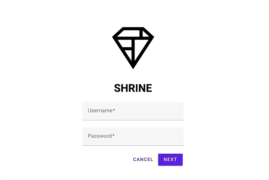
</div>在 http://localhost:8080/ 重新整理頁面。現在應該會看到一個頁面,其中有兩個文字欄位,分別是使用者名稱和密碼!
按一下文字欄位,即可查看浮動標籤動畫和線條漣漪動畫 (向外擴散的底部邊框線):
接著,我們會在登入頁面新增兩個按鈕:「取消」和「下一步」。我們將使用 MDC 按鈕元件和 MDC 波紋元件,完成標誌性的 Material Design 墨水波紋效果。
安裝 MDC 按鈕
如要安裝按鈕元件的套件,請執行:
npm install @material/button
新增 HTML
在 index.html 中,於 <div class="mdc-text-field password"> 元素的結尾標記下方新增下列內容:
<div class="button-container">
  <button type="button" class="mdc-button cancel">
    <div class="mdc-button__ripple"></div>
    <span class="mdc-button__label">
      Cancel
    </span>
  </button>
  <button class="mdc-button mdc-button--raised next">
    <div class="mdc-button__ripple"></div>
    <span class="mdc-button__label">
      Next
    </span>
  </button>
</div>
「取消」按鈕則使用預設按鈕樣式。不過,「Next」按鈕使用 raised 樣式變體,以 mdc-button--raised 類別表示。
為方便日後對齊,我們將兩個 mdc-button 元素包裝在 <div> 元素中。
新增 CSS
在 login.scss 中,於現有匯入項目後方新增下列匯入陳述式:
@import "@material/button/mdc-button";如要對齊按鈕並在周圍新增邊界,請將下列樣式新增至 login.scss:
.button-container {
  display: flex;
  justify-content: flex-end;
  width: 300px;
  margin: auto;
}

.button-container button {
  margin: 3px;
}
在按鈕中新增墨水漣漪效果
使用者輕觸或點選按鈕時,系統應以墨水漣漪的形式顯示回饋。墨水漣漪元件需要 JavaScript,因此我們會將其新增至網頁。
如要安裝漣漪元件的套件,請執行:
npm install @material/ripple
在 login.js 頂端新增下列匯入陳述式:
import {MDCRipple} from '@material/ripple';如要例項化波紋,請在 login.js 中新增下列內容:
new MDCRipple(document.querySelector('.cancel'));
new MDCRipple(document.querySelector('.next'));
由於我們不需要保留水波紋執行個體的參照,因此不必將其指派給變數。
大功告成!重新整理頁面。點選每個按鈕時,都會顯示墨水漣漪效果。
在文字欄位中填入有效值,然後按下「下一步」按鈕。你成功了!您將在 MDC-102 中繼續使用這個頁面。
您使用基本的 HTML 標記,以及幾行 CSS 和 JavaScript,透過網頁專用的 Material Components 程式庫,建立符合 Material Design 指南的美觀登入頁面,且在所有裝置上看起來和運作方式都一致。
後續步驟
「Text Field」、「Button」和「Ripple」是 MDC 網頁元件庫中的三個核心元件,但還有更多元件!您也可以探索 MDC Web 中的其餘元件。
如要瞭解導覽匣和圖片清單,請前往 MDC-102:Material Design 結構和版面配置。感謝您試用 Material Components。希望您喜歡這個程式碼研究室!