
Индекс
-
Action(сообщение) -
Action.ActionParameter(сообщение) -
Action.Interaction(перечисление) -
Action.LoadIndicator(перечисление) -
BorderStyle(сообщение) -
BorderStyle.BorderType(перечисление) -
Button(сообщение) -
ButtonList(сообщение) -
Card(сообщение) -
Card.CardAction(сообщение) -
Card.CardFixedFooter(сообщение) -
Card.CardHeader(сообщение) -
Card.DisplayStyle(перечисление) -
Card.DividerStyle(перечисление) -
Card.Section(сообщение) -
Columns(сообщение) -
Columns.Column(сообщение) -
Columns.Column.HorizontalSizeStyle(перечисление) -
Columns.Column.VerticalAlignment(перечисление) -
Columns.Column.Widgets(сообщение) -
DateTimePicker(сообщение) -
DateTimePicker.DateTimePickerType(перечисление) -
DecoratedText(сообщение) -
DecoratedText.SwitchControl(сообщение) -
DecoratedText.SwitchControl.ControlType(перечисление) -
Divider(сообщение) -
EndNavigation(сообщение) -
EndNavigation.Action(перечисление) -
GetAutocompletionResponse(сообщение) -
Grid(сообщение) -
Grid.GridItem(сообщение) -
Grid.GridItem.GridItemLayout(перечисление) -
Icon(сообщение) -
Image(сообщение) -
ImageComponent(сообщение) -
ImageCropStyle(сообщение) -
ImageCropStyle.ImageCropType(перечисление) -
Link(сообщение) -
LinkPreview(сообщение) -
MaterialIcon(сообщение) -
Navigation(сообщение) -
Notification(сообщение) -
OnClick(сообщение) -
OpenLink(сообщение) -
OpenLink.OnClose(перечисление) -
OpenLink.OpenAs(перечисление) -
RenderActions(сообщение) -
RenderActions.Action(сообщение) -
SelectionInput(сообщение) -
SelectionInput.PlatformDataSource(сообщение) -
SelectionInput.PlatformDataSource.CommonDataSource(перечисление) -
SelectionInput.SelectionItem(сообщение) -
SelectionInput.SelectionType(перечисление) -
SubmitFormResponse(сообщение) -
Suggestions(сообщение) -
Suggestions.SuggestionItem(сообщение) -
TextInput(сообщение) -
TextInput.Type(перечисление) -
TextParagraph(сообщение) -
Widget(сообщение) -
Widget.HorizontalAlignment(перечисление) -
Widget.ImageType(перечисление)
Действие
Действие, описывающее поведение при отправке формы. Например, вы можете вызвать сценарий Apps Script для обработки формы. Если действие срабатывает, значения формы отправляются на сервер.

 Доступно для приложений Google Chat и дополнений Google Workspace.
| Поля | |
|---|---|
function | Пользовательская функция, вызываемая при щелчке по содержащему элементу или его активации иным образом. Пример использования см. в разделе Чтение данных формы . |
parameters[] | Список параметров действия. |
loadIndicator | Указывает индикатор загрузки, который отображается при вызове действия. |
persistValues | Указывает, сохраняются ли значения формы после действия. Значение по умолчанию Если Если |
interaction | Необязательный. Требуется при открытии диалога . Что делать в ответ на взаимодействие с пользователем, например, когда пользователь нажимает кнопку в сообщении с карточкой. Если не указано, приложение отвечает, выполняя Указав
|
Параметр действия
Список строковых параметров, которые необходимо указать при вызове метода действия. Например, рассмотрим три кнопки повтора: отложить сейчас, отложить один день или отложить на следующей неделе. Вы можете использовать action method = snooze() , передав тип и время повтора в списке строковых параметров.
Дополнительные сведения см. в CommonEventObject .
Доступно для приложений Google Chat и дополнений Google Workspace.
| Поля | |
|---|---|
key | Имя параметра сценария действия. |
value | Значение параметра. |
Взаимодействие
Необязательный. Требуется при открытии диалога .
Что делать в ответ на взаимодействие с пользователем, например, когда пользователь нажимает кнопку в сообщении с карточкой.
Если не указано, приложение отвечает, выполняя action , например открытие ссылки или запуск функции, как обычно.
Указав interaction , приложение может реагировать особым интерактивным способом. Например, установив для interaction значение OPEN_DIALOG , приложение сможет открыть диалоговое окно .
Если указано, индикатор загрузки не отображается. Если указано для надстройки, вся карта удаляется и в клиенте ничего не отображается.
Доступно для приложений Google Chat и недоступно для дополнений Google Workspace.
| Перечисления | |
|---|---|
INTERACTION_UNSPECIFIED | Значение по умолчанию. action выполняется как обычно. |
OPEN_DIALOG | Открывает диалоговое окно — оконный интерфейс на основе карточек, который приложения чата используют для взаимодействия с пользователями. Поддерживается только приложениями чата в ответ на нажатие кнопок в карточных сообщениях. Если указано для надстройки, вся карта удаляется и в клиенте ничего не отображается.
|
Индикатор нагрузки
Указывает индикатор загрузки, который отображается при вызове действия.
Доступно для приложений Google Chat и дополнений Google Workspace.
| Перечисления | |
|---|---|
SPINNER | Отображает счетчик, указывающий на загрузку содержимого. |
NONE | Ничего не отображается. |
BorderStyle
Параметры стиля границы карточки или виджета, включая тип и цвет границы.
Доступно для приложений Google Chat и дополнений Google Workspace.
| Поля | |
|---|---|
type | Тип границы. |
strokeColor | Цвета, которые будут использоваться, если тип |
cornerRadius | Угловой радиус границы. |
Тип границы
Представляет типы границ, применяемые к виджетам.
Доступно для приложений Google Chat и дополнений Google Workspace.
| Перечисления | |
|---|---|
BORDER_TYPE_UNSPECIFIED | Не используйте. Неопределенные. |
NO_BORDER | Значение по умолчанию. Без границ. |
STROKE | Контур. |
Кнопка
Текст, значок или кнопка с текстом и значком, которую пользователи могут нажать. Пример использования приложений Google Chat см. в разделе « Добавление кнопки» .
Чтобы сделать изображение интерактивной кнопкой, укажите ImageImageComponentonClick .
Доступно для приложений Google Chat и дополнений Google Workspace.
| Поля | |
|---|---|
text | Текст, отображаемый внутри кнопки. |
icon | Изображение значка. Если установлены и |
color | Если установлено, кнопка заполняется сплошным цветом фона, а цвет шрифта изменяется, чтобы сохранить контраст с цветом фона. Например, установка синего фона, скорее всего, приведет к появлению белого текста. Если этот параметр не установлен, фон изображения будет белым, а цвет шрифта — синим. Для красного, зеленого и синего значение каждого поля представляет собой число При необходимости установите Для Например, следующий цвет представляет собой полупрозрачный красный: |
onClick | Необходимый. Действие, которое необходимо выполнить, когда пользователь нажимает кнопку, например открытие гиперссылки или запуск пользовательской функции. |
disabled | Если |
altText | Альтернативный текст, используемый для специальных возможностей. Установите описательный текст, который позволит пользователям узнать, что делает кнопка. Например, если кнопка открывает гиперссылку, вы можете написать: «Открывает новую вкладку браузера и переходит к документации для разработчиков Google Chat по адресу https://developers.google.com/workspace/chat» . |
Список кнопок
Список кнопок, расположенных горизонтально. Пример использования приложений Google Chat см. в разделе « Добавление кнопки» .
Доступно для приложений Google Chat и дополнений Google Workspace.
| Поля | |
|---|---|
buttons[] | Массив кнопок. |
Карта
Интерфейс карты, отображаемый в сообщении Google Chat или надстройке Google Workspace.
Карты поддерживают определенный макет, интерактивные элементы пользовательского интерфейса, такие как кнопки, и мультимедийные средства, такие как изображения. Используйте карточки, чтобы представить подробную информацию, собрать информацию от пользователей и помочь им сделать следующий шаг.
Создавайте и просматривайте карты с помощью Card Builder.
Откройте конструктор карточекЧтобы узнать, как создавать карты, см. следующую документацию:
- О приложениях Google Chat см. раздел Разработка компонентов карточки или диалогового окна .
- Информацию о надстройках Google Workspace см. в разделе Интерфейсы на основе карт .
Пример: карточное сообщение для приложения Google Chat.
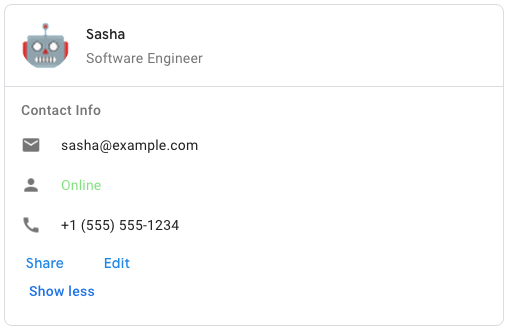
Чтобы создать образец сообщения-карточки в Google Chat, используйте следующий JSON:
{
  "cardsV2": [
    {
      "cardId": "unique-card-id",
      "card": {
        "header": {
           "title": "Sasha",
           "subtitle": "Software Engineer",
           "imageUrl":
           "https://developers.google.com/workspace/chat/images/quickstart-app-avatar.png",
           "imageType": "CIRCLE",
           "imageAltText": "Avatar for Sasha"
         },
         "sections": [
           {
             "header": "Contact Info",
             "collapsible": true,
             "uncollapsibleWidgetsCount": 1,
             "widgets": [
               {
                 "decoratedText": {
                   "startIcon": {
                     "knownIcon": "EMAIL"
                   },
                   "text": "sasha@example.com"
                 }
               },
               {
                 "decoratedText": {
                   "startIcon": {
                     "knownIcon": "PERSON"
                   },
                   "text": "<font color=\"#80e27e\">Online</font>"
                 }
               },
               {
                 "decoratedText": {
                   "startIcon": {
                     "knownIcon": "PHONE"
                   },
                   "text": "+1 (555) 555-1234"
                 }
               },
               {
                 "buttonList": {
                   "buttons": [
                     {
                       "text": "Share",
                       "onClick": {
                        "openLink": {
                           "url": "https://example.com/share"
                         }
                       }
                     },
                     {
                       "text": "Edit",
                       "onClick": {
                         "action": {
                           "function": "goToView",
                           "parameters": [
                             {
                               "key": "viewType",
                               "value": "EDIT"
                             }
                           ]
                         }
                       }
                     }
                   ]
                 }
               }
             ]
           }
         ]
       }
    }
  ]
}
| Поля | |
|---|---|
header | Заголовок карты. Заголовок обычно содержит ведущее изображение и заголовок. Заголовки всегда отображаются вверху карточки. |
sections[] | Содержит коллекцию виджетов. Каждый раздел имеет свой собственный необязательный заголовок. Разделы визуально разделены разделителем. Пример использования приложений Google Chat см. в разделе Определение раздела карточки . |
sectionDividerStyle | Стиль разделителя между разделами. |
cardActions[] | Действия карты. Действия добавляются в меню панели инструментов карточки.
Например, следующий JSON создает меню действий карты с параметрами |
name | Название карты. Используется в качестве идентификатора карты при карточной навигации.
|
fixedFooter | Фиксированный нижний колонтитул, показанный внизу этой карточки. Установка
|
displayStyle | В надстройках Google Workspace задает свойства отображения
|
peekCardHeader | При отображении контекстного контента заголовок карточки просмотра действует как заполнитель, позволяя пользователю перемещаться между карточками главной страницы и контекстными карточками.
|
КартаДействие
Действие карты — это действие, связанное с картой. Например, карточка счета-фактуры может включать такие действия, как удаление счета, отправка счета по электронной почте или открытие счета в браузере.
Доступно для дополнений Google Workspace и недоступно для приложений Google Chat.
| Поля | |
|---|---|
actionLabel | Метка, которая отображается как элемент меню действий. |
onClick | Действие |
КартаFixedFooter
Постоянный (прикрепленный) нижний колонтитул, который появляется внизу карточки.
Установка fixedFooter без указания primaryButton или secondaryButton вызывает ошибку.
В приложениях чата вы можете использовать фиксированные нижние колонтитулы в диалогах , но не в сообщениях-карточках . Пример использования приложений Google Chat см. в разделе Добавление постоянного нижнего колонтитула .
Доступно для приложений Google Chat и дополнений Google Workspace.
Заголовок карты
Представляет заголовок карты. Пример использования приложений Google Chat см. в разделе Добавление заголовка .
Доступно для приложений Google Chat и дополнений Google Workspace.
| Поля | |
|---|---|
title | Необходимый. Название шапки карты. Заголовок имеет фиксированную высоту: если указаны и заголовок, и подзаголовок, каждый занимает одну строку. Если указан только заголовок, он занимает обе строки. |
subtitle | Подзаголовок шапки карты. Если указано, отображается на отдельной строке под |
imageType | Форма, используемая для обрезки изображения.
|
imageUrl | URL-адрес HTTPS изображения в заголовке карты. |
imageAltText | Альтернативный текст этого изображения, используемый для специальных возможностей. |
Стиль отображения
В надстройках Google Workspace определяет способ отображения карточки.
Доступно для дополнений Google Workspace и недоступно для приложений Google Chat.
| Перечисления | |
|---|---|
DISPLAY_STYLE_UNSPECIFIED | Не используйте. Неопределенные. |
PEEK | Заголовок карты отображается внизу боковой панели, частично закрывая текущую верхнюю карту стопки. При нажатии на заголовок карточка помещается в стопку карточек. Если у карты нет заголовка, вместо него используется сгенерированный заголовок. |
REPLACE | Значение по умолчанию. Карта отображается путем замены вида верхней карты в стопке карт. |
РазделительСтиль
Стиль разделителя карты. В настоящее время используется только для разделителей между разделами карты.
Доступно для приложений Google Chat и дополнений Google Workspace.
| Перечисления | |
|---|---|
DIVIDER_STYLE_UNSPECIFIED | Не используйте. Неопределенные. |
SOLID_DIVIDER | Вариант по умолчанию. Создайте сплошной разделитель между разделами. |
NO_DIVIDER | Если установлено, между разделами не отображается разделитель. |
Раздел
Раздел содержит коллекцию виджетов, которые отображаются вертикально в указанном порядке.
Доступно для приложений Google Chat и дополнений Google Workspace.
| Поля | |
|---|---|
header | Текст, который отображается вверху раздела. Поддерживает простой текст в формате HTML. Дополнительную информацию о форматировании текста см. в разделах «Форматирование текста в приложениях Google Chat» и «Форматирование текста в надстройках Google Workspace» . |
widgets[] | Все виджеты в разделе. Должен содержать хотя бы один виджет. |
collapsible | Указывает, является ли этот раздел сворачиваемым. Сворачиваемые разделы скрывают некоторые или все виджеты, но пользователи могут развернуть раздел, чтобы отобразить скрытые виджеты, нажав «Показать больше» . Пользователи могут снова скрыть виджеты, нажав «Показать меньше» . Чтобы определить, какие виджеты скрыты, укажите |
uncollapsibleWidgetsCount | Количество несворачиваемых виджетов, которые остаются видимыми, даже если раздел свернут. Например, если раздел содержит пять виджетов и для |
Столбцы
Виджет Columns отображает до двух столбцов на карточке или в диалоговом окне. Вы можете добавлять виджеты в каждый столбец; виджеты отображаются в том порядке, в котором они указаны. Пример использования приложений Google Chat см. в разделе Отображение карточек и диалоговых окон в столбцах .
Высота каждого столбца определяется более высоким столбцом. Например, если первый столбец выше второго, оба столбца будут иметь высоту первого столбца. Поскольку каждый столбец может содержать разное количество виджетов, вы не можете определять строки или выравнивать виджеты между столбцами.
Столбцы отображаются рядом. Вы можете настроить ширину каждого столбца, используя поле HorizontalSizeStyle . Если ширина экрана пользователя слишком узкая, второй столбец переносится ниже первого:
- В Интернете второй столбец переносится, если ширина экрана меньше или равна 480 пикселям.
- На устройствах iOS второй столбец переносится, если ширина экрана меньше или равна 300 pt.
- На устройствах Android второй столбец переносится, если ширина экрана меньше или равна 320 dp.
Чтобы включить более двух столбцов или использовать строки, используйте виджет Grid
Доступно для приложений Google Chat и дополнений Google Workspace.
| Поля | |
|---|---|
columnItems[] | Массив столбцов. Вы можете включить до двух столбцов в карточку или диалог. |
Столбец
Колонка.
Доступно для приложений Google Chat и дополнений Google Workspace.
| Поля | |
|---|---|
horizontalSizeStyle | Указывает, как столбец заполняет ширину карточки. |
horizontalAlignment | Указывает, выравниваются ли виджеты по левому, правому или центру столбца. |
verticalAlignment | Указывает, выравниваются ли виджеты по верху, низу или центру столбца. |
widgets[] | Массив виджетов, включенных в столбец. Виджеты отображаются в том порядке, в котором они указаны. |
ГоризонтальныйРазмерСтиль
Указывает, как столбец заполняет ширину карточки. Ширина каждого столбца зависит как от HorizontalSizeStyle , так и от ширины виджетов внутри столбца.
Доступно для приложений Google Chat и дополнений Google Workspace.
| Перечисления | |
|---|---|
HORIZONTAL_SIZE_STYLE_UNSPECIFIED | Не используйте. Неопределенные. |
FILL_AVAILABLE_SPACE | Значение по умолчанию. Столбец заполняет доступное пространство до 70 % ширины карты. Если для обоих столбцов установлено значение FILL_AVAILABLE_SPACE , каждый столбец заполняет 50 % пространства. |
FILL_MINIMUM_SPACE | Столбец занимает минимально возможное пространство и не более 30 % ширины карты. |
Вертикальное выравнивание
Указывает, выравниваются ли виджеты по верху, низу или центру столбца.
Доступно для приложений Google Chat и дополнений Google Workspace.
| Перечисления | |
|---|---|
VERTICAL_ALIGNMENT_UNSPECIFIED | Не используйте. Неопределенные. |
CENTER | Значение по умолчанию. Выравнивает виджеты по центру столбца. |
TOP | Выравнивает виджеты по верху столбца. |
BOTTOM | Выравнивает виджеты по нижней части столбца. |
Виджеты
Поддерживаемые виджеты, которые можно включить в столбец.
Доступно для приложений Google Chat и дополнений Google Workspace.
| Поля | |
|---|---|
| |
textParagraph | Виджет |
image | Виджет |
decoratedText | Виджет |
buttonList | Виджет |
textInput | Виджет |
selectionInput | Виджет |
dateTimePicker | Виджет |
DateTimePicker
Позволяет пользователям вводить дату, время или дату и время одновременно. Пример использования приложений Google Chat см. в разделе Разрешить пользователю выбирать дату и время .
Пользователи могут вводить текст или использовать средство выбора для выбора даты и времени. Если пользователи вводят неверную дату или время, средство выбора отображает ошибку, которая предлагает пользователям ввести информацию правильно.
Доступно для приложений Google Chat и дополнений Google Workspace.
| Поля | |
|---|---|
name | Имя, по которому Подробные сведения о работе с входными данными формы см. в разделе Получение данных формы . |
label | Текст, предлагающий пользователям ввести дату, время или дату и время. Например, если пользователи планируют встречу, используйте такую метку, как |
type | Поддерживает ли виджет ввод даты, времени или даты и времени. |
valueMsEpoch | Значение по умолчанию, отображаемое в виджете, в миллисекундах с момента эпохи Unix . Укажите значение в зависимости от типа средства выбора (
|
timezoneOffsetDate | Число, представляющее смещение часового пояса от UTC в минутах. Если установлено, |
onChangeAction | Срабатывает, когда пользователь нажимает кнопку «Сохранить» или «Очистить» в интерфейсе |
DateTimePickerType
Формат даты и времени в виджете DateTimePicker . Определяет, могут ли пользователи вводить дату, время или дату и время одновременно.
Доступно для приложений Google Chat и дополнений Google Workspace.
| Перечисления | |
|---|---|
DATE_AND_TIME | Пользователи вводят дату и время. |
DATE_ONLY | Пользователи вводят дату. |
TIME_ONLY | Пользователи вводят время. |
УкрашенныйТекст
Виджет, отображающий текст с дополнительными украшениями, такими как метка над или под текстом, значок перед текстом, виджет выбора или кнопка после текста. Пример использования приложений Google Chat см. в разделе Отображение текста с декоративным текстом .
Доступно для приложений Google Chat и дополнений Google Workspace.
| Поля | |
|---|---|
icon | Устарело в пользу |
startIcon | Значок отображается перед текстом. |
topLabel | Текст, который появляется над |
text | Необходимый. Первичный текст. Поддерживает простое форматирование. Дополнительную информацию о форматировании текста см. в разделах «Форматирование текста в приложениях Google Chat» и «Форматирование текста в надстройках Google Workspace» . |
wrapText | Настройка переноса текста. Если Применяется только к |
bottomLabel | Текст, который отображается под |
onClick | Это действие запускается, когда пользователи нажимают |
Полевой control Союза. Кнопка, переключатель, флажок или изображение, которое отображается справа от текста в виджете decoratedText . control может быть только одним из следующих: | |
button | Кнопка, которую пользователь может нажать, чтобы вызвать действие. |
switchControl | Виджет переключения, по которому пользователь может щелкнуть, чтобы изменить его состояние и вызвать действие. |
endIcon | Значок, отображаемый после текста. Поддерживает встроенные и пользовательские значки. |
SwitchControl
Либо переключатель в стиле тумблера, либо флажок внутри виджета decoratedText .
Доступно для приложений Google Chat и дополнений Google Workspace.
Поддерживается только в виджете decoratedText .
| Поля | |
|---|---|
name | Имя, по которому виджет переключения идентифицируется в событии ввода формы. Подробные сведения о работе с входными данными формы см. в разделе Получение данных формы . |
value | Значение, введенное пользователем и возвращаемое как часть события ввода формы. Подробные сведения о работе с входными данными формы см. в разделе Получение данных формы . |
selected | Если |
onChangeAction | Действие, которое необходимо выполнить при изменении состояния переключателя, например, какую функцию запускать. |
controlType | Как переключатель отображается в пользовательском интерфейсе.
|
Тип управления
Как переключатель отображается в пользовательском интерфейсе.
Доступно для приложений Google Chat и дополнений Google Workspace.
| Перечисления | |
|---|---|
SWITCH | Тумблерный переключатель. |
CHECKBOX | Устарело в пользу CHECK_BOX . |
CHECK_BOX | Флажок. |
Разделитель
Этот тип не имеет полей.
Отображает разделитель между виджетами в виде горизонтальной линии. Пример использования приложений Google Chat см. в разделе «Добавление горизонтального разделителя между виджетами» .
Доступно для приложений Google Chat и дополнений Google Workspace.
Например, следующий JSON создает разделитель:
"divider": {}
КонецНавигации
Действие потока диалога.
Доступно для приложений Google Chat и недоступно для дополнений Google Workspace.
| Поля | |
|---|---|
action | Действие рендеринга для клиента, завершающее поток диалога.
|
Действие
Типы действий рендеринга, позволяющие клиенту завершить поток диалога.
Доступно для приложений Google Chat и недоступно для дополнений Google Workspace.
Получитьавтодополнениеответ
Ответ на получение контейнера автозаполнения, который включает элементы, необходимые для отображения элементов автозаполнения для текстового поля.
Доступно для дополнений Google Workspace и недоступно для приложений Google Chat. Например:
{
  "autoComplete": {
    "items": [
      {
        "text": "C++"
      },
      {
        "text": "Java"
      },
      {
        "text": "JavaScript"
      },
      {
        "text": "Python"
      }
    ]
  }
}
| Поля | |
|---|---|
autoComplete | |
schema | Это неиспользуемое поле схемы, которое может присутствовать в разметке для проверки синтаксиса. |
Сетка
Отображает сетку с коллекцией элементов. Элементы могут включать только текст или изображения. Для адаптивных столбцов или для включения большего количества текста или изображений используйте Columns
Сетка поддерживает любое количество столбцов и элементов. Количество строк определяется элементами, разделенными столбцами. Сетка с 10 элементами и 2 столбцами имеет 5 строк. Сетка с 11 элементами и 2 столбцами имеет 6 строк.
Доступно для приложений Google Chat и дополнений Google Workspace.
Например, следующий JSON создает сетку из двух столбцов с одним элементом:
"grid": {
  "title": "A fine collection of items",
  "columnCount": 2,
  "borderStyle": {
    "type": "STROKE",
    "cornerRadius": 4
  },
  "items": [
    {
      "image": {
        "imageUri": "https://www.example.com/image.png",
        "cropStyle": {
          "type": "SQUARE"
        },
        "borderStyle": {
          "type": "STROKE"
        }
      },
      "title": "An item",
      "textAlignment": "CENTER"
    }
  ],
  "onClick": {
    "openLink": {
      "url": "https://www.example.com"
    }
  }
}
| Поля | |
|---|---|
title | Текст, который отображается в заголовке сетки. |
items[] | Элементы, отображаемые в сетке. |
borderStyle | Стиль границы, применяемый к каждому элементу сетки. |
columnCount | Количество столбцов, отображаемых в сетке. Значение по умолчанию используется, если это поле не указано, и это значение по умолчанию различается в зависимости от того, где отображается сетка (диалоговое окно или сопутствующий текст). |
onClick | Этот обратный вызов повторно используется каждым отдельным элементом сетки, но к параметрам обратного вызова добавляется идентификатор и индекс элемента в списке элементов. |
Гридитем
Представляет элемент в макете сетки. Элементы могут содержать текст, изображение или и текст, и изображение.
Доступно для приложений Google Chat и дополнений Google Workspace.
| Поля | |
|---|---|
id | Заданный пользователем идентификатор для этого элемента сетки. Этот идентификатор возвращается в параметрах обратного вызова |
image | Изображение, которое отображается в элементе сетки. |
title | Название элемента сетки. |
subtitle | Подзаголовок элемента сетки. |
layout | Макет, используемый для элемента сетки. |
GridItemLayout
Представляет различные параметры макета, доступные для элемента сетки.
Доступно для приложений Google Chat и дополнений Google Workspace.
| Перечисления | |
|---|---|
GRID_ITEM_LAYOUT_UNSPECIFIED | Не используйте. Неопределенные. |
TEXT_BELOW | Заголовок и подзаголовок отображаются под изображением элемента сетки. |
TEXT_ABOVE | Заголовок и подзаголовок отображаются над изображением элемента сетки. |
Икона
Значок, отображаемый в виджете на карточке. Пример использования приложений Google Chat см. в разделе Добавление значка .
Поддерживает встроенные и пользовательские значки.
Доступно для приложений Google Chat и дополнений Google Workspace.
| Поля | |
|---|---|
altText | Необязательный. Описание значка, используемого для специальных возможностей. Если не указано, предоставляется значение Если значок установлен в |
imageType | К изображению применен стиль обрезки. В некоторых случаях применение обрезки |
icons полей Союза. Значок, отображаемый в виджете на карте. icons могут быть только одним из следующих: | |
knownIcon | Отобразите один из встроенных значков Google Workspace. Например, чтобы отобразить значок самолета, укажите Полный список поддерживаемых значков см. в разделе «Встроенные значки» . |
iconUrl | Отображение пользовательского значка, размещенного по URL-адресу HTTPS. Например: Поддерживаемые типы файлов: |
materialIcon | Отобразите один из значков материалов Google . Например, чтобы отобразить значок флажка , используйте |
Изображение
Изображение, заданное URL-адресом и может иметь действие onClick . Пример см. в разделе «Добавление изображения» .
Доступно для приложений Google Chat и дополнений Google Workspace.
| Поля | |
|---|---|
imageUrl | URL-адрес HTTPS, на котором размещено изображение. Например: |
onClick | Когда пользователь щелкает изображение, щелчок запускает это действие. |
altText | Альтернативный текст этого изображения, используемый для специальных возможностей. |
Компонент изображения
Представляет изображение.
Доступно для приложений Google Chat и дополнений Google Workspace.
| Поля | |
|---|---|
imageUri | URL-адрес изображения. |
altText | Метка доступности изображения. |
cropStyle | Стиль обрезки, применяемый к изображению. |
borderStyle | Стиль границы, применяемый к изображению. |
СтильОбрезки Изображения
Представляет стиль обрезки, примененный к изображению.
Доступно для приложений Google Chat и дополнений Google Workspace.
Например, вот как применить соотношение сторон 16:9:
cropStyle {
 "type": "RECTANGLE_CUSTOM",
 "aspectRatio": 16/9
}
| Поля | |
|---|---|
type | Тип урожая. |
aspectRatio | Соотношение сторон, которое будет использоваться, если тип кадрирования — Например, вот как применить соотношение сторон 16:9: |
ТипОбрезки Изображения
Представляет стиль обрезки, примененный к изображению.
Доступно для приложений Google Chat и дополнений Google Workspace.
| Перечисления | |
|---|---|
IMAGE_CROP_TYPE_UNSPECIFIED | Не используйте. Неопределенные. |
SQUARE | Значение по умолчанию. Применяет квадратную обрезку. |
CIRCLE | Применяет круговую обрезку. |
RECTANGLE_CUSTOM | Применяет прямоугольную обрезку с настраиваемым соотношением сторон. Установите пользовательское соотношение сторон с aspectRatio . |
RECTANGLE_4_3 | Применяет прямоугольную обрезку с соотношением сторон 4:3. |
Связь
Объект ссылки для стороннего ресурса, который возвращается в надстройку. Дополнительные сведения см. в разделе Создание сторонних ресурсов из меню @ .
Доступно для дополнений Google Workspace и недоступно для приложений Google Chat.
| Поля | |
|---|---|
url | URL ссылки для возврата в дополнение. |
title | Название ссылки для возврата в дополнение. |
СсылкаПредварительный просмотр
Действие карты, которое позволяет предварительно просмотреть стороннюю ссылку, отображая карту и смарт-чип. Дополнительные сведения см. в разделе Предварительный просмотр ссылок со смарт-чипами .
Доступно для дополнений Google Workspace и недоступно для приложений Google Chat.
Например, следующий JSON возвращает уникальный заголовок для предварительного просмотра ссылки и ее смарт-чипа, а также карточку предварительного просмотра с заголовком и текстовым описанием:
{
  "action": {
    "linkPreview": {
      "title": "Smart chip title",
      "linkPreviewTitle": "Link preview title",
      "previewCard": {
        "header": {
          "title": "Preview card header",
        },
        "sections": [
          {
            "widgets": [
              {
                "textParagraph": {
                  "text": "Description of the link."
                }
              }
            ]
          }
        ]
      }
    }
  }
}
В примере возвращается следующий предварительный просмотр ссылки:
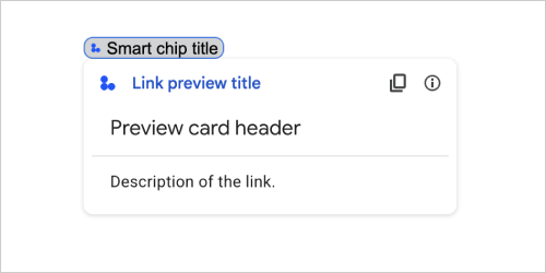
| Поля | |
|---|---|
previewCard | Карточка, отображающая информацию о ссылке со стороннего сервиса. |
title | Заголовок, который отображается на смарт-чипе для предварительного просмотра ссылки. Если значение не установлено, смарт-чип отображает заголовок |
linkPreviewTitle | Заголовок, который отображается при предварительном просмотре ссылки. Если этот параметр не установлен, при предварительном просмотре ссылки отображается заголовок |
МатериалИконка
Значок Google Material , включающий более 2500+ вариантов.
Например, чтобы отобразить значок флажка с настроенным весом и оценкой, напишите следующее:
{
  "name": "check_box",
  "fill": true,
  "weight": 300,
  "grade": -25
}
Доступно для приложений Google Chat и недоступно для дополнений Google Workspace.
| Поля | |
|---|---|
name | Имя значка, определенное в Google Material Icon , например, |
fill | Будет ли значок отображаться заполненным. Значение по умолчанию — ложь. Чтобы просмотреть различные настройки значков, перейдите в раздел «Значки шрифтов Google» и настройте параметры в разделе «Настроить» . |
weight | Толщина штриха значка. Выберите из {100, 200, 300, 400, 500, 600, 700}. Если оно отсутствует, значение по умолчанию — 400. Если указано любое другое значение, используется значение по умолчанию. Чтобы просмотреть различные настройки значков, перейдите в раздел «Значки шрифтов Google» и настройте параметры в разделе «Настроить» . |
grade | Вес и класс влияют на толщину символа. Корректировки класса являются более детальными, чем корректировки веса, и оказывают небольшое влияние на размер символа. Выберите из {-25, 0, 200}. Если оно отсутствует, значение по умолчанию равно 0. Если указано любое другое значение, используется значение по умолчанию. Чтобы просмотреть различные настройки значков, перейдите в раздел «Значки шрифтов Google» и настройте параметры в разделе «Настроить» . |
Навигация
Действие карты, управляющее стопкой карт.
Например:
1) Добавьте в стопку новую карту (перейдите вперед). Для приложений чата доступно только на главной странице приложения .
Доступно для приложений Google Chat и дополнений Google Workspace.
 navigations : {
    pushCard : CARD
  }
2) Обновить карту поверх стека (обновить на месте).
Доступно для дополнений Google Workspace и недоступно для приложений Google Chat.
  navigations : {
    popCard : true,
  }, {
    pushCard : CARD
  }
3) Вернитесь на один шаг назад без обновления.
Доступно для дополнений Google Workspace и недоступно для приложений Google Chat.
  navigations : {
    popCard : true,
  }
4) Вернитесь на несколько шагов назад и обновите эту карту.
Доступно для дополнений Google Workspace и недоступно для приложений Google Chat.
  navigations : {
    popCard : true,
  }, ... {
    pushCard : CARD
  }
5) Вернитесь на несколько шагов назад к определенному CARD_NAME .
Доступно для дополнений Google Workspace и недоступно для приложений Google Chat.
  navigations : {
    popToCardName : CARD_NAME,
  }, {
    pushCard : CARD
  }
6) Вернитесь в корень и обновите эту карту.
Доступно для дополнений Google Workspace и недоступно для приложений Google Chat.
  navigations : {
    popToRoot : true
  }, {
    pushCard : CARD
  }
7) Перейдите к указанной карте и вставьте и ее.
Доступно для дополнений Google Workspace и недоступно для приложений Google Chat.
navigations : { popToCardName : CARD_NAME }, { popCard : true, }
8) Замените верхнюю карту новой картой. Для приложений чата доступно только на главной странице приложения .
Доступно для приложений Google Chat и дополнений Google Workspace.
  navigations : {
    updateCard : CARD
  }
| Поля | |
|---|---|
Поле объединения | |
popToRoot | Из стопки карт вынимаются все карты, кроме корневой. |
pop | Стопка карт выталкивает одну карту. |
popToCard | Стек карт извлекает все карты выше указанной карты с заданным именем карты. |
pushCard | Стек карт помещает карту в стопку карт. |
updateCard | Стек карточек обновляет верхнюю карточку новой карточкой и сохраняет значения заполненных полей формы. Для неэквивалентного поля значение удаляется. |
endNavigation | Поток диалога завершает действие навигации. Дополнительные сведения см. в разделе «Ответ на диалоговое окно для сообщений домашней карточки приложения».
|
Уведомление
Действие карты, которое отображает уведомление в главном приложении.
Доступно для дополнений Google Workspace и недоступно для приложений Google Chat.
| Поля | |
|---|---|
text | Обычный текст для отображения уведомления без HTML-тегов. |
По щелчку
Представляет, как реагировать, когда пользователи нажимают интерактивный элемент на карточке, например кнопку.
Доступно для приложений Google Chat и дополнений Google Workspace.
| Поля | |
|---|---|
| |
action | Если указано, действие запускается этим |
openLink | Если указано, этот |
openDynamicLinkAction | Надстройка запускает это действие, когда действию необходимо открыть ссылку. Это отличается от приведенного выше
|
card | Новая карта помещается в стопку карточек после щелчка, если это указано.
|
Открыть ссылку
Представляет событие onClick , открывающее гиперссылку.
Доступно для приложений Google Chat и дополнений Google Workspace.
| Поля | |
|---|---|
url | URL-адрес для открытия. |
openAs | Как открыть ссылку.
|
onClose | Забывает ли клиент о ссылке после ее открытия или наблюдает за ней до закрытия окна.
|
При Закрытии
Что делает клиент, когда ссылка, открытая действием OnClick закрывается.
Реализация зависит от возможностей клиентской платформы. Например, веб-браузер может открыть ссылку во всплывающем окне с обработчиком OnClose .
Если установлены оба обработчика OnOpen и OnClose , а клиентская платформа не может поддерживать оба значения, OnClose имеет приоритет.
Доступно для дополнений Google Workspace и недоступно для приложений Google Chat.
| Перечисления | |
|---|---|
NOTHING | Значение по умолчанию. Карта не перезагружается; Ничего не произошло. |
RELOAD | Перезагружает карту после закрытия дочернего окна. При использовании в сочетании с |
OpenS
Когда действие OnClick открывает ссылку, тогда клиент может либо открыть его как полноразмерное окно (если это кадр, используемый клиентом), либо наложением (например, всплывающее окно). Реализация зависит от возможностей клиентской платформы, и выбранное значение может быть проигнорировано, если клиент не поддерживает ее. FULL_SIZE поддерживается всеми клиентами.
Доступно для Google Workspace Adsons и недоступно для приложений Google Chat.
| Перечисление | |
|---|---|
FULL_SIZE | Ссылка открывается как полноразмерное окно (если это кадр, используемый клиентом). |
OVERLAY | Ссылка открывается как наложение, например, всплывающее окно. |
Рендеринги
Набор инструкций по рендеринге, которые сообщают карте для выполнения действия или сообщает приложению Add-Host или приложению Chat для выполнения специфического приложения.
Доступно для приложений Google Chat и надстройки Google Workspace.
| Поля | |
|---|---|
action | |
hostAppAction | Действия, выполняемые отдельными приложениями хоста. |
schema | Это поле схемы NO-OP, которое может присутствовать в наценке для проверки синтаксиса. |
Действие
| Поля | |
|---|---|
navigations[] | Нажмите, всплывают или обновляют отображаемые карты. |
link | Немедленно откройте целевую ссылку на новой вкладке или всплывающее окно. |
notification | Отобразить уведомление для конечного пользователя. |
linkPreview | Отобразить предварительный просмотр ссылки на конечного пользователя. |
links[] | Ссылка для стороннего ресурса, созданного из приложения Google Workspace. Отформатируется как массив объектов с одним элементом. Для получения дополнительной информации см. Создание сторонних ресурсов из меню @ . |
SelectionInput
Виджет, который создает один или несколько элементов пользовательского интерфейса, которые могут выбрать пользователи. Например, выпадающее меню или флажки. Вы можете использовать этот виджет для сбора данных, которые могут быть предсказаны или перечислены. Для примера в приложениях Google Chat см. «Добавить выбранные элементы пользовательского интерфейса» .
Приложения чата могут обрабатывать значение элементов, которые пользователи выбирают или вводятся. Для получения подробной информации о работе с входами формы см. Данные формы приема .
Чтобы собрать неопределенные или абстрактные данные от пользователей, используйте виджет TextInput .
Доступно для приложений Google Chat и надстройки Google Workspace.
| Поля | |
|---|---|
name | Имя, которое идентифицирует ввод выбора в событии ввода формы. Для получения подробной информации о работе с входами формы см. Данные формы приема . |
label | Текст, который появляется над полем ввода выбора в пользовательском интерфейсе. Укажите текст, который помогает пользователю ввести информацию, необходимую вашему приложению. Например, если пользователи выбирают срочность рабочего билета из раскрывающегося меню, этикетка может быть «срочно» или «выберите срочность». |
type | Тип элементов, которые отображаются пользователям в виджете |
items[] | Массив выбранных элементов. Например, массив радиопроизводств или флажок. Поддерживает до 100 предметов. |
onChangeAction | Если указано, форма отправляется при изменении выбора. Если не указано, вы должны указать отдельную кнопку, которая подчиняет форму. Для получения подробной информации о работе с входами формы см. Данные формы приема . |
multiSelectMaxSelectedItems | Для MultiSelect Menus максимальное количество элементов, которые пользователь может выбрать. Минимальное значение - 1 элемент. Если не указано, по умолчанию 3 пункта. |
multiSelectMinQueryLength | Для MultiSelect Menus количество текстовых символов, которые пользователь вводит перед приложением, запрашивает автозаполнение и отображает предлагаемые элементы в меню. Если не указано, по умолчанию до 0 символов для статических источников данных и 3 символов для внешних источников данных. |
Поле Союза
| |
externalDataSource | Внешний источник данных, такой как реляционная база данных. |
platformDataSource | Источник данных из Google Workspace. |
PlatformDatasource
Для виджета SelectionInput
Доступно для приложений Google Chat и недоступно для надстройки Google Workspace.
| Поля | |
|---|---|
Поле Союза data_source . Источник данных. data_source может быть только одним из следующих: | |
commonDataSource | Источник данных, разделяемый всеми приложениями Google Workspace, таких как пользователи в организации Google Workspace. |
hostAppDataSource | Источник данных, уникальный для приложения Google Workspace Host, таких пространств в Google Chat. |
Commondatasource
Источник данных, разделяемый всеми приложениями Google Workspace .
Доступно для приложений Google Chat и недоступно для надстройки Google Workspace.
| Перечисление | |
|---|---|
UNKNOWN | Значение по умолчанию. Не используйте. |
USER | Пользователи Google Workspace. Пользователь может просматривать и выбирать пользователей только из своей организации Google Workspace. |
SelectionItem
Элемент, который пользователи могут выбрать во входе выбора, например, флажок или коммутатор.
Доступно для приложений Google Chat и надстройки Google Workspace.
| Поля | |
|---|---|
text | Текст, который идентифицирует или описывает элемент для пользователей. |
value | Значение, связанное с этим элементом. Клиент должен использовать это в качестве входного значения формы. Для получения подробной информации о работе с входами формы см. Данные формы приема . |
selected | Будет ли элемент выбран по умолчанию. Если ввод выбора принимает только одно значение (например, для радиопроизводительных кнопок или раскрывающегося меню), установите это поле только для одного элемента. |
startIconUri | Для MultiSelect Menus URL -адрес для значка, отображаемого рядом с |
bottomText | Для MultiSelect Menus текстовое описание или этикетку, отображаемое ниже |
SelectionType
Формат для элементов, которые пользователи могут выбрать. Различные параметры поддерживают различные типы взаимодействий. Например, пользователи могут выбрать несколько флажков, но могут выбрать только один элемент из раскрывающегося меню.
Каждый ввод выбора поддерживает один тип выбора. Например, смешивание флажок и коммутаторов не поддерживается.
Доступно для приложений Google Chat и надстройки Google Workspace.
| Перечисление | |
|---|---|
CHECK_BOX | Набор флажок. Пользователи могут выбрать один или несколько флажков. |
RADIO_BUTTON | Набор радиопроизводств. Пользователи могут выбрать одну радиопроизводительную кнопку. |
SWITCH | Набор переключателей. Пользователи могут включать один или несколько коммутаторов. |
DROPDOWN | Выпадающее меню. Пользователи могут выбрать один элемент из меню. |
MULTI_SELECT | Многосекционное меню для статических или динамических данных. В строке меню пользователи выбирают один или несколько элементов. Пользователи также могут вводить значения для заполнения динамических данных. Например, пользователи могут начать набирать имя пространства чата Google, а виджет автоматически использует пространство. Чтобы заполнить элементы для многосекционного меню, вы можете использовать один из следующих типов источников данных:
Примеры того, как реализовать MultiSelect Menus, см. Добавьте меню MultiSelect .
|
Отправить формулируйте
Ответ на отправку формы, кроме получения контейнера для автозаполнения, который содержит действия, которые должна выполнять карту, и/или приложение для хоста, и изменилось ли состояние карты.
Доступно для Google Workspace Adsons и недоступно для приложений Google Chat. Например:
{
  "renderActions": {
    "action": {
      "notification": {
        "text": "Email address is added: salam.heba@example.com"
      }
    },
    "hostAppAction": {
      "gmailAction": {
        "openCreatedDraftAction": {
          "draftId": "msg-a:r-79766936926021702",
          "threadServerPermId": "thread-f:15700999851086004"
        }
      }
    }
  }
}
| Поля | |
|---|---|
renderActions | Набор инструкций по рендерингу, который сообщает карте выполнить действие и/или сообщает приложению Add-Host для выполнения специфического приложения действие. |
stateChanged | Изменилось ли состояние карт, и данные в существующих картах устареют. |
schema | Это поле схемы NO-OP, которое может присутствовать в наценке для проверки синтаксиса. |
Предложения
Предлагаемые значения, в которые пользователи могут ввести. Эти значения появляются, когда пользователи нажимают внутри поля ввода текста. Как вводит пользователи, предлагаемые значения динамически фильтровали, чтобы соответствовать тому, что напечатали пользователи.
Например, поле ввода текста для языка программирования может предложить Java, JavaScript, Python и C ++. Когда пользователи начнут печатать Jav , список предложений фильтровал, чтобы показать Java и JavaScript .
Предлагаемые значения помогают пользователям вводить значения, которые может понять ваше приложение. При ссылке на JavaScript некоторые пользователи могут ввести javascript , а другие java script . Предложение JavaScript может стандартизировать, как пользователи взаимодействуют с вашим приложением.
Когда указано, TextInput.type всегда SINGLE_LINE , даже если он устанавливается на MULTIPLE_LINE .
Доступно для приложений Google Chat и надстройки Google Workspace.
| Поля | |
|---|---|
items[] | Список предложений, используемых для рекомендаций автозаполнения в полях ввода текста. |
Предложение
Одно предложенное значение, которое пользователи могут ввести в поле текстового ввода.
Доступно для приложений Google Chat и надстройки Google Workspace.
| Поля | |
|---|---|
Полевой | |
text | Значение предлагаемого ввода в поле ввода текста. Это эквивалентно тому, что пользователи вводят себя. |
Ввод текста
Поле, в которое пользователи могут вводить текст. Поддерживает предложения и действия по изменению. Для примера в приложениях Google Chat см. Добавьте поле, в которое пользователь может ввести текст .
Приложения чата получают и могут обрабатывать значение введенного текста во время событий ввода формы. Для получения подробной информации о работе с входами формы см. Данные формы приема .
Когда вам нужно собирать неопределенные или абстрактные данные от пользователей, используйте текстовый ввод. Для сбора определенных или перечисленных данных от пользователей используйте виджет SelectionInput .
Доступно для приложений Google Chat и надстройки Google Workspace.
| Поля | |
|---|---|
name | Имя, с помощью которого текстовый ввод идентифицируется в событии ввода формы. Для получения подробной информации о работе с входами формы см. Данные формы приема . |
label | Текст, который появляется над полем ввода текста в пользовательском интерфейсе. Укажите текст, который помогает пользователю ввести информацию, необходимую вашему приложению. Например, если вы спрашиваете чье -то имя, но особенно нужна их фамилия, напишите Требуется, если |
hintText | Текст, который появляется под полем ввода текста, предназначенным для помощи пользователям, побуждая их ввести определенное значение. Этот текст всегда виден. Требуется, если |
value | Значение, введенное пользователем, возвращенное как часть события ввода формы. Для получения подробной информации о работе с входами формы см. Данные формы приема . |
type | Как ввод текстового ввода появляется в пользовательском интерфейсе. Например, является ли поле одиночным или многострочным. |
onChangeAction | Что делать, когда изменение происходит в поле ввода текста. Например, пользователь, добавляющий в поле или удаляет текст. Примеры действий, которые необходимо предпринять, включают запуск пользовательской функции или открытие диалога в чате Google. |
initialSuggestions | Предлагаемые значения, в которые пользователи могут ввести. Эти значения появляются, когда пользователи нажимают внутри поля ввода текста. Как вводит пользователи, предлагаемые значения динамически фильтровали, чтобы соответствовать тому, что напечатали пользователи. Например, поле ввода текста для языка программирования может предложить Java, JavaScript, Python и C ++. Когда пользователи начинают печатать Предлагаемые значения помогают пользователям вводить значения, которые может понять ваше приложение. При ссылке на JavaScript некоторые пользователи могут ввести Когда указано,
|
autoCompleteAction | Необязательный. Укажите, какое действие предпринять, когда поле Text Inpult предоставляет предложения пользователям, которые взаимодействуют с ним. В случае неопределенности предложения устанавливаются Если указано, приложение принимает указанное здесь действие, например, запуск пользовательской функции.
|
placeholderText | Текст, который появляется в поле ввода текста, когда поле пустое. Используйте этот текст, чтобы попросить пользователей ввести значение. Например,
|
Тип
Как ввод текстового ввода появляется в пользовательском интерфейсе. Например, будь то поле ввода одной линии или многострочный вход. Если указаны initialSuggestions , type всегда является SINGLE_LINE , даже если он установлен на MULTIPLE_LINE .
Доступно для приложений Google Chat и надстройки Google Workspace.
| Перечисление | |
|---|---|
SINGLE_LINE | Поле ввода текста имеет фиксированную высоту одной линии. |
MULTIPLE_LINE | Поле ввода текста имеет фиксированную высоту нескольких линий. |
TextParagraph
Абзац текста, который поддерживает форматирование. Для примера в приложениях Google Chat см. Добавьте абзац форматированного текста . Для получения дополнительной информации о форматировании текста см. Форматирование текста в приложениях Google Chat и форматирование текста в надстройках Google Workspace .
Доступно для приложений Google Chat и надстройки Google Workspace.
| Поля | |
|---|---|
text | Текст, который показан в виджет. |
Виджет
Каждая карта состоит из виджетов.
Виджет - это композитный объект, который может представлять один из текста, изображений, кнопок и других типов объектов.
| Поля | |
|---|---|
horizontalAlignment | Определяет, выровняются ли виджеты влево, справа или центр столбца. |
Объединенные полевые data . Виджет может иметь только один из следующих элементов. Вы можете использовать несколько полей виджетов для отображения большего количества элементов. data могут быть только одним из следующих: | |
textParagraph | Отображает текстовый абзац. Поддерживает простой HTML -форматированный текст. Для получения дополнительной информации о форматировании текста см. Форматирование текста в приложениях Google Chat и форматирование текста в надстройках Google Workspace . Например, следующий JSON создает жирный жирный текст: |
image | Отображает изображение. Например, следующий JSON создает изображение с альтернативным текстом: |
decoratedText | Отображает украшенный текстовый элемент. Например, следующий JSON создает украшенный виджет текста, показывающий адрес электронной почты: |
buttonList | Список кнопок. Например, следующий JSON создает две кнопки. Первый - это синяя текстовая кнопка, а вторая - это кнопка изображения, которая открывает ссылку: |
textInput | Отображает текстовое поле, в которое пользователи могут ввести. Например, следующий JSON создает текстовый ввод для адреса электронной почты: В качестве другого примера, следующий JSON создает текстовый ввод для языка программирования со статическими предложениями: |
selectionInput | Отображает элемент управления выбором, который позволяет пользователям выбирать элементы. Элементы управления выбором могут быть флажками, радионотоками, переключателями или раскрывающимися меню. Например, следующее JSON создает выпадающее меню, которое позволяет пользователям выбирать размер: |
dateTimePicker | Отображает виджет, который позволяет пользователям вводить дату, время или дату и время. Например, следующий JSON создает сборщик даты, чтобы назначить встречу: |
divider | Отображает горизонтальную линейную разделитель между виджетами. Например, следующий JSON создает делитель: |
grid | Отображает сетку с коллекцией предметов. Сетка поддерживает любое количество столбцов и элементов. Количество строк определяется верхними границами числа элементов, деленных на количество столбцов. Сетка с 10 пунктами и 2 столбцами имеет 5 строк. Сетка с 11 элементами и 2 столбцами имеет 6 строк.
Например, следующий JSON создает сетку из 2 столбцов с одним элементом: |
columns | Отображает до 2 столбцов. Чтобы включить более 2 столбцов или для использования строк, используйте виджет Например, следующий JSON создает по 2 столбца, каждый из которых содержит текстовые абзацы: |
Горизонтальное выравнивание
Определяет, выровняются ли виджеты влево, справа или центр столбца.
Доступно для приложений Google Chat и недоступно для надстройки Google Workspace.
| Перечисление | |
|---|---|
HORIZONTAL_ALIGNMENT_UNSPECIFIED | Не используйте. Неопределенные. |
START | Значение по умолчанию. Выравнивает виджеты с начальной позицией столбца. Для макетов слева направо выровняется влево. Для макетов справа налево выровняется справа. |
CENTER | Выравнивает виджеты в центр колонны. |
END | Выравнивает виджеты с конечной позицией столбца. Для макетов слева направо выравнивает виджеты вправо. Для макетов справа налево выравнивает виджеты влево. |
ImageType
Форма, используемая для обрезания изображения.
Доступно для приложений Google Chat и надстройки Google Workspace.
| Перечисление | |
|---|---|
SQUARE | Значение по умолчанию. Применяет квадратную маску к изображению. Например, изображение 4x3 становится 3x3. |
CIRCLE | Применяет круговую маску к изображению. Например, изображение 4x3 становится кругом с диаметром 3. |