Karty to przyciski, które zawsze występują w grupach i zależą od siebie nawzajem – w danym momencie aktywny może być tylko jeden z nich.

Anatomia
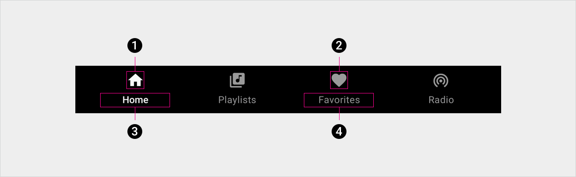
2. Ikona nieaktywnej karty
3. Etykieta aktywnej karty.
4. Etykieta nieaktywnej karty
Specyfikacja
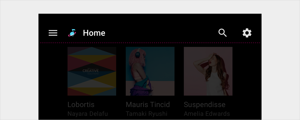
Karty zagnieżdżone na pasku aplikacji – wyrównane do lewej
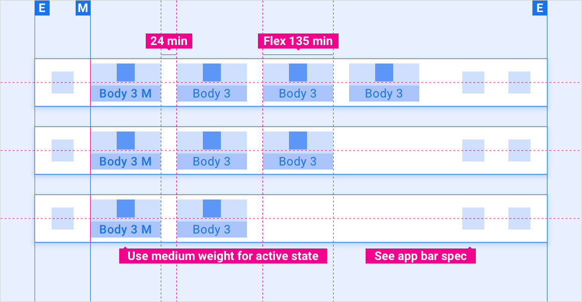
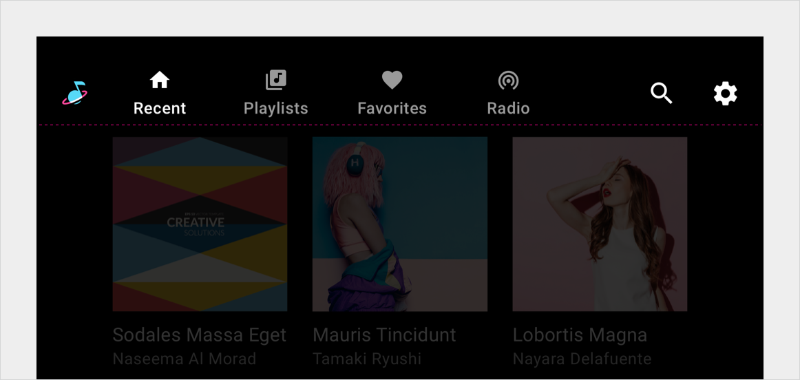
Karty umieszczone na pasku aplikacji – elastyczne wyrównanie
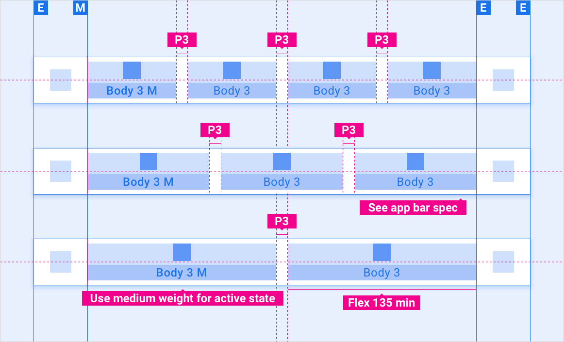
Karty zwinięte na pasku aplikacji – menu panelu
Autonomiczny pasek kart – wyrównany do lewej
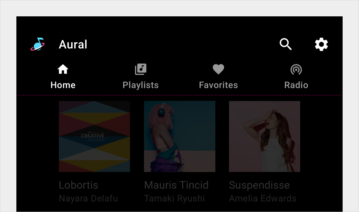
Niezależny pasek kart – elastyczne wyrównanie
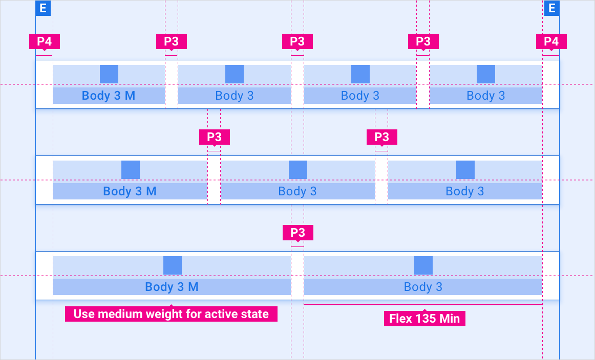
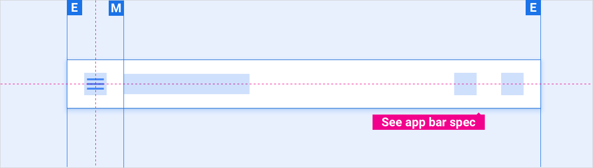
Rozszerzone menu etykiety karty
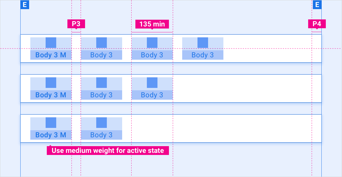
Skalowanie układów
W tych układach znajdziesz informacje o dostosowywaniu kart do ekranów o różnej szerokości i wysokości. (Kategorie szerokości i wysokości są zdefiniowane w sekcji Układ). Pamiętaj, że wszystkie wartości w pikselach są wyrenderowane w pikselach przed próbkowaniem w górę lub w dół.
Ekrany standardowe i szerokie w nawiasie kwadratowym
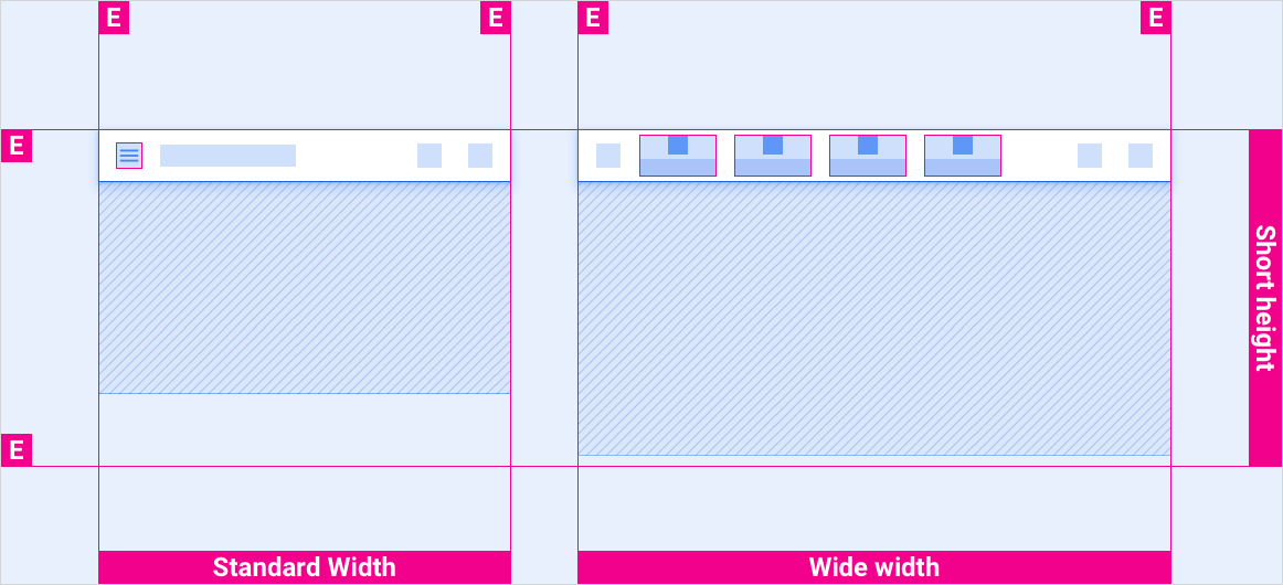
Ekrany standardowe i szerokie w standardowym nawiasie wysokości
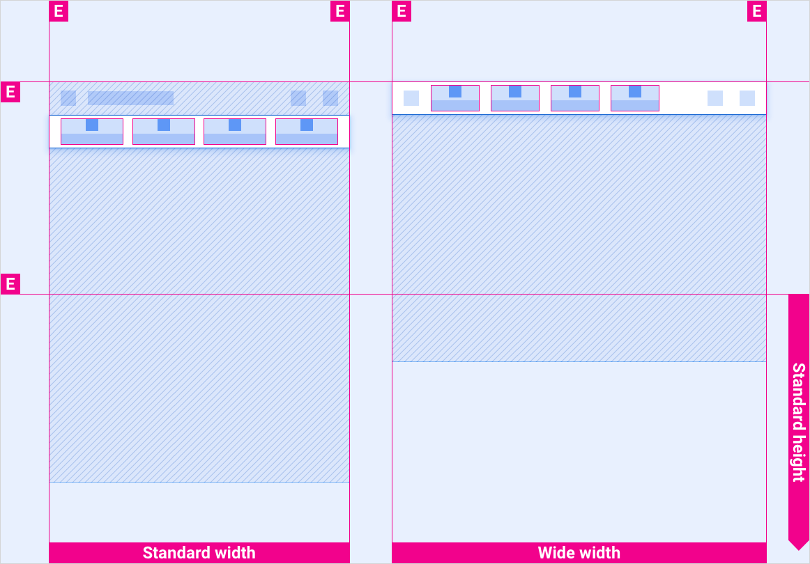
Ekrany standardowe i szerokokątne w wysokim nawiasie
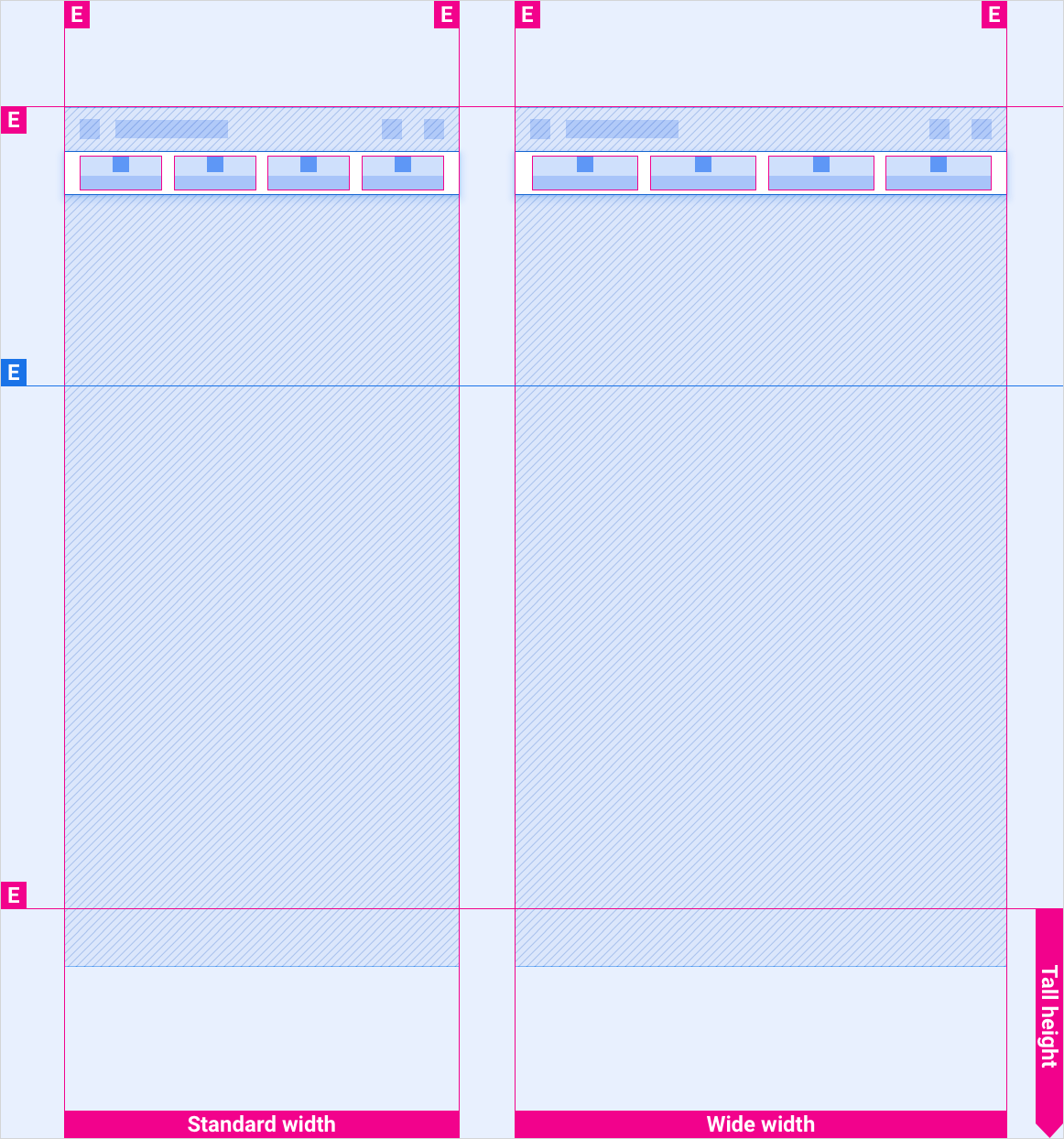
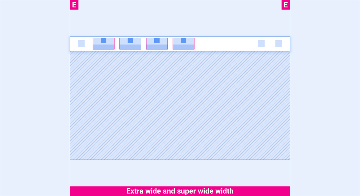
Bardzo szerokie i bardzo szerokie ekrany we wszystkich nawiasach wysokości
Style
Typografia
| Styl pisania | Krój czcionki | Waga | Rozmiar (dp) |
|---|---|---|---|
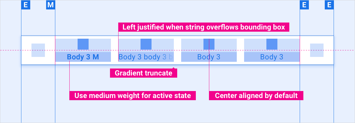
| Korpus 3 M | Roboto | Medium | 24 |
| Tekst główny 3 | Roboto | Zwykły | 24 |
Kolor
| Element | Kolor(tryb dzienny) | Kolor (tryb nocny) |
|---|---|---|
| Podstawowy typ / ikony | Biały | Biały – 88% |
| Dodatkowy typ / ikony | Biały – 72% | Biały: 60% |
| Tło paska kart | czerń | czerń |
| Tło paska kart podczas przewijania | Czarny – 84% | Czarny – 88% |
| Ikona karty – stan aktywny | Biały | Biały – 88% |
| Ikona karty – stan nieaktywny | Biały – 56% | Biały – 50% |
Rozmiary
| Element | Rozmiar (dp) |
|---|---|
| Ikona główna | 44 |
| Ikona dodatkowa | 36 |
| Docelowy element dotykowy ikony | 76 |
Przykłady