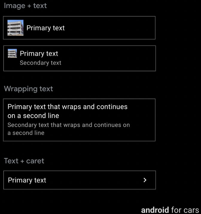
Template panel
tanpa pemisah garis di template Panel karena barisnya tidak dapat ditindaklanjuti
Panduan
Baris sangat mudah disesuaikan dan dapat digunakan untuk membuat beragam jenis daftar:
daftar dengan data, daftar dengan gambar, dan sebagainya.
Opsi baris hanya untuk Template daftar
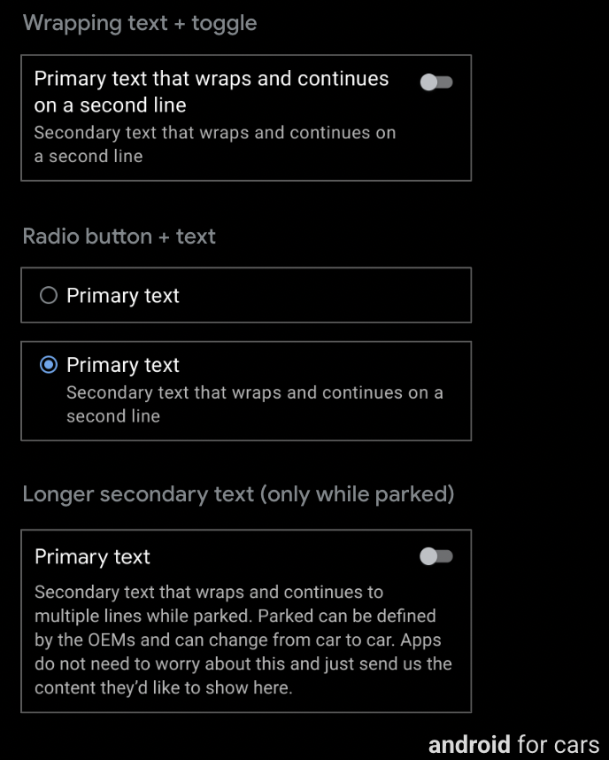
Selain fitur umum yang tersedia untuk komponen Baris (teks utama dan sekunder, serta gambar atau ikon), baris pada template Daftar juga dapat menyertakan salah satu hal berikut:
Tombol akses (opsional)
Tombol pilihan (opsional, hanya digunakan di daftar yang dapat dipilih, yang harus memiliki
tombol pilihan di semua baris)
Teks sekunder yang lebih panjang (hanya terlihat saat parkir), dipotong menjadi 2
baris saat mengemudi
Panduan
Baris dengan tombol beralih tidak dapat berisi tombol pilihan, dan sebaliknya. Selain itu,
karat tidak digunakan pada daftar dengan tombol beralih atau tombol pilihan.
Namun, baris dengan salah satu opsi ini juga dapat berisi gambar atau ikon
dan teks yang dikemas.
[null,null,["Terakhir diperbarui pada 2025-07-25 UTC."],[[["\u003cp\u003eRows, supported by six templates, display primary text, optional secondary text, and can include icons, images, and carets.\u003c/p\u003e\n"],["\u003cp\u003eRow templates include List, Place List (map), Search, Route Preview, and Pane templates (without line dividers).\u003c/p\u003e\n"],["\u003cp\u003eRows are highly customizable, accommodating various list types and options like toggle switches, radio buttons, and longer secondary text (List template only).\u003c/p\u003e\n"],["\u003cp\u003eRows with toggle switches or radio buttons exclude carets but allow images, icons, and wrapping text; toggle switches and radio buttons are mutually exclusive within a row.\u003c/p\u003e\n"]]],[],null,["# Rows\n\n\u003cbr /\u003e\n\nSix templates support the row component, which contains a small amount of\ntext, plus other options.\n\nFor most templates, rows can also accommodate actionable buttons. \n**Can include:**\n\n- **Primary text** (mandatory), up to 2 lines, where the second line either wraps or comes after a line break\n- **Secondary text** (optional), up to 2 lines with customizable text color\n- **Optional inline icon or image** in either primary or secondary text\n- **Caret** (optional), indicating presence of a submenu\n\n\n\u003cbr /\u003e\n\nTemplate support\n----------------\n\nThe following templates support rows:\n\n- [List](/cars/design/create-apps/apps-for-drivers/templates/list-template)\n- [Place List (map)](/cars/design/create-apps/apps-for-drivers/templates/place-list-map-template)\n- [Search](/cars/design/create-apps/apps-for-drivers/templates/search-template)\n- [Route Preview](/cars/design/create-apps/apps-for-drivers/templates/route-preview-map-template)\n- [Pane template](/cars/design/create-apps/apps-for-drivers/templates/pane-template) with no line dividers in the Pane template because its rows are not actionable\n\nGuidance\n--------\n\nRows are highly customizable and can be used to create a variety of list types:\nlists with data, lists with images, and so on.\n\nRow options for List template only\n----------------------------------\n\nIn addition to the typical features available for the Row component\n(primary and secondary text, and image or icon), a row on the List\ntemplate can also include any of the following:\n\n- Toggle switch (optional)\n- Radio button (optional, used only in selectable lists, which must have radio buttons on all rows)\n- Longer secondary text (visible only when parked), to be truncated to 2 lines while driving\n\n\u003cbr /\u003e\n\n### Guidance\n\nA row with a toggle switch can't contain a radio button, and vice versa. Also,\ncarats are not used on lists with either toggle switches or radio buttons.\nHowever, a row with either of these options can also contain an image or icon\nand wrapping text."]]