Tetap teratur dengan koleksi
Simpan dan kategorikan konten berdasarkan preferensi Anda.
Template Daftar menampilkan item informasi dalam tata letak daftar.
Daftar dapat dipisahkan menjadi beberapa bagian menggunakan subdaftar.
Template ini dapat disematkan di
Template tab
untuk menyediakan navigasi tab.
Template ini dapat disertakan dalam template Peta + Konten untuk memberikan daftar pada peta.
Mencakup:
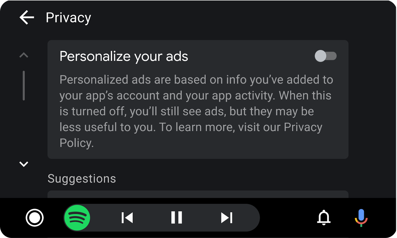
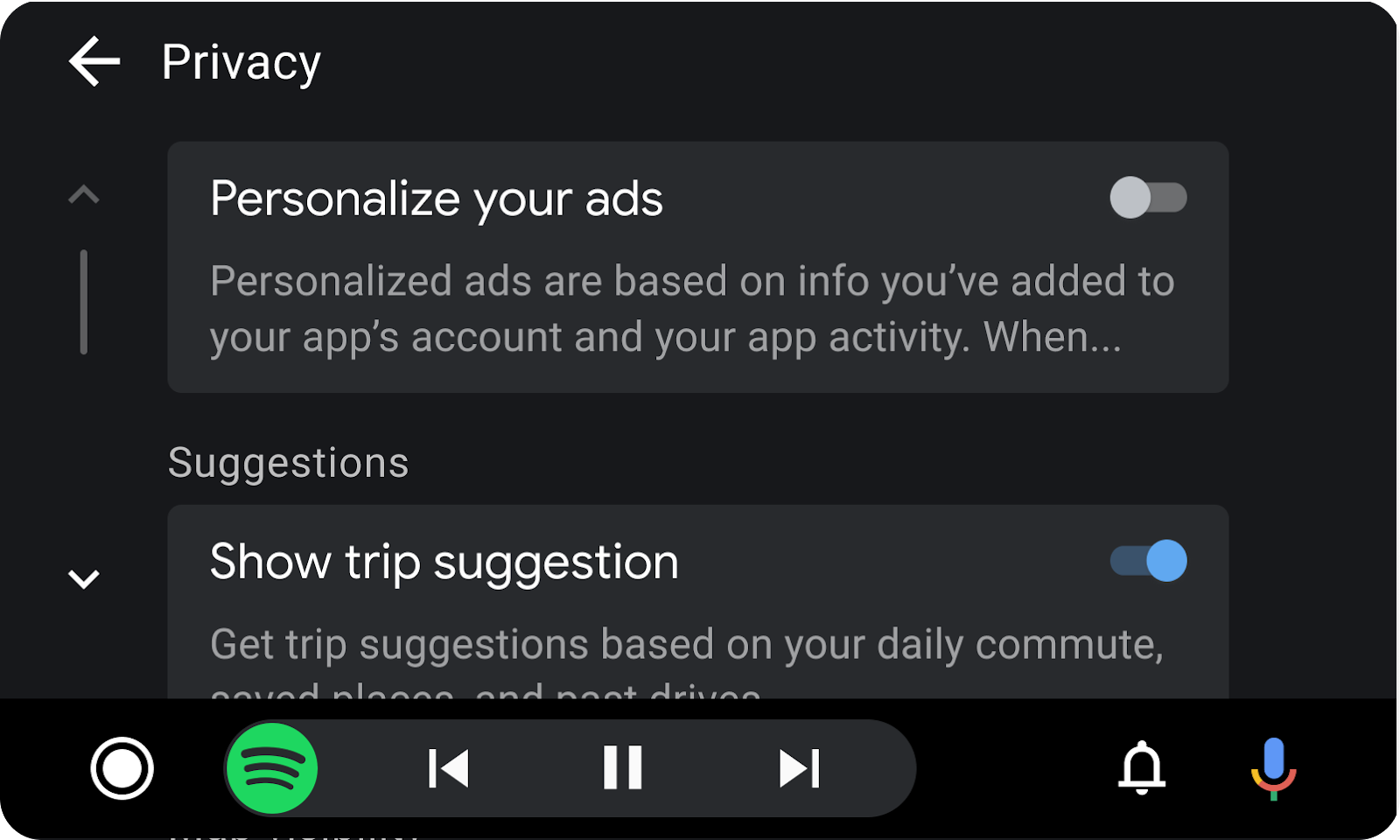
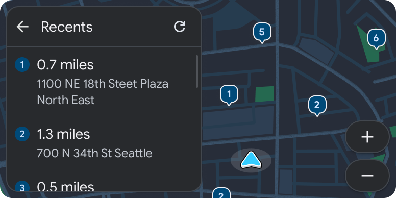
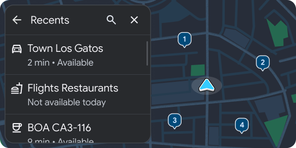
Header opsional.
Jika template ini disematkan dalam Template tab, header akan diganti dengan tab.
Item daftar (dengan jumlah item dan jumlah teks dalam satu baris
dapat bervariasi):
Jumlah item daftar. Jumlah item yang diizinkan
untuk ditampilkan bergantung pada kendaraan. Untuk mengambil batas baris daftar untuk
kendaraan tertentu, gunakan
ConstraintManager API.
Jumlah teks per item. Teks sekunder dalam baris
daftar bisa lebih dari 2 baris saat parkir. Lihat
Teks daftar lainnya saat parkir.
Jumlah teks sekunder yang diizinkan di setiap baris daftar bervariasi bergantung pada
apakah mobil diparkir atau mengemudi. Untuk meminimalkan gangguan, teks
dipotong menjadi 2 baris saat mengemudi. Konten apa pun yang dimaksudkan untuk dibaca saat
mengemudi harus ditampilkan di awal teks sekunder.
Saat parkir, teks dapat melebihi dua baris.Saat berkendara, teks harus dipotong agar tidak mengganggu.
Membuat daftar contoh template
Contoh Android Auto dan Android Automotive OS (AAOS) berikut dibuat
menggunakan template Daftar.
Daftar lokasiDaftar lokasi yang baru dinavigasi
{i>Template<i} daftar persyaratan UX
Developer aplikasi:
HARUS
Sertakan header bagian saat bagian tersedia.
TIDAK BOLEH
Gabungkan baris daftar yang dapat dipilih (baris dengan tombol pilihan) dengan jenis
baris lain atau pisahkan dengan bagian-bagian.
SEBAIKNYA
Sajikan pilihan default pada daftar yang dapat dipilih.
SEBAIKNYA
Memiliki tindakan yang terkait dengan setiap item daftar (baris khusus informasi
tidak direkomendasikan).
SEBAIKNYA
Tempatkan konten dalam teks sekunder yang dimaksudkan untuk dibaca saat
berkendara mendekati awal agar tidak terpotong.
SEBAIKNYA
Sertakan header dengan judul opsional serta tindakan utama dan sekunder.
DAPAT
Bagi konten daftar menjadi beberapa bagian.
DAPAT
Gabungkan baris yang memiliki tombol beralih dengan baris lain sesuai kebutuhan.
DAPAT
Memperbarui teks baris dan aset gambar atau ikon saat pengguna mengubah status tombol.
[null,null,["Terakhir diperbarui pada 2025-07-25 UTC."],[[["\u003cp\u003eThe List template displays information in a list format, which can be divided into sections using sublists and integrated with Tab or Map + Content templates.\u003c/p\u003e\n"],["\u003cp\u003eList items have varying amounts of allowed text depending on the car's state (parked or driving) and the vehicle's capabilities, and ideally, each item should have an associated action.\u003c/p\u003e\n"],["\u003cp\u003eThis template includes an optional header (or tabs when embedded), list items with varying text limits, and an optional floating action button for user interaction.\u003c/p\u003e\n"],["\u003cp\u003eWhile driving, secondary text in list items is truncated to two lines to minimize distraction, so crucial information should be placed at the beginning.\u003c/p\u003e\n"],["\u003cp\u003eDevelopers should utilize section headers, avoid mixing selectable rows with others, offer default selections on lists, and prioritize clear actions for each list item for optimal user experience.\u003c/p\u003e\n"]]],[],null,["# List template\n\n\u003cbr /\u003e\n\nThe List template presents information items in a list layout.\n\nLists may be separated into sections using sublists.\n\nThis template can be embedded in the\n[Tab template](/cars/design/create-apps/apps-for-drivers/templates/tab-template)\nto provide tabbed navigation.\n\nThis template can be included in the\n[Map + Content template](/cars/design/create-apps/apps-for-drivers/templates/map-content-template)\nto provide a list on a map. \n**Includes:**\n\n- Optional [header](/cars/design/create-apps/apps-for-drivers/components/header). When this template is embedded in the [Tab template](/cars/design/create-apps/apps-for-drivers/templates/tab-template), the header is replaced with tabs.\n- List items (where the number of items and the amount of text in a row can vary):\n - **Number of list items.** The number of items allowed to be shown depends on the vehicle. To retrieve the list row limit for a given vehicle, use the [ConstraintManager API](https://developer.android.com/training/cars/apps#constraint-manager).\n - **Amount of text per item.** Secondary text in list rows can be longer than 2 rows when parked. See [More list text while parked](#parked).\n- Optional [floating action button](/cars/design/create-apps/apps-for-drivers/components/fab)\n\nFor more about what rows can include in this template, see\n[Row options for List template only](/cars/design/create-apps/apps-for-drivers/components/row#row-options)\nand the examples in [Sample flows](/cars/design/create-apps/sample-flows/overview).\n\n\u003cbr /\u003e\n\n| **Note:** There is a limit on the number of list items allowed to be shown, but the limit will not be less than 6 and may be higher in some vehicles. To retrieve the item limit for a given vehicle, use the [ConstraintManager API](https://developer.android.com/training/cars/apps#constraint-manager).\n\nMore list text when parked\n--------------------------\n\nThe amount of secondary text allowed in each list row varies depending on\nwhether the car is parked or driving. To minimize distraction, text is\ntruncated to 2 lines while driving. Any content intended to be read while\ndriving should be displayed at the beginning of the secondary text.\nWhen parked, text can be longer than two lines. When driving, text should be truncated to avoid causing distraction.\n\n\u003cbr /\u003e\n\nList template examples\n----------------------\n\nThe following Android Auto and Android Automotive OS (AAOS) examples were built\nusing the List template.\nList of locations List of recently-navigated locations\n\n\u003cbr /\u003e\n\nList template UX requirements\n-----------------------------\n\nApp developers:\n\n|--------------|--------------------------------------------------------------------------------------------------------------------|\n| **MUST** | Include a section header when sections are present. |\n| **MUST NOT** | Mix selectable list rows (rows with radio buttons) with other types of rows or separate them with sections. |\n| **SHOULD** | Present default selections on selectable lists. |\n| **SHOULD** | Have an action associated with each list item (information-only rows are not recommended). |\n| **SHOULD** | Place content in secondary text that is intended to be read while driving near the beginning, to avoid truncation. |\n| **SHOULD** | Include a header with an optional title and primary and secondary actions. |\n| **MAY** | Divide list content into sections. |\n| **MAY** | Mix rows that have toggle switches with other rows as needed. |\n| **MAY** | Update row text and image or icon asset when user changes toggle state. |"]]