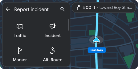
Petak menampilkan item dalam tata letak petak.
Template ini berguna saat pengguna terutama mengandalkan gambar untuk membuat pilihan mereka.
Template ini dapat disematkan di Template tab untuk menyediakan navigasi tab.
Template ini dapat disertakan dalam template Peta + Konten untuk memberikan petak pada peta.
Mencakup:
- header opsional (header diganti dengan tab saat template ini disematkan di Template tab)
- Item petak (lihat catatan di bawah), masing-masing berisi ikon atau gambar berukuran besar
- Teks utama untuk setiap item petak (opsional)
- Teks sekunder untuk setiap item petak (opsional)
- Tombol tindakan mengambang (FAB) opsional

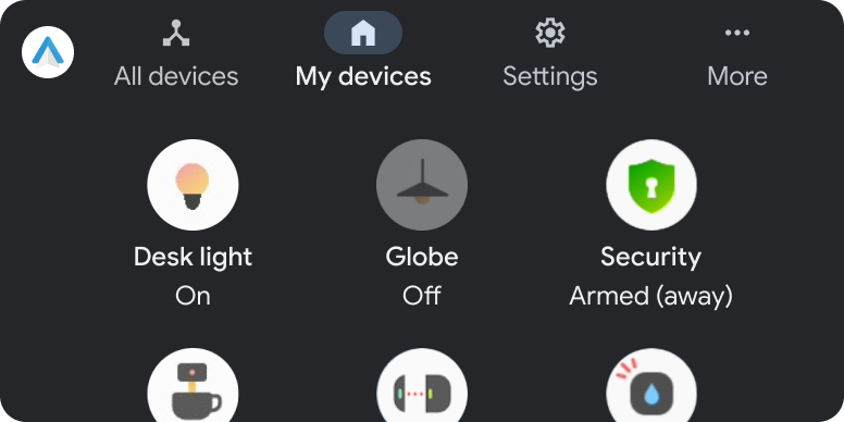
Contoh template petak
Contoh Android Auto dan Android Automotive OS (AAOS) berikut dibuat menggunakan template Grid.
Persyaratan UX {i>template<i} {i>grid<i}
Developer aplikasi:
| SEBAIKNYA | Batasi panjang string teks primer dan sekunder agar tidak terpotong. |
| SEBAIKNYA | Memiliki tindakan yang terkait dengan setiap item petak (item khusus informasi tidak direkomendasikan). |
| SEBAIKNYA | Menunjukkan dengan jelas status item (untuk item petak yang memiliki beberapa status, seperti dipilih dan tidak dipilih) dengan variasi gambar, ikon, atau teks. |
| SEBAIKNYA | Sertakan header dengan judul opsional serta tindakan utama dan sekunder. |
| TIDAK BOLEH | Sertakan strip tindakan dan tombol tindakan mengambang secara bersamaan. |
| DAPAT | Menampilkan indikator lingkaran berputar pemuatan, bukan ikon atau gambar untuk item petak saat tindakan yang terkait dengan item tersebut sedang berlangsung. |