Template Tab berfungsi sebagai penampung untuk template lain yang tercantum di bawah, menyediakan tab di bagian atas (seperti yang ditunjukkan dalam Anatomi template Tab).
Dengan tab, Anda dapat beralih di antara tampilan. Kemampuan ini sangat berguna untuk mengatur konten atau tampilan yang akan dijelajahi atau ditelusuri pengguna.
Mencakup:
- Menu tab dengan ikon aplikasi dan maksimal 4 tab (tanpa tombol kembali)
- Template tersemat, yang dapat berupa salah satu jenis berikut:
Setiap tampilan tab berhubungan dengan satu template tersemat, dan hanya satu tampilan tab yang dapat aktif pada satu waktu.

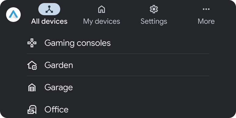
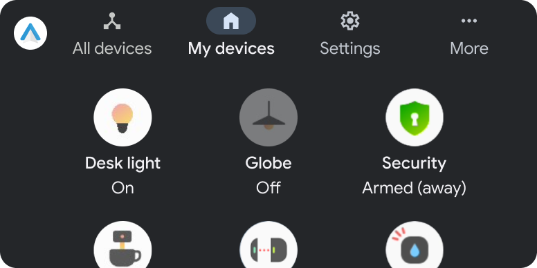
Anatomi template Tab

Template Tab terdiri dari elemen-elemen berikut:
- Panel tab, yang dapat menampilkan hingga 4 tab
- Template tersemat, menggunakan salah satu template berikut: Daftar, Petak, Penelusuran, Panel, Pesan, atau Navigasi
Contoh template tab
Persyaratan UX template tab
Developer aplikasi:
| HARUS | Sediakan ikon vektor monokromatik untuk setiap tab. |
| HARUS | Sertakan minimal 2 dan maksimal 4 tab di header aplikasi. |
| TIDAK BOLEH | Izinkan lebih dari 1 tab untuk aktif sekaligus. |
| TIDAK BOLEH | Buat navigasi sekunder dengan menambahkan tab tingkat kedua. |
| SEBAIKNYA | Gunakan label tab yang pendek untuk menghindari pemotongan. |
| TIDAK BOLEH | Mengandalkan header atau strip tindakan dalam template tersemat. |