本文档介绍了如何遵循 Glass 样式并实现常见的界面最佳实践,从而优化用户体验。它涵盖以下界面元素:
主题
我们建议您使用的 Glass 主题具有以下特征:
- 全屏显示 activity,不显示操作栏。
- 应用纯黑色背景。
- 设置颜色边缘效果的较浅颜色。
- 应用白色文字颜色。
以下是 Glass 的推荐主题设置:
 <style name="AppTheme" parent="Theme.AppCompat.NoActionBar">
   <item name="android:windowBackground">@android:color/black</item>
   <item name="android:colorEdgeEffect">@android:color/white</item>
   <item name="android:textColor">@android:color/white</item>
 </style>
XML 布局
以下是您的 fragment 可以扩充的两种基本卡片布局:
主要布局
此布局定义了卡片的建议标准内边距和页脚。在空白的
FrameLayout 中输入您自己的观点。
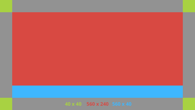
以下是一个 XML 布局示例:
<?xml version="1.0" encoding="utf-8"?>
<androidx.constraintlayout.widget.ConstraintLayout
    xmlns:android="http://schemas.android.com/apk/res/android"
    xmlns:app="http://schemas.android.com/apk/res-auto"
    android:id="@+id/layout"
    android:layout_width="match_parent"
    android:layout_height="match_parent">

  <FrameLayout
      android:id="@+id/body_layout"
      android:layout_width="0dp"
      android:layout_height="0dp"
      android:layout_margin="@dimen/glass_card_margin"
      app:layout_constraintBottom_toTopOf="@id/footer"
      app:layout_constraintEnd_toEndOf="parent"
      app:layout_constraintStart_toStartOf="parent"
      app:layout_constraintTop_toTopOf="parent">

    <!-- Put your widgets inside this FrameLayout. -->

  </FrameLayout>

  <!-- The footer view will grow to fit as much content as possible while the
         timestamp view keeps its width. If the footer text is too long, it
         will be ellipsized with a 40dp margin between it and the timestamp. -->

  <TextView
      android:id="@+id/footer"
      android:layout_width="0dp"
      android:layout_height="wrap_content"
      android:layout_marginStart="@dimen/glass_card_margin"
      android:layout_marginEnd="@dimen/glass_card_margin"
      android:layout_marginBottom="@dimen/glass_card_margin"
      android:ellipsize="end"
      android:singleLine="true"
      android:textAppearance="?android:attr/textAppearanceSmall"
      app:layout_constraintBottom_toBottomOf="parent"
      app:layout_constraintEnd_toStartOf="@id/timestamp"
      app:layout_constraintStart_toStartOf="parent" />

  <TextView
      android:id="@+id/timestamp"
      android:layout_width="0dp"
      android:layout_height="wrap_content"
      android:layout_marginEnd="@dimen/glass_card_margin"
      android:layout_marginBottom="@dimen/glass_card_margin"
      android:ellipsize="end"
      android:singleLine="true"
      android:textAlignment="viewEnd"
      android:textAppearance="?android:attr/textAppearanceSmall"
      app:layout_constraintBottom_toBottomOf="parent"
      app:layout_constraintEnd_toEndOf="parent" />

</androidx.constraintlayout.widget.ConstraintLayout>
左列布局
此布局以两个
FrameLayout 类的形式定义了一个宽度为三分之一的左列和一个宽度为三分之二的右列,您可以将视图放入这两个类中。请参考下图查看示例。
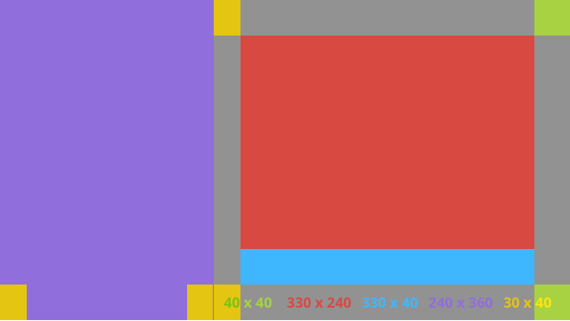
以下是一个 XML 布局示例:
<?xml version="1.0" encoding="utf-8"?>
<androidx.constraintlayout.widget.ConstraintLayout
    xmlns:android="http://schemas.android.com/apk/res/android"
    xmlns:app="http://schemas.android.com/apk/res-auto"
    android:layout_width="match_parent"
    android:layout_height="match_parent">

  <FrameLayout
      android:id="@+id/left_column"
      android:layout_width="0dp"
      android:layout_height="match_parent"
      android:background="#303030"
      app:layout_constraintBottom_toBottomOf="parent"
      app:layout_constraintStart_toStartOf="parent"
      app:layout_constraintTop_toTopOf="parent"
      app:layout_constraintWidth_percent=".333">

    <!-- Put widgets for the left column inside this FrameLayout. -->

  </FrameLayout>

  <FrameLayout
      android:id="@+id/right_column"
      android:layout_width="0dp"
      android:layout_height="0dp"
      android:layout_marginTop="@dimen/glass_card_two_column_margin"
      android:layout_marginStart="@dimen/glass_card_two_column_margin"
      android:layout_marginBottom="@dimen/glass_card_two_column_margin"
      android:layout_marginEnd="@dimen/glass_card_margin"
      app:layout_constraintBottom_toTopOf="@id/footer"
      app:layout_constraintEnd_toEndOf="parent"
      app:layout_constraintStart_toEndOf="@id/left_column"
      app:layout_constraintTop_toTopOf="parent">

    <!-- Put widgets for the right column inside this FrameLayout. -->

  </FrameLayout>

  <!-- The footer view will grow to fit as much content as possible while the
         timestamp view keeps its width. If the footer text is too long, it
         will be ellipsized with a 40dp margin between it and the timestamp. -->

  <TextView
      android:id="@+id/footer"
      android:layout_width="0dp"
      android:layout_height="wrap_content"
      android:layout_marginStart="@dimen/glass_card_margin"
      android:layout_marginEnd="@dimen/glass_card_margin"
      android:layout_marginBottom="@dimen/glass_card_margin"
      android:ellipsize="end"
      android:singleLine="true"
      android:textAppearance="?android:attr/textAppearanceSmall"
      app:layout_constraintBottom_toBottomOf="parent"
      app:layout_constraintEnd_toStartOf="@id/timestamp"
      app:layout_constraintStart_toEndOf="@id/left_column" />

  <TextView
      android:id="@+id/timestamp"
      android:layout_width="0dp"
      android:layout_height="wrap_content"
      android:layout_marginEnd="@dimen/glass_card_margin"
      android:layout_marginBottom="@dimen/glass_card_margin"
      android:ellipsize="end"
      android:singleLine="true"
      android:textAlignment="viewEnd"
      android:textAppearance="?android:attr/textAppearanceSmall"
      app:layout_constraintBottom_toBottomOf="parent"
      app:layout_constraintEnd_toEndOf="parent" />

</androidx.constraintlayout.widget.ConstraintLayout>
标准尺寸
将以下内容与之前的布局或您自己的布局结合使用,以创建符合 Glass 标准样式的文件。在 Android 项目中创建此文件,并将其命名为 res/values/dimens.xml。
<?xml version="1.0" encoding="utf-8"?>
<resources>

  <!-- The recommended margin for the top, left, and right edges of a card. -->
  <dimen name="glass_card_margin">40dp</dimen>

  <!-- The recommended margin between the bottom of the card and the footer. -->
  <dimen name="glass_card_footer_margin">50dp</dimen>

  <!-- The recommended margin for the left column of the two-column card. -->
  <dimen name="glass_card_two_column_margin">30dp</dimen>

</resources>
菜单
我们建议您使用
RecyclerView 构建菜单。它们应基于 Android Studio 项目资源中的标准 Android 菜单文件。Android 允许您替换标准菜单创建,并将其替换为您的实现。具体步骤如下:
- 使用
RecyclerView创建布局,并将其设置为Activity的视图。 - 将
RecyclerView及其适配器设置为使用新创建的菜单项集合。 - 替换
onCreateOptionsMenu方法。- 展开菜单,并为每个菜单项向集合中添加新元素。
- 在适配器上调用
notifyDataSetChanged方法。
Kotlin
    override fun onCreateOptionsMenu(menu: Menu): Boolean {
        val menuResource = intent
            .getIntExtra(EXTRA_MENU_KEY, EXTRA_MENU_ITEM_DEFAULT_VALUE)
        if (menuResource != EXTRA_MENU_ITEM_DEFAULT_VALUE) {
            menuInflater.inflate(menuResource, menu)
            for (i in 0 until menu.size()) {
                val menuItem = menu.getItem(i)
                menuItems.add(
                    GlassMenuItem(
                        menuItem.itemId, menuItem.icon,
                        menuItem.title.toString()
                    )
                )
                adapter.notifyDataSetChanged()
            }
        }
        return super.onCreateOptionsMenu(menu)
    }
Java
    @Override
    public boolean onCreateOptionsMenu(Menu menu) {
      final int menuResource = getIntent()
          .getIntExtra(EXTRA_MENU_KEY, EXTRA_MENU_ITEM_DEFAULT_VALUE);
      if (menuResource != EXTRA_MENU_ITEM_DEFAULT_VALUE) {
        final MenuInflater inflater = getMenuInflater();
        inflater.inflate(menuResource, menu);

        for (int i = 0; i < menu.size(); i++) {
          final MenuItem menuItem = menu.getItem(i);
          menuItems.add(
              new GlassMenuItem(menuItem.getItemId(), menuItem.getIcon(),
                  menuItem.getTitle().toString()));
          adapter.notifyDataSetChanged();
        }
      }
      return super.onCreateOptionsMenu(menu);
    }
- 将
OnScrollListener与LayoutManager和SnapHelper结合使用,以确定选择了哪个选项。 - 监听
TAP手势,以处理菜单项选择事件。 - 创建包含所选菜单项信息的
Intent。 - 为此 activity 设置结果并结束该 activity。
- 从要显示菜单的 fragment 或 activity 中调用
startActivityForResult。 为此,请使用TAP手势。 - 在调用 fragment 或 activity 中替换
onActivityResult以处理所选的菜单项。
指南
以下是有关如何设置菜单布局的一些建议:
- 文字大小:
64sp - 背景色:
#96000000 - 使用大小为
64dpx64dp的 Material 图标 - 将
windowIsTranslucent主题标志设置为true
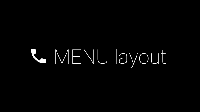
下图展示了一个自定义菜单布局示例:
如需了解实现详情,请查看卡片示例应用。
可滑动浏览的页面
Glass 显示屏和触控板可协同工作,以便捷的方式显示可滑动浏览的卡片。您可以使用标准 Android
ViewPager API 在 activity 中构建可滑动页面。