במסמך הזה מוסבר איך לפעול לפי הסגנון של Glass וליישם שיטות מומלצות נפוצות לממשק משתמש, שיכולות לשפר את חוויית המשתמש. הוא כולל את רכיבי ממשק המשתמש הבאים:
עיצוב
המאפיינים של עיצוב Glass שאנחנו ממליצים עליו:
- הפעילויות מוצגות במסך מלא ללא סרגל פעולות.
- החלפת הרקע ברקע שחור אחיד.
- הגדרת הצבע בהיר יותר לאפקט של קצה הצבע.
- הגדרת צבע הטקסט ללבן.
אלה הגדרות העיצוב המומלצות ל-Glass:
 <style name="AppTheme" parent="Theme.AppCompat.NoActionBar">
   <item name="android:windowBackground">@android:color/black</item>
   <item name="android:colorEdgeEffect">@android:color/white</item>
   <item name="android:textColor">@android:color/white</item>
 </style>
פריסות XML
אלה שני פריסות הכרטיסים הבסיסיות שניתן להציג בהן את הקטעים:
פריסה ראשית
הפריסה הזו מגדירה את הריווח הפנימי ואת הכותרת התחתונה המומלצים של כרטיס. כותבים את הדעות שלכם בתיבה הריקה
FrameLayout.
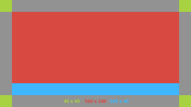
דוגמה לפריסה בפורמט XML:
<?xml version="1.0" encoding="utf-8"?>
<androidx.constraintlayout.widget.ConstraintLayout
    xmlns:android="http://schemas.android.com/apk/res/android"
    xmlns:app="http://schemas.android.com/apk/res-auto"
    android:id="@+id/layout"
    android:layout_width="match_parent"
    android:layout_height="match_parent">

  <FrameLayout
      android:id="@+id/body_layout"
      android:layout_width="0dp"
      android:layout_height="0dp"
      android:layout_margin="@dimen/glass_card_margin"
      app:layout_constraintBottom_toTopOf="@id/footer"
      app:layout_constraintEnd_toEndOf="parent"
      app:layout_constraintStart_toStartOf="parent"
      app:layout_constraintTop_toTopOf="parent">

    <!-- Put your widgets inside this FrameLayout. -->

  </FrameLayout>

  <!-- The footer view will grow to fit as much content as possible while the
         timestamp view keeps its width. If the footer text is too long, it
         will be ellipsized with a 40dp margin between it and the timestamp. -->

  <TextView
      android:id="@+id/footer"
      android:layout_width="0dp"
      android:layout_height="wrap_content"
      android:layout_marginStart="@dimen/glass_card_margin"
      android:layout_marginEnd="@dimen/glass_card_margin"
      android:layout_marginBottom="@dimen/glass_card_margin"
      android:ellipsize="end"
      android:singleLine="true"
      android:textAppearance="?android:attr/textAppearanceSmall"
      app:layout_constraintBottom_toBottomOf="parent"
      app:layout_constraintEnd_toStartOf="@id/timestamp"
      app:layout_constraintStart_toStartOf="parent" />

  <TextView
      android:id="@+id/timestamp"
      android:layout_width="0dp"
      android:layout_height="wrap_content"
      android:layout_marginEnd="@dimen/glass_card_margin"
      android:layout_marginBottom="@dimen/glass_card_margin"
      android:ellipsize="end"
      android:singleLine="true"
      android:textAlignment="viewEnd"
      android:textAppearance="?android:attr/textAppearanceSmall"
      app:layout_constraintBottom_toBottomOf="parent"
      app:layout_constraintEnd_toEndOf="parent" />

</androidx.constraintlayout.widget.ConstraintLayout>
פריסת העמודה השמאלית
הפריסה הזו מגדירה עמודה שמאלית ברוחב של שליש ועמודה ימנית ברוחב של שני שלישים בצורה של שתי מחלקות
FrameLayout שאפשר להציב בהן את התצוגות. אפשר להיעזר בתמונה שמוצגת בהמשך.
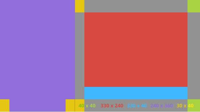
דוגמה לפריסה בפורמט XML:
<?xml version="1.0" encoding="utf-8"?>
<androidx.constraintlayout.widget.ConstraintLayout
    xmlns:android="http://schemas.android.com/apk/res/android"
    xmlns:app="http://schemas.android.com/apk/res-auto"
    android:layout_width="match_parent"
    android:layout_height="match_parent">

  <FrameLayout
      android:id="@+id/left_column"
      android:layout_width="0dp"
      android:layout_height="match_parent"
      android:background="#303030"
      app:layout_constraintBottom_toBottomOf="parent"
      app:layout_constraintStart_toStartOf="parent"
      app:layout_constraintTop_toTopOf="parent"
      app:layout_constraintWidth_percent=".333">

    <!-- Put widgets for the left column inside this FrameLayout. -->

  </FrameLayout>

  <FrameLayout
      android:id="@+id/right_column"
      android:layout_width="0dp"
      android:layout_height="0dp"
      android:layout_marginTop="@dimen/glass_card_two_column_margin"
      android:layout_marginStart="@dimen/glass_card_two_column_margin"
      android:layout_marginBottom="@dimen/glass_card_two_column_margin"
      android:layout_marginEnd="@dimen/glass_card_margin"
      app:layout_constraintBottom_toTopOf="@id/footer"
      app:layout_constraintEnd_toEndOf="parent"
      app:layout_constraintStart_toEndOf="@id/left_column"
      app:layout_constraintTop_toTopOf="parent">

    <!-- Put widgets for the right column inside this FrameLayout. -->

  </FrameLayout>

  <!-- The footer view will grow to fit as much content as possible while the
         timestamp view keeps its width. If the footer text is too long, it
         will be ellipsized with a 40dp margin between it and the timestamp. -->

  <TextView
      android:id="@+id/footer"
      android:layout_width="0dp"
      android:layout_height="wrap_content"
      android:layout_marginStart="@dimen/glass_card_margin"
      android:layout_marginEnd="@dimen/glass_card_margin"
      android:layout_marginBottom="@dimen/glass_card_margin"
      android:ellipsize="end"
      android:singleLine="true"
      android:textAppearance="?android:attr/textAppearanceSmall"
      app:layout_constraintBottom_toBottomOf="parent"
      app:layout_constraintEnd_toStartOf="@id/timestamp"
      app:layout_constraintStart_toEndOf="@id/left_column" />

  <TextView
      android:id="@+id/timestamp"
      android:layout_width="0dp"
      android:layout_height="wrap_content"
      android:layout_marginEnd="@dimen/glass_card_margin"
      android:layout_marginBottom="@dimen/glass_card_margin"
      android:ellipsize="end"
      android:singleLine="true"
      android:textAlignment="viewEnd"
      android:textAppearance="?android:attr/textAppearanceSmall"
      app:layout_constraintBottom_toBottomOf="parent"
      app:layout_constraintEnd_toEndOf="parent" />

</androidx.constraintlayout.widget.ConstraintLayout>
מאפיינים רגילים
אפשר להשתמש בפריסות הבאות בשילוב עם הפריסות הקודמות או עם פריסות משלכם כדי ליצור קובץ
שעומד בסגנון הסטנדרטי של Glass. יוצרים את הקובץ הזה בשם res/values/dimens.xml בפרויקט Android.
<?xml version="1.0" encoding="utf-8"?>
<resources>

  <!-- The recommended margin for the top, left, and right edges of a card. -->
  <dimen name="glass_card_margin">40dp</dimen>

  <!-- The recommended margin between the bottom of the card and the footer. -->
  <dimen name="glass_card_footer_margin">50dp</dimen>

  <!-- The recommended margin for the left column of the two-column card. -->
  <dimen name="glass_card_two_column_margin">30dp</dimen>

</resources>
תפריטים
מומלץ להשתמש ב-
RecyclerView כדי ליצור תפריטים. הם צריכים להתבסס על קובץ התפריט הרגיל של Android מתוך משאבי הפרויקט של Android Studio. מערכת Android מאפשרת לכם לבטל את יצירת התפריט הרגילה ולהחליף אותה בהטמעה שלכם. לשם כך, בצע את הצעדים הבאים:
- יוצרים את הפריסה באמצעות
RecyclerViewומגדירים אותה כתצוגה שלActivity. - מגדירים את
RecyclerViewואת המתאם שלו כך שישתמשו באוסף החדש של פריטי התפריט. - מחליפים את השיטה
onCreateOptionsMenu.- מרחיבים את התפריט ומוסיפים את הרכיב החדש לאוסף של כל פריט בתפריט.
- מבצעים קריאה לשיטה
notifyDataSetChangedבמתאם.
Kotlin
    override fun onCreateOptionsMenu(menu: Menu): Boolean {
        val menuResource = intent
            .getIntExtra(EXTRA_MENU_KEY, EXTRA_MENU_ITEM_DEFAULT_VALUE)
        if (menuResource != EXTRA_MENU_ITEM_DEFAULT_VALUE) {
            menuInflater.inflate(menuResource, menu)
            for (i in 0 until menu.size()) {
                val menuItem = menu.getItem(i)
                menuItems.add(
                    GlassMenuItem(
                        menuItem.itemId, menuItem.icon,
                        menuItem.title.toString()
                    )
                )
                adapter.notifyDataSetChanged()
            }
        }
        return super.onCreateOptionsMenu(menu)
    }
Java
    @Override
    public boolean onCreateOptionsMenu(Menu menu) {
      final int menuResource = getIntent()
          .getIntExtra(EXTRA_MENU_KEY, EXTRA_MENU_ITEM_DEFAULT_VALUE);
      if (menuResource != EXTRA_MENU_ITEM_DEFAULT_VALUE) {
        final MenuInflater inflater = getMenuInflater();
        inflater.inflate(menuResource, menu);

        for (int i = 0; i < menu.size(); i++) {
          final MenuItem menuItem = menu.getItem(i);
          menuItems.add(
              new GlassMenuItem(menuItem.getItemId(), menuItem.getIcon(),
                  menuItem.getTitle().toString()));
          adapter.notifyDataSetChanged();
        }
      }
      return super.onCreateOptionsMenu(menu);
    }
- כדי לדעת איזו אפשרות נבחרה, משתמשים ב
OnScrollListenerיחד עםLayoutManagerועםSnapHelper. - האזנה לתנועת
TAPכדי לטפל באירוע של בחירת פריט בתפריט. - יוצרים
Intentעם מידע על הפריט שנבחר בתפריט. - מגדירים תוצאה לפעילות ומסיימים אותה.
- קוראים ל-
startActivityForResultמהקטע או מהפעילות שבהם רוצים להציג תפריט. לשם כך, משתמשים בתנועתTAP. - מבטלים את ההגדרה של
onActivityResultבקטע או בפעילות שקוראים לפונקציה כדי לטפל בפריט שנבחר בתפריט.
הנחיות
ריכזנו כאן כמה הצעות לאופן ההגדרה של פריסת התפריט:
- גודל הטקסט:
64sp - צבע הרקע:
#96000000 - שימוש בסמלי Material
בגודל
64dpx64dp - מגדירים את דגל העיצוב
windowIsTranslucentלערךtrue
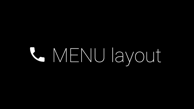
התמונה הבאה היא דוגמה לפריסת תפריט בהתאמה אישית:
פרטים על ההטמעה מופיעים באפליקציית הדוגמה של הכרטיס.
דפים שאפשר להחליק בהם
המסך ומסך המגע של Glass פועלים יחד כדי להציג כרטיסים שאפשר להחליק ביניהם בצורה נוחה. אפשר ליצור דפים שניתן להחליק ביניהם בפעילות באמצעות ה-API הסטנדרטי של Android
ViewPager.
מידע נוסף על שימוש ב-
ViewPager ב-Android כדי לגלול בין כרטיסים או מסכים זמין במסמכי ההדרכה בנושא החלקה על המסך.