इस दस्तावेज़ में, Glass स्टाइल को फ़ॉलो करने और यूज़र इंटरफ़ेस (यूआई) के सबसे सही तरीकों को लागू करने के बारे में बताया गया है. इससे, उपयोगकर्ताओं को बेहतर अनुभव मिल सकता है. इसमें ये यूज़र इंटरफ़ेस (यूआई) एलिमेंट शामिल हैं:
थीम
हमारा सुझाव है कि आप Glass थीम का इस्तेमाल करें. इसकी ये विशेषताएं हैं:
- इसमें ऐक्शन बार नहीं होता और गतिविधियां फ़ुल-स्क्रीन पर दिखती हैं.
- इससे पूरी तरह से काले रंग का बैकग्राउंड लागू होता है.
- इस विकल्प का इस्तेमाल, रंग के किनारे के इफ़ेक्ट के लिए हल्के रंग को सेट करने के लिए किया जाता है.
- इससे टेक्स्ट का रंग सफ़ेद हो जाता है.
Glass के लिए, थीम की इन सेटिंग का सुझाव दिया जाता है:
 <style name="AppTheme" parent="Theme.AppCompat.NoActionBar">
   <item name="android:windowBackground">@android:color/black</item>
   <item name="android:colorEdgeEffect">@android:color/white</item>
   <item name="android:textColor">@android:color/white</item>
 </style>
एक्सएमएल लेआउट
यहां दो बुनियादी कार्ड लेआउट दिए गए हैं. इनमें आपके फ़्रैगमेंट शामिल किए जा सकते हैं:
मुख्य लेआउट
इस लेआउट में, कार्ड के लिए सुझाए गए स्टैंडर्ड पैडिंग और फ़ुटर के बारे में बताया गया है. खाली
FrameLayout में अपने विचार लिखें.
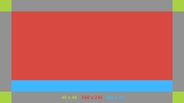
यहां एक्सएमएल लेआउट का एक उदाहरण दिया गया है:
<?xml version="1.0" encoding="utf-8"?>
<androidx.constraintlayout.widget.ConstraintLayout
    xmlns:android="http://schemas.android.com/apk/res/android"
    xmlns:app="http://schemas.android.com/apk/res-auto"
    android:id="@+id/layout"
    android:layout_width="match_parent"
    android:layout_height="match_parent">

  <FrameLayout
      android:id="@+id/body_layout"
      android:layout_width="0dp"
      android:layout_height="0dp"
      android:layout_margin="@dimen/glass_card_margin"
      app:layout_constraintBottom_toTopOf="@id/footer"
      app:layout_constraintEnd_toEndOf="parent"
      app:layout_constraintStart_toStartOf="parent"
      app:layout_constraintTop_toTopOf="parent">

    <!-- Put your widgets inside this FrameLayout. -->

  </FrameLayout>

  <!-- The footer view will grow to fit as much content as possible while the
         timestamp view keeps its width. If the footer text is too long, it
         will be ellipsized with a 40dp margin between it and the timestamp. -->

  <TextView
      android:id="@+id/footer"
      android:layout_width="0dp"
      android:layout_height="wrap_content"
      android:layout_marginStart="@dimen/glass_card_margin"
      android:layout_marginEnd="@dimen/glass_card_margin"
      android:layout_marginBottom="@dimen/glass_card_margin"
      android:ellipsize="end"
      android:singleLine="true"
      android:textAppearance="?android:attr/textAppearanceSmall"
      app:layout_constraintBottom_toBottomOf="parent"
      app:layout_constraintEnd_toStartOf="@id/timestamp"
      app:layout_constraintStart_toStartOf="parent" />

  <TextView
      android:id="@+id/timestamp"
      android:layout_width="0dp"
      android:layout_height="wrap_content"
      android:layout_marginEnd="@dimen/glass_card_margin"
      android:layout_marginBottom="@dimen/glass_card_margin"
      android:ellipsize="end"
      android:singleLine="true"
      android:textAlignment="viewEnd"
      android:textAppearance="?android:attr/textAppearanceSmall"
      app:layout_constraintBottom_toBottomOf="parent"
      app:layout_constraintEnd_toEndOf="parent" />

</androidx.constraintlayout.widget.ConstraintLayout>
बाएं कॉलम वाला लेआउट
इस लेआउट में, बाईं ओर मौजूद कॉलम की चौड़ाई एक-तिहाई और दाईं ओर मौजूद कॉलम की चौड़ाई दो-तिहाई होती है. यह लेआउट, दो
FrameLayout क्लास के तौर पर होता है. इसमें अपने व्यू रखे जा सकते हैं. उदाहरण देखने के लिए, यहां दी गई इमेज देखें.
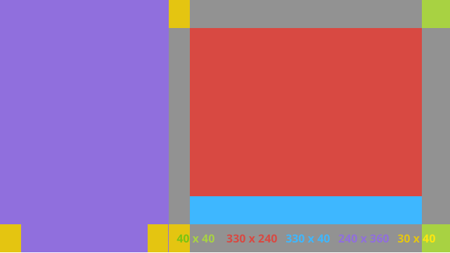
यहां एक्सएमएल लेआउट का एक उदाहरण दिया गया है:
<?xml version="1.0" encoding="utf-8"?>
<androidx.constraintlayout.widget.ConstraintLayout
    xmlns:android="http://schemas.android.com/apk/res/android"
    xmlns:app="http://schemas.android.com/apk/res-auto"
    android:layout_width="match_parent"
    android:layout_height="match_parent">

  <FrameLayout
      android:id="@+id/left_column"
      android:layout_width="0dp"
      android:layout_height="match_parent"
      android:background="#303030"
      app:layout_constraintBottom_toBottomOf="parent"
      app:layout_constraintStart_toStartOf="parent"
      app:layout_constraintTop_toTopOf="parent"
      app:layout_constraintWidth_percent=".333">

    <!-- Put widgets for the left column inside this FrameLayout. -->

  </FrameLayout>

  <FrameLayout
      android:id="@+id/right_column"
      android:layout_width="0dp"
      android:layout_height="0dp"
      android:layout_marginTop="@dimen/glass_card_two_column_margin"
      android:layout_marginStart="@dimen/glass_card_two_column_margin"
      android:layout_marginBottom="@dimen/glass_card_two_column_margin"
      android:layout_marginEnd="@dimen/glass_card_margin"
      app:layout_constraintBottom_toTopOf="@id/footer"
      app:layout_constraintEnd_toEndOf="parent"
      app:layout_constraintStart_toEndOf="@id/left_column"
      app:layout_constraintTop_toTopOf="parent">

    <!-- Put widgets for the right column inside this FrameLayout. -->

  </FrameLayout>

  <!-- The footer view will grow to fit as much content as possible while the
         timestamp view keeps its width. If the footer text is too long, it
         will be ellipsized with a 40dp margin between it and the timestamp. -->

  <TextView
      android:id="@+id/footer"
      android:layout_width="0dp"
      android:layout_height="wrap_content"
      android:layout_marginStart="@dimen/glass_card_margin"
      android:layout_marginEnd="@dimen/glass_card_margin"
      android:layout_marginBottom="@dimen/glass_card_margin"
      android:ellipsize="end"
      android:singleLine="true"
      android:textAppearance="?android:attr/textAppearanceSmall"
      app:layout_constraintBottom_toBottomOf="parent"
      app:layout_constraintEnd_toStartOf="@id/timestamp"
      app:layout_constraintStart_toEndOf="@id/left_column" />

  <TextView
      android:id="@+id/timestamp"
      android:layout_width="0dp"
      android:layout_height="wrap_content"
      android:layout_marginEnd="@dimen/glass_card_margin"
      android:layout_marginBottom="@dimen/glass_card_margin"
      android:ellipsize="end"
      android:singleLine="true"
      android:textAlignment="viewEnd"
      android:textAppearance="?android:attr/textAppearanceSmall"
      app:layout_constraintBottom_toBottomOf="parent"
      app:layout_constraintEnd_toEndOf="parent" />

</androidx.constraintlayout.widget.ConstraintLayout>
स्टैंडर्ड डाइमेंशन
Glass की स्टैंडर्ड स्टाइल के मुताबिक फ़ाइल बनाने के लिए, पिछले लेआउट या अपने लेआउट के साथ इनका इस्तेमाल करें. इस फ़ाइल को अपने Android प्रोजेक्ट में res/values/dimens.xml के तौर पर बनाएं.
<?xml version="1.0" encoding="utf-8"?>
<resources>

  <!-- The recommended margin for the top, left, and right edges of a card. -->
  <dimen name="glass_card_margin">40dp</dimen>

  <!-- The recommended margin between the bottom of the card and the footer. -->
  <dimen name="glass_card_footer_margin">50dp</dimen>

  <!-- The recommended margin for the left column of the two-column card. -->
  <dimen name="glass_card_two_column_margin">30dp</dimen>

</resources>
मेन्यू
हमारा सुझाव है कि मेन्यू बनाने के लिए,
RecyclerView का इस्तेमाल करें. ये Android Studio प्रोजेक्ट के संसाधनों से, Android की स्टैंडर्ड मेन्यू फ़ाइल पर आधारित होने चाहिए. Android, स्टैंडर्ड मेन्यू बनाने की सुविधा को बदलने की अनुमति देता है. साथ ही, इसे अपनी पसंद के मुताबिक लागू करने की सुविधा देता है. ऐसा करने के लिए, इन चरणों का अनुसरण करें:
-
RecyclerViewकी मदद से लेआउट बनाएं और इसे अपनेActivityके लिए व्यू के तौर पर सेट करें. -
RecyclerViewऔर इसके अडैप्टर को सेट करें, ताकि मेन्यू आइटम के नए कलेक्शन का इस्तेमाल किया जा सके. -
onCreateOptionsMenuतरीके को बदलें.- अपने मेन्यू को बड़ा करें और हर मेन्यू आइटम के लिए, कलेक्शन में नया एलिमेंट जोड़ें.
- अडैप्टर पर
notifyDataSetChangedतरीके को कॉल करें.
Kotlin
    override fun onCreateOptionsMenu(menu: Menu): Boolean {
        val menuResource = intent
            .getIntExtra(EXTRA_MENU_KEY, EXTRA_MENU_ITEM_DEFAULT_VALUE)
        if (menuResource != EXTRA_MENU_ITEM_DEFAULT_VALUE) {
            menuInflater.inflate(menuResource, menu)
            for (i in 0 until menu.size()) {
                val menuItem = menu.getItem(i)
                menuItems.add(
                    GlassMenuItem(
                        menuItem.itemId, menuItem.icon,
                        menuItem.title.toString()
                    )
                )
                adapter.notifyDataSetChanged()
            }
        }
        return super.onCreateOptionsMenu(menu)
    }
Java
    @Override
    public boolean onCreateOptionsMenu(Menu menu) {
      final int menuResource = getIntent()
          .getIntExtra(EXTRA_MENU_KEY, EXTRA_MENU_ITEM_DEFAULT_VALUE);
      if (menuResource != EXTRA_MENU_ITEM_DEFAULT_VALUE) {
        final MenuInflater inflater = getMenuInflater();
        inflater.inflate(menuResource, menu);

        for (int i = 0; i < menu.size(); i++) {
          final MenuItem menuItem = menu.getItem(i);
          menuItems.add(
              new GlassMenuItem(menuItem.getItemId(), menuItem.getIcon(),
                  menuItem.getTitle().toString()));
          adapter.notifyDataSetChanged();
        }
      }
      return super.onCreateOptionsMenu(menu);
    }
-
OnScrollListenerका इस्तेमालLayoutManagerऔरSnapHelperके साथ करें, ताकि यह पता चल सके कि कौनसा विकल्प चुना गया है. - मेन्यू आइटम चुनने के इवेंट को हैंडल करने के लिए,
TAPजेस्चर को सुनें. - चुने गए मेन्यू आइटम की जानकारी के साथ एक
Intentबनाएं. - इस गतिविधि के लिए कोई नतीजा सेट करें और इसे पूरा करें.
- उस फ़्रैगमेंट या गतिविधि से
startActivityForResultको कॉल करें जहां आपको मेन्यू चाहिए. इसके लिए,TAPजेस्चर का इस्तेमाल करें. - चुने गए मेन्यू आइटम को हैंडल करने के लिए, कॉलिंग फ़्रैगमेंट या गतिविधि में
onActivityResultको बदलें.
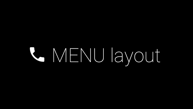
दिशा-निर्देश
यहां मेन्यू लेआउट सेट अप करने के कुछ सुझाव दिए गए हैं:
- टेक्स्ट का साइज़:
64sp - बैकग्राउंड का रंग:
#96000000 - मटेरियल आइकॉन का इस्तेमाल करें
जिनका साइज़
64dpx64dpहो -
windowIsTranslucentथीम फ़्लैग कोtrueपर सेट करें
यहां दी गई इमेज, पसंद के मुताबिक बनाए गए मेन्यू लेआउट का एक उदाहरण है:
लागू करने से जुड़ी जानकारी के लिए, कार्ड का सैंपल ऐप्लिकेशन देखें.
स्वाइप किए जा सकने वाले पेज
Glass का डिसप्ले और टचपैड, एक साथ काम करते हैं. इससे स्वाइप किए जा सकने वाले कार्ड आसानी से दिखते हैं. Android के स्टैंडर्ड
ViewPager एपीआई की मदद से, अपनी गतिविधि में स्वाइप किए जा सकने वाले पेज बनाए जा सकते हैं.
कार्ड या स्क्रीन पर स्क्रोल करने के लिए, Android
ViewPager का इस्तेमाल करने के तरीके के बारे में ज़्यादा जानने के लिए, स्क्रीन स्लाइड ट्रेनिंग से जुड़ा दस्तावेज़ पढ़ें.