Page Summary
-
Real-world data often lacks clearly defined clusters, making visual assessment of clustering quality difficult and requiring the use of heuristics and best practices.
-
Evaluating clustering involves assessing cluster cardinality, magnitude, downstream performance, and the similarity measure used.
-
The optimal number of clusters can be determined by analyzing the relationship between the number of clusters and the sum of cluster magnitudes, often using the elbow method.
-
If clustering results are unsatisfactory, re-evaluate data preparation, the similarity measure, and the algorithm's assumptions to ensure they align with the data's characteristics.
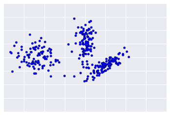
Because clustering is unsupervised, no ground truth is available to verify results. The absence of truth complicates assessments of quality. Moreover, real-world datasets typically don't offer obvious clusters of examples as in the example shown in Figure 1.
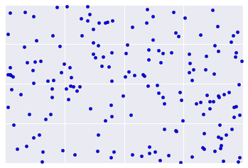
Instead, real-world data often looks more like Figure 2, making it difficult to visually assess clustering quality.
However, there are heuristics and best practices that you can iteratively apply to improve the quality of your clustering. The following flowchart gives an overview of how to evaluate your clustering results. We'll expand upon each step.

Step 1: Assess quality of clustering
First check that the clusters look as you'd expect, and that examples you consider similar to each other appear in the same cluster.
Then check these commonly-used metrics (not an exhaustive list):
- Cluster cardinality
- Cluster magnitude
- Downstream performance
Cluster cardinality
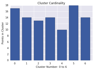
Cluster cardinality is the number of examples per cluster. Plot the cluster cardinality for all clusters and investigate clusters that are major outliers. In Figure 2, this would be cluster 5.
Cluster magnitude
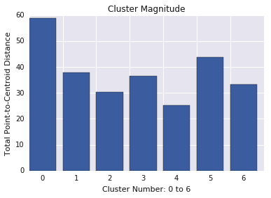
Cluster magnitude is the sum of distances from all examples in a cluster to the cluster's centroid. Plot cluster magnitude for all clusters and investigate outliers. In Figure 3, cluster 0 is an outlier.
Also consider looking at the maximum or average distance of examples from centroids, by cluster, to find outliers.
Magnitude versus cardinality
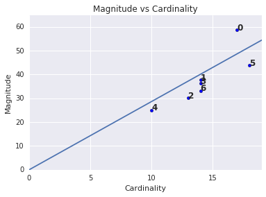
You may have noticed that a higher cluster cardinality corresponds to a higher cluster magnitude, which makes intuitive sense, since the more points in a cluster (cardinality), the greater the probable sum of the distances of those points from the centroid (magnitude). You can also identify anomalous clusters by looking for ones where this relationship between cardinality and magnitude is very different than for other clusters. In Figure 4, fitting a line to the plot of cardinality and magnitude suggests that cluster 0 is anomalous. (Cluster 5 is also far from the line, but if cluster 0 were omitted, the new fitted line would be much closer to cluster 5.)
Downstream performance
Since clustering outputs are often used in downstream ML systems, see if downstream model performance improves when your clustering process changes. This offers a real-world evaluation of the quality of your clustering results, although it can be complex and expensive to conduct this kind of test.
Step 2: Reassess your similarity measure
Your clustering algorithm is only as good as your similarity measure. Make sure your similarity measure returns sensible results. A quick check is to identify pairs of examples known to be more or less similar. Calculate the similarity measure for each pair of examples, and compare your results to your knowledge: pairs of similar examples should have a higher similarity measure than pairs of dissimilar examples.
The examples you use to spot-check your similarity measure should be representative of the dataset, so you can be confident that your similarity measure holds for all your examples. The performance of your similarity measure, whether manual or supervised, must be consistent across your dataset. If your similarity measure is inconsistent for some examples, those examples won't be clustered with similar examples.
If you find examples with inaccurate similarity scores, then your similarity measure probably doesn't fully capture the feature data that distinguishes those examples. Experiment with your similarity measure until it returns more accurate and consistent results.
Step 3: Find the optimal number of clusters
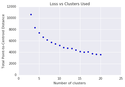
k-means requires you to decide the number of clusters \(k\) beforehand. How do you determine an optimal \(k\)? Try running the algorithm with increasing values of \(k\) and note the sum of all cluster magnitudes. As \(k\) increases, clusters become smaller, and the total distance of points from centroids decreases. We can treat this total distance as a loss. Plot this distance against the number of clusters.
As shown in Figure 5, above a certain \(k\), the reduction in loss becomes marginal with increasing \(k\). Consider using the \(k\) where the slope first has a drastic change, which is called the elbow method. For the plot shown, the optimal \(k\) is approximately 11. If you prefer more granular clusters, you can choose a higher \(k\), consulting this plot.
Troubleshooting questions
If you discover issues in the course of your evaluation, reassess your data preparation steps and chosen similarity measure. Ask:
- Is your data appropriately scaled?
- Is your similarity measure correct?
- Is your algorithm performing semantically meaningful operations on the data?
- Do your algorithm's assumptions match the data?