
卡片
在 Google Chat 消息或 Google Workspace 插件中显示的卡片界面。
卡片支持已定义的布局、按钮等互动式界面元素以及图片等富媒体。使用卡片呈现详细信息、从用户那里收集信息,并引导用户采取下一步行动。
使用卡片构建器设计和预览卡片。
打开卡片构建器
如需了解如何构建卡片,请参阅以下文档:
- 对于 Google Chat 应用,请参阅设计卡片或对话框的组件。
- 对于 Google Workspace 加购项,请参阅基于卡片的界面。
注意:每张卡片最多可添加 100 个微件。如果某个版块的 widget 使总数超过 100,则整个版块及后续所有版块都会被忽略。此限制适用于 Google Chat 应用中的卡片消息和对话框,以及 Google Workspace 插件中的卡片。
示例:Google Chat 应用的卡片消息
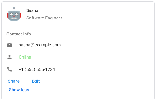
如需在 Google Chat 中创建示例卡片消息,请使用以下 JSON:
{
  "cardsV2": [
    {
      "cardId": "unique-card-id",
      "card": {
        "header": {
           "title": "Sasha",
           "subtitle": "Software Engineer",
           "imageUrl":
           "https://developers.google.com/workspace/chat/images/quickstart-app-avatar.png",
           "imageType": "CIRCLE",
           "imageAltText": "Avatar for Sasha"
         },
         "sections": [
           {
             "header": "Contact Info",
             "collapsible": true,
             "uncollapsibleWidgetsCount": 1,
             "widgets": [
               {
                 "decoratedText": {
                   "startIcon": {
                     "knownIcon": "EMAIL"
                   },
                   "text": "sasha@example.com"
                 }
               },
               {
                 "decoratedText": {
                   "startIcon": {
                     "knownIcon": "PERSON"
                   },
                   "text": "<font color=\"#80e27e\">Online</font>"
                 }
               },
               {
                 "decoratedText": {
                   "startIcon": {
                     "knownIcon": "PHONE"
                   },
                   "text": "+1 (555) 555-1234"
                 }
               },
               {
                 "buttonList": {
                   "buttons": [
                     {
                       "text": "Share",
                       "onClick": {
                        "openLink": {
                           "url": "https://example.com/share"
                         }
                       }
                     },
                     {
                       "text": "Edit",
                       "onClick": {
                         "action": {
                           "function": "goToView",
                           "parameters": [
                             {
                               "key": "viewType",
                               "value": "EDIT"
                             }
                           ]
                         }
                       }
                     }
                   ]
                 }
               }
             ]
           }
         ]
       }
    }
  ]
}
| JSON 表示法 |
|---|
{ "header": { object ( |
| 字段 | |
|---|---|
header
|
卡片的标题。标题通常包含一张前导图片和一个标题。标题始终显示在卡片顶部。 |
sections[]
|
包含 widget 的集合。每个部分都有自己的可选标题。各部分之间用分隔线隔开。如需查看 Google Chat 应用中的示例,请参阅定义卡片的一部分。 |
sectionDividerStyle
|
标题、部分和页脚之间的分隔线样式。 |
cardActions[]
|
卡片的操作。操作会添加到卡片的工具栏菜单中。
例如,以下 JSON 会构建一个包含 |
name
|
卡片的名称。在卡片导航中用作卡片标识符。
|
fixedFooter
|
此卡片底部显示的固定页脚。
如果设置了
|
displayStyle
|
在 Google Workspace 插件中,设置
|
peekCardHeader
|
显示情境化内容时,预览卡片标题会充当占位符,以便用户在首页卡片和情境化卡片之间向前导航。
|
expressionData[]
|
卡片的表情数据。 适用于扩展 Google Workspace Studio 的 Google Workspace 插件。不适用于 Google Chat 应用。 |
CardHeader
表示卡片标题。如需查看 Google Chat 应用中的示例,请参阅添加标题。

 适用于 Google Chat 扩展应用和 Google Workspace 插件。
| JSON 表示法 |
|---|
{
"title": string,
"subtitle": string,
"imageType": enum ( |
| 字段 | |
|---|---|
title
|
必需。卡片标题的标题。标题的高度是固定的:如果同时指定了标题和副标题,则每个标题各占一行。如果仅指定了标题,则标题会占据两行。 |
subtitle
|
卡片标题的副标题。如果指定,则显示在 |
imageType
|
用于剪裁图片的形状。
|
imageUrl
|
卡片标题中图片的 HTTPS 网址。 |
imageAltText
|
此图片的替代文本,用于实现无障碍功能。 |
ImageType
用于剪裁图片的形状。
适用于 Google Chat 扩展应用和 Google Workspace 插件。
| 枚举 | |
|---|---|
SQUARE
|
默认值。为图片应用方形蒙版。例如,4x3 的图片会变为 3x3。 |
CIRCLE
|
为图片应用圆形蒙版。例如,4x3 的图片会变成直径为 3 的圆形。 |
部分
一个部分包含一组按指定顺序垂直呈现的微件。
适用于 Google Chat 扩展应用和 Google Workspace 插件。
| JSON 表示法 |
|---|
{ "header": string, "widgets": [ { object ( |
| 字段 | |
|---|---|
header
|
显示在部分顶部的文字。支持简单的 HTML 格式文本。如需详细了解如何设置文本格式,请参阅 在 Google Chat 应用中设置文本格式 和 在 Google Workspace 加载项中设置文本格式。 |
widgets[]
|
相应部分中的所有 widget。必须包含至少一个 widget。 |
collapsible
|
指示相应部分是否可收起。 可收起的部分会隐藏部分或全部微件,但用户可以点击显示更多来展开该部分,从而显示隐藏的微件。用户可以点击减少显示再次隐藏微件。
如需确定哪些 widget 已隐藏,请指定 |
uncollapsibleWidgetsCount
|
即使在某个部分折叠时仍保持可见的不可折叠 widget 的数量。
例如,如果某个部分包含 5 个 widget,并且 |
id
|
分配给部分的唯一 ID,用于标识要发生变异的部分。ID 的字符数上限为 64 个,格式应为 适用于扩展 Google Workspace Studio 的 Google Workspace 插件。不适用于 Google Chat 应用。 |
collapseControl
|
可选。定义部分的展开和收起按钮。仅当相应部分可折叠时,系统才会显示此按钮。如果未设置此字段,则使用默认按钮。 |
widget
每张卡片都由 widget 组成。
widget 是一种复合对象,可以表示文本、图片、按钮和其他对象类型。
| JSON 表示法 |
|---|
{ "horizontalAlignment": enum ( |
| 字段 | |
|---|---|
horizontalAlignment
|
指定 widget 是与列的左侧、右侧还是中心对齐。 |
id
|
分配给 widget 的唯一 ID,用于标识要发生变化的 widget。ID 的字符数上限为 64 个字符,应采用以下格式:
适用于扩展 Google Workspace Studio 的 Google Workspace 插件。不适用于 Google Chat 应用。 |
visibility
|
指定 widget 是可见还是隐藏。默认值为 适用于扩展 Google Workspace Studio 的 Google Workspace 插件。不适用于 Google Chat 应用。 |
eventActions[]
|
指定可在 widget 上执行的事件操作。 适用于扩展 Google Workspace Studio 的 Google Workspace 插件。不适用于 Google Chat 应用。 |
联合字段 data。一个 widget 只能包含以下项之一。您可以使用多个 widget 字段来显示更多商品。
data 只能是下列其中一项:
|
|
textParagraph
|
显示文本段落。支持简单的 HTML 格式文本。如需详细了解如何设置文本格式,请参阅 在 Google Chat 应用中设置文本格式 和 在 Google Workspace 加载项中设置文本格式。 例如,以下 JSON 会创建粗体文本: |
image
|
显示图片。 例如,以下 JSON 会创建带有替代文字的图片: |
decoratedText
|
显示带装饰的文本项。 例如,以下 JSON 会创建一个显示电子邮件地址的装饰文本微件: |
buttonList
|
按钮列表。 例如,以下 JSON 会创建两个按钮。第一个是蓝色文字按钮,第二个是用于打开链接的图片按钮: |
textInput
|
显示一个文本框,供用户在其中输入内容。 例如,以下 JSON 会创建一个电子邮件地址的文本输入: 再举一个例子,以下 JSON 会创建一个具有静态建议的编程语言文本输入: |
selectionInput
|
显示一个选择控件,供用户选择项目。选择控件可以是复选框、单选按钮、开关或下拉菜单。 例如,以下 JSON 会创建一个下拉菜单,供用户选择尺寸: |
dateTimePicker
|
显示一个微件,供用户输入日期、时间或日期和时间。 例如,以下 JSON 会创建一个用于安排预约的日期时间选择器: |
divider
|
在 widget 之间显示水平线分隔线。 例如,以下 JSON 会创建一个分隔线: |
grid
|
显示包含一系列项的网格。 网格支持任意数量的列和项。行数由商品数量上限除以列数确定。一个包含 10 个项和 2 列的网格有 5 行。一个包含 11 个项和 2 列的网格有 6 行。
例如,以下 JSON 会创建一个包含单个商品的 2 列网格: |
columns
|
最多可显示 2 列。
如需添加 2 列以上的列,或使用行,请使用 例如,以下 JSON 会创建 2 个列,每个列都包含文本段落: |
carousel
|
轮播界面包含一组嵌套的 widget。例如,以下是包含两个文本段落的轮播界面的 JSON 表示法。 |
chipList
|
芯片列表。 例如,以下 JSON 会创建两个 chip。第一个是文字条状标签,第二个是用于打开链接的图标条状标签: |
TextParagraph
支持格式设置的一段文字。如需查看 Google Chat 应用中的示例,请参阅添加一段格式化文本。如需详细了解如何设置文本格式,请参阅 在 Google Chat 应用中设置文本格式 和 在 Google Workspace 加载项中设置文本格式。
适用于 Google Chat 扩展应用和 Google Workspace 插件。
| JSON 表示法 |
|---|
{
"text": string,
"maxLines": integer,
"textSyntax": enum ( |
| 字段 | |
|---|---|
text
|
微件中显示的文字。 |
maxLines
|
widget 中显示的最大文本行数。如果文本超过指定的最大行数,多余的内容会隐藏在显示更多按钮后面。如果文本的行数等于或少于指定的最大行数,则不会显示显示更多按钮。 默认值为 0,表示显示所有上下文。系统会忽略负值。 |
textSyntax
|
文本的语法。如果未设置,则文本会呈现为 HTML。
|
TextSyntax
用于设置文本格式的语法。
适用于 Google Chat 应用,但不适用于 Google Workspace 加购项。
| 枚举 | |
|---|---|
TEXT_SYNTAX_UNSPECIFIED
|
如果未指定,则将文本呈现为 HTML。 |
HTML
|
文本以 HTML 格式呈现。这是默认值。 |
MARKDOWN
|
文本会呈现为 Markdown。 |
图片
由网址指定的图片,可以具有 onClick 操作。如需查看示例,请参阅添加图片。
适用于 Google Chat 扩展应用和 Google Workspace 插件。
| JSON 表示法 |
|---|
{
"imageUrl": string,
"onClick": {
object ( |
| 字段 | |
|---|---|
imageUrl
|
托管图片的 HTTPS 网址。 例如: |
onClick
|
当用户点击图片时,点击操作会触发此操作。 |
altText
|
此图片的替代文本,用于实现无障碍功能。 |
OnClick
表示当用户点击卡片上的互动元素(例如按钮)时如何做出响应。
适用于 Google Chat 扩展应用和 Google Workspace 插件。
| JSON 表示法 |
|---|
{ "action": { object ( |
| 字段 | |
|---|---|
|
联合字段
|
|
action
|
如果指定,则通过此 |
openLink
|
如果指定了此属性,则 |
openDynamicLinkAction
|
当操作需要打开链接时,插件会触发此操作。这与上面的
|
card
|
点击后,如果指定了新卡片,则将新卡片推送到卡片堆栈。
|
overflowMenu
|
如果指定,此 |
操作
一种用于描述提交表单时的行为的操作。例如,您可以调用 Apps 脚本来处理表单。如果触发了该操作,表单值会发送到服务器。
适用于 Google Chat 扩展应用和 Google Workspace 插件。
| JSON 表示法 |
|---|
{ "function": string, "parameters": [ { object ( |
| 字段 | |
|---|---|
function
|
当包含元素被点击或以其他方式激活时调用的自定义函数。 如需查看使用示例,请参阅读取表单数据。 |
parameters[]
|
操作参数列表。 |
loadIndicator
|
指定在调用操作时操作显示的加载指示器。 |
persistValues
|
指明表单值在操作后是否保持不变。默认值为
如果值为
如果值为 |
interaction
|
可选。打开对话框时必须提供。 在与用户互动(例如用户点击卡片消息中的按钮)时应执行的操作。
如果未指定,应用会像往常一样执行
通过指定
|
requiredWidgets[]
|
可选。使用此操作需要哪些微件的名称填充此列表,以便有效提交。 如果此处列出的微件在调用此操作时没有值,则会中止表单提交。
|
allWidgetsAreRequired
|
可选。如果此值为 true,则此操作会认为所有 widget 都是必需的。
|
ActionParameter
调用操作方法时要提供的字符串形参列表。例如,假设有三个“延后”按钮:“立即延后”“延后一天”或“延后到下周”。您可以使用 action method = snooze(),并在字符串参数列表中传递延迟类型和延迟时间。
如需了解详情,请参阅 CommonEventObject。
适用于 Google Chat 扩展应用和 Google Workspace 插件。
| JSON 表示法 |
|---|
{ "key": string, "value": string } |
| 字段 | |
|---|---|
key
|
操作脚本的参数名称。 |
value
|
参数的值。 |
LoadIndicator
指定在调用操作时操作显示的加载指示器。
适用于 Google Chat 扩展应用和 Google Workspace 插件。
| 枚举 | |
|---|---|
SPINNER
|
显示一个微调器,以指示内容正在加载。 |
NONE
|
不显示任何内容。 |
互动
可选。打开对话框时必须提供。
在与用户互动(例如用户点击卡片消息中的按钮)时应执行的操作。
如果未指定,应用会像往常一样执行 action(例如打开链接或运行函数)来做出响应。
通过指定 interaction,应用可以以特殊的互动方式做出响应。例如,通过将 interaction 设置为 OPEN_DIALOG,应用可以打开对话框。
如果指定此值,则不会显示加载指示器。如果为插件指定了此属性,则整个卡片都会被剥离,并且客户端中不会显示任何内容。
适用于 Google Chat 应用,但不适用于 Google Workspace 加购项。
| 枚举 | |
|---|---|
INTERACTION_UNSPECIFIED
|
默认值。action 正常执行。
|
OPEN_DIALOG
|
打开一个对话框,即基于卡片的窗口化界面,供 Chat 应用与用户互动。 仅受聊天应用支持,用于响应卡片消息上的按钮点击。如果为插件指定了此值,则整个卡片都会被剥离,并且客户端中不会显示任何内容。
|
OpenLink
表示打开超链接的 onClick 事件。
适用于 Google Chat 扩展应用和 Google Workspace 插件。
| JSON 表示法 |
|---|
{ "url": string, "openAs": enum ( |
| 字段 | |
|---|---|
url
|
要打开的网址。HTTP 网址会转换为 HTTPS。 |
openAs
|
如何打开链接。
|
onClose
|
客户端在打开链接后是忘记该链接,还是会一直观察该链接直到窗口关闭。
|
OpenAs
当 OnClick 操作打开链接时,客户端可以将其作为全尺寸窗口(如果这是客户端使用的框架)或叠加层(例如弹出式窗口)打开。具体实现取决于客户端平台的功能,如果客户端不支持所选值,则可能会忽略该值。
所有客户端都支持 FULL_SIZE。
适用于 Google Workspace 加购项,但不适用于 Google Chat 应用。
| 枚举 | |
|---|---|
FULL_SIZE
|
链接会以全尺寸窗口打开(如果客户端使用的是该框架)。 |
OVERLAY
|
链接会以叠加层的形式打开,例如弹出式窗口。 |
OnClose
当由 OnClick 操作打开的链接关闭时,客户端执行的操作。
实现取决于客户端平台的功能。例如,网络浏览器可能会在带有 OnClose 处理程序的弹出式窗口中打开链接。
如果同时设置了 OnOpen 和 OnClose 处理程序,但客户端平台无法同时支持这两个值,则以 OnClose 为准。
适用于 Google Workspace 加购项,但不适用于 Google Chat 应用。
| 枚举 | |
|---|---|
NOTHING
|
默认值。卡片不会重新加载;不会发生任何情况。 |
RELOAD
|
在子窗口关闭后重新加载卡片。
如果与 |
OverflowMenu
一种用于呈现弹出式菜单的 widget,其中包含用户可调用的一个或多个操作。例如,在卡片中显示非主要操作。当操作无法放入可用空间时,您可以使用此 widget。如需使用,请在支持此 widget 的 widget 的 OnClick 操作中指定此 widget。例如,在 Button 中。
适用于 Google Chat 扩展应用和 Google Workspace 插件。
| JSON 表示法 |
|---|
{
"items": [
{
object ( |
| 字段 | |
|---|---|
items[]
|
必需。菜单选项列表。 |
OverflowMenuItem
用户可在溢出菜单中调用的选项。
适用于 Google Chat 扩展应用和 Google Workspace 插件。
| JSON 表示法 |
|---|
{ "startIcon": { object ( |
| 字段 | |
|---|---|
startIcon
|
显示在文本前面的图标。 |
text
|
必需。向用户标识或描述商品的文本。 |
onClick
|
必需。选择菜单选项时调用的操作。此 |
disabled
|
菜单选项是否已停用。默认值为 false。 |
图标
卡片上的 widget 中显示的图标。如需查看 Google Chat 应用中的示例,请参阅添加图标。
适用于 Google Chat 扩展应用和 Google Workspace 插件。
| JSON 表示法 |
|---|
{ "altText": string, "imageType": enum ( |
| 字段 | |
|---|---|
altText
|
可选。用于辅助功能的图标的说明。如果未指定,则系统会提供默认值
如果图标是在 |
imageType
|
应用于图片的剪裁样式。在某些情况下,应用 |
联合字段 icons。卡片上的 widget 中显示的图标。
icons 只能是下列其中一项:
|
|
knownIcon
|
显示 Google Workspace 提供的内置图标之一。
例如,如需显示飞机图标,请指定 如需查看受支持的图标的完整列表,请参阅内置图标。 |
iconUrl
|
显示托管在 HTTPS 网址中的自定义图标。 例如:
支持的文件类型包括
|
materialIcon
|
显示一个 Google Material 图标。 例如,如需显示复选框图标,请使用
|
MaterialIcon
一种 Google Material 图标,包含 2, 500 多个选项。
例如,如需显示具有自定义权重和等级的复选框图标,请编写以下代码:
{
"name": "check_box",
"fill": true,
"weight": 300,
"grade": -25
}
适用于 Google Chat 应用,但不适用于 Google Workspace 加购项。
| JSON 表示法 |
|---|
{ "name": string, "fill": boolean, "weight": integer, "grade": integer } |
| 字段 | |
|---|---|
name
|
Google Material 图标中定义的图标名称,例如 |
fill
|
图标是否以填充状态呈现。默认值为 false。 如需预览不同的图标设置,请前往 Google 字体图标,然后调整自定义下的设置。 |
weight
|
图标的描边粗细。您可以从 {100, 200, 300, 400, 500, 600, 700} 中选择。如果不存在,则默认值为 400。如果指定了任何其他值,则使用默认值。 如需预览不同的图标设置,请前往 Google 字体图标,然后调整自定义下的设置。 |
grade
|
粗细和等级会影响符号的粗细。与调整粗细相比,调整等级更加精细,对符号大小的影响也较小。请从 {-25, 0, 200} 中选择一个值。如果未提供,则默认值为 0。如果指定了任何其他值,则使用默认值。 如需预览不同的图标设置,请前往 Google 字体图标,然后调整自定义下的设置。 |
DecoratedText
一种用于显示文本的 widget,可选择性地添加装饰,例如文本上方或下方的标签、文本前面的图标、选择 widget 或文本后面的按钮。如需查看 Google Chat 应用中的示例,请参阅显示带有装饰性文字的文本。
适用于 Google Chat 扩展应用和 Google Workspace 插件。
| JSON 表示法 |
|---|
{ "icon": { object ( |
| 字段 | |
|---|---|
icon
|
已弃用,取而代之的是 |
startIcon
|
显示在文本前面的图标。 |
startIconVerticalAlignment
|
可选。开始图标的垂直对齐方式。如果未设置,图标将垂直居中。
|
topLabel
|
显示在 |
topLabelText
|
|
text
|
必需。主要文本。 支持简单格式。如需详细了解如何设置文本格式,请参阅 在 Google Chat 应用中设置文本格式 和 在 Google Workspace 加载项中设置文本格式。 |
contentText
|
|
wrapText
|
文字环绕设置。如果值为
仅适用于 |
bottomLabel
|
显示在 |
bottomLabelText
|
|
onClick
|
当用户点击 |
联合字段 control。显示在 decoratedText 微件 中文字右侧的按钮、开关、复选框或图片。control 只能是下列其中一项:
|
|
button
|
用户可以点击以触发操作的按钮。 |
switchControl
|
一种开关微件,用户可以点击它来更改其状态并触发操作。 |
endIcon
|
显示在文字后面的图标。 |
VerticalAlignment
表示垂直对齐属性。
| 枚举 | |
|---|---|
VERTICAL_ALIGNMENT_UNSPECIFIED
|
未指定类型。请勿使用。 |
TOP
|
与首位对齐。 |
MIDDLE
|
与中间位置对齐。 |
BOTTOM
|
与底部位置对齐。 |
按钮
用户可以点击的文本、图标或文本和图标按钮。如需查看 Google Chat 应用中的示例,请参阅添加按钮。
如需将图片设为可点击的按钮,请指定 ImageImageComponentonClick 操作。
适用于 Google Chat 扩展应用和 Google Workspace 插件。
| JSON 表示法 |
|---|
{ "text": string, "icon": { object ( |
| 字段 | |
|---|---|
text
|
按钮内显示的文字。 |
icon
|
按钮内显示的图标。如果同时设置了
|
color
|
可选。按钮的颜色。如果设置了此属性,按钮
如需设置按钮颜色,请为 例如,以下代码将颜色设置为红色,并达到最大强度:
|
onClick
|
必需。用户点击按钮时要执行的操作,例如打开超链接或运行自定义函数。 |
disabled
|
如果值为 |
altText
|
用于辅助功能的替代文本。 设置描述性文本,让用户了解按钮的作用。例如,如果某个按钮用于打开超链接,您可以这样写:“打开新的浏览器标签页,并前往 Google Chat 开发者文档,网址为 https://developers.google.com/workspace/chat"。” |
type
|
可选。按钮的类型。如果未设置,按钮类型默认为 |
颜色
表示 RGBA 颜色空间中的一种颜色。这种表示法旨在简化各种语言的颜色表示法之间的转换,而不是追求紧凑性。例如,此表示法的字段可以轻松地提供给 Java 中 java.awt.Color 的构造函数;也可以轻松地提供给 iOS 中 UIColor 的 +colorWithRed:green:blue:alpha 方法;只需稍作处理,即可轻松地将其格式化为 JavaScript 中的 CSS rgba() 字符串。
此参考页面不包含应用于解释 RGB 值的绝对颜色空间(例如 sRGB、Adobe RGB、DCI-P3 和 BT.2020)的相关信息。默认情况下,应用应采用 sRGB 颜色空间。
在需要确定颜色是否相等时,除非另有说明,否则如果两种颜色的红色、绿色、蓝色和 Alpha 值各自的差值不超过 1e-5,实现会将这两种颜色视为相等。
示例 (Java):
import com.google.type.Color;
// ...
public static java.awt.Color fromProto(Color protocolor) {
float alpha = protocolor.hasAlpha()
? protocolor.getAlpha().getValue()
: 1.0;
return new java.awt.Color(
protocolor.getRed(),
protocolor.getGreen(),
protocolor.getBlue(),
alpha);
}
public static Color toProto(java.awt.Color color) {
float red = (float) color.getRed();
float green = (float) color.getGreen();
float blue = (float) color.getBlue();
float denominator = 255.0;
Color.Builder resultBuilder =
Color
.newBuilder()
.setRed(red / denominator)
.setGreen(green / denominator)
.setBlue(blue / denominator);
int alpha = color.getAlpha();
if (alpha != 255) {
result.setAlpha(
FloatValue
.newBuilder()
.setValue(((float) alpha) / denominator)
.build());
}
return resultBuilder.build();
}
// ...
示例 (iOS / Obj-C):
// ...
static UIColor* fromProto(Color* protocolor) {
float red = [protocolor red];
float green = [protocolor green];
float blue = [protocolor blue];
FloatValue* alpha_wrapper = [protocolor alpha];
float alpha = 1.0;
if (alpha_wrapper != nil) {
alpha = [alpha_wrapper value];
}
return [UIColor colorWithRed:red green:green blue:blue alpha:alpha];
}
static Color* toProto(UIColor* color) {
CGFloat red, green, blue, alpha;
if (![color getRed:&red green:&green blue:&blue alpha:&alpha]) {
return nil;
}
Color* result = [[Color alloc] init];
[result setRed:red];
[result setGreen:green];
[result setBlue:blue];
if (alpha <= 0.9999) {
[result setAlpha:floatWrapperWithValue(alpha)];
}
[result autorelease];
return result;
}
// ...
示例 (JavaScript):
// ...
var protoToCssColor = function(rgb_color) {
var redFrac = rgb_color.red || 0.0;
var greenFrac = rgb_color.green || 0.0;
var blueFrac = rgb_color.blue || 0.0;
var red = Math.floor(redFrac * 255);
var green = Math.floor(greenFrac * 255);
var blue = Math.floor(blueFrac * 255);
if (!('alpha' in rgb_color)) {
return rgbToCssColor(red, green, blue);
}
var alphaFrac = rgb_color.alpha.value || 0.0;
var rgbParams = [red, green, blue].join(',');
return ['rgba(', rgbParams, ',', alphaFrac, ')'].join('');
};
var rgbToCssColor = function(red, green, blue) {
var rgbNumber = new Number((red << 16) | (green << 8) | blue);
var hexString = rgbNumber.toString(16);
var missingZeros = 6 - hexString.length;
var resultBuilder = ['#'];
for (var i = 0; i < missingZeros; i++) {
resultBuilder.push('0');
}
resultBuilder.push(hexString);
return resultBuilder.join('');
};
// ...
| JSON 表示法 |
|---|
{ "red": number, "green": number, "blue": number, "alpha": number } |
| 字段 | |
|---|---|
red
|
颜色中的红色量,以介于区间 [0, 1] 内的值表示。 |
green
|
颜色中的绿色量,以介于区间 [0, 1] 内的值表示。 |
blue
|
颜色中的蓝色量,以介于区间 [0, 1] 内的值表示。 |
alpha
|
此颜色在像素中的应用比例。也就是说,最终像素颜色由以下等式定义:
也就是说,值为 1.0 表示纯色,而值为 0.0 表示完全透明的颜色。它会使用封装容器消息,而非简单的浮动标量,以便区分默认值和未设置的值。如果省略此字段,此颜色对象将呈现为纯色(就像已明确给定 Alpha 值为 1.0)。 |
类型
可选。按钮的类型。如果设置了 color 字段,则强制将 type 设置为 FILLED。
适用于 Google Chat 应用,但不适用于 Google Workspace 加购项。
| 枚举 | |
|---|---|
TYPE_UNSPECIFIED
|
请勿使用。未指定。 |
OUTLINED
|
轮廓按钮属于中度强调按钮。它们通常包含重要的操作,但不是 Chat 应用或插件中的主要操作。 |
FILLED
|
填充按钮的容器具有纯色。它具有最强的视觉冲击力,建议用于 Chat 应用或插件中的重要操作和主要操作。 |
FILLED_TONAL
|
填充色调按钮是填充按钮和轮廓按钮之间的中间替代方案。在需要比轮廓按钮略微强调的低优先级按钮的上下文中,它们非常有用。 |
BORDERLESS
|
按钮在默认状态下没有不可见的容器。它通常用于优先级最低的操作,尤其是在呈现多个选项时。 |
SwitchControl
切换开关样式或 decoratedText widget 内的复选框。
适用于 Google Chat 扩展应用和 Google Workspace 插件。
仅在 decoratedText widget 中受支持。
| JSON 表示法 |
|---|
{ "name": string, "value": string, "selected": boolean, "onChangeAction": { object ( |
| 字段 | |
|---|---|
name
|
开关 widget 在表单输入事件中的标识名称。 如需详细了解如何处理表单输入,请参阅接收表单数据。 |
value
|
用户输入的值,作为表单输入事件的一部分返回。 如需详细了解如何处理表单输入,请参阅接收表单数据。 |
selected
|
当值为 |
onChangeAction
|
开关状态发生变化时要执行的操作,例如要运行的函数。 |
controlType
|
开关在界面中的显示方式。
|
ControlType
开关在界面中的显示方式。
适用于 Google Chat 扩展应用和 Google Workspace 插件。
| 枚举 | |
|---|---|
SWITCH
|
切换开关样式。 |
CHECKBOX
|
已弃用,取而代之的是 CHECK_BOX。
|
CHECK_BOX
|
一个复选框。 |
ButtonList
水平布局的按钮列表。如需查看 Google Chat 应用中的示例,请参阅添加按钮。
适用于 Google Chat 扩展应用和 Google Workspace 插件。
| JSON 表示法 |
|---|
{
"buttons": [
{
object ( |
| 字段 | |
|---|---|
buttons[]
|
按钮数组。 |
TextInput
用户可以在其中输入文本的字段。支持建议和更改时操作。支持表单提交验证。当 Action.all_widgets_are_required 设置为 true 或在 Action.required_widgets 中指定此微件时,除非输入值,否则提交操作会被阻止。如需查看 Google Chat 应用中的示例,请参阅添加可供用户输入文本的字段。
聊天应用会在表单输入事件期间接收并处理所输入文本的值。如需详细了解如何处理表单输入,请参阅接收表单数据。
当您需要从用户那里收集未定义或抽象数据时,请使用文本输入。如需从用户处收集已定义或枚举的数据,请使用 SelectionInput widget。
适用于 Google Chat 扩展应用和 Google Workspace 插件。
| JSON 表示法 |
|---|
{ "name": string, "label": string, "hintText": string, "value": string, "type": enum ( |
| 字段 | |
|---|---|
name
|
在表单输入事件中标识文本输入的名称。 如需详细了解如何处理表单输入,请参阅接收表单数据。 |
label
|
用户界面中显示在文本输入字段上方的文本。
指定有助于用户输入应用所需信息的文字。例如,如果您要询问某人的姓名,但特别需要对方的姓氏,请使用
如果未指定 |
hintText
|
显示在文本输入字段下方的文本,旨在通过提示用户输入特定值来帮助用户。此文本始终可见。
如果未指定 |
value
|
用户输入的值,作为表单输入事件的一部分返回。 如需详细了解如何处理表单输入,请参阅接收表单数据。 |
type
|
文本输入字段在界面中的显示方式。例如,字段是单行还是多行。 |
onChangeAction
|
当文本输入字段发生更改时应执行的操作。例如,用户向字段中添加内容或删除文本。 可采取的操作包括运行自定义函数或在 Google Chat 中打开对话框。 |
initialSuggestions
|
用户可以输入的建议值。当用户点击文本输入字段时,系统会显示这些值。随着用户输入内容,建议值会动态过滤,以匹配用户输入的内容。
例如,编程语言的文本输入字段可能会建议 Java、JavaScript、Python 和 C++。当用户开始输入
建议值有助于引导用户输入您的应用可以理解的值。在提及 JavaScript 时,有些用户可能会输入
如果指定了该值,则
|
autoCompleteAction
|
可选。指定当文本输入字段向与之互动的用户提供建议时要采取的操作。
如果未指定,建议由 如果指定了此属性,应用会执行此处指定的操作,例如运行自定义函数。
|
validation
|
指定此文本字段所需的输入格式验证。
|
placeholderText
|
当文本输入字段为空时,该字段中显示的文本。使用此文本提示用户输入值。例如
|
|
联合字段
|
|
hostAppDataSource
|
Google Workspace 宿主应用特有的数据源,例如 Gmail 电子邮件、Google 日历活动或 Google Chat 消息。 适用于扩展 Google Workspace Studio 的 Google Workspace 插件。不适用于 Google Chat 应用。 |
类型
文本输入字段在界面中的显示方式。例如,是单行输入字段还是多行输入字段。如果指定了 initialSuggestions,则 type 始终为 SINGLE_LINE,即使将其设置为 MULTIPLE_LINE 也是如此。
适用于 Google Chat 扩展应用和 Google Workspace 插件。
| 枚举 | |
|---|---|
SINGLE_LINE
|
文本输入字段的高度固定为一行。 |
MULTIPLE_LINE
|
文本输入字段的高度固定为多行。 |
RenderActions
一组渲染指令,用于指示卡片执行操作,或指示加购项宿主应用或 Chat 应用执行应用专属操作。
适用于 Google Chat 应用和 Google Workspace 插件。
| 字段 | |
|---|---|
action | |
操作
| 字段 | |
|---|---|
navigations[] |
推送、弹出或更新卡片。 |
导航
向堆叠中添加新卡片(向前导航)。对于 Chat 应用,仅适用于应用首页。
适用于 Google Chat 应用和 Google Workspace 插件。
navigations: {
pushCard: CARD
}
用新卡替换顶部卡片。对于 Chat 应用,仅适用于应用首页。
适用于 Google Chat 应用和 Google Workspace 插件。
navigations: {
updateCard: CARD
}
建议
用户可以输入的建议值。当用户点击文本输入字段时,系统会显示这些值。随着用户输入内容,建议值会动态过滤,以匹配用户输入的内容。
例如,编程语言的输入字段可能会建议 Java、JavaScript、Python 和 C++。当用户开始输入 Jav 时,建议列表会过滤为仅显示 Java 和 JavaScript。
建议值有助于引导用户输入您的应用可以理解的值。在提及 JavaScript 时,有些用户可能会输入 javascript,而其他用户可能会输入 java script。建议
JavaScript
可以标准化用户与应用的互动方式。
如果指定了该值,则 TextInput.type 始终为 SINGLE_LINE,即使将其设置为 MULTIPLE_LINE 也是如此。
适用于 Google Chat 扩展应用和 Google Workspace 插件。
| JSON 表示法 |
|---|
{
"items": [
{
object ( |
| 字段 | |
|---|---|
items[]
|
用于文本输入字段中的自动补全建议的建议列表。 |
SuggestionItem
用户可在文本输入字段中输入的一个建议值。
适用于 Google Chat 扩展应用和 Google Workspace 插件。
| JSON 表示法 |
|---|
{ "text": string } |
| 字段 | |
|---|---|
|
联合字段
|
|
text
|
文本输入字段的建议输入值。这相当于用户自行输入的内容。 |
验证
表示验证所附加 widget 所需的数据。
适用于 Google Chat 扩展应用和 Google Workspace 插件。
| JSON 表示法 |
|---|
{
"characterLimit": integer,
"inputType": enum ( |
| 字段 | |
|---|---|
characterLimit
|
指定文本输入 widget 的字符数限制。请注意,此属性仅用于文本输入,对于其他微件会被忽略。
|
inputType
|
指定输入 widget 的类型。
|
InputType
输入 widget 的类型。
| 枚举 | |
|---|---|
INPUT_TYPE_UNSPECIFIED
|
未指定类型。请勿使用。 |
TEXT
|
接受所有字符的常规文本。 |
INTEGER
|
一个整数值。 |
FLOAT
|
一个浮点值。 |
EMAIL
|
电子邮件地址。 |
EMOJI_PICKER
|
从系统提供的表情符号选择器中选择的表情符号。 |
HostAppDataSourceMarkup
Google Workspace 应用中的数据源。数据源用于填充微件的可用项。
| JSON 表示法 |
|---|
{ "chatDataSource": { object ( |
| 字段 | |
|---|---|
联合字段 data_source。用于填充 widget 可用项的 Google Workspace 应用。
data_source 只能是下列其中一项:
|
|
chatDataSource
|
来自 Google Chat 的数据源。 |
workflowDataSource
|
来自 Google Workflow 的数据源。 |
ChatClientDataSourceMarkup
对于使用多选菜单的 SelectionInput
适用于 Google Chat 应用,但不适用于 Google Workspace 加购项。
| JSON 表示法 |
|---|
{
"spaceDataSource": {
object ( |
| 字段 | |
|---|---|
联合字段 source。Google Chat 数据源。
source 只能是下列其中一项:
|
|
spaceDataSource
|
用户所属的 Google Chat 聊天室。 |
SpaceDataSource
一种数据源,用于将 Google Chat 聊天室填充为多选菜单的选择项。仅填充用户所属的聊天室。
适用于 Google Chat 应用,但不适用于 Google Workspace 加购项。
| JSON 表示法 |
|---|
{ "defaultToCurrentSpace": boolean } |
| 字段 | |
|---|---|
defaultToCurrentSpace
|
如果设置为 |
WorkflowDataSourceMarkup
* 仅受 Google Workspace Workflow 支持,不受 Google Chat 应用或 Google Workspace 加购项支持。
在具有 MULTI_SELECT 类型的 TextInputSelectionInputDateTimePicker
| JSON 表示法 |
|---|
{
"includeVariables": boolean,
"type": enum ( |
| 字段 | |
|---|---|
includeVariables
|
是否在数据源中包含上一步中的变量。 |
type
|
数据源的类型。 |
类型
表示工作流数据源类型的枚举。
| 枚举 | |
|---|---|
UNKNOWN
|
默认值。请勿使用。 |
USER
|
Google Workspace 用户。用户只能查看和选择其 Google Workspace 组织中的用户。 |
SPACE
|
用户所属的 Google Chat 聊天室。 |
USER_WITH_FREE_FORM
|
用户可以选择查看和选择 Google Workspace 组织中的现有成员,也可以手动输入电子邮件地址或有效网域。 |
SelectionInput
用于创建一个或多个可供用户选择的界面项的 widget。仅支持对 dropdown 和 multiselect 菜单的表单提交进行验证。当 Action.all_widgets_are_required 设置为 true 或在 Action.required_widgets 中指定此微件时,除非选择一个值,否则提交操作会被阻止。例如,下拉菜单或复选框。您可以使用此 widget 收集可预测或可枚举的数据。如需查看 Google Chat 应用中的示例,请参阅添加可选择的界面元素。
聊天应用可以处理用户选择或输入的商品价值。如需详细了解如何处理表单输入,请参阅接收表单数据。
如需从用户处收集未定义或抽象的数据,请使用 TextInput 微件。
适用于 Google Chat 扩展应用和 Google Workspace 插件。
| JSON 表示法 |
|---|
{ "name": string, "label": string, "type": enum ( |
| 字段 | |
|---|---|
name
|
必需。用于在表单输入事件中标识选择输入的名称。 如需详细了解如何处理表单输入,请参阅接收表单数据。 |
label
|
用户界面中显示在选择输入字段上方的文本。 指定有助于用户输入应用所需信息的文字。例如,如果用户要从下拉菜单中选择工单的紧急程度,则标签可能是“紧急程度”或“选择紧急程度”。 |
type
|
在 |
items[]
|
一个可选择项的数组。例如,单选按钮或复选框的数组。最多支持 100 个项目。 |
onChangeAction
|
如果指定了该值,则在选择发生更改时提交表单。如果未指定,您必须指定一个单独的按钮来提交表单。 如需详细了解如何处理表单输入,请参阅接收表单数据。 |
multiSelectMinQueryLength
|
对于多选菜单,用户在菜单返回建议的选择项之前输入的文本字符数。 如果未设置,多选菜单将使用以下默认值:
|
dataSourceConfigs[]
|
可选。选择控件的数据源配置。此字段可提供对数据源的更精细控制。
如果指定了此字段,则会忽略 适用于扩展 Google Workspace Studio 的 Google Workspace 插件。
适用于 Google Chat 应用中的
|
multiSelectMaxSelectedItems
|
对于多选菜单,用户可以选择的商品数量上限。最小值为 1 项。如果未指定,则默认为 3 项。 |
hintText
|
可选。显示在选择输入字段下方的文本,旨在通过提示用户输入特定值来帮助他们。此文本始终可见。 适用于扩展 Google Workspace Studio 的 Google Workspace 插件。不适用于 Google Chat 应用。 |
|
联合字段
|
|
externalDataSource
|
外部数据源,例如关系型数据库。 |
platformDataSource
|
Google Workspace 中的数据源。 |
SelectionType
用户可选择的商品的格式。不同的选项支持不同类型的互动。例如,用户可以选择多个复选框,但只能从下拉菜单中选择一项。
每个选择输入源都支持一种选择类型。例如,不支持混合使用复选框和开关。
适用于 Google Chat 扩展应用和 Google Workspace 插件。
| 枚举 | |
|---|---|
CHECK_BOX
|
一组复选框。用户可以选择一个或多个复选框。 |
RADIO_BUTTON
|
一组单选按钮。用户可以选择一个单选按钮。 |
SWITCH
|
一组开关。用户可以开启一个或多个开关。 |
DROPDOWN
|
一个下拉菜单。用户可以从菜单中选择一项。 对于 Google Chat 应用,您可以使用动态数据源填充菜单项,并在用户在菜单中输入内容时自动建议菜单项。例如,用户可以开始输入 Google Chat 聊天室的名称,然后 widget 会自动建议该聊天室。如需动态填充下拉菜单的项,请使用以下类型的数据源之一:
如需查看有关如何为 Chat 应用实现下拉菜单的示例,请参阅添加下拉菜单和动态填充下拉菜单。
|
MULTI_SELECT
|
包含文本框的菜单。用户可以输入文字并选择一项或多项内容。对于 Google Workspace 加购项,您必须使用 对于 Google Chat 应用,您还可以使用动态数据源填充菜单项,并在用户在菜单中输入内容时自动建议菜单项。例如,用户可以开始输入 Google Chat 聊天室的名称,然后 widget 会自动建议该聊天室。如需动态填充多选菜单的项,请使用以下类型的数据源之一:
如需查看有关如何为 Chat 应用实现多选菜单的示例,请参阅添加多选菜单。
|
SelectionItem
用户可以在选择输入源(例如复选框或开关)中选择的项。最多支持 100 个项目。
适用于 Google Chat 扩展应用和 Google Workspace 插件。
| JSON 表示法 |
|---|
{ "text": string, "value": string, "selected": boolean, "bottomText": string, "startIconUri": string } |
| 字段 | |
|---|---|
text
|
向用户标识或描述商品的文本。 |
value
|
与相应商品关联的值。客户端应将此值用作表单输入值。 如需详细了解如何处理表单输入,请参阅接收表单数据。 |
selected
|
相应项是否默认处于选中状态。如果选择输入仅接受一个值(例如对于单选按钮或下拉菜单),则仅为一个项设置此字段。 |
bottomText
|
对于多选菜单,显示在项目 |
联合字段 start_icon。对于多选菜单,显示在商品 text 字段旁边的图标的网址。支持 PNG 和 JPEG 文件。必须是 HTTPS 网址。例如,https://developers.google.com/workspace/chat/images/quickstart-app-avatar.png。
start_icon 只能是下列其中一项:
|
|
startIconUri
|
|
PlatformDataSource
对于使用多选菜单的 SelectionInput
适用于 Google Chat 应用,但不适用于 Google Workspace 加购项。
| JSON 表示法 |
|---|
{ "commonDataSource": enum ( |
| 字段 | |
|---|---|
联合字段 data_source。数据源。
data_source 只能是下列其中一项:
|
|
commonDataSource
|
由所有 Google Workspace 应用共享的数据源,例如 Google Workspace 组织中的用户。 |
hostAppDataSource
|
Google Workspace 宿主应用特有的数据源,例如 Google Chat 中的聊天室。 此字段支持 Google API 客户端库,但在 Cloud 客户端库中不可用。如需了解详情,请参阅安装客户端库。 |
CommonDataSource
由所有 Google Workspace 应用共享的数据源。
适用于 Google Chat 应用,但不适用于 Google Workspace 加购项。
| 枚举 | |
|---|---|
UNKNOWN
|
默认值。请勿使用。 |
USER
|
Google Workspace 用户。用户只能查看和选择其 Google Workspace 组织中的用户。 |
DataSourceConfig
一种配置对象,用于帮助配置 widget 的数据源。
适用于扩展 Google Workspace Studio 的 Google Chat 应用和 Google Workspace 插件。
| JSON 表示法 |
|---|
{ "remoteDataSource": { object ( |
| 字段 | |
|---|---|
联合字段 data_source。数据源。
data_source 只能是下列其中一项:
|
|
remoteDataSource
|
数据来自远程数据提供方。 |
platformDataSource
|
数据来自 Google Workspace 应用。 |
minCharactersTrigger
|
用户必须输入的最少字符数,达到此数量后,系统才会触发相应的数据提供程序(即,开始返回结果)。 |
DateTimePicker
让用户输入日期、时间或日期和时间。支持表单提交验证。当 Action.all_widgets_are_required 设置为 true 或在 Action.required_widgets 中指定此微件时,除非选择一个值,否则提交操作会被阻止。如需查看 Google Chat 应用中的示例,请参阅让用户选择日期和时间。
用户可以输入文字,也可以使用选择器选择日期和时间。如果用户输入了无效的日期或时间,选择器会显示一条错误消息,提示用户正确输入信息。
适用于 Google Chat 扩展应用和 Google Workspace 插件。
| JSON 表示法 |
|---|
{ "name": string, "label": string, "type": enum ( |
| 字段 | |
|---|---|
name
|
在表单输入事件中标识 如需详细了解如何处理表单输入,请参阅接收表单数据。 |
label
|
提示用户输入日期、时间或日期和时间的文本。例如,如果用户正在安排预约,请使用 |
type
|
widget 是否支持输入日期、时间或日期和时间。 |
valueMsEpoch
|
微件中显示的默认值,以自 Unix 纪元时间以来的毫秒数表示。
根据选择器的类型 (
|
timezoneOffsetDate
|
表示与世界协调时间 (UTC) 的时区偏移量(以分钟为单位)的数字。如果设置了此属性,则 |
onChangeAction
|
当用户在 |
联合字段 data_source。指定用于表示日期和时间的数据源。data_source 只能是下列其中一项:
|
|
hostAppDataSource
|
Google Workspace 宿主应用特有的数据源,例如 Gmail 电子邮件、Google 日历活动或 Google Chat 消息。 适用于扩展 Google Workspace Studio 的 Google Workspace 插件。不适用于 Google Chat 应用。 |
DateTimePickerType
DateTimePicker widget 中日期和时间的格式。确定用户能否输入日期、时间或同时输入日期和时间。
适用于 Google Chat 扩展应用和 Google Workspace 插件。
| 枚举 | |
|---|---|
DATE_AND_TIME
|
用户输入日期和时间。 |
DATE_ONLY
|
用户输入日期。 |
TIME_ONLY
|
用户输入时间。 |
分隔线
此类型没有字段。
在 widget 之间显示分隔线(水平线)。如需查看 Google Chat 应用中的示例,请参阅在 widget 之间添加水平分隔线。
适用于 Google Chat 扩展应用和 Google Workspace 插件。
例如,以下 JSON 会创建一个分隔线:
"divider": {}
网格
显示包含一系列项的网格。商品只能包含文字或图片。对于自适应列,或者要添加文字或图片以外的内容,请使用 Columns
网格支持任意数量的列和项。行数由商品数量除以列数得出。一个包含 10 个项和 2 列的网格有 5 行。一个包含 11 个项和 2 列的网格有 6 行。
适用于 Google Chat 扩展应用和 Google Workspace 插件。
例如,以下 JSON 会创建一个包含单个商品的 2 列网格:
"grid": {
  "title": "A fine collection of items",
  "columnCount": 2,
  "borderStyle": {
    "type": "STROKE",
    "cornerRadius": 4
  },
  "items": [
    {
      "image": {
        "imageUri": "https://www.example.com/image.png",
        "cropStyle": {
          "type": "SQUARE"
        },
        "borderStyle": {
          "type": "STROKE"
        }
      },
      "title": "An item",
      "textAlignment": "CENTER"
    }
  ],
  "onClick": {
    "openLink": {
      "url": "https://www.example.com"
    }
  }
}
| JSON 表示法 |
|---|
{ "title": string, "items": [ { object ( |
| 字段 | |
|---|---|
title
|
网格标题中显示的文字。 |
items[]
|
要在网格中显示的项。 |
borderStyle
|
要应用于每个网格项的边框样式。 |
columnCount
|
网格中要显示的列数。如果未指定此字段,系统会使用默认值,而该默认值因网格的显示位置(对话框与辅助信息)而异。 |
onClick
|
每个网格项都会重复使用此回调,但会将相应项的标识符和在作品列表中的索引添加到回调的参数中。 |
GridItem
表示网格布局中的项。商品可以包含文字、图片,也可以同时包含文字和图片。
适用于 Google Chat 扩展应用和 Google Workspace 插件。
| JSON 表示法 |
|---|
{ "id": string, "image": { object ( |
| 字段 | |
|---|---|
id
|
相应网格项的用户指定标识符。此标识符会在父网格的 |
image
|
网格项中显示的图片。 |
title
|
网格项的标题。 |
subtitle
|
网格项的副标题。 |
layout
|
用于网格项的布局。 |
ImageComponent
表示图片。
适用于 Google Chat 扩展应用和 Google Workspace 插件。
| JSON 表示法 |
|---|
{ "imageUri": string, "altText": string, "cropStyle": { object ( |
| 字段 | |
|---|---|
imageUri
|
图片网址。 |
altText
|
图片的无障碍功能标签。 |
cropStyle
|
要应用于图片的剪裁样式。 |
borderStyle
|
要应用于图片的边框样式。 |
ImageCropStyle
表示应用于图片的剪裁样式。
适用于 Google Chat 扩展应用和 Google Workspace 插件。
例如,以下展示了如何应用 16:9 的宽高比:
cropStyle {
 "type": "RECTANGLE_CUSTOM",
 "aspectRatio": 16/9
}
| JSON 表示法 |
|---|
{
"type": enum ( |
| 字段 | |
|---|---|
type
|
裁剪类型。 |
aspectRatio
|
如果剪裁类型为 例如,以下展示了如何应用 16:9 的宽高比: |
ImageCropType
表示应用于图片的剪裁样式。
适用于 Google Chat 扩展应用和 Google Workspace 插件。
| 枚举 | |
|---|---|
IMAGE_CROP_TYPE_UNSPECIFIED
|
请勿使用。未指定。 |
SQUARE
|
默认值。应用方形裁剪。 |
CIRCLE
|
应用圆形裁剪。 |
RECTANGLE_CUSTOM
|
应用具有自定义宽高比的矩形剪裁。使用 aspectRatio 设置自定义宽高比。
|
RECTANGLE_4_3
|
应用宽高比为 4:3 的矩形剪裁。 |
BorderStyle
卡片或 widget 边框的样式选项,包括边框类型和颜色。
适用于 Google Chat 扩展应用和 Google Workspace 插件。
| JSON 表示法 |
|---|
{ "type": enum ( |
| 字段 | |
|---|---|
type
|
边框类型。 |
strokeColor
|
当类型为
如需设置描边颜色,请为 例如,以下代码将颜色设置为红色,并达到最大强度:
|
cornerRadius
|
边框的圆角半径。 |
BorderType
表示应用于 widget 的边框类型。
适用于 Google Chat 扩展应用和 Google Workspace 插件。
| 枚举 | |
|---|---|
BORDER_TYPE_UNSPECIFIED
|
请勿使用。未指定。 |
NO_BORDER
|
无边框。 |
STROKE
|
默认值。Outline。 |
GridItemLayout
表示网格项可用的各种布局选项。
适用于 Google Chat 扩展应用和 Google Workspace 插件。
| 枚举 | |
|---|---|
GRID_ITEM_LAYOUT_UNSPECIFIED
|
请勿使用。未指定。 |
TEXT_BELOW
|
标题和副标题显示在网格项的图片下方。 |
TEXT_ABOVE
|
标题和副标题显示在网格项的图片上方。 |
列
Columns widget 最多可在卡片或对话框中显示 2 列。您可以向每个列添加 widget;widget 会按指定的顺序显示。如需查看 Google Chat 应用中的示例,请参阅在列中显示卡片和对话框。
每个列的高度由较高的列决定。例如,如果第一列比第二列高,则两列的高度都与第一列相同。由于每列可以包含不同数量的 widget,因此您无法定义行或在列之间对齐 widget。
列会并排显示。您可以使用 HorizontalSizeStyle 字段自定义每列的宽度。如果用户的屏幕宽度过窄,第二列会换行到第一列下方:
- 在网页上,如果屏幕宽度小于或等于 480 像素,则第二列会换行。
- 在 iOS 设备上,如果屏幕宽度小于或等于 300 pt,则第二列会换行。
- 在 Android 设备上,如果屏幕宽度小于或等于 320 dp,则第二列会换行。
如需添加两列以上的列,或使用行,请使用 Grid
适用于 Google Chat 扩展应用和 Google Workspace 插件。支持列的插件界面包括:
- 当用户从电子邮件草稿中打开插件时显示的对话框。
- 用户通过 Google 日历活动中的添加附件菜单打开插件时显示的对话框。
| JSON 表示法 |
|---|
{
"columnItems": [
{
object ( |
| 字段 | |
|---|---|
columnItems[]
|
列数组。您可以在卡片或对话框中添加最多 2 列。 |
列
一列。
| JSON 表示法 |
|---|
{ "horizontalSizeStyle": enum ( |
| 字段 | |
|---|---|
horizontalSizeStyle
|
指定列如何填充卡片的宽度。 |
horizontalAlignment
|
指定 widget 是与列的左侧、右侧还是中心对齐。 |
verticalAlignment
|
指定 widget 是与列的顶部、底部还是中心对齐。 |
widgets[]
|
列中包含的 widget 数组。微件会按指定顺序显示。 |
HorizontalSizeStyle
指定列如何填充卡片的宽度。每列的宽度取决于 HorizontalSizeStyle 和列内 widget 的宽度。
| 枚举 | |
|---|---|
HORIZONTAL_SIZE_STYLE_UNSPECIFIED
|
请勿使用。未指定。 |
FILL_AVAILABLE_SPACE
|
默认值。列会填充可用空间,最多可占卡片宽度的 70%。如果两个列都设置为 FILL_AVAILABLE_SPACE,则每个列会填充 50% 的空间。
|
FILL_MINIMUM_SPACE
|
列尽可能少地占用空间,且不超过卡片宽度的 30%。 |
HorizontalAlignment
指定 widget 是与列的左侧、右侧还是中心对齐。
适用于 Google Chat 应用,但不适用于 Google Workspace 加购项。
| 枚举 | |
|---|---|
HORIZONTAL_ALIGNMENT_UNSPECIFIED
|
请勿使用。未指定。 |
START
|
默认值。将 widget 对齐到列的起始位置。对于从左到右的布局,则与左侧对齐。对于从右到左的布局,则靠右对齐。 |
CENTER
|
将 widget 对齐到列的中心。 |
END
|
将 widget 对齐到列的末尾位置。对于从左向右的布局,将 widget 靠右对齐。对于从右到左的布局,将 widget 对齐到左侧。 |
VerticalAlignment
指定 widget 是与列的顶部、底部还是中心对齐。
| 枚举 | |
|---|---|
VERTICAL_ALIGNMENT_UNSPECIFIED
|
请勿使用。未指定。 |
CENTER
|
默认值。将 widget 与列的中心对齐。 |
TOP
|
将 widget 与列的顶部对齐。 |
BOTTOM
|
将 widget 与列的底部对齐。 |
微件
您可以包含在列中的受支持 widget。
| JSON 表示法 |
|---|
{ "textParagraph": { object ( |
| 字段 | |
|---|---|
|
联合字段
|
|
textParagraph
|
|
image
|
|
decoratedText
|
|
buttonList
|
|
textInput
|
|
selectionInput
|
|
dateTimePicker
|
|
chipList
|
|
ChipList
水平布局的条状标签列表,可以水平滚动或换行。
适用于 Google Chat 扩展应用和 Google Workspace 插件。
| JSON 表示法 |
|---|
{ "layout": enum ( |
| 字段 | |
|---|---|
layout
|
指定的条状标签列表布局。 |
chips[]
|
芯片数组。 |
布局
条状标签列表布局。
| 枚举 | |
|---|---|
LAYOUT_UNSPECIFIED
|
请勿使用。未指定。 |
WRAPPED
|
默认值。如果横向空间不足,芯片列表会换行。 |
HORIZONTAL_SCROLLABLE
|
如果芯片无法放入可用空间,则会水平滚动。 |
条状标签
用户可以点击的文字、图标或文字和图标组合的条状标签。
适用于 Google Chat 扩展应用和 Google Workspace 插件。
| JSON 表示法 |
|---|
{ "icon": { object ( |
| 字段 | |
|---|---|
icon
|
图标图片。如果同时设置了
|
label
|
条状标签内显示的文字。 |
onClick
|
可选。用户点击条状标签时要执行的操作,例如打开超链接或运行自定义函数。 |
enabled
|
相应 chip 是否处于有效状态并响应用户操作。默认值为 |
disabled
|
芯片是否处于非活动状态并忽略用户操作。默认值为 |
altText
|
用于辅助功能的替代文本。 设置描述性文字,让用户了解相应条状标签的作用。例如,如果某个功能块会打开超链接,请写明:“打开新的浏览器标签页,并前往 https://developers.google.com/workspace/chat" 中的 Google Chat 开发者文档。” |
轮播界面
轮播界面(也称为滑块)会以幻灯片的形式轮流显示 widget 列表,并提供用于前往上一个或下一个 widget 的按钮。
例如,以下是包含三个文本段落 widget 的轮播界面的 JSON 表示法。
{
  "carouselCards": [
    {
      "widgets": [
        {
          "textParagraph": {
            "text": "First text paragraph in carousel",
          }
        }
      ]
    },
    {
      "widgets": [
        {
          "textParagraph": {
            "text": "Second text paragraph in carousel",
          }
        }
      ]
    },
    {
      "widgets": [
        {
          "textParagraph": {
            "text": "Third text paragraph in carousel",
          }
        }
      ]
    }
  ]
}
适用于 Google Chat 应用,但不适用于 Google Workspace 加购项。
| JSON 表示法 |
|---|
{
"carouselCards": [
{
object ( |
| 字段 | |
|---|---|
carouselCards[]
|
轮播界面中包含的卡片列表。 |
CarouselCard
可作为轮播界面项显示的卡片。
适用于 Google Chat 应用,但不适用于 Google Workspace 加购项。
| JSON 表示法 |
|---|
{ "widgets": [ { object ( |
| 字段 | |
|---|---|
widgets[]
|
轮播卡片中显示的 widget 列表。微件会按指定顺序显示。 |
footerWidgets[]
|
轮播界面卡片底部显示的 widget 列表。微件会按指定顺序显示。 |
NestedWidget
可在包含布局(例如 CarouselCard)中显示的 widget 列表。
适用于 Google Chat 应用,但不适用于 Google Workspace 加购项。
| JSON 表示法 |
|---|
{ "textParagraph": { object ( |
| 字段 | |
|---|---|
|
联合字段
|
|
textParagraph
|
文本段落 widget。 |
buttonList
|
一个按钮列表 widget。 |
image
|
图片 widget。 |
曝光度
指定界面元素是可见还是隐藏。
适用于扩展 Google Workspace Studio 的 Google Workspace 插件。不适用于 Google Chat 应用。
| 枚举 | |
|---|---|
VISIBILITY_UNSPECIFIED
|
未指定可见性。请勿使用。 |
VISIBLE
|
界面元素可见。 |
HIDDEN
|
界面元素处于隐藏状态。 |
EventAction
表示可对界面元素执行的操作。
适用于扩展 Google Workspace Studio 的 Google Workspace 插件。不适用于 Google Chat 应用。
| JSON 表示法 |
|---|
{ "actionRuleId": string, "postEventTriggers": [ { object ( |
| 字段 | |
|---|---|
actionRuleId
|
ActionRule 的唯一标识符。 |
postEventTriggers[]
|
执行 EventAction 后将触发的触发器列表。 |
联合字段 action。要执行的操作。
action 只能是下列其中一项:
|
|
commonWidgetAction
|
常见的 widget 操作。 |
触发器
表示触发器。
适用于扩展 Google Workspace Studio 的 Google Workspace 插件。不适用于 Google Chat 应用。
| JSON 表示法 |
|---|
{ "actionRuleId": string } |
| 字段 | |
|---|---|
actionRuleId
|
ActionRule 的唯一标识符。 |
CommonWidgetAction
表示不特定于 widget 的操作。
适用于扩展 Google Workspace Studio 的 Google Workspace 插件。不适用于 Google Chat 应用。
| JSON 表示法 |
|---|
{
"updateVisibilityAction": {
object ( |
| 字段 | |
|---|---|
联合字段 action。要执行的操作。
action 只能是下列其中一项:
|
|
updateVisibilityAction
|
用于更新 widget 可见性的操作。 |
UpdateVisibilityAction
表示用于更新 widget 可见性的操作。
适用于扩展 Google Workspace Studio 的 Google Workspace 插件。不适用于 Google Chat 应用。
| JSON 表示法 |
|---|
{
"visibility": enum ( |
| 字段 | |
|---|---|
visibility
|
新的曝光度。 |
CollapseControl
表示展开和收起控件。
适用于 Google Chat 扩展应用和 Google Workspace 插件。
| JSON 表示法 |
|---|
{ "horizontalAlignment": enum ( |
| 字段 | |
|---|---|
horizontalAlignment
|
展开和收起按钮的水平对齐方式。 |
expandButton
|
可选。定义一个可自定义的按钮以展开该部分。必须同时设置 expandButton 和 collapseButton 字段。仅设置一个字段集不会生效。如果未设置此字段,则使用默认按钮。 |
collapseButton
|
可选。定义一个可自定义的按钮来收起该部分。必须同时设置 expandButton 和 collapseButton 字段。仅设置一个字段集不会生效。如果未设置此字段,则使用默认按钮。 |
DividerStyle
卡片的分隔线样式。目前仅用于卡片部分之间的分隔线。
适用于 Google Chat 扩展应用和 Google Workspace 插件。
| 枚举 | |
|---|---|
DIVIDER_STYLE_UNSPECIFIED
|
请勿使用。未指定。 |
SOLID_DIVIDER
|
默认选项。渲染实心分隔线。 |
NO_DIVIDER
|
如果设置了该属性,则不会呈现分隔线。此样式会从布局中完全移除分隔线。结果相当于根本不添加分隔线。 |
CardAction
卡片操作是指与卡片关联的操作。例如,账单卡片可能包含“删除账单”“通过电子邮件发送账单”或“在浏览器中打开账单”等操作。
适用于 Google Workspace 加购项,但不适用于 Google Chat 应用。
| JSON 表示法 |
|---|
{
"actionLabel": string,
"onClick": {
object ( |
| 字段 | |
|---|---|
actionLabel
|
显示为操作菜单项的标签。 |
onClick
|
相应待办项的 |
CardFixedFooter
显示在卡片底部的持久性(粘性)页脚。
如果设置了 fixedFooter,但未指定 primaryButton 或 secondaryButton,则会导致错误。
对于 Chat 应用,您可以在对话框中使用固定页脚,但不能在卡片消息中使用。如需查看 Google Chat 应用中的示例,请参阅添加持久性页脚。
适用于 Google Chat 扩展应用和 Google Workspace 插件。
DisplayStyle
在 Google Workspace 加购项中,用于确定卡片的显示方式。
适用于 Google Workspace 加购项,但不适用于 Google Chat 应用。
| 枚举 | |
|---|---|
DISPLAY_STYLE_UNSPECIFIED
|
请勿使用。未指定。 |
PEEK
|
卡片的标题显示在边栏底部,部分遮盖了堆栈中当前的顶部卡片。点击标题会将卡片弹出到卡片堆栈中。如果卡片没有标题,则系统会改用生成的标题。 |
REPLACE
|
默认值。通过替换卡片堆栈中顶部卡片的视图来显示卡片。 |
ExpressionData
表示用于评估表达式的数据。
适用于扩展 Google Workspace Studio 的 Google Workspace 插件。不适用于 Google Chat 应用。
| JSON 表示法 |
|---|
{ "id": string, "expression": string, "conditions": [ { object ( |
| 字段 | |
|---|---|
id
|
ExpressionData 的唯一标识符。 |
expression
|
未编译的表达式。 |
conditions[]
|
由表达式评估结果确定的条件列表。 |
eventActions[]
|
ExpressionData 可用于执行的操作的列表。 |
条件
表示可用于触发操作的条件。
适用于扩展 Google Workspace Studio 的 Google Workspace 插件。不适用于 Google Chat 应用。
| JSON 表示法 |
|---|
{
"actionRuleId": string,
"expressionDataCondition": {
object ( |
| 字段 | |
|---|---|
actionRuleId
|
ActionRule 的唯一标识符。 |
联合字段 condition。条件。
condition 只能是下列其中一项:
|
|
expressionDataCondition
|
由表达式数据确定的条件。 |
ExpressionDataCondition
表示使用 CEL 进行评估的条件。
适用于扩展 Google Workspace Studio 的 Google Workspace 插件。不适用于 Google Chat 应用。
| JSON 表示法 |
|---|
{
"conditionType": enum ( |
| 字段 | |
|---|---|
conditionType
|
条件的类型。 |
ConditionType
条件的类型。
| 枚举 | |
|---|---|
CONDITION_TYPE_UNSPECIFIED
|
未指定条件类型。 |
EXPRESSION_EVALUATION_SUCCESS
|
表达式评估成功。 |
EXPRESSION_EVALUATION_FAILURE
|
表达式求值失败。 |