このドキュメントでは、Glass のスタイルに沿って、ユーザー エクスペリエンスを最適化できる一般的な UI のベスト プラクティスを実装する方法について説明します。次の UI 要素について説明します。
テーマ
おすすめの Glass テーマには、次の特徴があります。
- アクションバーなしでアクティビティを全画面表示します。
- 黒一色の背景を適用します。
- カラー エッジ効果の明るい色を設定します。
- テキストの色を白に設定します。
Glass のテーマ設定は次のとおりです。
 <style name="AppTheme" parent="Theme.AppCompat.NoActionBar">
   <item name="android:windowBackground">@android:color/black</item>
   <item name="android:colorEdgeEffect">@android:color/white</item>
   <item name="android:textColor">@android:color/white</item>
 </style>
XML レイアウト
フラグメントで拡張できるベーシック カードのレイアウトは次の 2 つです。
メイン レイアウト
このレイアウトは、カードの推奨される標準のパディングとフッターを定義します。空の
FrameLayout に独自のビューを配置します。
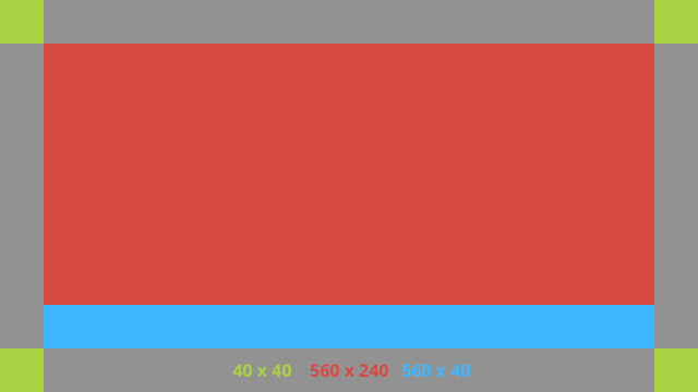
XML レイアウトの例を次に示します。
<?xml version="1.0" encoding="utf-8"?>
<androidx.constraintlayout.widget.ConstraintLayout
    xmlns:android="http://schemas.android.com/apk/res/android"
    xmlns:app="http://schemas.android.com/apk/res-auto"
    android:id="@+id/layout"
    android:layout_width="match_parent"
    android:layout_height="match_parent">

  <FrameLayout
      android:id="@+id/body_layout"
      android:layout_width="0dp"
      android:layout_height="0dp"
      android:layout_margin="@dimen/glass_card_margin"
      app:layout_constraintBottom_toTopOf="@id/footer"
      app:layout_constraintEnd_toEndOf="parent"
      app:layout_constraintStart_toStartOf="parent"
      app:layout_constraintTop_toTopOf="parent">

    <!-- Put your widgets inside this FrameLayout. -->

  </FrameLayout>

  <!-- The footer view will grow to fit as much content as possible while the
         timestamp view keeps its width. If the footer text is too long, it
         will be ellipsized with a 40dp margin between it and the timestamp. -->

  <TextView
      android:id="@+id/footer"
      android:layout_width="0dp"
      android:layout_height="wrap_content"
      android:layout_marginStart="@dimen/glass_card_margin"
      android:layout_marginEnd="@dimen/glass_card_margin"
      android:layout_marginBottom="@dimen/glass_card_margin"
      android:ellipsize="end"
      android:singleLine="true"
      android:textAppearance="?android:attr/textAppearanceSmall"
      app:layout_constraintBottom_toBottomOf="parent"
      app:layout_constraintEnd_toStartOf="@id/timestamp"
      app:layout_constraintStart_toStartOf="parent" />

  <TextView
      android:id="@+id/timestamp"
      android:layout_width="0dp"
      android:layout_height="wrap_content"
      android:layout_marginEnd="@dimen/glass_card_margin"
      android:layout_marginBottom="@dimen/glass_card_margin"
      android:ellipsize="end"
      android:singleLine="true"
      android:textAlignment="viewEnd"
      android:textAppearance="?android:attr/textAppearanceSmall"
      app:layout_constraintBottom_toBottomOf="parent"
      app:layout_constraintEnd_toEndOf="parent" />

</androidx.constraintlayout.widget.ConstraintLayout>
左側の列のレイアウト
このレイアウトでは、2 つの
FrameLayout クラスの形式で、幅 3 分の 1 の左側の列と幅 3 分の 2 の右側の列を定義します。ビューをこれらのクラスに配置できます。次の図を参照してください。
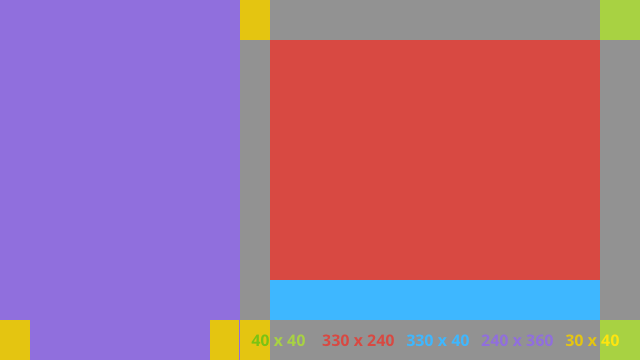
XML レイアウトの例を次に示します。
<?xml version="1.0" encoding="utf-8"?>
<androidx.constraintlayout.widget.ConstraintLayout
    xmlns:android="http://schemas.android.com/apk/res/android"
    xmlns:app="http://schemas.android.com/apk/res-auto"
    android:layout_width="match_parent"
    android:layout_height="match_parent">

  <FrameLayout
      android:id="@+id/left_column"
      android:layout_width="0dp"
      android:layout_height="match_parent"
      android:background="#303030"
      app:layout_constraintBottom_toBottomOf="parent"
      app:layout_constraintStart_toStartOf="parent"
      app:layout_constraintTop_toTopOf="parent"
      app:layout_constraintWidth_percent=".333">

    <!-- Put widgets for the left column inside this FrameLayout. -->

  </FrameLayout>

  <FrameLayout
      android:id="@+id/right_column"
      android:layout_width="0dp"
      android:layout_height="0dp"
      android:layout_marginTop="@dimen/glass_card_two_column_margin"
      android:layout_marginStart="@dimen/glass_card_two_column_margin"
      android:layout_marginBottom="@dimen/glass_card_two_column_margin"
      android:layout_marginEnd="@dimen/glass_card_margin"
      app:layout_constraintBottom_toTopOf="@id/footer"
      app:layout_constraintEnd_toEndOf="parent"
      app:layout_constraintStart_toEndOf="@id/left_column"
      app:layout_constraintTop_toTopOf="parent">

    <!-- Put widgets for the right column inside this FrameLayout. -->

  </FrameLayout>

  <!-- The footer view will grow to fit as much content as possible while the
         timestamp view keeps its width. If the footer text is too long, it
         will be ellipsized with a 40dp margin between it and the timestamp. -->

  <TextView
      android:id="@+id/footer"
      android:layout_width="0dp"
      android:layout_height="wrap_content"
      android:layout_marginStart="@dimen/glass_card_margin"
      android:layout_marginEnd="@dimen/glass_card_margin"
      android:layout_marginBottom="@dimen/glass_card_margin"
      android:ellipsize="end"
      android:singleLine="true"
      android:textAppearance="?android:attr/textAppearanceSmall"
      app:layout_constraintBottom_toBottomOf="parent"
      app:layout_constraintEnd_toStartOf="@id/timestamp"
      app:layout_constraintStart_toEndOf="@id/left_column" />

  <TextView
      android:id="@+id/timestamp"
      android:layout_width="0dp"
      android:layout_height="wrap_content"
      android:layout_marginEnd="@dimen/glass_card_margin"
      android:layout_marginBottom="@dimen/glass_card_margin"
      android:ellipsize="end"
      android:singleLine="true"
      android:textAlignment="viewEnd"
      android:textAppearance="?android:attr/textAppearanceSmall"
      app:layout_constraintBottom_toBottomOf="parent"
      app:layout_constraintEnd_toEndOf="parent" />

</androidx.constraintlayout.widget.ConstraintLayout>
標準ディメンション
以下のレイアウトを、前のレイアウトまたは独自のレイアウトと組み合わせて使用し、Glass の標準スタイルに準拠したファイルを作成します。このファイルは、Android プロジェクトで res/values/dimens.xml として作成します。
<?xml version="1.0" encoding="utf-8"?>
<resources>

  <!-- The recommended margin for the top, left, and right edges of a card. -->
  <dimen name="glass_card_margin">40dp</dimen>

  <!-- The recommended margin between the bottom of the card and the footer. -->
  <dimen name="glass_card_footer_margin">50dp</dimen>

  <!-- The recommended margin for the left column of the two-column card. -->
  <dimen name="glass_card_two_column_margin">30dp</dimen>

</resources>
メニュー
メニューの作成には
RecyclerView を使用することをおすすめします。これらは、Android Studio プロジェクト リソースの標準の Android メニュー ファイルに基づく必要があります。Android では、標準のメニュー作成をオーバーライドして、独自の実装に置き換えることができます。方法は次のとおりです。
-
RecyclerViewでレイアウトを作成し、Activityのビューとして設定します。 -
RecyclerViewとそのアダプターを設定して、新しく作成したメニュー項目のコレクションを使用します。 -
onCreateOptionsMenuメソッドをオーバーライドします。- メニューを拡張し、各メニュー項目のコレクションに新しい要素を追加します。
- アダプタで
notifyDataSetChangedメソッドを呼び出します。
Kotlin
    override fun onCreateOptionsMenu(menu: Menu): Boolean {
        val menuResource = intent
            .getIntExtra(EXTRA_MENU_KEY, EXTRA_MENU_ITEM_DEFAULT_VALUE)
        if (menuResource != EXTRA_MENU_ITEM_DEFAULT_VALUE) {
            menuInflater.inflate(menuResource, menu)
            for (i in 0 until menu.size()) {
                val menuItem = menu.getItem(i)
                menuItems.add(
                    GlassMenuItem(
                        menuItem.itemId, menuItem.icon,
                        menuItem.title.toString()
                    )
                )
                adapter.notifyDataSetChanged()
            }
        }
        return super.onCreateOptionsMenu(menu)
    }
Java
    @Override
    public boolean onCreateOptionsMenu(Menu menu) {
      final int menuResource = getIntent()
          .getIntExtra(EXTRA_MENU_KEY, EXTRA_MENU_ITEM_DEFAULT_VALUE);
      if (menuResource != EXTRA_MENU_ITEM_DEFAULT_VALUE) {
        final MenuInflater inflater = getMenuInflater();
        inflater.inflate(menuResource, menu);

        for (int i = 0; i < menu.size(); i++) {
          final MenuItem menuItem = menu.getItem(i);
          menuItems.add(
              new GlassMenuItem(menuItem.getItemId(), menuItem.getIcon(),
                  menuItem.getTitle().toString()));
          adapter.notifyDataSetChanged();
        }
      }
      return super.onCreateOptionsMenu(menu);
    }
-
OnScrollListenerとLayoutManager、SnapHelperを組み合わせて、どのオプションが選択されたかを判断します。 TAPジェスチャーをリッスンして、メニュー アイテム選択イベントを処理します。- 選択したメニュー項目に関する情報を含む
Intentを作成します。 - このアクティビティの結果を設定して終了します。
- メニューを表示するフラグメントまたはアクティビティから
startActivityForResultを呼び出します。この目的にはTAPジェスチャーを使用します。 - 呼び出し元のフラグメントまたはアクティビティで
onActivityResultをオーバーライドして、選択されたメニュー項目を処理します。
ガイドライン
メニュー レイアウトの設定に関する提案は次のとおりです。
- テキストサイズ:
64sp - 背景色:
#96000000 - サイズ
64dpx64dpのマテリアル アイコンを使用します。 -
windowIsTranslucentテーマフラグをtrueに設定
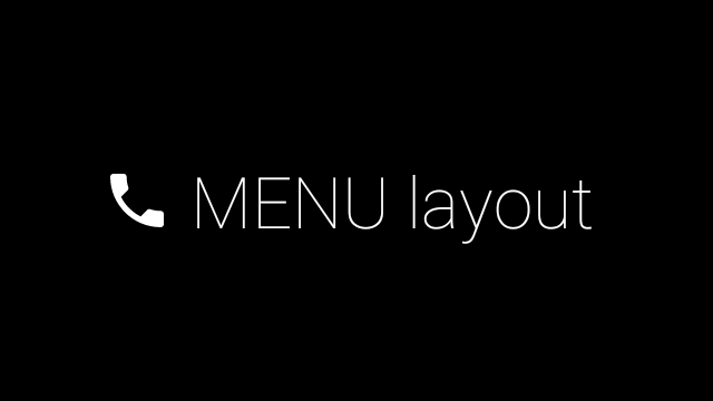
次の画像は、カスタマイズされたメニュー レイアウトの例です。
実装の詳細については、カードのサンプルアプリをご覧ください。
スワイプ可能なページ
Glass のディスプレイとタッチパッドは連携して、スワイプ可能なカードを便利な方法で表示します。標準の Android
ViewPager API を使用して、アクティビティでスワイプ可能なページを構築できます。
Android の
ViewPager を使用してカードや画面をスクロールする方法について詳しくは、画面スライドのトレーニング ドキュメントをご覧ください。