绘制优化可视化图表
使用集合让一切井井有条
根据您的偏好保存内容并对其进行分类。
本页面介绍了如何自定义优化可视化图表。优化器输出的 OptimizationResults 数据对象也包含用于直观呈现数据的绘制方法。
优化后支出的变化
您可以查看显示各渠道的优化后支出变化的可视化图表,将当前预算与优化后的支出进行比较,从而获得针对每个渠道的更精细的数据分析。
运行以下命令可绘制各渠道的优化后支出变化图表:
optimization_results.plot_spend_delta()
输出示例:

优化后的增量收入或 KPI
您可以对比历史数据和优化后的数据,了解增量收入或 KPI 的变化。此可视化图表以当前的增量收入或 KPI 为起点,显示每个渠道在达到优化后的增量收入或 KPI 时的变化。
运行以下命令可绘制优化后的增量收入或 KPI 图表:
optimization_results.plot_incremental_outcome_delta()
输出示例:

优化后的预算分配
您可以直观呈现各渠道的预算分配优化,以便获得有关如何分配预算的总体建议。
运行以下命令可查看各渠道优化后的预算分配:
optimization_results.plot_budget_allocation()
输出示例:

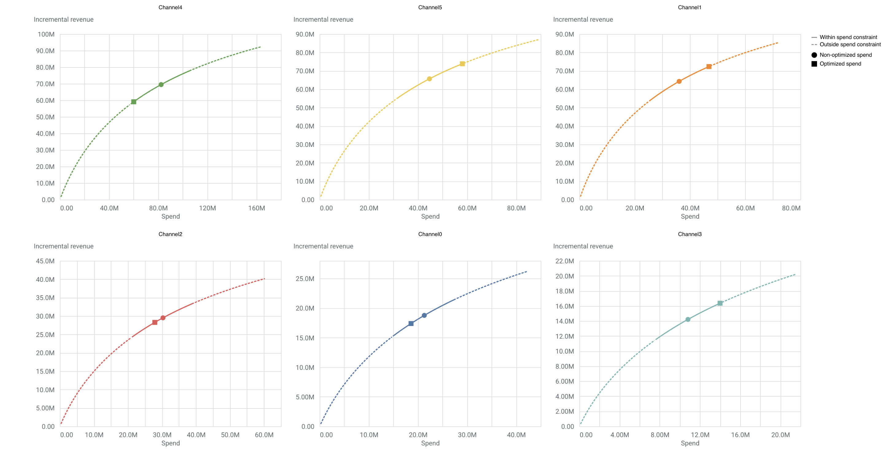
基于响应曲线的优化预算
响应曲线会显示增加预算后可能获得的收入。实线表示为优化设置的支出限制范围,图中会指明以下两点:当前支出水平和优化后新的支出水平。
运行以下命令可基于响应曲线绘制优化后的预算:
optimization_results.plot_response_curves()
输出示例:(点击图片可放大。)
如未另行说明,那么本页面中的内容已根据知识共享署名 4.0 许可获得了许可,并且代码示例已根据 Apache 2.0 许可获得了许可。有关详情,请参阅 Google 开发者网站政策。Java 是 Oracle 和/或其关联公司的注册商标。
最后更新时间 (UTC):2026-05-25。
[null,null,["最后更新时间 (UTC):2026-05-25。"],[],["The `OptimizationResults` object provides plotting methods for visualizing optimization data. Key actions include using `plot_spend_delta()` to compare current vs. optimized spend per channel, `plot_incremental_impact_delta()` to visualize changes in incremental revenue/KPI, and `plot_budget_allocation()` to see the optimized budget distribution across channels. `plot_response_curves()` visualizes potential revenue changes with budget increases, highlighting current and optimized spend levels within set constraints. Each function generates a visualization output.\n"]]