本文档介绍了如何遵循 Glass 风格 并在使用 GDK 时实施常见的界面最佳做法。
玻璃主题
Glass 会对您的 Glassware 应用标准主题 与界面的其余部分保持一致通过 主题具有以下特征:
- 使用 Roboto 字体
- 全屏显示活动,无状态栏或操作栏
- 应用纯黑色背景
如要应用 Glass 主题,请勿在 Android 清单中声明主题。
如果您为 Glassware 的部件设置了自定义样式
而想将其他所有内容都使用默认的 Glass 主题
从具有 parent 属性的 Theme.DeviceDefault 继承:
<resources>
    <style name="CustomTheme" parent="@android:style/Theme.DeviceDefault">
        <!-- Theme customization goes here. -->
    </style>
</resources>
请参阅 Android 开发者指南, 样式和主题 。
玻璃风格的卡片
CardBuilder
类会根据一组属性创建格式正确的卡片。使用布局
提供方:CardBuilder.Layout
以使您的内容在外观和风格上与 Google 上的其他内容类似
玻璃。
如需使用 CardBuilder,请执行以下操作:
- 创建一个
CardBuilder实例,从CardBuilder.Layout。 - 设置卡片的属性,例如文本、脚注和时间戳。
- 调用
CardBuilder.getView()将卡转换为 Android 卡View或CardBuilder.getRemoteViews()将其转换为RemoteViews对象。 - 在您的 activity、布局或
ViewCardScrollView,或使用LiveCard中的RemoteViews。
常见界面功能
CardBuilder 提供的许多布局都支持通用界面
如下所述。请参阅
CardBuilder.Layout
了解每种卡片支持的功能列表。
提供方图标
提供方图标是一个可选的 36 × 36 像素图标,显示在
卡片的右下角和时间戳的右侧。设置此项
调用图标
CardBuilder.setAttributionIcon()
识别您的应用,尤其是在实时卡片上,以便用户快速
并查看该卡片上信息的来源
堆栈指示器
堆栈指示器,由
CardBuilder.showStackIndicator()、
是指出现在卡片右上角的角折。用作
一个直观的指示符,表示您的卡片代表
用户可以直接点按进入
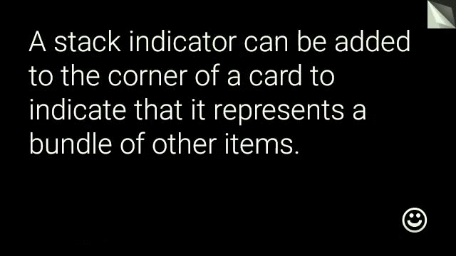
View view = new CardBuilder(context, CardBuilder.Layout.TEXT)
    .setText("A stack indicator can be added to the corner of a card...")
    .setAttributionIcon(R.drawable.ic_smile)
    .showStackIndicator(true)
    .getView();
布局
以下示例显示了使用
CardBuilder。
TEXT和TEXT_FIXED
CardBuilder.Layout.TEXT
显示全宽文本,
背景是拼接图文本会动态调整大小,以最好地适应
可用空间。
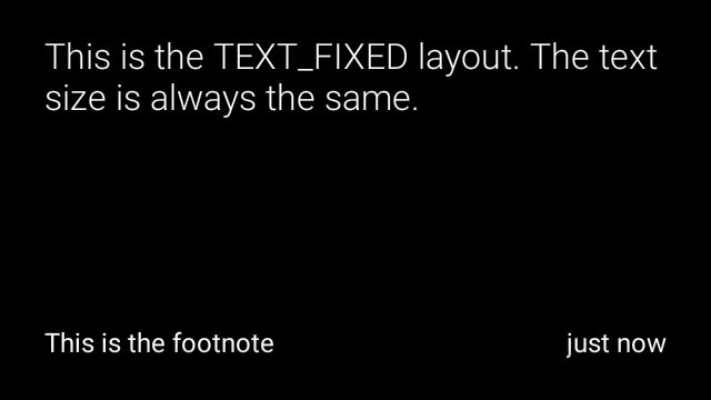
CardBuilder.Layout.TEXT_FIXED
类似,但会将其文字调整为较小的字号。
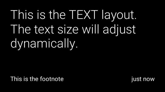
View view1 = new CardBuilder(context, CardBuilder.Layout.TEXT)
.setText("This is the TEXT layout. The text size will adjust dynamically.")
.setFootnote("This is the footnote")
.setTimestamp("just now")
.getView();
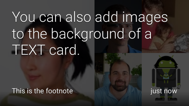
View view2 = new CardBuilder(context, CardBuilder.Layout.TEXT)
.setText("You can also add images to the background of a TEXT card.")
.setFootnote("This is the footnote")
.setTimestamp("just now")
.addImage(R.drawable.image1)
.addImage(R.drawable.image2)
.addImage(R.drawable.image3)
.addImage(R.drawable.image4)
.addImage(R.drawable.image5)
.getView();
View view3 = new CardBuilder(context, CardBuilder.Layout.TEXT_FIXED)
.setText("This is the TEXT_FIXED layout. The text size is always the same.")
.setFootnote("This is the footnote")
.setTimestamp("just now")
.getView();
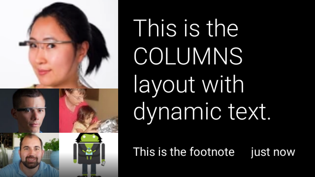
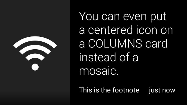
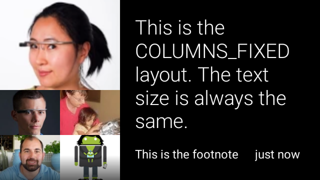
COLUMNS和COLUMNS_FIXED
通过
CardBuilder.Layout.COLUMNS
上会显示拼接图或图标
在卡片左侧显示文字,在右侧显示文字。文本大小会动态变化
尽量填满可用空间要保持文字大小固定,请使用
CardBuilder.Layout.COLUMNS_FIXED。
View view1 = new CardBuilder(context, CardBuilder.Layout.COLUMNS)
    .setText("This is the COLUMNS layout with dynamic text.")
    .setFootnote("This is the footnote")
    .setTimestamp("just now")
    .addImage(R.drawable.image1)
    .addImage(R.drawable.image2)
    .addImage(R.drawable.image3)
    .addImage(R.drawable.image4)
    .addImage(R.drawable.image5)
    .getView();
View view2 = new CardBuilder(context, CardBuilder.Layout.COLUMNS)
    .setText("You can even put a centered icon on a COLUMNS card instead of a mosaic.")
    .setFootnote("This is the footnote")
    .setTimestamp("just now")
    .setIcon(R.drawable.ic_wifi)
    .getView();
View view3 = new CardBuilder(context, CardBuilder.Layout.COLUMNS_FIXED)
    .setText("This is the COLUMNS_FIXED layout. The text size is always the same.")
    .setFootnote("This is the footnote")
    .setTimestamp("just now")
    .addImage(R.drawable.image1)
    .addImage(R.drawable.image2)
    .addImage(R.drawable.image3)
    .addImage(R.drawable.image4)
    .addImage(R.drawable.image5)
    .getView();
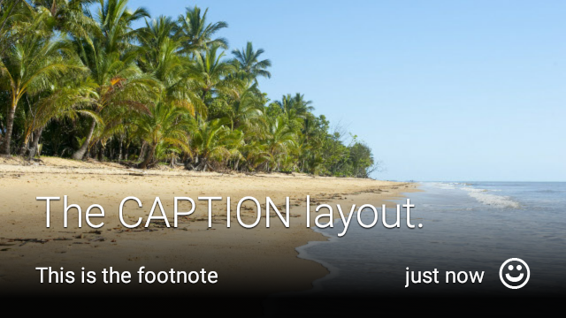
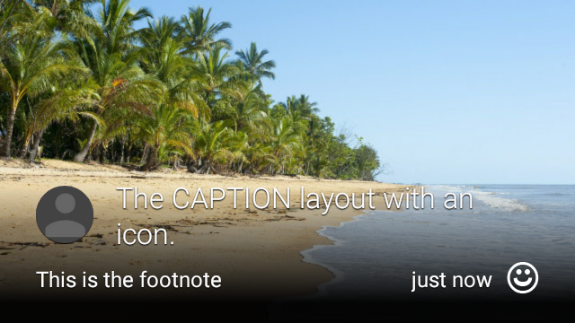
CAPTION
通过
CardBuilder.Layout.CAPTION
布局背景为拼接图
并将简短的图片说明文字对齐卡片底部。图标还可以
放置在图片说明旁边,例如代表某个人的身份
与卡片内容相关联
View view1 = new CardBuilder(context, CardBuilder.Layout.CAPTION)
    .setText("The caption layout.")
    .setFootnote("This is the footnote")
    .setTimestamp("just now")
    .addImage(R.drawable.beach)
    .setAttributionIcon(R.drawable.ic_smile)
    .getView();

View view2 = new CardBuilder(context, CardBuilder.Layout.CAPTION)
    .setText("The caption layout with an icon.")
    .setFootnote("This is the footnote")
    .setTimestamp("just now")
    .addImage(R.drawable.beach)
    .setIcon(R.drawable.ic_avatar)
    .setAttributionIcon(R.drawable.ic_smile)
    .getView();
TITLE
通过
CardBuilder.Layout.TITLE
布局背景为拼接图
标题居中显示,卡片底部显示可选的图标此版式
通常用于表示联系人或共享目标。脚注和时间戳为
不支持此版式。

View view = new CardBuilder(context, CardBuilder.Layout.TITLE)
    .setText("TITLE Card")
    .setIcon(R.drawable.ic_phone)
    .addImage(R.drawable.beach)
    .getView();
AUTHOR
使用
CardBuilder.Layout.AUTHOR
用于显示消息或会话的布局
焦点在作者身上。它支持背景为拼接图
一个用作作者头像的图标,还有一个标题和副标题,您可以
列出身份信息。
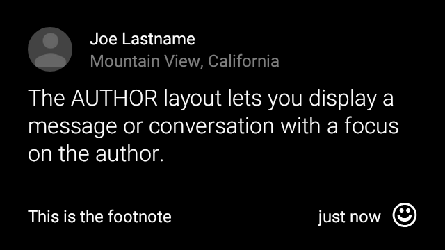
View view = new CardBuilder(context, CardBuilder.Layout.AUTHOR)
    .setText("The AUTHOR layout lets you display a message or conversation "
            + " with a focus on the author.")
    .setIcon(R.drawable.ic_avatar)
    .setHeading("Joe Lastname")
    .setSubheading("Mountain View, California")
    .setFootnote("This is the footnote")
    .setTimestamp("just now")
    .getView();
MENU
通过
CardBuilder.Layout.MENU
布局看起来就像标准的 Glass 菜单它具有
居中的图标和标题,以及可选的脚注。将此布局用于
确认屏幕(用户从“删除”变为“已删除”
选择菜单项)。如果您需要实际菜单,则应使用
标准选项菜单
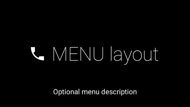
View view = new CardBuilder(context, CardBuilder.Layout.MENU)
    .setText("MENU layout")
    .setIcon(R.drawable.ic_phone)
    .setFootnote("Optional menu description")
    .getView();
EMBED_INSIDE
通过
CardBuilder.Layout.EMBED_INSIDE
布局会将您自己设计的自定义布局 XML 嵌入到标准 Glass
卡片模板。这样,你就可以为自己的应用设计自定义界面
卡片脚注、时间戳、提供方图标以及
堆栈指示器。
通话后
CardBuilder.getView()、
使用
findViewById()
访问嵌入式布局中的视图。同样,如果
致电
CardBuilder.getRemoteViews()、
您可以通过直接传递嵌入式布局的 ID 来操纵其视图,
复制到
RemoteViews
setter 方法。
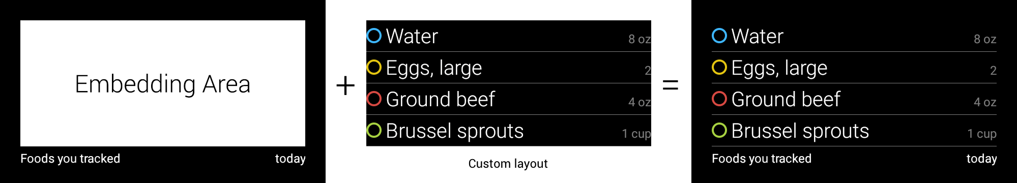
View view = new CardBuilder(context, CardBuilder.Layout.EMBED_INSIDE)
    .setEmbeddedLayout(R.layout.food_table)
    .setFootnote("Foods you tracked")
    .setTimestamp("today")
    .getView();
TextView textView1 = (TextView) view.findViewById(R.id.text_view_1);
textView1.setText("Water");
// ...and so on
如需查看更详细的示例,请参阅 GitHub ApiDemo 项目。
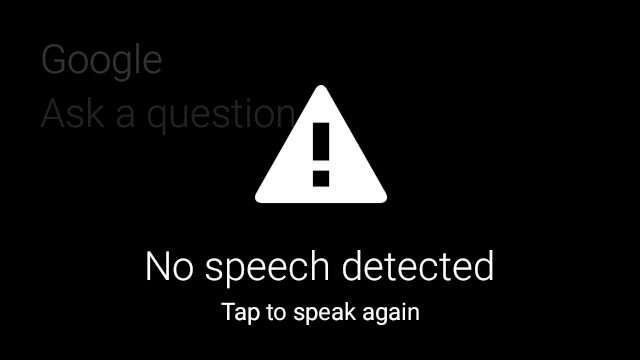
ALERT
通过
CardBuilder.Layout.ALERT
布局包含一个居中的大型图标
主要讯息和脚注在
Dialog至
在 Glassware 中显示重要信息性消息、警告或错误。

以下示例展示了 AlertDialog 的实现并关闭了
在用户点按卡片时打开 Wi-Fi 设置:
- 创建一个扩展
Dialog的类。 - 使用带有
CardBuilder.Layout.ALERT布局的CardBuilder创建卡片,然后使用此卡片设置内容视图。 (可选)创建
GestureDetector来处理此卡片上的用户手势。public class AlertDialog extends Dialog { private final DialogInterface.OnClickListener mOnClickListener; private final AudioManager mAudioManager; private final GestureDetector mGestureDetector; /** * Handles the tap gesture to call the dialog's * onClickListener if one is provided. */ private final GestureDetector.BaseListener mBaseListener = new GestureDetector.BaseListener() { @Override public boolean onGesture(Gesture gesture) { if (gesture == Gesture.TAP) { mAudioManager.playSoundEffect(Sounds.TAP); if (mOnClickListener != null) { // Since Glass dialogs do not have buttons, // the index passed to onClick is always 0. mOnClickListener.onClick(AlertDialog.this, 0); } return true; } return false; } }; public AlertDialog(Context context, int iconResId, int textResId, int footnoteResId, DialogInterface.OnClickListener onClickListener) { super(context); mOnClickListener = onClickListener; mAudioManager = (AudioManager) context.getSystemService(Context.AUDIO_SERVICE); mGestureDetector = new GestureDetector(context).setBaseListener(mBaseListener); setContentView(new CardBuilder(context, CardBuilder.Layout.ALERT) .setIcon(iconResId) .setText(textResId) .setFootnote(footnoteResId) .getView()); } /** Overridden to let the gesture detector handle a possible tap event. */ @Override public boolean onGenericMotionEvent(MotionEvent event) { return mGestureDetector.onMotionEvent(event) || super.onGenericMotionEvent(event); } }(可选)在您的 activity 中,实现一个
OnClickListener来处理用户点按的任何其他流程。如需详细了解 启动 Wi-Fi 等设置 activity,请参阅 启动设置。调用
AlertDialog构造函数以显示提醒卡片。public class MyActivity extends Activity { ... private final DialogInterface.OnClickListener mOnClickListener = new DialogInterface.OnClickListener() { @Override public void onClick(DialogInterface dialog, int button) { // Open WiFi Settings startActivity(new Intent(Settings.ACTION_WIFI_SETTINGS)); } }; @Override protected void onCreate(Bundle bundle) { ... new AlertDialog(context, R.drawable.ic_cloud_sad_150, R.string.alert_text, R.string.alert_footnote_text, mOnClickListener).show(); ... } }
XML 布局
如果 CardBuilder 类 无法满足您的需求
主布局
此布局定义了卡片的标准内边距和页脚。添加你自己的
视图(位于空 RelativeLayout 中)。
<?xml version="1.0" encoding="utf-8"?>
<FrameLayout xmlns:android="http://schemas.android.com/apk/res/android"
    xmlns:tools="http://schemas.android.com/tools"
    android:id="@+id/layout"
    android:layout_width="match_parent"
    android:layout_height="match_parent"
    >

    <RelativeLayout
        android:id="@+id/body_layout"
        android:layout_width="match_parent"
        android:layout_height="@dimen/glass_card_body_height"
        android:layout_marginLeft="@dimen/glass_card_margin"
        android:layout_marginTop="@dimen/glass_card_margin"
        android:layout_marginRight="@dimen/glass_card_margin"
        tools:ignore="UselessLeaf"
        >

        <!-- Put your widgets inside this RelativeLayout. -->

    </RelativeLayout>

    <LinearLayout
        android:id="@+id/footer_container"
        android:layout_width="match_parent"
        android:layout_height="wrap_content"
        android:layout_gravity="bottom|left"
        android:layout_marginLeft="@dimen/glass_card_margin"
        android:layout_marginBottom="@dimen/glass_card_footer_margin"
        android:layout_marginRight="@dimen/glass_card_margin"
        android:orientation="horizontal"
        >

        <!-- The footer view will grow to fit as much content as possible while the
             timestamp view keeps a fixed width. If the footer text is too long, it
             will be ellipsized with a 40px margin between it and the timestamp. -->

        <TextView
            android:id="@+id/footer"
            android:layout_width="0dip"
            android:layout_height="wrap_content"
            android:layout_weight="1"
            android:ellipsize="end"
            android:singleLine="true"
            android:textAppearance="?android:attr/textAppearanceSmall"
            />

        <TextView
            android:id="@+id/timestamp"
            android:layout_width="wrap_content"
            android:layout_height="wrap_content"
            android:layout_marginLeft="@dimen/glass_card_margin"
            android:ellipsize="end"
            android:singleLine="true"
            android:textAppearance="?android:attr/textAppearanceSmall"
            />

    </LinearLayout>

</FrameLayout>
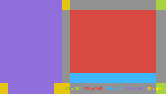
左列布局
这会以两个 RelativeLayout 的形式定义一个左列和 400 像素的右列
您可以把自己的视图放入其中
<?xml version="1.0" encoding="utf-8"?>
<RelativeLayout xmlns:android="http://schemas.android.com/apk/res/android"
    xmlns:tools="http://schemas.android.com/tools"
    android:layout_width="match_parent"
    android:layout_height="match_parent"
    >

    <RelativeLayout
        android:id="@+id/left_column"
        android:layout_width="@dimen/glass_card_left_column_width"
        android:layout_height="match_parent"
        >

        <!-- Put widgets for the left column inside this RelativeLayout. -->

    </RelativeLayout>

    <RelativeLayout
        android:layout_width="wrap_content"
        android:layout_height="@dimen/glass_card_body_height"
        android:layout_alignParentRight="true"
        android:layout_alignParentTop="true"
        android:layout_marginLeft="@dimen/glass_card_two_column_margin"
        android:layout_marginRight="@dimen/glass_card_margin"
        android:layout_marginTop="@dimen/glass_card_margin"
        android:layout_toRightOf="@+id/left_column"
        tools:ignore="UselessLeaf"
        >

        <!-- Put widgets for the right column inside this RelativeLayout. -->

    </RelativeLayout>

    <LinearLayout
        android:id="@+id/footer_container"
        android:layout_width="wrap_content"
        android:layout_height="wrap_content"
        android:layout_alignParentBottom="true"
        android:layout_alignParentRight="true"
        android:layout_gravity="bottom|left"
        android:layout_marginBottom="@dimen/glass_card_footer_margin"
        android:layout_marginLeft="@dimen/glass_card_two_column_margin"
        android:layout_marginRight="@dimen/glass_card_margin"
        android:layout_toRightOf="@+id/left_column"
        android:orientation="horizontal"
        >

        <!--
             The footer view will grow to fit as much content as possible while the
             timestamp view keeps a fixed width. If the footer text is too long, it
             will be ellipsized with a 40px margin between it and the timestamp.
        -->

        <TextView
            android:id="@+id/footer"
            android:layout_width="0dip"
            android:layout_height="wrap_content"
            android:layout_weight="1"
            android:ellipsize="end"
            android:singleLine="true"
            android:textAppearance="?android:attr/textAppearanceSmall"
            />

        <TextView
            android:id="@+id/timestamp"
            android:layout_width="wrap_content"
            android:layout_height="wrap_content"
            android:layout_marginLeft="@dimen/glass_card_margin"
            android:ellipsize="end"
            android:singleLine="true"
            android:textAppearance="?android:attr/textAppearanceSmall"
            />

    </LinearLayout>

</RelativeLayout>
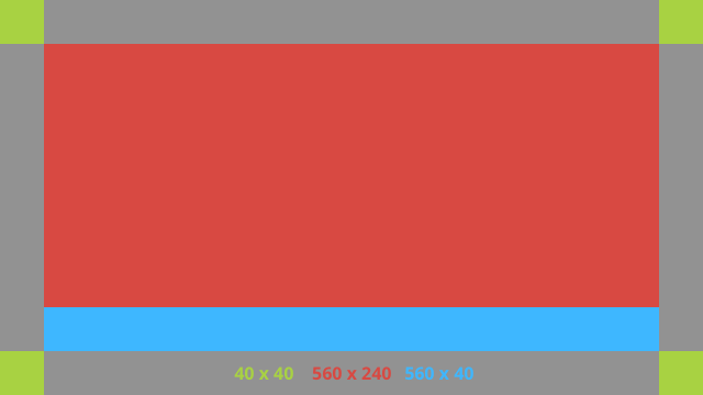
标准尺寸
请将此文件与之前的布局或您自己的布局结合使用,
以遵循标准的 Glass 风格将此文件创建为
在您的 Android 项目中使用 res/values/dimens.xml。
<?xml version="1.0" encoding="utf-8"?>

<resources>

    <!-- The recommended margin for the top, left, and right edges of a card. -->
    <dimen name="glass_card_margin">40px</dimen>

    <!-- The recommended margin between the bottom of the card and the footer. This is
         an adjusted value so that the baseline of the text in the footer sits 40px
         from the bottom of the card, matching the other margins. -->
    <dimen name="glass_card_footer_margin">33px</dimen>

    <!-- The recommended margin for the left column of the two-column card. -->
    <dimen name="glass_card_two_column_margin">30px</dimen>

    <!-- The maximum height of the body content inside a card. -->
    <dimen name="glass_card_body_height">240px</dimen>

    <!-- The width of the left column in the two-column layout. -->
    <dimen name="glass_card_left_column_width">240px</dimen>

</resources>