使用集合让一切井井有条
根据您的偏好保存内容并对其进行分类。
利用 Search Console 气泡图改进搜索引擎优化 (SEO) 效果
分析搜索效果数据始终是一项挑战,存在可视化和理解难度更大的大量长尾查询时,更是如此。气泡图可以帮助您了解,对于您的网站来说,哪些查询的效果比较好,哪些查询的效果有待改进。
如果您想要测试这里讨论的方法,可以将数据关联到 Looker Studio,然后调整图表设置。
如果您尚未阅读将 Search Console 关联到 Looker Studio 和使用 Looker Studio 实现 Google 搜索流量监控,不妨阅读这些内容,以便深入了解在 Looker Studio 中可以利用 Search Console 做些什么。
解读图表
存在多个指标和维度时,气泡图是一种较直观的可视化图表,因为它可以让您更高效地发现数据中的关系和模式。在此处显示的示例中,您可以在一个视图中查看相应查询和设备维度的点击率 (CTR)、平均排名以及点击次数。
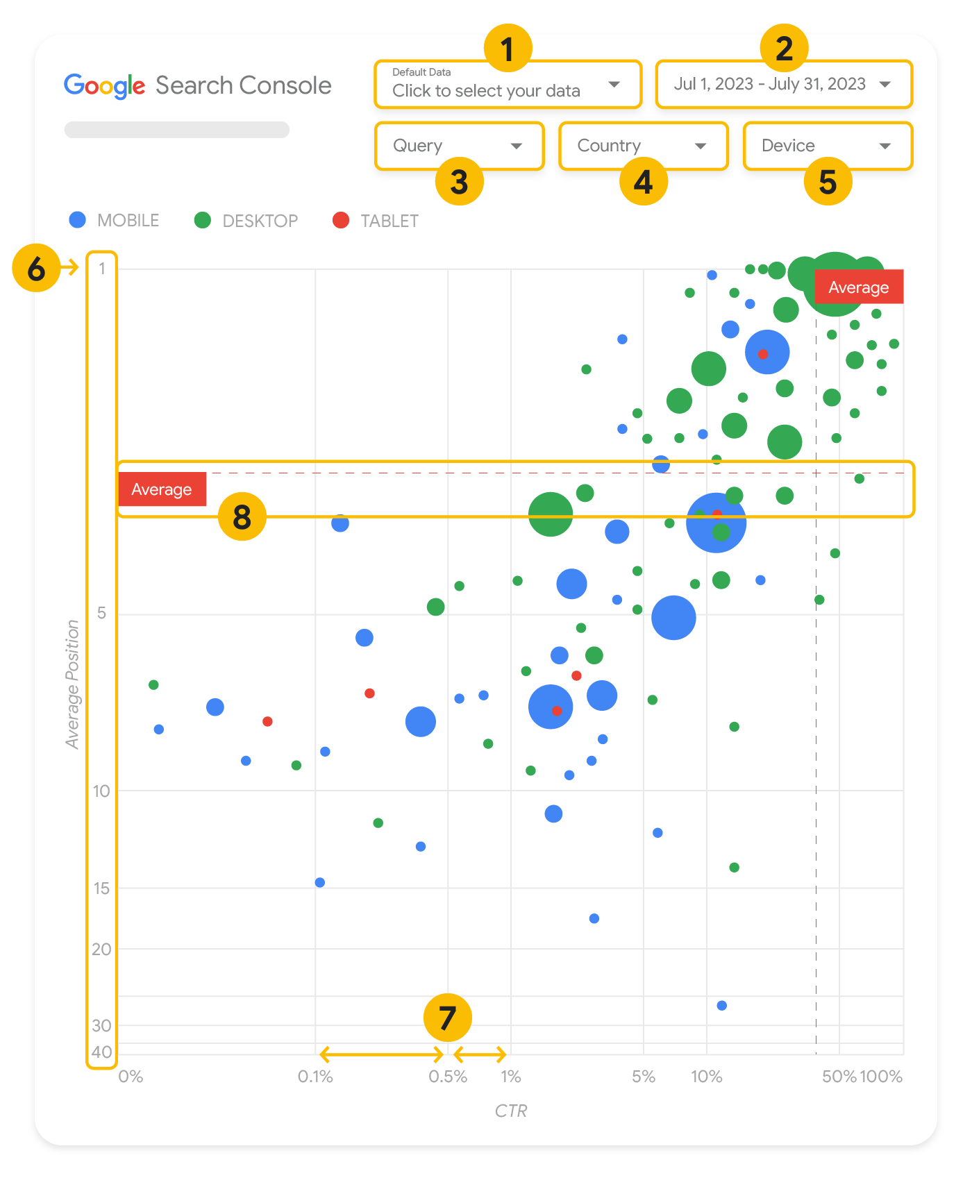
本部分详细介绍了部分图表元素,以阐明图表显示哪些内容,以及不显示哪些内容。
数据源
此页中显示的气泡图使用的是通过 Search Console 数据源获得的网站展示次数表,其中包括按网站和查询汇总的搜索效果数据。
过滤条件和数据控制
为帮助您有效控制数据,图表中提供了五个自定义选项:
- 数据控制:选择要分析的 Search Console 资源。
- 日期范围:选择您要在报告中查看的日期范围;默认情况下,您会看到过去 28 天的数据。
- 查询:包含或排除要重点关注的查询。您可以过滤数据,方法与在 Search Console 中过滤数据类似。
- 国家/地区:包含或排除国家/地区。
- 设备:包含或排除设备类别。
坐标轴
图表中的坐标轴是平均排名(y 轴)和网站点击率(x 轴)。坐标轴中存在 3 项重要转换:
- 逆转 y 轴方向:由于 y 轴显示平均排名,逆转该轴意味着 1 位于顶部。对于大多数图表而言,最佳位置是右上角,因此使用 y 轴显示平均排名时,逆转其方向会更符合直觉。
- 对数刻度:对两个轴都使用对数刻度时,您可以更好地了解图表中存在极端情况的查询(点击率非常低、平均排名非常低或两者都非常低)。
- 参考行:参考行非常有助于突出显示高于或低于特定阈值的值。查看平均值、中位数或特定百分位数可以让您注意到偏离特定模式的情况。
气泡
图表中的每个气泡都表示单个查询,并具有以下样式属性:
- 大小:用气泡大小代表点击次数,有助于您一目了然地看出哪些查询带来了大部分流量:气泡越大,查询产生的流量越多。
- 颜色:用气泡颜色代表不同设备类别,有助于您了解网站在移动设备上与桌面设备上的 Google 搜索表现的差异。您可以使用颜色区分各维度,但随着值数量的增加,识别模式的难度会随之增大。
分析数据
这种可视化方式的目标是帮助发现查询优化机会。该图表显示了查询效果,其中 y 轴表示平均排名,x 轴表示点击率,气泡大小表示总点击次数,气泡颜色表示设备类别。
红色“平均值”参考虚线显示了每个轴的平均值,这两条虚线将图表分为四个象限,以显示四种类型的查询效果。您的象限划分情况可能与这篇博文中显示的有所不同;具体取决于您的网站查询的分布情况。
该图表显示了四组查询,您可以对其进行分析,以确定优化您的 Google 搜索效果时要在哪些方面投入时间。
- 高排名,高点击率:您无需针对这些查询采取任何行动;现在的效果很理想。
- 低排名,高点击率:此类查询似乎与用户相关;即使这些查询的排名低于您网站的平均查询排名,也会获得较高的点击率。如果查询的平均排名上升,可能会对效果产生显著影响,请重点改进这些查询的搜索引擎优化 (SEO) 效果。例如,某园艺网站第 2 象限中的热门查询可能是“how to build a wooden shed”(如何制作木棚)。请检查您是否已有与此相关的网页,并通过以下两种方式继续操作:
- 如果您没有相关网页,不妨考虑创建一个,以便将您的网站上与该主题相关的所有信息集中到一处。
- 如果您有相关网页,不妨考虑添加此类内容,以便更好地满足用户需求。
- 低排名,低点击率:查看点击率较低的查询(无论排名高低)时,非常有趣的是,查看气泡大小,了解哪些查询虽然点击率较低,但仍带来了大量流量。尽管此象限中的查询可能看似不值得您投入精力进行优化,但它们可以分为两大类:
- 相关查询:如果相应查询对您来说非常重要,确保它已经显示在 Google 搜索中是个很好的开始。请优先优化这些查询而非完全不会出现在搜索结果中的查询,因为这类查询更容易优化。
- 不相关查询:如果您的网站未涵盖与这类查询相关的内容,不妨优化您的内容或侧重于可带来相关流量的查询。
- 高排名,低点击率:这些查询可能会因各种原因而点击率较低。查看较大的气泡,看看是否存在以下迹象:
- 您的竞争对手可能使用了结构化数据标记,且展示的是富媒体搜索结果,这可能会吸引用户点击竞争对手的结果而非您的结果。请考虑针对 Google 搜索结果中最常见的视觉元素进行优化。
- 您已进行针对性优化或“意外”获得排名,但所针对的查询可能与您的网站相关但用户不感兴趣。如果您没有遇到此类问题,可以忽略这些查询。如果您不希望用户通过这些查询找到您(例如,这些查询包含令人反感的字词),请尝试微调您的内容,并针对这类会带来流量的查询,移除可能被视为其同义词或相关查询的提及内容。
- 用户可能已找到所需信息,如贵公司的营业时间、地址或电话号码。请查看用户使用的查询以及包含相关信息的网址。如果您的网站目标之一是吸引用户光顾您的实体店,那么这如您所期;如果您认为用户应该访问您的网站以获取更多信息,则可以尝试优化标题和说明,明确体现这一点。如需了解详情,请参阅下一部分。
我们没有提及设备类别,因为它们可以作为衡量查询效果的额外指标。例如,假设当用户在街道中导航以查找某个地点时,某些查询的相关性更高;在这种情况下,相应查询在移动设备上的效果可能会非常出色,但在桌面设备上的效果则不佳。
针对特定查询改进搜索引擎优化 (SEO) 效果
当您找到值得投入时间和精力进行优化的查询后,请务必针对这些查询来优化或制作网页。
使用本页中显示的可视化图表找到相应查询后,您可以使用 Search Console 界面为特定查询创建查询过滤条件,或使用 Looker Studio 创建数据透视表;无论是哪种情况,您都可以查看由特定查询带来流量的所有网页。在确定要优化的查询及其相关网址后,请参阅 SEO 入门指南来优化您的内容。以下是一些建议:
- 确保标题元素、描述元标记以及 Alt 属性具有描述性、具体且准确。
- 使用标题元素强调重要文字,为您的内容创建层次结构,便于用户和搜索引擎更轻松地浏览您的文档。
- 想一想用户为了找到您的某些内容而可能搜索的其他字词,例如同义词和相关查询。您可以借助由 Google Ads 提供的关键字规划工具来发现新关键字变体,并了解每个关键字的大概搜索量。您还可以使用 Google 趋势,从与您的网站相关的热门主题和查询中寻找优化灵感。
如未另行说明,那么本页面中的内容已根据知识共享署名 4.0 许可获得了许可,并且代码示例已根据 Apache 2.0 许可获得了许可。有关详情,请参阅 Google 开发者网站政策。Java 是 Oracle 和/或其关联公司的注册商标。
最后更新时间 (UTC):2025-08-04。
[null,null,["最后更新时间 (UTC):2025-08-04。"],[[["\u003cp\u003eVisualize Search Console data with a bubble chart to reveal query optimization opportunities by analyzing click-through rate, average position, and clicks.\u003c/p\u003e\n"],["\u003cp\u003eIdentify high-potential queries by focusing on those with low positions but high click-through rates, indicating relevance and potential for increased traffic with improved ranking.\u003c/p\u003e\n"],["\u003cp\u003eInvestigate queries with low click-through rates and high positions to determine if they are unrelated to your site or require optimization for better user engagement.\u003c/p\u003e\n"],["\u003cp\u003eOptimize content for identified queries by refining titles, meta descriptions, headings, and incorporating relevant keywords to enhance search visibility and user experience.\u003c/p\u003e\n"]]],["A bubble chart visualizes query performance using Search Console data. It displays click-through rate (CTR) on the x-axis, average position on the y-axis, click volume as bubble size, and device category as bubble color. Customization options include data control, date range, query, country, and device filters. Analyzing the quadrants formed by average CTR and position helps identify optimization opportunities. Focus on queries with low position but high CTR, and address top-position, low-CTR queries by improving content or structured data.\n"],null,["# How to Create a Search Console Bubble Chart | Google Search Central\n\nImproving SEO with a Search Console bubble chart\n================================================\n\n\nAnalyzing Search performance data is always a challenge, but even more so when you have plenty of\nlong-tail queries, which are harder to visualize and understand. A\n[bubble chart](https://support.google.com/datastudio/answer/7207785)\ncan help you understand which queries are performing well for your site, and which could be improved.\n\n\nIf you'd like to test the techniques discussed here, you can\n[connect your data to Looker Studio](https://datastudio.google.com/reporting/1e5b5f6a-38d7-4547-a54b-69594681a09b/page/xFbeC/preview) and play with the chart settings. \n\n\nIf you haven't read [connecting Search Console to Looker Studio](/search/blog/2022/03/connecting-data-studio) and\n[monitoring Search traffic with Looker Studio](/search/blog/2022/03/monitoring-dashboard),\nconsider checking them out to understand more about what you can do with Search Console in Looker\nStudio.\n\nUnderstanding the chart\n-----------------------\n\n\nA bubble chart is a great visualization when you have multiple metrics and dimensions because it\nlets you to see relationships and patterns in your\ndata more effectively. In the example shown here, you can see\n[click-through rate](https://support.google.com/webmasters/answer/7576553#choosingmetrics)\n(CTR), average position, and clicks for the query and device dimensions in one view.\n\n\nThis section goes into detail on some of the chart elements to clarify what the chart shows, and what it doesn't.\n\n### Data source\n\n\nThe bubble chart shown in this page uses the Site Impression table available through the\n[Search Console data source](https://support.google.com/datastudio/answer/7314895),\nwhich includes [Search performance data](https://support.google.com/webmasters/answer/7576553)\naggregated by site and queries.\n\n### Filters and data controls\n\n\nThere are five customization options in the chart to help you control your data effectively:\n\n1. **[Data control](https://support.google.com/datastudio/answer/7415591)**: Choose the Search Console property you'd like to analyze.\n2. **Date range**: Choose the date range you'd like to see in the report; by default you'll see the last 28 days.\n3. **Query** : Include or exclude queries to focus on. You can [filter your data](/search/blog/2021/06/regex-negative-match) similar to how you do it in Search Console.\n4. **Country**: Include or exclude countries.\n5. **Device**: Include or exclude device categories.\n\n### Axes\n\n\nThe axes in the chart are average position (y-axis) and site CTR (x-axis). There are three\nsignificant transformations in the axes:\n\n6. **Reverse y-axis direction**: Since the y-axis shows average position, inverting it means that 1 is at the top. For most charts, the best position is in the top right corner, so it is more intuitive to invert the y-axis when using it to display average position.\n7. **Log scale** : Using a [logarithmic scale](https://en.wikipedia.org/wiki/Logarithmic_scale) for both axes lets you to have a better understanding of queries that are in the extremities of the chart (very low CTR, average position, or both).\n8. **[Reference lines](https://support.google.com/datastudio/answer/9921462)**: The reference line is very helpful to highlight values that are above or below a certain threshold. Looking at the average, median, or a certain percentile can call attention to deviations from the pattern.\n\n### Bubbles\n\n\nEach bubble in the chart represents a single query, with the following\n[style properties](https://support.google.com/datastudio/answer/7207785#style-properties):\n\n- **Size**: Using the number of clicks as the bubble size helps you see in a glance which queries are driving the bulk of the traffic---the larger the bubble the more traffic the query generates.\n- **Color**: Using the device category as the bubble color helps you understand the differences between mobile and desktop Search performance. You can use any dimension as the color, but as the number of values increases, the harder it is to recognize patterns.\n\nAnalyzing the data\n------------------\n\n\nThe goal of this visualization is to help surface query optimization opportunities. The chart\nshows query performance, where the y-axis represents average position, the x-axis represents CTR\nthe bubble size represents total number of clicks, and the bubble color represents\ndevice category.\n\n\nThe red Average dashed reference lines show the average for each of the axes, which split the chart\ninto quadrants, showing four types of query performance. Your quadrants are likely to look\ndifferent than the one shared in this post; they'll depend on how your site queries\nare distributed.\n\n\nThe chart shows four groups of queries, which you can analyze to help you decide where to invest\nyour time when optimizing your Google Search performance.\n\n1. **Top position, high CTR**: There's not much you need to do for those; you're doing a great job already.\n2. **Low position, high CTR** : Those queries seem relevant to users; the queries get a high CTR even when ranking lower than the average query on your website. If the query average position moves up, it could have a significant impact on your performance---focus on improving SEO for these queries. For example, a top query in quadrant 2 for a gardening website could be \"how to build a wooden shed.\" Check if you have a page about this already, and proceed in two ways:\n - If you don't have a page, consider creating one to centralize all the info you have in the website about the subject.\n - If you do have a page, consider adding content to better address that user need.\n3. **Low position, low CTR** : When looking at queries with low CTR (both with low and top position), it's especially interesting to look at the bubble sizes to understand which queries have a low CTR but are still driving significant traffic. While the queries in this quadrant might seem unworthy of your effort, they can be divided into two main groups:\n - **Related queries**: If the query in question is important to you, it's a good start to have it appearing in Search already. Prioritize these queries over queries that are not appearing in Search results at all, as they'll be easier to optimize.\n - **Unrelated queries**: If your site doesn't cover content related to this query, maybe it's a good opportunity to fine tune your content or focus on queries that will bring relevant traffic.\n4. **Top position, low CTR** : Those queries might have a low CTR for various reasons. Check the largest bubbles to find signs of the following:\n - Your competitors may have [structured data markup](/search/docs/appearance/search-result-features) and are showing up with rich results, which might attract users to click their results instead of yours. Consider optimizing for the most common [visual elements in Google Search](/search/docs/appearance/visual-elements-gallery).\n - You may have optimized, or be \"accidentally\" ranking, for a query that users are not interested in relation to your site. This might not be an issue for you, in which case you can ignore those queries. If you prefer people not to find you through those queries (for example, they contain offensive words), try to fine-tune your content to remove mentions that could be seen as synonyms or related queries to the one bringing traffic.\n - People may have already found the information they needed, for example your company's opening hours, address, or phone number. Check the queries that were used and the URLs that contained the information. If one of your website goals is to drive people to your stores, this is working as intended; if you believe that people should visit your website for extra information, you could try to optimize your titles and description to make that clear. See next section for more details.\n\n\nWe haven't mentioned the device categories because they can be used as additional signs of query\nperformance. For example, suppose some queries are more relevant when people are navigating in the\nstreet, trying to find a location; in that case, the query might have a high performance\non mobile devices, but a low performance on desktop.\n\nImproving SEO for specific queries\n----------------------------------\n\n\nOnce you find queries that are worth the time and effort, make sure to optimize or create pages\nrelated to those queries.\n\n\nAfter you find the queries using the visualization shown in this page, you can\n[create a query filter](https://support.google.com/webmasters/answer/7576553#filteringdata)\nfor specific queries using the Search Console user interface, or create a\n[pivot table](https://support.google.com/looker-studio/answer/7516660)\nusing Looker Studio; in both ways, you can check all the pages that are receiving\ntraffic for a specific query. After you know the queries you want to optimize and their related\nURLs, use the [SEO starter guide](/search/docs/fundamentals/seo-starter-guide)\nto optimize your content. Here are some tips:\n\n- Ensure that your [title](/search/docs/appearance/title-link#page-titles) elements, [description meta tags](/search/docs/appearance/snippet#meta-descriptions), and alt attributes are descriptive, specific, and accurate.\n- Use heading elements to emphasize important text and help create a hierarchical structure for your content, making it easier for users and search engines to navigate through your document.\n- Think about other words that a user might search for to find a piece of your content, for example, synonyms and related queries. You can use the [Keyword Planner](https://ads.google.com/home/tools/keyword-planner/) provided by Google Ads to help you discover new keyword variations and see the approximate search volume for each keyword. You can also [use Google Trends](/search/docs/monitor-debug/google-trends) to find ideas from rising topics and queries related to your website."]]