
Indice
Action(messaggio)Action.ActionParameter(messaggio)Action.Interaction(enum)Action.LoadIndicator(enum)BorderStyle(messaggio)BorderStyle.BorderType(enum)Button(messaggio)Button.Type(enum)ButtonList(messaggio)Card(messaggio)Card.CardAction(messaggio)Card.CardFixedFooter(messaggio)Card.CardHeader(messaggio)Card.DisplayStyle(enum)Card.DividerStyle(enum)Card.NestedWidget(messaggio)Card.Section(messaggio)Carousel(messaggio)Carousel.CarouselCard(messaggio)Chip(messaggio)ChipList(messaggio)ChipList.Layout(enum)CollapseControl(messaggio)Columns(messaggio)Columns.Column(messaggio)Columns.Column.HorizontalSizeStyle(enum)Columns.Column.VerticalAlignment(enum)Columns.Column.Widgets(messaggio)DataActions(messaggio)DateTimePicker(messaggio)DateTimePicker.DateTimePickerType(enum)DecoratedText(messaggio)DecoratedText.SwitchControl(messaggio)DecoratedText.SwitchControl.ControlType(enum)Divider(messaggio)EndNavigation(messaggio)EndNavigation.Action(enum)GetAutocompletionResponse(messaggio)Grid(messaggio)Grid.GridItem(messaggio)Grid.GridItem.GridItemLayout(enum)Icon(messaggio)Image(messaggio)ImageComponent(messaggio)ImageCropStyle(messaggio)ImageCropStyle.ImageCropType(enum)Link(messaggio)LinkPreview(messaggio)MaterialIcon(messaggio)ModifyCard(messaggio)ModifyCard.UpdateWidget(messaggio)ModifyCard.UpdateWidget.SelectionInputWidgetSuggestions(messaggio)Navigation(messaggio)Notification(messaggio)OnClick(messaggio)OpenLink(messaggio)OpenLink.OnClose(enum)OpenLink.OpenAs(enum)OverflowMenu(messaggio)OverflowMenu.OverflowMenuItem(messaggio)RenderActions(messaggio)RenderActions.Action(messaggio)SelectionInput(messaggio)SelectionInput.PlatformDataSource(messaggio)SelectionInput.PlatformDataSource.CommonDataSource(enum)SelectionInput.SelectionItem(messaggio)SelectionInput.SelectionType(enum)SubmitFormResponse(messaggio)Suggestions(messaggio)Suggestions.SuggestionItem(messaggio)TextInput(messaggio)TextInput.Type(enum)TextParagraph(messaggio)Validation(messaggio)Validation.InputType(enum)Widget(messaggio)Widget.HorizontalAlignment(enum)Widget.ImageType(enum)
Azione
Un'azione che descrive il comportamento quando il modulo viene inviato. Ad esempio, puoi richiamare uno script di Apps Script per gestire il modulo. Se l'azione viene attivata, i valori del modulo vengono inviati al server.

 Disponibile per le app Google Chat e i componenti aggiuntivi di Google Workspace.
| Campi | |
|---|---|
function |
Una funzione personalizzata da richiamare quando si fa clic sull'elemento contenitore o quando viene attivato in altro modo. Per un esempio di utilizzo, consulta Leggere i dati del modulo. |
parameters[] |
Elenco dei parametri di azione. |
loadIndicator |
Specifica l'indicatore di caricamento visualizzato durante l'esecuzione dell'azione. |
persistValues |
Indica se i valori del modulo vengono mantenuti dopo l'azione. Il valore predefinito è Se Se |
interaction |
Facoltativo. Obbligatorio quando si apre una finestra di dialogo. Che cosa fare in risposta a un'interazione con un utente, ad esempio se l'utente fa clic su un pulsante in un messaggio della scheda. Se non specificato, l'app risponde eseguendo un Se specifichi un
|
requiredWidgets[] |
Facoltativo. Compila questo elenco con i nomi dei widget di cui questa azione ha bisogno per un invio valido. Se i widget elencati qui non hanno un valore quando viene invocata questa azione, l'invio del modulo viene interrotto.
|
allWidgetsAreRequired |
Facoltativo. Se il valore è true, tutti i widget sono considerati obbligatori per questa azione.
|
ActionParameter
Elenco di parametri di stringa da fornire quando viene invocato il metodo di azione. Ad esempio, considera tre pulsanti Posticipa: Posticipa ora, Posticipa un giorno o Posticipa la prossima settimana. Puoi utilizzare action method = snooze(), passando il tipo di posticipazione e la relativa ora nell'elenco dei parametri di stringa.
Per scoprire di più, visita la pagina CommonEventObject.
Disponibile per le app Google Chat e i componenti aggiuntivi di Google Workspace.
| Campi | |
|---|---|
key |
Il nome del parametro per lo script dell'azione. |
value |
Il valore del parametro. |
Interazione
Facoltativo. Obbligatorio quando si apre una finestra di dialogo.
Che cosa fare in risposta a un'interazione con un utente, ad esempio se l'utente fa clic su un pulsante in un messaggio della scheda.
Se non specificato, l'app risponde eseguendo un action, ad esempio aprendo un link o eseguendo una funzione, come di consueto.
Se specifichi un interaction, l'app può rispondere in modi interattivi speciali. Ad esempio, impostando interaction su OPEN_DIALOG, l'app può aprire una finestra di dialogo.
Se specificato, non viene visualizzato un indicatore di caricamento. Se specificato per un componente aggiuntivo, l'intera scheda viene rimossa e nel client non viene mostrato nulla.
Disponibile per le app Google Chat e non disponibile per i componenti aggiuntivi di Google Workspace.
| Enum | |
|---|---|
INTERACTION_UNSPECIFIED |
Valore predefinito. action viene eseguito normalmente. |
OPEN_DIALOG |
Apre una finestra di dialogo, un'interfaccia basata su schede con finestra utilizzata dalle app di Chat per interagire con gli utenti. Supportato solo dalle app di Chat in risposta ai clic sui pulsanti dei messaggi della scheda. Se specificato per un componente aggiuntivo, l'intera scheda viene rimossa e nel client non viene mostrato nulla.
|
LoadIndicator
Specifica l'indicatore di caricamento visualizzato durante l'esecuzione dell'azione.
Disponibile per le app Google Chat e i componenti aggiuntivi di Google Workspace.
| Enum | |
|---|---|
SPINNER |
Viene visualizzata un'icona di caricamento per indicare che i contenuti sono in fase di caricamento. |
NONE |
Non viene visualizzato nulla. |
BorderStyle
Le opzioni di stile per il bordo di una scheda o di un widget, inclusi il tipo e il colore del bordo.
Disponibile per le app Google Chat e i componenti aggiuntivi di Google Workspace.
| Campi | |
|---|---|
type |
Il tipo di bordo. |
strokeColor |
I colori da utilizzare quando il tipo è Per impostare il colore del tratto, specifica un valore per i campi Ad esempio, il seguente codice imposta il colore rosso alla sua intensità massima: Il campo |
cornerRadius |
Il raggio d'angolo del bordo. |
BorderType
Rappresenta i tipi di bordi applicati ai widget.
Disponibile per le app Google Chat e i componenti aggiuntivi di Google Workspace.
| Enum | |
|---|---|
BORDER_TYPE_UNSPECIFIED |
Non utilizzare. Non specificato. |
NO_BORDER |
Valore predefinito. Nessun bordo. |
STROKE |
Contorno. |
Pulsante
Un pulsante di testo, un'icona o un pulsante di testo e icona su cui gli utenti possono fare clic. Per un esempio nelle app Google Chat, vedi Aggiungere un pulsante.
Per fare in modo che un'immagine sia un pulsante cliccabile, specifica un ImageImageComponentonClick.
Disponibile per le app Google Chat e i componenti aggiuntivi di Google Workspace.
| Campi | |
|---|---|
text |
Il testo visualizzato all'interno del pulsante. |
icon |
Un'icona visualizzata all'interno del pulsante. Se sono impostati sia |
color |
Facoltativo. Il colore del pulsante. Se impostato, il pulsante Per impostare il colore del pulsante, specifica un valore per i campi Ad esempio, il seguente codice imposta il colore rosso alla sua intensità massima: Il campo |
onClick |
Obbligatorio. L'azione da eseguire quando un utente fa clic sul pulsante, ad esempio l'apertura di un iperlink o l'esecuzione di una funzione personalizzata. |
disabled |
Se |
altText |
Il testo alternativo utilizzato per l'accessibilità. Imposta un testo descrittivo che consenta agli utenti di sapere cosa fa il pulsante. Ad esempio, se un pulsante apre un link ipertestuale, potresti scrivere: "Apre una nuova scheda del browser e si accede alla documentazione per gli sviluppatori di Google Chat all'indirizzo https://developers.google.com/workspace/chat". |
type |
Facoltativo. Il tipo di pulsante. Se non viene impostato, il tipo di pulsante predefinito è |
Tipo
Facoltativo. Il tipo di un pulsante. Se il campo color è impostato, type viene impostato forzatamente su FILLED.
Disponibile per le app Google Chat e non disponibile per i componenti aggiuntivi di Google Workspace.
| Enum | |
|---|---|
TYPE_UNSPECIFIED |
Non utilizzare. Non specificato. |
OUTLINED |
I pulsanti con contorni sono pulsanti di media enfasi. In genere contengono azioni importanti, ma non sono l'azione principale in un'app di Chat o in un componente aggiuntivo. |
FILLED |
Un pulsante con riempimento ha un contenitore con un colore a tinta unita. Ha l'impatto visivo maggiore ed è consigliato per l'azione importante e principale in un'app di chat o in un componente aggiuntivo. |
FILLED_TONAL |
Un pulsante con tonalità riempita è una via di mezzo alternativa tra i pulsanti con riempimento e con contorni. Sono utili in contesti in cui un pulsante con priorità inferiore richiede un'enfasi leggermente maggiore rispetto a quella di un pulsante con contorni. |
BORDERLESS |
Un pulsante non ha un contenitore invisibile nel suo stato predefinito. Viene spesso utilizzato per le azioni con la priorità più bassa, in particolare quando vengono presentate più opzioni. |
ButtonList
Un elenco di pulsanti disposti orizzontalmente. Per un esempio nelle app Google Chat, vedi Aggiungere un pulsante.
Disponibile per le app Google Chat e i componenti aggiuntivi di Google Workspace.
| Campi | |
|---|---|
buttons[] |
Un array di pulsanti. |
Scheda
Un'interfaccia della scheda visualizzata in un messaggio di Google Chat o in un componente aggiuntivo di Google Workspace.
Le schede supportano un layout definito, elementi interattivi dell'interfaccia utente come i pulsanti e rich media come le immagini. Utilizza le schede per presentare informazioni dettagliate, raccogliere informazioni dagli utenti e indirizzarli verso il passaggio successivo.
Progetta e visualizza l'anteprima delle schede con lo strumento per la creazione di schede.
Apri lo strumento per la creazione di schedePer scoprire come creare le schede, consulta la seguente documentazione:
- Per le app Google Chat, vedi Disegna i componenti di una scheda o di una finestra di dialogo.
- Per i componenti aggiuntivi di Google Workspace, consulta Interfacce basate su schede.
Nota: puoi aggiungere fino a 100 widget per scheda. Eventuali widget oltre questo limite vengono ignorati. Questo limite si applica sia ai messaggi e alle finestre di dialogo delle schede nelle app Google Chat sia alle schede nei componenti aggiuntivi di Google Workspace.
Esempio: messaggio della scheda per un'app Google Chat

Per creare il messaggio della scheda di esempio in Google Chat, utilizza il seguente JSON:
{
  "cardsV2": [
    {
      "cardId": "unique-card-id",
      "card": {
        "header": {
           "title": "Sasha",
           "subtitle": "Software Engineer",
           "imageUrl":
           "https://developers.google.com/workspace/chat/images/quickstart-app-avatar.png",
           "imageType": "CIRCLE",
           "imageAltText": "Avatar for Sasha"
         },
         "sections": [
           {
             "header": "Contact Info",
             "collapsible": true,
             "uncollapsibleWidgetsCount": 1,
             "widgets": [
               {
                 "decoratedText": {
                   "startIcon": {
                     "knownIcon": "EMAIL"
                   },
                   "text": "sasha@example.com"
                 }
               },
               {
                 "decoratedText": {
                   "startIcon": {
                     "knownIcon": "PERSON"
                   },
                   "text": "<font color=\"#80e27e\">Online</font>"
                 }
               },
               {
                 "decoratedText": {
                   "startIcon": {
                     "knownIcon": "PHONE"
                   },
                   "text": "+1 (555) 555-1234"
                 }
               },
               {
                 "buttonList": {
                   "buttons": [
                     {
                       "text": "Share",
                       "onClick": {
                        "openLink": {
                           "url": "https://example.com/share"
                         }
                       }
                     },
                     {
                       "text": "Edit",
                       "onClick": {
                         "action": {
                           "function": "goToView",
                           "parameters": [
                             {
                               "key": "viewType",
                               "value": "EDIT"
                             }
                           ]
                         }
                       }
                     }
                   ]
                 }
               }
             ]
           }
         ]
       }
    }
  ]
}
| Campi | |
|---|---|
header |
L'intestazione della scheda. Un'intestazione di solito contiene un'immagine iniziale e un titolo. Le intestazioni vengono sempre visualizzate nella parte superiore di una scheda. |
sections[] |
Contiene una raccolta di widget. Ogni sezione ha un'intestazione facoltativa. Le sezioni sono separate visivamente da una linea divisoria. Per un esempio nelle app Google Chat, vedi Definire una sezione di una scheda. |
sectionDividerStyle |
Lo stile del divisore tra l'intestazione, le sezioni e il piè di pagina. |
cardActions[] |
Le azioni della scheda. Le azioni vengono aggiunte al menu della barra degli strumenti della scheda.
Ad esempio, il seguente JSON crea un menu di azioni della scheda con le opzioni |
name |
Nome della scheda. Utilizzato come identificatore della scheda nella navigazione tra le schede.
|
fixedFooter |
Il piè di pagina fisso mostrato nella parte inferiore di questa scheda. L'impostazione di
|
displayStyle |
Nei componenti aggiuntivi di Google Workspace, imposta le proprietà di visualizzazione del
|
peekCardHeader |
Quando vengono visualizzati contenuti contestuali, l'intestazione della scheda di anteprima funge da segnaposto per consentire all'utente di passare dalle schede della home page alle schede contestuali.
|
CardAction
Un'azione della scheda è l'azione associata alla scheda. Ad esempio, una scheda di fattura potrebbe includere azioni come eliminare la fattura, inviare la fattura via email o aprirla in un browser.
Disponibile per i componenti aggiuntivi di Google Workspace e non disponibile per le app Google Chat.
| Campi | |
|---|---|
actionLabel |
L'etichetta visualizzata come elemento del menu di azioni. |
onClick |
L'azione |
CardFixedFooter
Un piè di pagina permanente (bloccato) visualizzato in fondo alla scheda.
L'impostazione di fixedFooter senza specificare un primaryButton o un secondaryButton genera un errore.
Per le app di chat, puoi utilizzare i piè di pagina fissi nelle finestre di dialogo, ma non nei messaggi della scheda. Per un esempio nelle app Google Chat, consulta Aggiungere un piè di pagina permanente.
Disponibile per le app Google Chat e i componenti aggiuntivi di Google Workspace.
CardHeader
Rappresenta un'intestazione della scheda. Per un esempio nelle app Google Chat, vedi Aggiungere un'intestazione.
Disponibile per le app Google Chat e i componenti aggiuntivi di Google Workspace.
| Campi | |
|---|---|
title |
Obbligatorio. Il titolo dell'intestazione della scheda. L'intestazione ha un'altezza fissa: se vengono specificati sia un titolo che un sottotitolo, ciascuno occupa una riga. Se viene specificato solo il titolo, questo occupa entrambe le righe. |
subtitle |
Il sottotitolo dell'intestazione della scheda. Se specificato, viene visualizzato su una riga separata sotto |
imageType |
La forma utilizzata per ritagliare l'immagine.
|
imageUrl |
L'URL HTTPS dell'immagine nell'intestazione della scheda. |
imageAltText |
Il testo alternativo di questa immagine utilizzato per l'accessibilità. |
DisplayStyle
Nei componenti aggiuntivi di Google Workspace, determina il modo in cui viene visualizzata una scheda.
Disponibile per i componenti aggiuntivi di Google Workspace e non disponibile per le app Google Chat.
| Enum | |
|---|---|
DISPLAY_STYLE_UNSPECIFIED |
Non utilizzare. Non specificato. |
PEEK |
L'intestazione della scheda viene visualizzata nella parte inferiore della barra laterale, coprendo parzialmente la scheda attualmente in primo piano della serie. Se fai clic sull'intestazione, la scheda viene inserita nella serie di schede. Se la scheda non ha un'intestazione, viene utilizzata un'intestazione generata. |
REPLACE |
Valore predefinito. La scheda viene visualizzata sostituendo la visualizzazione della scheda in cima alla serie. |
DividerStyle
Lo stile del divisore di una scheda. Attualmente utilizzato solo per i separatori tra le sezioni delle schede.
Disponibile per le app Google Chat e i componenti aggiuntivi di Google Workspace.
| Enum | |
|---|---|
DIVIDER_STYLE_UNSPECIFIED |
Non utilizzare. Non specificato. |
SOLID_DIVIDER |
Opzione predefinita. Mostra un divisore solido. |
NO_DIVIDER |
Se impostato, non viene visualizzato alcun divisore. Questo stile rimuove completamente il divisore dal layout. Il risultato è equivalente a non aggiungere alcun divisore. |
NestedWidget
CarouselCard. Disponibile per le app Google Chat e non disponibile per i componenti aggiuntivi di Google Workspace.
| Campi | |
|---|---|
Campo unione
|
|
textParagraph |
Un widget di paragrafo di testo. |
buttonList |
Un widget elenco di pulsanti. |
image |
Un widget immagine. |
Sezione
Una sezione contiene una raccolta di widget visualizzati verticalmente nell'ordine in cui sono specificati.
Disponibile per le app Google Chat e i componenti aggiuntivi di Google Workspace.
| Campi | |
|---|---|
header |
Testo visualizzato nella parte superiore di una sezione. Supporta il testo semplice con formattazione HTML. Per saperne di più sulla formattazione del testo, vedi Formattare il testo nelle app Google Chat e Formattare il testo nei componenti aggiuntivi di Google Workspace. |
widgets[] |
Tutti i widget della sezione. Deve contenere almeno un widget. |
collapsible |
Indica se questa sezione è comprimibile. Le sezioni comprimibili nascondono alcuni o tutti i widget, ma gli utenti possono espandere la sezione per visualizzare i widget nascosti facendo clic su Mostra altro. Gli utenti possono nascondere di nuovo i widget facendo clic su Mostra meno. Per determinare quali widget sono nascosti, specifica |
uncollapsibleWidgetsCount |
Il numero di widget non comprimibili che rimangono visibili anche quando una sezione è compressa. Ad esempio, quando una sezione contiene cinque widget e |
collapseControl |
Facoltativo. Definisci il pulsante Espandi e comprimi della sezione. Questo pulsante viene visualizzato solo se la sezione è comprimibile. Se questo campo non è impostato, viene utilizzato il pulsante predefinito. |
Carosello
Ad esempio, questa è una rappresentazione JSON di un carosello contenente tre widget di paragrafi di testo.
{
  "carouselCards": [
    {
      "widgets": [
        {
          "textParagraph": {
            "text": "First text paragraph in carousel",
          }
        }
      ]
    },
    {
      "widgets": [
        {
          "textParagraph": {
            "text": "Second text paragraph in carousel",
          }
        }
      ]
    },
    {
      "widgets": [
        {
          "textParagraph": {
            "text": "Third text paragraph in carousel",
          }
        }
      ]
    }
  ]
}
Disponibile per le app Google Chat e non disponibile per i componenti aggiuntivi di Google Workspace.
| Campi | |
|---|---|
carouselCards[] |
Un elenco di schede incluse nel carosello. |
CarouselCard
Disponibile per le app Google Chat e non disponibile per i componenti aggiuntivi di Google Workspace.
| Campi | |
|---|---|
widgets[] |
Un elenco di widget visualizzati nella scheda del carosello. I widget vengono visualizzati nell'ordine in cui sono specificati. |
footerWidgets[] |
Un elenco di widget visualizzato nella parte inferiore della scheda del carosello. I widget vengono visualizzati nell'ordine in cui sono specificati. |
Chip
Un chip di testo, icona o testo e icona su cui gli utenti possono fare clic.
Disponibile per le app Google Chat e i componenti aggiuntivi di Google Workspace.
| Campi | |
|---|---|
icon |
L'immagine dell'icona. Se sono impostati sia |
label |
Il testo visualizzato all'interno del chip. |
onClick |
Facoltativo. L'azione da eseguire quando un utente fa clic sul chip, ad esempio l'apertura di un link ipertestuale o l'esecuzione di una funzione personalizzata. |
enabled |
Indica se il chip è in uno stato attivo e risponde alle azioni dell'utente. Il valore predefinito è |
disabled |
Indica se il chip è in uno stato non attivo e ignora le azioni dell'utente. Il valore predefinito è |
altText |
Il testo alternativo utilizzato per l'accessibilità. Imposta un testo descrittivo che consenta agli utenti di sapere cosa fa il chip. Ad esempio, se un chip apre un link ipertestuale, scrivi: "Apre una nuova scheda del browser e si accede alla documentazione per gli sviluppatori di Google Chat all'indirizzo https://developers.google.com/workspace/chat". |
ChipList
Un elenco di chip disposti orizzontalmente, che può scorrere orizzontalmente o andare a capo nella riga successiva.
Disponibile per le app Google Chat e i componenti aggiuntivi di Google Workspace.
Layout
Il layout dell'elenco di chip.
| Enum | |
|---|---|
LAYOUT_UNSPECIFIED |
Non utilizzare. Non specificato. |
WRAPPED |
Valore predefinito. L'elenco dei chip passa alla riga successiva se non c'è spazio orizzontale sufficiente. |
HORIZONTAL_SCROLLABLE |
I chip scorrono orizzontalmente se non rientrano nello spazio disponibile. |
CollapseControl
Rappresenta un controllo di espansione e compressione.
Disponibile per le app Google Chat e i componenti aggiuntivi di Google Workspace.
| Campi | |
|---|---|
horizontalAlignment |
L'allineamento orizzontale del pulsante di espansione e compressione. |
expandButton |
Facoltativo. Definisci un pulsante personalizzabile per espandere la sezione. È necessario impostare entrambi i campi expandButton e collapseButton. Solo un insieme di campi non verrà applicato. Se questo campo non è impostato, viene utilizzato il pulsante predefinito. |
collapseButton |
Facoltativo. Definisci un pulsante personalizzabile per comprimere la sezione. È necessario impostare entrambi i campi expandButton e collapseButton. Solo un insieme di campi non verrà applicato. Se questo campo non è impostato, viene utilizzato il pulsante predefinito. |
Colonne
Il widget Columns mostra fino a due colonne in una scheda o una finestra di dialogo. Puoi aggiungere widget a ogni colonna; i widget vengono visualizzati nell'ordine in cui sono specificati. Per un esempio nelle app Google Chat, consulta Visualizzare schede e finestre di dialogo in colonne.
L'altezza di ogni colonna è determinata dalla colonna più alta. Ad esempio, se la prima colonna è più alta della seconda, entrambe le colonne avranno l'altezza della prima. Poiché ogni colonna può contenere un numero diverso di widget, non puoi definire righe o allineare i widget tra le colonne.
Le colonne vengono visualizzate una accanto all'altra. Puoi personalizzare la larghezza di ogni colonna utilizzando il campo HorizontalSizeStyle. Se la larghezza dello schermo dell'utente è troppo stretta, la seconda colonna si inserisce sotto la prima:
- Sul web, la seconda colonna viene a capo se la larghezza dello schermo è inferiore o uguale a 480 pixel.
- Sui dispositivi iOS, la seconda colonna viene a capo se la larghezza dello schermo è inferiore o uguale a 300 pt.
- Sui dispositivi Android, la seconda colonna viene a capo se la larghezza dello schermo è inferiore o uguale a 320 dp.
Per includere più di due colonne o per utilizzare le righe, utilizza il widget Grid
Disponibile per le app Google Chat e i componenti aggiuntivi di Google Workspace. Le UI dei componenti aggiuntivi che supportano le colonne includono:
- La finestra di dialogo visualizzata quando gli utenti aprono il componente aggiuntivo da una bozza di email.
- La finestra di dialogo visualizzata quando gli utenti aprono il componente aggiuntivo dal menu Aggiungi allegato in un evento di Google Calendar.
| Campi | |
|---|---|
columnItems[] |
Un array di colonne. Puoi includere fino a due colonne in una scheda o una finestra di dialogo. |
Colonna
Una colonna.
| Campi | |
|---|---|
horizontalSizeStyle |
Specifica in che modo una colonna riempie la larghezza della scheda. |
horizontalAlignment |
Specifica se i widget devono essere allineati a sinistra, a destra o al centro di una colonna. |
verticalAlignment |
Specifica se i widget devono essere allineati alla parte superiore, inferiore o al centro di una colonna. |
widgets[] |
Un array di widget inclusi in una colonna. I widget vengono visualizzati nell'ordine in cui sono specificati. |
HorizontalSizeStyle
Specifica in che modo una colonna riempie la larghezza della scheda. La larghezza di ogni colonna dipende sia da HorizontalSizeStyle sia dalla larghezza dei widget al suo interno.
| Enum | |
|---|---|
HORIZONTAL_SIZE_STYLE_UNSPECIFIED |
Non utilizzare. Non specificato. |
FILL_AVAILABLE_SPACE |
Valore predefinito. La colonna riempie lo spazio disponibile, fino al 70% della larghezza della scheda. Se entrambe le colonne sono impostate su FILL_AVAILABLE_SPACE, ogni colonna occupa il 50% dello spazio. |
FILL_MINIMUM_SPACE |
La colonna deve occupare il minor spazio possibile e non più del 30% della larghezza della scheda. |
VerticalAlignment
Specifica se i widget devono essere allineati alla parte superiore, inferiore o al centro di una colonna.
| Enum | |
|---|---|
VERTICAL_ALIGNMENT_UNSPECIFIED |
Non utilizzare. Non specificato. |
CENTER |
Valore predefinito. Allinea i widget al centro di una colonna. |
TOP |
Allinea i widget alla parte superiore di una colonna. |
BOTTOM |
Allinea i widget alla parte inferiore di una colonna. |
Widget
I widget supportati che puoi includere in una colonna.
| Campi | |
|---|---|
Campo unione
|
|
textParagraph |
|
image |
|
decoratedText |
|
buttonList |
|
textInput |
|
selectionInput |
|
dateTimePicker |
|
chipList |
|
DataActions
Un'azione del componente aggiuntivo che aggiorna i dati di Google Workspace.
| Campi | |
|---|---|
hostAppDataAction |
Definisce come aggiornare i dati di Google Workspace. |
DateTimePicker
Consente agli utenti di inserire una data, un'ora o entrambe. Supporta la convalida dell'invio dei moduli. Quando Action.all_widgets_are_required è impostato su true o questo widget è specificato in Action.required_widgets, l'azione di invio viene bloccata, a meno che non venga selezionato un valore. Per un esempio nelle app Google Chat, vedi Consentire a un utente di scegliere una data e un'ora.
Gli utenti possono inserire del testo o utilizzare il selettore per selezionare date e orari. Se gli utenti inseriscono una data o un'ora non valide, il selettore mostra un errore che chiede agli utenti di inserire le informazioni correttamente.
Disponibile per le app Google Chat e i componenti aggiuntivi di Google Workspace.
| Campi | |
|---|---|
name |
Il nome con cui Per informazioni dettagliate sull'utilizzo degli input dei moduli, vedi Ricevere i dati dei moduli. |
label |
Il testo che chiede agli utenti di inserire una data, un'ora o una data e un'ora. Ad esempio, se gli utenti stanno pianificando un appuntamento, utilizza un'etichetta come |
type |
Indica se il widget supporta l'inserimento di una data, un'ora o la data e l'ora. |
valueMsEpoch |
Il valore predefinito visualizzato nel widget, in millisecondi dal formato tempo Unix. Specifica il valore in base al tipo di selettore (
|
timezoneOffsetDate |
Il numero che rappresenta la differenza di fuso orario rispetto a UTC, in minuti. Se impostato, |
onChangeAction |
Si attiva quando l'utente fa clic su Salva o Cancella nell'interfaccia |
DateTimePickerType
Il formato della data e dell'ora nel widget DateTimePicker. Determina se gli utenti possono inserire una data, un'ora o entrambe.
Disponibile per le app Google Chat e i componenti aggiuntivi di Google Workspace.
| Enum | |
|---|---|
DATE_AND_TIME |
Gli utenti inseriscono una data e un'ora. |
DATE_ONLY |
Gli utenti inseriscono una data. |
TIME_ONLY |
Gli utenti inseriscono un orario. |
DecoratedText
Un widget che mostra il testo con decorazioni facoltative, ad esempio un'etichetta sopra o sotto il testo, un'icona davanti al testo, un widget di selezione o un pulsante dopo il testo. Per un esempio nelle app Google Chat, vedi Visualizzare il testo con testo decorativo.
Disponibile per le app Google Chat e i componenti aggiuntivi di Google Workspace.
| Campi | |
|---|---|
icon |
È stata sostituita da |
startIcon |
L'icona visualizzata davanti al testo. |
topLabel |
Il testo visualizzato sopra |
text |
Obbligatorio. Il testo principale. Supporta la formattazione semplice. Per saperne di più sulla formattazione del testo, vedi Formattare il testo nelle app Google Chat e Formattare il testo nei componenti aggiuntivi di Google Workspace. |
wrapText |
L'impostazione di a capo del testo. Se Si applica solo a |
bottomLabel |
Il testo visualizzato sotto |
onClick |
Questa azione viene attivata quando gli utenti fanno clic su |
Campo unione control. Un pulsante, un'opzione, una casella di controllo o un'immagine visualizzata sul lato destro del testo nel widget decoratedText. control può essere solo uno dei seguenti: |
|
button |
Un pulsante su cui un utente può fare clic per attivare un'azione. |
switchControl |
Un widget di opzione su cui un utente può fare clic per modificarne lo stato e attivare un'azione. |
endIcon |
Un'icona visualizzata dopo il testo. Supporta le icone incorporate e personalizzate. |
SwitchControl
Un'opzione di tipo Attiva/disattiva o una casella di controllo all'interno di un widget decoratedText.
Disponibile per le app Google Chat e i componenti aggiuntivi di Google Workspace.
Supportato solo nel widget decoratedText.
| Campi | |
|---|---|
name |
Il nome con cui il widget di opzione è identificato in un evento di immissione di un modulo. Per informazioni dettagliate sull'utilizzo degli input dei moduli, vedi Ricevere i dati dei moduli. |
value |
Il valore inserito da un utente, restituito nell'ambito di un evento di inserimento di un modulo. Per informazioni dettagliate sull'utilizzo degli input dei moduli, vedi Ricevere i dati dei moduli. |
selected |
Quando è |
onChangeAction |
L'azione da eseguire quando lo stato dell'opzione cambia, ad esempio la funzione da eseguire. |
controlType |
Come viene visualizzato il pulsante di attivazione/disattivazione nell'interfaccia utente.
|
ControlType
Come viene visualizzato il pulsante di attivazione/disattivazione nell'interfaccia utente.
Disponibile per le app Google Chat e i componenti aggiuntivi di Google Workspace.
| Enum | |
|---|---|
SWITCH |
Un interruttore di tipo a pulsante. |
CHECKBOX |
È stata sostituita da CHECK_BOX. |
CHECK_BOX |
Una casella di controllo. |
Divisore
Questo tipo non contiene campi.
Mostra un divisore tra i widget sotto forma di linea orizzontale. Per un esempio nelle app Google Chat, vedi Aggiungere un divisore orizzontale tra i widget.
Disponibile per le app Google Chat e i componenti aggiuntivi di Google Workspace.
Ad esempio, il seguente JSON crea un divisore:
"divider": {}
EndNavigation
| Campi | |
|---|---|
action |
Per i componenti aggiuntivi in Google Chat, l'azione che chiude una finestra di dialogo. Disponibile per i componenti aggiuntivi di Google Workspace e non disponibile per le app Google Chat.
|
GetAutocompletionResponse
Una risposta per ottenere il contenitore del completamento automatico, che include gli elementi necessari per mostrare gli elementi di completamento automatico per il campo di testo.
Disponibile per i componenti aggiuntivi di Google Workspace e non disponibile per le app Google Chat. Ad esempio:
{
  "autoComplete": {
    "items": [
      {
        "text": "C++"
      },
      {
        "text": "Java"
      },
      {
        "text": "JavaScript"
      },
      {
        "text": "Python"
      }
    ]
  }
}
| Campi | |
|---|---|
autoComplete |
|
schema |
Si tratta di un campo dello schema senza operazioni che potrebbe essere presente nel markup per il controllo della sintassi. |
Griglia
Mostra una griglia con una raccolta di elementi. Gli elementi possono includere solo testo o immagini. Per le colonne adattabili o per includere più di testo o immagini, utilizza Columns
Una griglia supporta un numero qualsiasi di colonne ed elementi. Il numero di righe è determinato dagli elementi divisi per le colonne. Una griglia con 10 elementi e 2 colonne ha 5 righe. Una griglia con 11 elementi e 2 colonne ha 6 righe.
Disponibile per le app Google Chat e i componenti aggiuntivi di Google Workspace.
Ad esempio, il seguente JSON crea una griglia di 2 colonne con un singolo elemento:
"grid": {
  "title": "A fine collection of items",
  "columnCount": 2,
  "borderStyle": {
    "type": "STROKE",
    "cornerRadius": 4
  },
  "items": [
    {
      "image": {
        "imageUri": "https://www.example.com/image.png",
        "cropStyle": {
          "type": "SQUARE"
        },
        "borderStyle": {
          "type": "STROKE"
        }
      },
      "title": "An item",
      "textAlignment": "CENTER"
    }
  ],
  "onClick": {
    "openLink": {
      "url": "https://www.example.com"
    }
  }
}
| Campi | |
|---|---|
title |
Il testo visualizzato nell'intestazione della griglia. |
items[] |
Gli elementi da visualizzare nella griglia. |
borderStyle |
Lo stile del bordo da applicare a ogni elemento della griglia. |
columnCount |
Il numero di colonne da visualizzare nella griglia. Se questo campo non è specificato, viene utilizzato un valore predefinito diverso a seconda di dove viene visualizzata la griglia (dialogo o companion). |
onClick |
Questo callback viene riutilizzato da ogni singolo elemento della griglia, ma con l'identificatore e l'indice dell'elemento nell'elenco degli elementi aggiunti ai parametri del callback. |
GridItem
Rappresenta un elemento in un layout a griglia. Gli elementi possono contenere testo, un'immagine o testo e un'immagine.
Disponibile per le app Google Chat e i componenti aggiuntivi di Google Workspace.
| Campi | |
|---|---|
id |
Un identificatore specificato dall'utente per questo elemento della griglia. Questo identificatore viene restituito nei |
image |
L'immagine visualizzata nell'elemento della griglia. |
title |
Il titolo dell'elemento della griglia. |
subtitle |
Il sottotitolo dell'elemento della griglia. |
layout |
Il layout da utilizzare per l'elemento della griglia. |
GridItemLayout
Rappresenta le varie opzioni di layout disponibili per un elemento della griglia.
Disponibile per le app Google Chat e i componenti aggiuntivi di Google Workspace.
| Enum | |
|---|---|
GRID_ITEM_LAYOUT_UNSPECIFIED |
Non utilizzare. Non specificato. |
TEXT_BELOW |
Il titolo e il sottotitolo vengono visualizzati sotto l'immagine dell'elemento della griglia. |
TEXT_ABOVE |
Il titolo e il sottotitolo vengono visualizzati sopra l'immagine dell'elemento della griglia. |
Icona
Un'icona visualizzata in un widget in una scheda. Per un esempio nelle app Google Chat, vedi Aggiungere un'icona.
Supporta le icone incorporate e personalizzate.
Disponibile per le app Google Chat e i componenti aggiuntivi di Google Workspace.
| Campi | |
|---|---|
altText |
Facoltativo. Una descrizione dell'icona utilizzata per l'accessibilità. Se non specificato, viene fornito il valore predefinito Se l'icona è impostata in un |
imageType |
Lo stile di ritaglio applicato all'immagine. In alcuni casi, l'applicazione di un ritaglio |
Campo unione icons. L'icona visualizzata nel widget nella scheda. icons può essere solo uno dei seguenti: |
|
knownIcon |
Mostra una delle icone integrate fornite da Google Workspace. Ad esempio, per visualizzare un'icona a forma di aereo, specifica Per un elenco completo delle icone supportate, consulta le icone integrate. |
iconUrl |
Mostra un'icona personalizzata ospitata su un URL HTTPS. Ad esempio: I tipi di file supportati includono |
materialIcon |
Mostra una delle icone di Google Material. Ad esempio, per visualizzare un'icona di casella di controllo, utilizza
|
Immagine
Un'immagine specificata da un URL e che può avere un'azione onClick. Per un esempio, vedi Aggiungere un'immagine.
Disponibile per le app Google Chat e i componenti aggiuntivi di Google Workspace.
| Campi | |
|---|---|
imageUrl |
L'URL HTTPS che ospita l'immagine. Ad esempio: |
onClick |
Quando un utente fa clic sull'immagine, il clic attiva questa azione. |
altText |
Il testo alternativo di questa immagine utilizzato per l'accessibilità. |
ImageComponent
Rappresenta un'immagine.
Disponibile per le app Google Chat e i componenti aggiuntivi di Google Workspace.
| Campi | |
|---|---|
imageUri |
L'URL dell'immagine. |
altText |
L'etichetta di accessibilità per l'immagine. |
cropStyle |
Lo stile di ritaglio da applicare all'immagine. |
borderStyle |
Lo stile del bordo da applicare all'immagine. |
ImageCropStyle
Rappresenta lo stile di ritaglio applicato a un'immagine.
Disponibile per le app Google Chat e i componenti aggiuntivi di Google Workspace.
Ad esempio, ecco come applicare proporzioni 16:9:
cropStyle {
 "type": "RECTANGLE_CUSTOM",
 "aspectRatio": 16/9
}
| Campi | |
|---|---|
type |
Il tipo di ritaglio. |
aspectRatio |
Le proporzioni da utilizzare se il tipo di ritaglio è Ad esempio, ecco come applicare proporzioni 16:9: |
ImageCropType
Rappresenta lo stile di ritaglio applicato a un'immagine.
Disponibile per le app Google Chat e i componenti aggiuntivi di Google Workspace.
| Enum | |
|---|---|
IMAGE_CROP_TYPE_UNSPECIFIED |
Non utilizzare. Non specificato. |
SQUARE |
Valore predefinito. Applica un ritaglio quadrato. |
CIRCLE |
Applica un ritaglio circolare. |
RECTANGLE_CUSTOM |
Applica un ritaglio rettangolare con proporzioni personalizzate. Imposta le proporzioni personalizzate con aspectRatio. |
RECTANGLE_4_3 |
Applica un ritaglio rettangolare con proporzioni 4:3. |
Link
L'oggetto link per la risorsa di terze parti restituita al componente aggiuntivo. Per ulteriori informazioni, vedi Creare risorse di terze parti dal menu @.
Disponibile per i componenti aggiuntivi di Google Workspace e non disponibile per le app Google Chat.
| Campi | |
|---|---|
url |
URL del link per tornare al componente aggiuntivo. |
title |
Titolo del link per tornare al componente aggiuntivo. |
LinkPreview
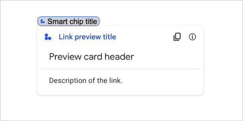
Azione della scheda che mostra l'anteprima di un link di terze parti visualizzando una scheda e uno smart chip. Per scoprire di più, consulta Visualizzare l'anteprima dei link con gli smart chip.
Disponibile per i componenti aggiuntivi di Google Workspace e non disponibile per le app Google Chat.
Ad esempio, il seguente JSON restituisce un titolo univoco per l'anteprima del link e il relativo smart chip, nonché una scheda di anteprima con un'intestazione e una descrizione del testo:
{
  "action": {
    "linkPreview": {
      "title": "Smart chip title",
      "linkPreviewTitle": "Link preview title",
      "previewCard": {
        "header": {
          "title": "Preview card header",
        },
        "sections": [
          {
            "widgets": [
              {
                "textParagraph": {
                  "text": "Description of the link."
                }
              }
            ]
          }
        ]
      }
    }
  }
}
L'esempio restituisce la seguente anteprima del link:
| Campi | |
|---|---|
previewCard |
Una scheda che mostra informazioni su un link da un servizio di terze parti. |
title |
Il titolo visualizzato nello smart chip per l'anteprima del link. Se non è impostato, lo smart chip mostra l'intestazione del |
linkPreviewTitle |
Il titolo visualizzato nell'anteprima del link. Se non è impostato, l'anteprima del link mostra l'intestazione del |
MaterialIcon
Un'icona di Google Material, che include oltre 2500 opzioni.
Ad esempio, per visualizzare un'icona di casella di controllo con spessore e livello personalizzati, scrivi quanto segue:
{
  "name": "check_box",
  "fill": true,
  "weight": 300,
  "grade": -25
}
Disponibile per le app Google Chat e non disponibile per i componenti aggiuntivi di Google Workspace.
| Campi | |
|---|---|
name |
Il nome dell'icona definito nell'icona di Material Design di Google, ad esempio |
fill |
Indica se l'icona viene visualizzata come riempita. Il valore predefinito è false. Per visualizzare l'anteprima di diverse impostazioni delle icone, vai a Icone dei caratteri Google e modifica le impostazioni in Personalizza. |
weight |
Lo spessore del tratto dell'icona. Scegli tra {100, 200, 300, 400, 500, 600, 700}. Se non è presente, il valore predefinito è 400. Se viene specificato un altro valore, viene utilizzato il valore predefinito. Per visualizzare l'anteprima di diverse impostazioni delle icone, vai a Icone dei caratteri Google e modifica le impostazioni in Personalizza. |
grade |
Lo spessore di un simbolo è influenzato dal tratto e dalla qualità. Le modifiche al voto sono più granulari rispetto a quelle al peso e hanno un impatto ridotto sulle dimensioni del simbolo. Scegli tra {-25, 0, 200}. Se non è presente, il valore predefinito è 0. Se viene specificato un altro valore, viene utilizzato il valore predefinito. Per visualizzare l'anteprima di diverse impostazioni delle icone, vai a Icone dei caratteri Google e modifica le impostazioni in Personalizza. |
ModifyCard
Per i componenti aggiuntivi in Google Chat, aggiorna una scheda in base a un'interazione dell'utente. L'array deve contenere un solo oggetto.
| Campi | |
|---|---|
Campo unione
|
|
updateWidget |
Per i componenti aggiuntivi in Google Chat, aggiorna un widget in una scheda o una finestra di dialogo. |
UpdateWidget
Per i componenti aggiuntivi in Google Chat, aggiorna un widget in una scheda o una finestra di dialogo.
| Campi | |
|---|---|
Campo unione updated_widget. Gli aggiornamenti di un widget. updated_widget può essere solo uno dei seguenti: |
|
selectionInputWidgetSuggestions |
Per i widget |
SelectionInputWidgetSuggestions
Per un widget selectionInput che utilizza un menu di selezione multipla, restituisce gli elementi di selezione da un'origine dati dinamica esterna.
| Campi | |
|---|---|
suggestions[] |
Un array di elementi selezionabili che vengono visualizzati a un utente dopo che ha digitato in un menu di selezione multipla. |
Navigazione
Aggiorna o passa da una scheda all'altra in una serie di schede.
Disponibile per i componenti aggiuntivi di Google Workspace e non disponibile per le app Google Chat.
Ad esempio:
1) Restituire una nuova carta (Avanti).
 navigations : {
    pushCard : CARD
  }
2) Aggiorna la scheda in cima alla serie (aggiornamento in situ).
  navigations : {
    popCard : true,
  }, {
    pushCard : CARD
  }
3) Torna indietro di un passaggio senza aggiornare.
  navigations : {
    popCard : true,
  }
4) Torna indietro di più passaggi e aggiorna la carta.
  navigations : {
    popCard : true,
  }, ... {
    pushCard : CARD
  }
5) Torna indietro di più passaggi a un CARD_NAME definito.
  navigations : {
    popToCardName : CARD_NAME,
  }, {
    pushCard : CARD
  }
6) Torna alla cartella principale e aggiorna la scheda.
  navigations : {
    popToRoot : true
  }, {
    pushCard : CARD
  }
7) Vai alla scheda specificata e apri anche quella.
  navigations : {
    popToCardName : CARD_NAME
  }, {
    popCard : true,
  }
8) Sostituisci la carta in alto con una nuova carta.
  navigations : {
    updateCard : CARD
  }
Notifica
Un'azione che mostra una notifica nell'applicazione Google Workspace host quando un utente interagisce con una scheda.
Anteprima per sviluppatori: per i componenti aggiuntivi in Google Chat, viene visualizzata una notifica quando gli utenti inviano e chiudono una finestra di dialogo.
Disponibile per i componenti aggiuntivi di Google Workspace e non disponibile per le app Google Chat.
| Campi | |
|---|---|
text |
Testo normale da visualizzare per la notifica, senza tag HTML. |
OnClick
Rappresenta la modalità di risposta quando gli utenti fanno clic su un elemento interattivo in una scheda, ad esempio un pulsante.
Disponibile per le app Google Chat e i componenti aggiuntivi di Google Workspace.
| Campi | |
|---|---|
Campo unione
|
|
action |
Se specificato, questo |
openLink |
Se specificato, questo |
openDynamicLinkAction |
Un componente aggiuntivo attiva questa azione quando deve aprire un link. Questo comando è diverso da
|
card |
Se specificato, dopo il clic viene inviata una nuova scheda alla pila di schede.
|
overflowMenu |
Se specificato, |
OpenLink
Rappresenta un evento onClick che apre un link ipertestuale.
Disponibile per le app Google Chat e i componenti aggiuntivi di Google Workspace.
| Campi | |
|---|---|
url |
L'URL da aprire. |
openAs |
Come aprire un link.
|
onClose |
Indica se il cliente dimentica un link dopo averlo aperto o lo osserva fino alla chiusura della finestra.
|
OnClose
Azione del client quando viene chiuso un link aperto da un'azione OnClick.
L'implementazione dipende dalle funzionalità della piattaforma client. Ad esempio, un browser web potrebbe aprire un link in una finestra popup con un gestore OnClose.
Se sono impostati sia gli handler OnOpen che OnClose e la piattaforma client non può supportare entrambi i valori, OnClose ha la precedenza.
Disponibile per i componenti aggiuntivi di Google Workspace e non disponibile per le app Google Chat.
| Enum | |
|---|---|
NOTHING |
Valore predefinito. La carta non viene ricaricata; non succede nulla. |
RELOAD |
Ricarica la carta dopo la chiusura della finestra secondaria. Se utilizzata in combinazione con |
OpenAs
Quando un'azione OnClick apre un link, il client può aprirlo come finestra a grandezza naturale (se si tratta del frame utilizzato dal client) o come overlay (ad esempio un popup). L'implementazione dipende dalle funzionalità della piattaforma client e il valore selezionato potrebbe essere ignorato se il client non lo supporta. FULL_SIZE è supportato da tutti i client.
Disponibile per i componenti aggiuntivi di Google Workspace e non disponibile per le app Google Chat.
| Enum | |
|---|---|
FULL_SIZE |
Il link si apre in una finestra a grandezza originale (se è il frame utilizzato dal cliente). |
OVERLAY |
Il link si apre come overlay, ad esempio un popup. |
OverflowMenu
Un widget che mostra un menu popup con una o più azioni che gli utenti possono richiamare. Ad esempio, la visualizzazione di azioni non principali in una scheda. Puoi utilizzare questo widget quando le azioni non rientrano nello spazio disponibile. Per utilizzarlo, specifica questo widget nell'azione OnClick dei widget che lo supportano. Ad esempio, in un Button.
Disponibile per le app Google Chat e i componenti aggiuntivi di Google Workspace.
| Campi | |
|---|---|
items[] |
Obbligatorio. L'elenco delle opzioni di menu. |
OverflowMenuItem
Un'opzione che gli utenti possono richiamare in un menu extra.
Disponibile per le app Google Chat e i componenti aggiuntivi di Google Workspace.
| Campi | |
|---|---|
startIcon |
L'icona visualizzata davanti al testo. |
text |
Obbligatorio. Il testo che identifica o descrive l'elemento agli utenti. |
onClick |
Obbligatorio. L'azione invocata quando viene selezionata un'opzione di menu. Questo |
disabled |
Indica se l'opzione di menu è disattivata. Il valore predefinito è false. |
RenderActions
Un insieme di istruzioni di rendering che indicano al componente aggiuntivo di eseguire un'azione in una scheda o nell'applicazione host.
Disponibile per i componenti aggiuntivi di Google Workspace e non disponibile per le app Google Chat.
| Campi | |
|---|---|
action |
L'azione che i componenti aggiuntivi possono utilizzare per aggiornare l'interfaccia utente. Anteprima per gli sviluppatori: componenti aggiuntivi in Google Chat. |
hostAppAction |
Azioni gestite dalle singole app host. |
schema |
Si tratta di un campo dello schema senza operazioni che potrebbe essere presente nel markup per il controllo della sintassi. |
Azione
Le azioni che i componenti aggiuntivi possono utilizzare nelle schede o nell'applicazione host.
Disponibile per i componenti aggiuntivi di Google Workspace e non disponibile per le app Google Chat.
| Campi | |
|---|---|
navigations[] |
Invia, mostra o aggiorna una scheda. Anteprima per gli sviluppatori: componenti aggiuntivi in Google Chat. |
link |
Apre il link di destinazione in una nuova scheda o finestra popup. |
notification |
Mostra una notifica nell'applicazione Google Workspace host quando un utente interagisce con una scheda. Anteprima per sviluppatori: per i componenti aggiuntivi in Google Chat, viene visualizzata una notifica quando gli utenti inviano e chiudono una finestra di dialogo. |
linkPreview |
Disponibile in Documenti, Fogli e Presentazioni Google. Visualizza l'anteprima dei link con smart chip e carta. Per maggiori dettagli, vedi Visualizzare l'anteprima dei link con smart chip. |
links[] |
Disponibile in Documenti Google. Restituisce un link da una risorsa di terze parti e lo converte in uno smart chip nell'applicazione host. Deve essere formattato come array di oggetti con un elemento. Per ulteriori informazioni, vedi Creare risorse di terze parti dal menu @. |
modifyOperations[] |
Per i componenti aggiuntivi in Google Chat, aggiorna una scheda in base a un'interazione dell'utente. L'array deve contenere un solo oggetto. |
SelectionInput
Un widget che crea uno o più elementi dell'interfaccia utente che gli utenti possono selezionare. Supporta la convalida dell'invio dei moduli solo per i menu dropdown e multiselect. Quando Action.all_widgets_are_required è impostato su true o questo widget è specificato in Action.required_widgets, l'azione di invio viene bloccata, a meno che non venga selezionato un valore. Ad esempio, un menu a discesa o caselle di controllo. Puoi utilizzare questo widget per raccogliere dati che possono essere previsti o enumerati. Per un esempio nelle app Google Chat, consulta Aggiungere elementi dell'interfaccia utente selezionabili.
Le app di chat possono elaborare il valore degli elementi selezionati o inseriti dagli utenti. Per informazioni dettagliate sull'utilizzo degli input dei moduli, vedi Ricevere i dati dei moduli.
Per raccogliere dati non definiti o astratti dagli utenti, utilizza il widget TextInput.
Disponibile per le app Google Chat e i componenti aggiuntivi di Google Workspace.
| Campi | |
|---|---|
name |
Obbligatorio. Il nome che identifica l'input di selezione in un evento di immissione di un modulo. Per informazioni dettagliate sull'utilizzo degli input dei moduli, vedi Ricevere i dati dei moduli. |
label |
Il testo visualizzato sopra il campo di immissione della selezione nell'interfaccia utente. Specifica il testo che aiuta l'utente a inserire le informazioni necessarie per la tua app. Ad esempio, se gli utenti selezionano l'urgenza di un ticket di lavoro da un menu a discesa, l'etichetta potrebbe essere "Urgenza" o "Seleziona urgenza". |
type |
Il tipo di elementi visualizzati agli utenti in un widget |
items[] |
Un array di elementi selezionabili. Ad esempio, un array di pulsanti di opzione o caselle di controllo. Supporta fino a 100 elementi. |
onChangeAction |
Se specificato, il modulo viene inviato quando la selezione cambia. Se non specificato, devi specificare un pulsante separato che invii il modulo. Per informazioni dettagliate sull'utilizzo degli input dei moduli, vedi Ricevere i dati dei moduli. |
multiSelectMaxSelectedItems |
Per i menu con selezione multipla, il numero massimo di elementi che un utente può selezionare. Il valore minimo è 1 articolo. Se non specificato, il valore predefinito è 3 elementi. |
multiSelectMinQueryLength |
Per i menu a più opzioni, il numero di caratteri di testo inseriti da un utente prima che il menu restituisca gli elementi di selezione suggeriti. Se non viene impostato, il menu di selezione multipla utilizza i seguenti valori predefiniti:
|
Campo unione
|
|
externalDataSource |
Un'origine dati esterna, ad esempio un database relazionale. |
platformDataSource |
Un'origine dati di Google Workspace. |
PlatformDataSource
Per un widget SelectionInput
Disponibile per le app Google Chat e non disponibile per i componenti aggiuntivi di Google Workspace.
| Campi | |
|---|---|
Campo unione data_source. L'origine dati. data_source può essere solo uno dei seguenti: |
|
commonDataSource |
Un'origine dati condivisa da tutte le applicazioni Google Workspace, ad esempio gli utenti di un'organizzazione Google Workspace. |
hostAppDataSource |
Un'origine dati univoca per un'applicazione host Google Workspace, ad esempio gli spazi in Google Chat. Questo campo supporta le librerie client delle API di Google, ma non è disponibile nelle librerie client di Cloud. Per saperne di più, vedi Installare le librerie client. |
CommonDataSource
Un'origine dati condivisa da tutte le applicazioni Google Workspace.
Disponibile per le app Google Chat e non disponibile per i componenti aggiuntivi di Google Workspace.
| Enum | |
|---|---|
UNKNOWN |
Valore predefinito. Non utilizzare. |
USER |
Utenti di Google Workspace. L'utente può visualizzare e selezionare solo gli utenti della propria organizzazione Google Workspace. |
SelectionItem
Un elemento che gli utenti possono selezionare in un input di selezione, ad esempio una casella di controllo o un pulsante di attivazione/disattivazione. Supporta fino a 100 elementi.
Disponibile per le app Google Chat e i componenti aggiuntivi di Google Workspace.
| Campi | |
|---|---|
text |
Il testo che identifica o descrive l'elemento agli utenti. |
value |
Il valore associato a questo elemento. Il cliente deve utilizzarlo come valore di input del modulo. Per informazioni dettagliate sull'utilizzo degli input dei moduli, vedi Ricevere i dati dei moduli. |
selected |
Indica se l'elemento è selezionato per impostazione predefinita. Se l'input di selezione accetta un solo valore (ad esempio per i pulsanti di opzione o un menu a discesa), imposta questo campo solo per un elemento. |
startIconUri |
Per i menu a selezione multipla, l'URL dell'icona visualizzata accanto al campo |
bottomText |
Per i menu a selezione multipla, una descrizione o un'etichetta di testo visualizzata sotto il campo |
SelectionType
Il formato degli elementi che gli utenti possono selezionare. Le varie opzioni supportano diversi tipi di interazioni. Ad esempio, gli utenti possono selezionare più caselle di controllo, ma possono selezionare un solo elemento da un menu a discesa.
Ogni input di selezione supporta un tipo di selezione. Ad esempio, non è supportato il mix di caselle di controllo e pulsanti di attivazione/disattivazione.
Disponibile per le app Google Chat e i componenti aggiuntivi di Google Workspace.
| Enum | |
|---|---|
CHECK_BOX |
Un insieme di caselle di controllo. Gli utenti possono selezionare una o più caselle di controllo. |
RADIO_BUTTON |
Un insieme di pulsanti di opzione. Gli utenti possono selezionare un solo pulsante di opzione. |
SWITCH |
Un insieme di interruttori. Gli utenti possono attivare uno o più pulsanti. |
DROPDOWN |
Un menu a discesa. Gli utenti possono selezionare un elemento dal menu. |
MULTI_SELECT |
Un menu con una casella di testo. Gli utenti possono digitare e selezionare uno o più elementi. Per i componenti aggiuntivi di Google Workspace, devi compilare gli elementi utilizzando un array statico di oggetti Per le app Google Chat, puoi anche compilare gli elementi utilizzando un'origine dati dinamica e suggerire automaticamente gli elementi man mano che gli utenti digitano nel menu. Ad esempio, gli utenti possono iniziare a digitare il nome di uno spazio di Google Chat e il widget suggerisce automaticamente lo spazio. Per compilare dinamicamente gli elementi di un menu a più opzioni, utilizza uno dei seguenti tipi di origini dati:
Per esempi su come implementare menu a selezione multipla per le app di Chat, vedi Aggiungere un menu a selezione multipla.
|
SubmitFormResponse
Una risposta all'invio di un modulo diversa dall'ottenimento di un contenitore di completamento automatico, che contiene le azioni che la scheda deve eseguire e/o l'app host del componente aggiuntivo e se lo stato della scheda è cambiato.
Disponibile per i componenti aggiuntivi di Google Workspace e non disponibile per le app Google Chat. Ad esempio:
{
  "renderActions": {
    "action": {
      "notification": {
        "text": "Email address is added: salam.heba@example.com"
      }
    },
    "hostAppAction": {
      "gmailAction": {
        "openCreatedDraftAction": {
          "draftId": "msg-a:r-79766936926021702",
          "threadServerPermId": "thread-f:15700999851086004"
        }
      }
    }
  }
}
| Campi | |
|---|---|
renderActions |
Un insieme di istruzioni di rendering che indicano alla scheda di eseguire un'azione e/o all'app host del componente aggiuntivo di eseguire un'azione specifica per l'app. |
stateChanged |
Se lo stato delle schede è cambiato e i dati nelle schede esistenti non sono aggiornati. |
schema |
Si tratta di un campo dello schema senza operazioni che può essere presente nel markup per il controllo della sintassi. |
Suggerimenti
Valori suggeriti che gli utenti possono inserire. Questi valori vengono visualizzati quando gli utenti fanno clic all'interno del campo di immissione del testo. Man mano che gli utenti digitano, i valori suggeriti vengono filtrati in modo dinamico in base a ciò che hanno digitato.
Ad esempio, un campo di immissione di testo per il linguaggio di programmazione potrebbe suggerire Java, JavaScript, Python e C++. Quando gli utenti iniziano a digitare Jav, l'elenco dei suggerimenti viene filtrato in modo da mostrare Java e JavaScript.
I valori suggeriti aiutano gli utenti a inserire valori che la tua app può interpretare. Quando si fa riferimento a JavaScript, alcuni utenti potrebbero inserire javascript e altri java script. Suggerire JavaScript può standardizzare il modo in cui gli utenti interagiscono con la tua app.
Se specificato, TextInput.type è sempre SINGLE_LINE, anche se è impostato su MULTIPLE_LINE.
Disponibile per le app Google Chat e i componenti aggiuntivi di Google Workspace.
| Campi | |
|---|---|
items[] |
Un elenco di suggerimenti utilizzati per i consigli di completamento automatico nei campi di immissione di testo. |
SuggestionItem
Un valore suggerito che gli utenti possono inserire in un campo di immissione di testo.
Disponibile per le app Google Chat e i componenti aggiuntivi di Google Workspace.
| Campi | |
|---|---|
Campo unione
|
|
text |
Il valore di un input suggerito per un campo di immissione di testo. Corrisponde a quanto inserito dagli utenti. |
TextInput
Un campo in cui gli utenti possono inserire del testo. Supporta i suggerimenti e le azioni al cambio. Supporta la convalida dell'invio dei moduli. Quando Action.all_widgets_are_required è impostato su true o questo widget è specificato in Action.required_widgets, l'azione di invio viene bloccata a meno che non venga inserito un valore. Per un esempio nelle app Google Chat, consulta Aggiungere un campo in cui un utente può inserire del testo.
Le app di chat ricevono e possono elaborare il valore del testo inserito durante gli eventi di inserimento del modulo. Per informazioni dettagliate sull'utilizzo degli input dei moduli, vedi Ricevere i dati dei moduli.
Quando devi raccogliere dati indefiniti o astratti dagli utenti, utilizza un input di testo. Per raccogliere dati definiti o enumerati dagli utenti, utilizza il widget SelectionInput.
Disponibile per le app Google Chat e i componenti aggiuntivi di Google Workspace.
| Campi | |
|---|---|
name |
Il nome con cui viene identificato l'input di testo in un evento di input del modulo. Per informazioni dettagliate sull'utilizzo degli input dei moduli, vedi Ricevere i dati dei moduli. |
label |
Il testo visualizzato sopra il campo di immissione di testo nell'interfaccia utente. Specifica il testo che aiuta l'utente a inserire le informazioni necessarie per la tua app. Ad esempio, se chiedi il nome di una persona, ma hai bisogno specificamente del suo cognome, scrivi Obbligatorio se |
hintText |
Testo visualizzato sotto il campo di immissione di testo per aiutare gli utenti chiedendo di inserire un determinato valore. Questo testo è sempre visibile. Obbligatorio se |
value |
Il valore inserito da un utente, restituito nell'ambito di un evento di inserimento di un modulo. Per informazioni dettagliate sull'utilizzo degli input dei moduli, vedi Ricevere i dati dei moduli. |
type |
La modalità di visualizzazione di un campo di immissione di testo nell'interfaccia utente. Ad esempio, se il campo è a una o più righe. |
onChangeAction |
Cosa fare quando si verifica una modifica nel campo di immissione del testo. Ad esempio, un utente che aggiunge testo al campo o lo elimina. Alcuni esempi di azioni da intraprendere sono l'esecuzione di una funzione personalizzata o l'apertura di una finestra di dialogo in Google Chat. |
initialSuggestions |
Valori suggeriti che gli utenti possono inserire. Questi valori vengono visualizzati quando gli utenti fanno clic all'interno del campo di immissione del testo. Man mano che gli utenti digitano, i valori suggeriti vengono filtrati in modo dinamico in base a ciò che hanno digitato. Ad esempio, un campo di immissione di testo per il linguaggio di programmazione potrebbe suggerire Java, JavaScript, Python e C++. Quando gli utenti iniziano a digitare I valori suggeriti aiutano gli utenti a inserire valori che la tua app può interpretare. Quando si fa riferimento a JavaScript, alcuni utenti potrebbero inserire Se specificato,
|
autoCompleteAction |
Facoltativo. Specifica l'azione da eseguire quando il campo di immissione di testo fornisce suggerimenti agli utenti che interagiscono con esso. Se non specificato, i suggerimenti vengono impostati da Se specificato, l'app esegue l'azione specificata qui, ad esempio l'esecuzione di una funzione personalizzata.
|
validation |
Specifica la convalida del formato di immissione necessaria per questo campo di testo.
|
placeholderText |
Il testo visualizzato nel campo di immissione di testo quando il campo è vuoto. Utilizza questo testo per chiedere agli utenti di inserire un valore. Ad esempio,
|
Tipo
La modalità di visualizzazione di un campo di immissione di testo nell'interfaccia utente. Ad esempio, se si tratta di un campo di immissione a una riga o di un input multiriga. Se viene specificato initialSuggestions, type è sempre SINGLE_LINE, anche se è impostato su MULTIPLE_LINE.
Disponibile per le app Google Chat e i componenti aggiuntivi di Google Workspace.
| Enum | |
|---|---|
SINGLE_LINE |
Il campo di immissione di testo ha un'altezza fissa di una riga. |
MULTIPLE_LINE |
Il campo di immissione del testo ha un'altezza fissa di più righe. |
TextParagraph
Un paragrafo di testo che supporta la formattazione. Per un esempio nelle app Google Chat, vedi Aggiungere un paragrafo di testo formattato. Per saperne di più sulla formattazione del testo, vedi Formattare il testo nelle app Google Chat e Formattare il testo nei componenti aggiuntivi di Google Workspace.
Disponibile per le app Google Chat e i componenti aggiuntivi di Google Workspace.
| Campi | |
|---|---|
text |
Il testo visualizzato nel widget. |
maxLines |
Il numero massimo di righe di testo visualizzate nel widget. Se il testo supera il numero massimo di righe specificato, i contenuti in eccesso vengono nascosti dietro un pulsante Mostra altro. Se il testo è uguale o più breve del numero massimo di righe specificato, non viene visualizzato il pulsante Mostra altro. Il valore predefinito è 0, nel qual caso viene visualizzato tutto il contesto. I valori negativi vengono ignorati. |
Convalida
Rappresenta i dati necessari per convalidare il widget a cui è associato.
Disponibile per le app Google Chat e i componenti aggiuntivi di Google Workspace.
| Campi | |
|---|---|
characterLimit |
Specifica il limite di caratteri per i widget di immissione di testo. Tieni presente che viene utilizzato solo per l'input di testo e viene ignorato per gli altri widget.
|
inputType |
Specifica il tipo di widget di immissione.
|
InputType
Il tipo di widget di immissione.
| Enum | |
|---|---|
INPUT_TYPE_UNSPECIFIED |
Tipo non specificato. Non utilizzare. |
TEXT |
Testo normale che accetta tutti i caratteri. |
INTEGER |
Un valore intero. |
FLOAT |
Un valore in virgola mobile. |
EMAIL |
Un indirizzo email. |
EMOJI_PICKER |
Un'emoji selezionata dal selettore di emoji fornito dal sistema. |
Widget
Ogni scheda è composta da widget.
Un widget è un oggetto composito che può rappresentare testo, immagini, pulsanti e altri tipi di oggetti.
| Campi | |
|---|---|
horizontalAlignment |
Specifica se i widget devono essere allineati a sinistra, a destra o al centro di una colonna. |
Campo unione data. Un widget può avere solo uno dei seguenti elementi. Puoi utilizzare più campi del widget per visualizzare più elementi. data può essere solo uno dei seguenti: |
|
textParagraph |
Mostra un paragrafo di testo. Supporta il testo semplice con formattazione HTML. Per saperne di più sulla formattazione del testo, vedi Formattare il testo nelle app Google Chat e Formattare il testo nei componenti aggiuntivi di Google Workspace. Ad esempio, il seguente JSON crea un testo in grassetto: |
image |
Mostra un'immagine. Ad esempio, il seguente JSON crea un'immagine con testo alternativo: |
decoratedText |
Mostra un elemento di testo decorato. Ad esempio, il seguente JSON crea un widget di testo decorato che mostra l'indirizzo email: |
buttonList |
Un elenco di pulsanti. Ad esempio, il seguente JSON crea due pulsanti. Il primo è un pulsante di testo blu e il secondo è un pulsante immagine che apre un link: |
textInput |
Mostra una casella di testo in cui gli utenti possono digitare. Ad esempio, il seguente JSON crea un input di testo per un indirizzo email: Come altro esempio, il seguente JSON crea un input di testo per un linguaggio di programmazione con suggerimenti statici: |
selectionInput |
Mostra un controllo di selezione che consente agli utenti di selezionare gli elementi. I controlli di selezione possono essere caselle di controllo, pulsanti di opzione, opzioni o menu a discesa. Ad esempio, il seguente JSON crea un menu a discesa che consente agli utenti di scegliere una taglia: |
dateTimePicker |
Mostra un widget che consente agli utenti di inserire una data, un'ora o una data e un'ora. Ad esempio, il seguente JSON crea un selettore di data e ora per pianificare un appuntamento: |
divider |
Mostra una linea divisoria orizzontale tra i widget. Ad esempio, il seguente JSON crea un divisore: |
grid |
Mostra una griglia con una raccolta di elementi. Una griglia supporta un numero qualsiasi di colonne ed elementi. Il numero di righe è determinato dal limite superiore del numero di elementi diviso per il numero di colonne. Una griglia con 10 elementi e 2 colonne ha 5 righe. Una griglia con 11 elementi e 2 colonne ha 6 righe.
Ad esempio, il seguente JSON crea una griglia di 2 colonne con un singolo elemento: |
columns |
Mostra fino a 2 colonne. Per includere più di due colonne o per utilizzare le righe, utilizza il widget Ad esempio, il seguente JSON crea due colonne contenenti ciascuna paragrafi di testo: |
carousel |
Un carosello contiene una raccolta di widget nidificati. Ad esempio, questa è una rappresentazione JSON di un carosello contenente due paragrafi di testo. |
chipList |
Un elenco di chip. Ad esempio, il seguente JSON crea due chip. Il primo è un chip di testo e il secondo è un chip di icone che apre un link: |
HorizontalAlignment
Specifica se i widget devono essere allineati a sinistra, a destra o al centro di una colonna.
Disponibile per le app Google Chat e non disponibile per i componenti aggiuntivi di Google Workspace.
| Enum | |
|---|---|
HORIZONTAL_ALIGNMENT_UNSPECIFIED |
Non utilizzare. Non specificato. |
START |
Valore predefinito. Allinea i widget alla posizione iniziale della colonna. Per i layout da sinistra a destra, l'allineamento è a sinistra. Per i layout da destra a sinistra, si allinea a destra. |
CENTER |
Allinea i widget al centro della colonna. |
END |
Allinea i widget alla posizione finale della colonna. Per i layout da sinistra a destra, allinea i widget a destra. Per i layout da destra a sinistra, allinea i widget a sinistra. |
ImageType
La forma utilizzata per ritagliare l'immagine.
Disponibile per le app Google Chat e i componenti aggiuntivi di Google Workspace.
| Enum | |
|---|---|
SQUARE |
Valore predefinito. Applica una maschera quadrata all'immagine. Ad esempio, un'immagine 4x3 diventa 3x3. |
CIRCLE |
Applica una maschera circolare all'immagine. Ad esempio, un'immagine 4x3 diventa un cerchio con un diametro di 3. |