이 문서에서는 Glass 스타일을 따르는 방법에 대해 설명합니다. GDK를 사용할 때 일반적인 UI 권장사항을 구현합니다.
유리 테마
Glass는 Glass 소프트웨어에 표준 테마를 적용하므로 사용자 인터페이스의 나머지 부분과 일관성을 유지합니다. 이 테마에는 다음과 같은 특성이 있습니다.
- Roboto 서체 사용
- 상태 표시줄이나 작업 모음 없이 활동을 전체 화면으로 표시합니다.
- 검은색 단색 배경을 적용합니다.
Glass 테마를 적용하려면 Android 매니페스트에서 테마를 선언하지 마세요.
Glass 용품의 각 부분에 맞춤 스타일이 있는 경우
나머지는 기본 Glass 테마를 원하는 경우
parent 속성을 사용하여 Theme.DeviceDefault에서 상속받습니다.
<resources>
    <style name="CustomTheme" parent="@android:style/Theme.DeviceDefault">
        <!-- Theme customization goes here. -->
    </style>
</resources>
자세한 내용은 Android 개발자 스타일 및 테마 참조하세요.
유리 스타일 카드
CardBuilder
클래스는 일련의 속성이 지정된 올바른 형식의 카드를 만듭니다. 레이아웃 사용
제공: CardBuilder.Layout
그렇게 하면 콘텐츠가 YouTube의 다른 콘텐츠와 비슷하며
유리
CardBuilder 앱을 사용하려면 다음 안내를 따르세요
CardBuilder의 인스턴스를 만들어 원하는 레이아웃을 제공합니다.CardBuilder.Layout- 텍스트, 각주, 타임스탬프와 같은 카드 속성을 설정합니다.
CardBuilder.getView()를 호출합니다. 카드를 Android 카드로 전환하기 위해View또는CardBuilder.getRemoteViews()이것을RemoteViews객체를 지정합니다.- 활동, 레이아웃 또는
ViewCardScrollView또는LiveCard의RemoteViews
일반적인 UI 기능
CardBuilder에서 제공하는 많은 레이아웃은 일반 사용자 인터페이스를 지원합니다.
기능을 사용할 수 있습니다. 개별 레이아웃에 대한 문서를 참조하세요.
CardBuilder.Layout 드림
를 참조하세요.
저작자 표시 아이콘
저작자 표시 아이콘은 선택사항으로 표시되는 36×36픽셀 아이콘입니다.
타임스탬프 오른쪽에 있습니다. 설정
아이콘을
CardBuilder.setAttributionIcon() 드림
특히 라이브 카드에서 애플리케이션을 식별하여 사용자가 빠르게
해당 카드에 적힌 정보의 출처를 확인할 수 있습니다.
스택 표시기
에 의해 제어되는 스택 표시기
CardBuilder.showStackIndicator()님,
카드의 오른쪽 상단 모서리에 표시되는 모서리의 접힘입니다. 다음 용도로 사용
해당 카드는 해당 카드가 해당되는 다른 카드들을 나타낸다는 것을
이용할 수 있습니다.
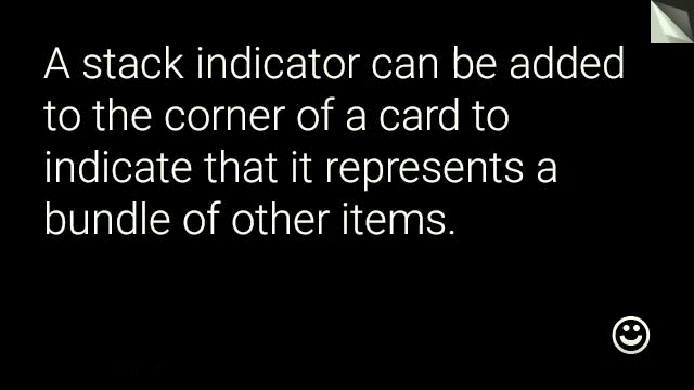
View view = new CardBuilder(context, CardBuilder.Layout.TEXT)
    .setText("A stack indicator can be added to the corner of a card...")
    .setAttributionIcon(R.drawable.ic_smile)
    .showStackIndicator(true)
    .getView();
레이아웃
다음 예는
CardBuilder
TEXT 및 TEXT_FIXED
CardBuilder.Layout.TEXT
선택사항인
이미지 모자이크가 있습니다. 텍스트의 크기가
여유 공간을 확보할 수 있습니다.
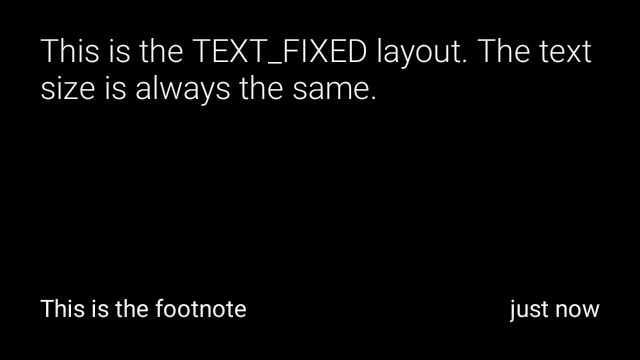
CardBuilder.Layout.TEXT_FIXED 드림
는 비슷하지만 텍스트를 더 작은 크기로 고정합니다.
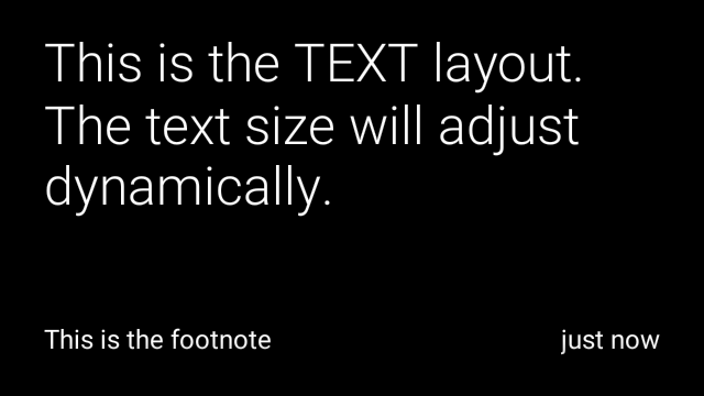
View view1 = new CardBuilder(context, CardBuilder.Layout.TEXT)
.setText("This is the TEXT layout. The text size will adjust dynamically.")
.setFootnote("This is the footnote")
.setTimestamp("just now")
.getView();
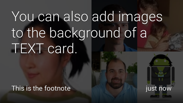
View view2 = new CardBuilder(context, CardBuilder.Layout.TEXT)
.setText("You can also add images to the background of a TEXT card.")
.setFootnote("This is the footnote")
.setTimestamp("just now")
.addImage(R.drawable.image1)
.addImage(R.drawable.image2)
.addImage(R.drawable.image3)
.addImage(R.drawable.image4)
.addImage(R.drawable.image5)
.getView();
View view3 = new CardBuilder(context, CardBuilder.Layout.TEXT_FIXED)
.setText("This is the TEXT_FIXED layout. The text size is always the same.")
.setFootnote("This is the footnote")
.setTimestamp("just now")
.getView();
COLUMNS 및 COLUMNS_FIXED
이
CardBuilder.Layout.COLUMNS 드림
이미지 모자이크 또는 아이콘이 표시된
왼쪽 측면에, 텍스트 상자는 측면에 있습니다. 텍스트 크기가 동적으로 설정됨
크기를 조정할 수 있습니다. 텍스트 크기를 고정된 상태로 유지하려면
CardBuilder.Layout.COLUMNS_FIXED
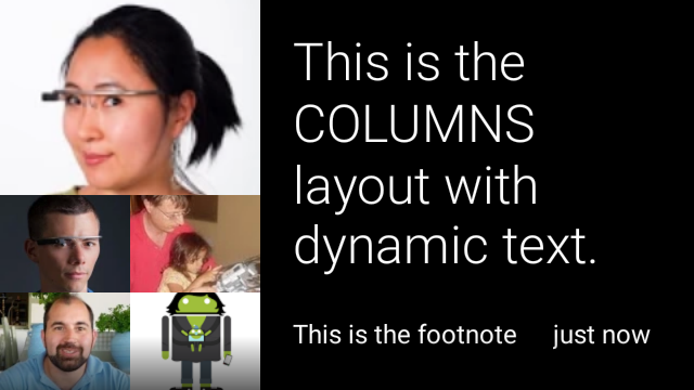
View view1 = new CardBuilder(context, CardBuilder.Layout.COLUMNS)
.setText("This is the COLUMNS layout with dynamic text.")
.setFootnote("This is the footnote")
.setTimestamp("just now")
.addImage(R.drawable.image1)
.addImage(R.drawable.image2)
.addImage(R.drawable.image3)
.addImage(R.drawable.image4)
.addImage(R.drawable.image5)
.getView();
View view2 = new CardBuilder(context, CardBuilder.Layout.COLUMNS)
.setText("You can even put a centered icon on a COLUMNS card instead of a mosaic.")
.setFootnote("This is the footnote")
.setTimestamp("just now")
.setIcon(R.drawable.ic_wifi)
.getView();
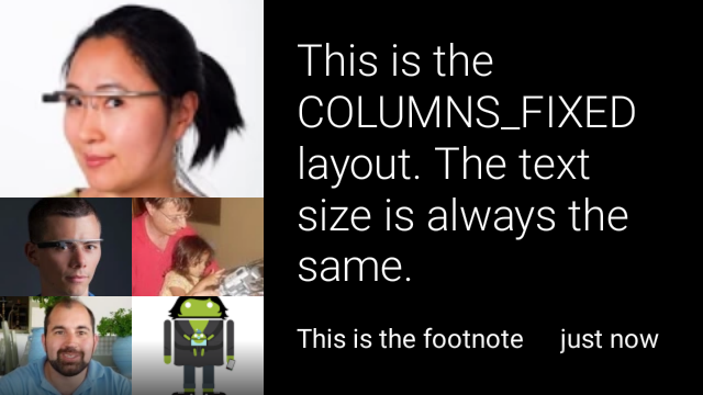
View view3 = new CardBuilder(context, CardBuilder.Layout.COLUMNS_FIXED)
.setText("This is the COLUMNS_FIXED layout. The text size is always the same.")
.setFootnote("This is the footnote")
.setTimestamp("just now")
.addImage(R.drawable.image1)
.addImage(R.drawable.image2)
.addImage(R.drawable.image3)
.addImage(R.drawable.image4)
.addImage(R.drawable.image5)
.getView();
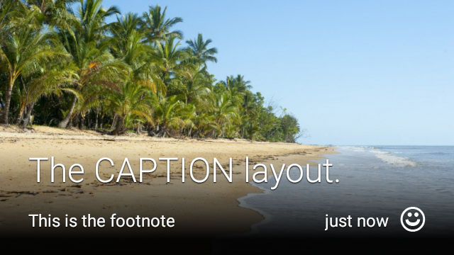
CAPTION
이
CardBuilder.Layout.CAPTION 드림
배경에 이미지 모자이크가 있는 레이아웃
카드 하단에 정렬되는 짧은 자막 텍스트 아이콘은 또한
캡션 옆에 배치하여 사람의 신원 등을 나타냄
카드 콘텐츠와 관련이 있습니다.
 <ph type="x-smartling-placeholder">
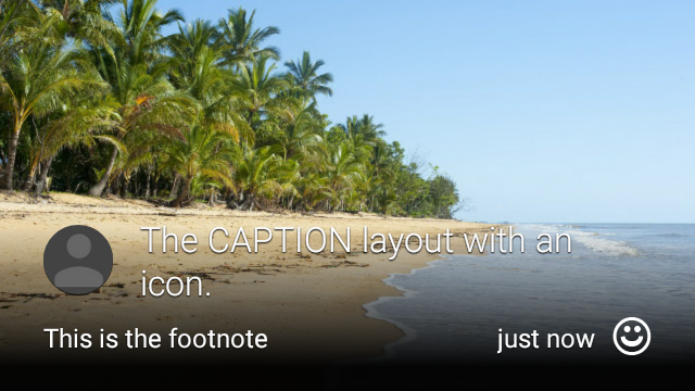 </ph>
</ph>
View view1 = new CardBuilder(context, CardBuilder.Layout.CAPTION)
    .setText("The caption layout.")
    .setFootnote("This is the footnote")
    .setTimestamp("just now")
    .addImage(R.drawable.beach)
    .setAttributionIcon(R.drawable.ic_smile)
    .getView();

View view2 = new CardBuilder(context, CardBuilder.Layout.CAPTION)
    .setText("The caption layout with an icon.")
    .setFootnote("This is the footnote")
    .setTimestamp("just now")
    .addImage(R.drawable.beach)
    .setIcon(R.drawable.ic_avatar)
    .setAttributionIcon(R.drawable.ic_smile)
    .getView();
TITLE
이
CardBuilder.Layout.TITLE 드림
배경에 이미지 모자이크가 있는 레이아웃
카드 하단에 제목 및 아이콘(선택사항)이 있습니다. 이 레이아웃
연락처를 나타내거나 대상을 공유하는 데 자주 사용됩니다. 각주와 타임스탬프는
이 레이아웃에서는 지원되지 않습니다.

View view = new CardBuilder(context, CardBuilder.Layout.TITLE)
    .setText("TITLE Card")
    .setIcon(R.drawable.ic_phone)
    .addImage(R.drawable.beach)
    .getView();
AUTHOR
사용
CardBuilder.Layout.AUTHOR 드림
메시지 또는 대화를 표시하는 레이아웃
포커스는 작성자에 있습니다 배경에 이미지 모자이크를 지원하고
작성자의 아바타로 사용되는 아이콘, 작성자의 아바타로 사용되는
식별할 수 있습니다.
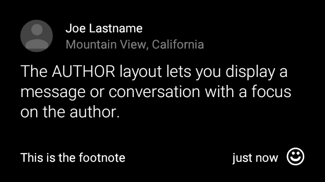
View view = new CardBuilder(context, CardBuilder.Layout.AUTHOR)
    .setText("The AUTHOR layout lets you display a message or conversation "
            + " with a focus on the author.")
    .setIcon(R.drawable.ic_avatar)
    .setHeading("Joe Lastname")
    .setSubheading("Mountain View, California")
    .setFootnote("This is the footnote")
    .setTimestamp("just now")
    .getView();
MENU
이
CardBuilder.Layout.MENU 드림
레이아웃은 표준 Glass 메뉴와 비슷합니다. 여기에는
아이콘과 제목, 각주(선택사항)를 표시할 수 있습니다. 이 레이아웃 사용 용도
확인 화면('삭제 중'에서 '삭제됨'으로 전환)
메뉴 항목 선택). 실제 메뉴가 필요하다면
표준 옵션 메뉴를 사용해야 합니다.

View view = new CardBuilder(context, CardBuilder.Layout.MENU)
    .setText("MENU layout")
    .setIcon(R.drawable.ic_phone)
    .setFootnote("Optional menu description")
    .getView();
EMBED_INSIDE
이
CardBuilder.Layout.EMBED_INSIDE 드림
자체 디자인의 맞춤 레이아웃 XML을 표준 Glass에 삽입합니다.
카드 템플릿 이를 통해 애플리케이션의 사용자 지정 UI를 디자인할 수 있습니다.
카드의 각주, 타임스탬프, 저작자 표시 아이콘 및
스택 표시기를 표시합니다.
통화 후
CardBuilder.getView()님,
사용
findViewById()
삽입한 레이아웃 내의 뷰에 액세스할 수 있습니다. 마찬가지로
통화
CardBuilder.getRemoteViews()님,
ID를 직접 전달하여 삽입된 레이아웃의 뷰를 조작할 수 있습니다.
를
RemoteViews
setter 메서드를 사용합니다.
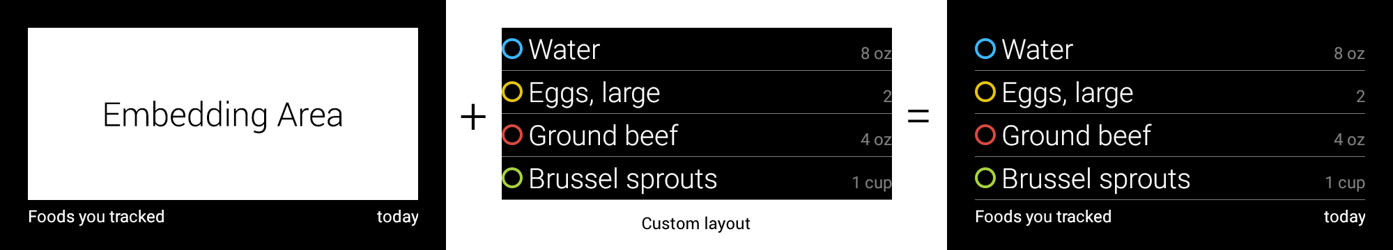
View view = new CardBuilder(context, CardBuilder.Layout.EMBED_INSIDE)
    .setEmbeddedLayout(R.layout.food_table)
    .setFootnote("Foods you tracked")
    .setTimestamp("today")
    .getView();
TextView textView1 = (TextView) view.findViewById(R.id.text_view_1);
textView1.setText("Water");
// ...and so on
더 자세한 예는 GitHub ApiDemo 프로젝트와 같은 이전 버전을 출시할 수 있습니다.
ALERT
이
CardBuilder.Layout.ALERT 드림
중앙에 배치된 큰 아이콘이 있고
기본 메시지 및 각주에 추가할 수 있습니다. 이 레이아웃을 사용할 수 있는
Dialog(으)로
Glass 소프트웨어에 중요한 정보 메시지, 경고 또는 오류를 표시할 수 없습니다.

다음 예에서는 AlertDialog 구현을 보여주고
카드를 탭하고 Wi-Fi 설정을 엽니다.
Dialog를 확장하는 클래스를 만듭니다.CardBuilder.Layout.ALERT레이아웃과 함께CardBuilder를 사용하여 카드를 만든 후 이 카드로 콘텐츠 뷰를 설정합니다.(선택사항) 이 카드에서 사용자 동작을 처리할
GestureDetector를 만듭니다.public class AlertDialog extends Dialog { private final DialogInterface.OnClickListener mOnClickListener; private final AudioManager mAudioManager; private final GestureDetector mGestureDetector; /** * Handles the tap gesture to call the dialog's * onClickListener if one is provided. */ private final GestureDetector.BaseListener mBaseListener = new GestureDetector.BaseListener() { @Override public boolean onGesture(Gesture gesture) { if (gesture == Gesture.TAP) { mAudioManager.playSoundEffect(Sounds.TAP); if (mOnClickListener != null) { // Since Glass dialogs do not have buttons, // the index passed to onClick is always 0. mOnClickListener.onClick(AlertDialog.this, 0); } return true; } return false; } }; public AlertDialog(Context context, int iconResId, int textResId, int footnoteResId, DialogInterface.OnClickListener onClickListener) { super(context); mOnClickListener = onClickListener; mAudioManager = (AudioManager) context.getSystemService(Context.AUDIO_SERVICE); mGestureDetector = new GestureDetector(context).setBaseListener(mBaseListener); setContentView(new CardBuilder(context, CardBuilder.Layout.ALERT) .setIcon(iconResId) .setText(textResId) .setFootnote(footnoteResId) .getView()); } /** Overridden to let the gesture detector handle a possible tap event. */ @Override public boolean onGenericMotionEvent(MotionEvent event) { return mGestureDetector.onMotionEvent(event) || super.onGenericMotionEvent(event); } }(선택사항) 활동에서
OnClickListener드림 사용자가 탭할 때 추가 흐름을 처리할 수 있습니다. 자세한 내용은 Wi-Fi와 같은 설정 활동을 시작하려면 설정 시작AlertDialog생성자를 호출하여 알림 카드를 표시합니다.public class MyActivity extends Activity { ... private final DialogInterface.OnClickListener mOnClickListener = new DialogInterface.OnClickListener() { @Override public void onClick(DialogInterface dialog, int button) { // Open WiFi Settings startActivity(new Intent(Settings.ACTION_WIFI_SETTINGS)); } }; @Override protected void onCreate(Bundle bundle) { ... new AlertDialog(context, R.drawable.ic_cloud_sad_150, R.string.alert_text, R.string.alert_footnote_text, mOnClickListener).show(); ... } }
XML 레이아웃
다음은 CardBuilder 클래스가 사용하는 경우 사용할 수 있는 두 가지 기본 카드 레이아웃입니다. 니즈를 충족하지 못할 수 있습니다
기본 레이아웃
이 레이아웃은 카드의 표준 패딩과 바닥글을 정의합니다. 직접 입력
뷰가 빈 RelativeLayout에 있습니다.
<?xml version="1.0" encoding="utf-8"?>
<FrameLayout xmlns:android="http://schemas.android.com/apk/res/android"
    xmlns:tools="http://schemas.android.com/tools"
    android:id="@+id/layout"
    android:layout_width="match_parent"
    android:layout_height="match_parent"
    >

    <RelativeLayout
        android:id="@+id/body_layout"
        android:layout_width="match_parent"
        android:layout_height="@dimen/glass_card_body_height"
        android:layout_marginLeft="@dimen/glass_card_margin"
        android:layout_marginTop="@dimen/glass_card_margin"
        android:layout_marginRight="@dimen/glass_card_margin"
        tools:ignore="UselessLeaf"
        >

        <!-- Put your widgets inside this RelativeLayout. -->

    </RelativeLayout>

    <LinearLayout
        android:id="@+id/footer_container"
        android:layout_width="match_parent"
        android:layout_height="wrap_content"
        android:layout_gravity="bottom|left"
        android:layout_marginLeft="@dimen/glass_card_margin"
        android:layout_marginBottom="@dimen/glass_card_footer_margin"
        android:layout_marginRight="@dimen/glass_card_margin"
        android:orientation="horizontal"
        >

        <!-- The footer view will grow to fit as much content as possible while the
             timestamp view keeps a fixed width. If the footer text is too long, it
             will be ellipsized with a 40px margin between it and the timestamp. -->

        <TextView
            android:id="@+id/footer"
            android:layout_width="0dip"
            android:layout_height="wrap_content"
            android:layout_weight="1"
            android:ellipsize="end"
            android:singleLine="true"
            android:textAppearance="?android:attr/textAppearanceSmall"
            />

        <TextView
            android:id="@+id/timestamp"
            android:layout_width="wrap_content"
            android:layout_height="wrap_content"
            android:layout_marginLeft="@dimen/glass_card_margin"
            android:ellipsize="end"
            android:singleLine="true"
            android:textAppearance="?android:attr/textAppearanceSmall"
            />

    </LinearLayout>

</FrameLayout>
왼쪽 열 레이아웃
이는 240픽셀 왼쪽 열과 400픽셀 오른쪽 열을 두 개의 RelativeLayout 형식으로 정의합니다.
여러 옵션을 선택할 수 있습니다.
<?xml version="1.0" encoding="utf-8"?>
<RelativeLayout xmlns:android="http://schemas.android.com/apk/res/android"
    xmlns:tools="http://schemas.android.com/tools"
    android:layout_width="match_parent"
    android:layout_height="match_parent"
    >

    <RelativeLayout
        android:id="@+id/left_column"
        android:layout_width="@dimen/glass_card_left_column_width"
        android:layout_height="match_parent"
        >

        <!-- Put widgets for the left column inside this RelativeLayout. -->

    </RelativeLayout>

    <RelativeLayout
        android:layout_width="wrap_content"
        android:layout_height="@dimen/glass_card_body_height"
        android:layout_alignParentRight="true"
        android:layout_alignParentTop="true"
        android:layout_marginLeft="@dimen/glass_card_two_column_margin"
        android:layout_marginRight="@dimen/glass_card_margin"
        android:layout_marginTop="@dimen/glass_card_margin"
        android:layout_toRightOf="@+id/left_column"
        tools:ignore="UselessLeaf"
        >

        <!-- Put widgets for the right column inside this RelativeLayout. -->

    </RelativeLayout>

    <LinearLayout
        android:id="@+id/footer_container"
        android:layout_width="wrap_content"
        android:layout_height="wrap_content"
        android:layout_alignParentBottom="true"
        android:layout_alignParentRight="true"
        android:layout_gravity="bottom|left"
        android:layout_marginBottom="@dimen/glass_card_footer_margin"
        android:layout_marginLeft="@dimen/glass_card_two_column_margin"
        android:layout_marginRight="@dimen/glass_card_margin"
        android:layout_toRightOf="@+id/left_column"
        android:orientation="horizontal"
        >

        <!--
             The footer view will grow to fit as much content as possible while the
             timestamp view keeps a fixed width. If the footer text is too long, it
             will be ellipsized with a 40px margin between it and the timestamp.
        -->

        <TextView
            android:id="@+id/footer"
            android:layout_width="0dip"
            android:layout_height="wrap_content"
            android:layout_weight="1"
            android:ellipsize="end"
            android:singleLine="true"
            android:textAppearance="?android:attr/textAppearanceSmall"
            />

        <TextView
            android:id="@+id/timestamp"
            android:layout_width="wrap_content"
            android:layout_height="wrap_content"
            android:layout_marginLeft="@dimen/glass_card_margin"
            android:ellipsize="end"
            android:singleLine="true"
            android:textAppearance="?android:attr/textAppearanceSmall"
            />

    </LinearLayout>

</RelativeLayout>
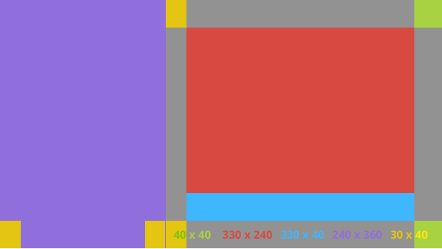
표준 측정기준
이 파일을 이전 레이아웃 또는 사용자의 자체 레이아웃과 함께 사용하여
표준 글래스 스타일을 준수해야 합니다. 이 파일을 다음으로 만들기
Android 프로젝트에서 res/values/dimens.xml를 생성합니다.
<?xml version="1.0" encoding="utf-8"?>

<resources>

    <!-- The recommended margin for the top, left, and right edges of a card. -->
    <dimen name="glass_card_margin">40px</dimen>

    <!-- The recommended margin between the bottom of the card and the footer. This is
         an adjusted value so that the baseline of the text in the footer sits 40px
         from the bottom of the card, matching the other margins. -->
    <dimen name="glass_card_footer_margin">33px</dimen>

    <!-- The recommended margin for the left column of the two-column card. -->
    <dimen name="glass_card_two_column_margin">30px</dimen>

    <!-- The maximum height of the body content inside a card. -->
    <dimen name="glass_card_body_height">240px</dimen>

    <!-- The width of the left column in the two-column layout. -->
    <dimen name="glass_card_left_column_width">240px</dimen>

</resources>