
This guide explains how to create an input variable.
To run, steps require certain information. For example, sending an email requires an email address. To provide steps this necessary information, define input variables. Once defined, input variables are typically set by the user on a step's configuration card while the user sets up the step.
Define the input variable in two places: the add-on's manifest file, and in code with a configuration card where users can enter values for input variables.
Define the input variable in the manifest file
In the manifest file, specify input variables with
the inputs[] array. Each item in the inputs[] array has these properties:
id: Unique identifier for an input variable. To allow the flow to associate a configuration card input element with this input variable, must match the name of the corresponding card element.description: A description of the input variable to display to end users.cardinality: How many values are permitted. Possible values are:SINGLE: Only one value is permitted.
dataType: The type of values accepted.dataTypehas the propertybasicTypewhich defines the type of data. Valid values include:STRING: An alphanumeric string.INTEGER: A number.TIMESTAMP: A timestamp in the "milliseconds since Unix epoch" format. For example, November 27, 2025, 16:49:02 UTC is represented as1764262142988.BOOLEAN: Either true or false.EMAIL_ADDRESS: An email address in the formatdana@example.com.
The following example defines three input variables for a calculator step. The first two input variables are integers, and the third is a arithmetic operation.
JSON
{
  "timeZone": "America/Los_Angeles",
  "exceptionLogging": "STACKDRIVER",
  "runtimeVersion": "V8",
  "addOns": {
    "common": {
      "name": "Calculator",
      "logoUrl": "https://www.gstatic.com/images/branding/productlogos/calculator_search/v1/web-24dp/logo_calculator_search_color_1x_web_24dp.png",
      "useLocaleFromApp": true
    },
    "flows": {
      "workflowElements": [
        {
          "id": "calculatorDemo",
          "state": "ACTIVE",
          "name": "Calculate",
          "description": "Asks the user for two values and a math operation, then performs the math operation on the values and outputs the result.",
          "workflowAction": {
            "inputs": [
              {
                "id": "value1",
                "description": "value1",
                "cardinality": "SINGLE",
                "dataType": {
                  "basicType": "INTEGER"
                }
              },
              {
                "id": "value2",
                "description": "value2",
                "cardinality": "SINGLE",
                "dataType": {
                  "basicType": "INTEGER"
                }
              },
              {
                "id": "operation",
                "description": "operation",
                "cardinality": "SINGLE",
                "dataType": {
                  "basicType": "STRING"
                }
              }
            ],
            "outputs": [
              {
                "id": "result",
                "description": "Calculated result",
                "cardinality": "SINGLE",
                "dataType": {
                  "basicType": "INTEGER"
                }
              }
            ],
            "onConfigFunction": "onConfigCalculate",
            "onExecuteFunction": "onExecuteCalculate"
          }
        }
      ]
    }
  }
}
Define the input variable in code
The step's code includes a function called onConfigFunction() that returns a
configuration card that defines one input card widget for each input variable
defined in the manifest file's inputs[] array.
The input widgets defined in the configuration card have the following requirements:
- The
nameof each input widget must match its corresponding input variable'sidin the manifest file. - The input widget's cardinality must match the input variable's
cardinalityin the manifest file. - The input widget's data type must match the input variable's
dataTypein the manifest file. If the input variable has adataTypeof integer, it can't hold a string.
For help building card interfaces, see one of these options:
- The Card Builder: An interactive tool that you can use to build and define cards.
- Card: in the Google Workspace add-on API reference documentation.
- Card Service: An Apps Script service that lets scripts configure and build cards.
- Overview of Card-based interfaces: in the Google Workspace add-on developer documentation.
The following example returns a configuration card for each input widget defined in Define the input variable in the manifest file.
Apps Script
/**
* Generates and displays a configuration card for the sample calculation step.
*
* This function creates a card with input fields for two values and a drop-down
* for selecting an arithmetic operation.
*
* The input fields are configured to let the user select outputs from previous
* workflow steps as input values using the `hostAppDataSource` property.
*/
function onConfigCalculate() {
  const firstInput = CardService.newTextInput()
    .setFieldName("value1") // "FieldName" must match an "id" in the manifest file's inputs[] array.
    .setTitle("First Value")
    .setHostAppDataSource(
      CardService.newHostAppDataSource()
        .setWorkflowDataSource(
          CardService.newWorkflowDataSource()
            .setIncludeVariables(true)
        )
    );

  const secondInput = CardService.newTextInput()
    .setFieldName("value2") // "FieldName" must match an "id" in the manifest file's inputs[] array.
    .setTitle("Second Value")
    .setHostAppDataSource(
      CardService.newHostAppDataSource()
        .setWorkflowDataSource(
          CardService.newWorkflowDataSource()
            .setIncludeVariables(true)
        )
    );

  const selectionInput = CardService.newSelectionInput()
    .setTitle("operation")
    .setFieldName("operation") // "FieldName" must match an "id" in the manifest file's inputs[] array.
    .setType(CardService.SelectionInputType.DROPDOWN)
    .addItem("+", "+", false)
    .addItem("-", "-", true)
    .addItem("x", "x", false)
    .addItem("/", "/", false);

  const sections = CardService.newCardSection()
    .setHeader("Action_sample: Calculate")
    .setId("section_1")
    .addWidget(firstInput)
    .addWidget(selectionInput)
    .addWidget(secondInput)

  let card = CardService.newCardBuilder()
    .addSection(sections)
    .build();

  return card;
}
Use output variables from previous steps
You can configure input variables to accept output variables from previous steps in the workflow.
Enable variable selection
To let users select variables from prior steps, use the includeVariables
property in TextInput and SelectionInput widgets.
The TextInput and SelectionInput widgets have these
Workspace Studio-specific features:
includeVariables: A boolean property that lets users select variables from prior steps. For variable picker to display in later steps, both the starting event and at least one corresponding output variable must map to the variable.type: An enumerated value that autocompletes suggestions. Supported values include:USER: Provides autocomplete suggestions for people in the user's contacts.SPACE: Provides autocomplete suggestions for Google Chat spaces the user is a member of.
When both includeVariables and type are set, the input field combines their
experiences. Users can select a variable of the matching type from a drop-down
menu, and see autocomplete suggestions for it.
-

Figure 4: A user reviews autocomplete suggestions when choosing a space. -

Figure 5: A user selects the output variable of a prior step from the ➕Variables drop-down.
Select only one output variable with an overflow menu
You can configure a SelectionInput
widget to let users select a single output variable
from a previous step using an overflow menu.
When you set the SelectionInputType to OVERFLOW_MENU, the widget serves as a
dedicated variable picker. Unlike using includeVariables with TextInput,
which converts variable values to strings, the OVERFLOW_MENU preserves the
original data type of the selected variable.
Apps Script
const selectionInput = CardService.newSelectionInput()
  .setFieldName("variable_picker_1")
  .setTitle("Variable Picker")
  .setType(
    CardService.SelectionInputType.OVERFLOW_MENU
  );
Let users combine text and output variables
You can configure TextInput
widgets to control how users interact with text and
output variables using
setInputMode().
RICH_TEXT: Allows users to combine text and output variables. The result is a single concatenated string.PLAIN_TEXT: Restricts the input. Users can either type text or select a single output variable. Selecting a variable replaces any existing text. Use this mode to enforce specific data types defined in the manifest.
The following image shows two TextInput widgets. The first is configured as
RICH_TEXT and features text and an output variable. The second is configured
as PLAIN_TEXT and only permits an output variable.
-

Figure 3: Text input widgets configured as RICH_TEXTandPLAIN_TEXT.
We recommend that you explicitly set the input mode for all TextInput widgets.
Here's the manifest file for configuring TextInput widgets with different input modes:
JSON
{
  "timeZone": "America/Toronto",
  "dependencies": {},
  "exceptionLogging": "STACKDRIVER",
  "runtimeVersion": "V8",
  "addOns": {
    "common": {
      "name": "Text and output variable demo",
      "logoUrl": "https://www.gstatic.com/images/icons/material/system/1x/pets_black_48dp.png",
      "useLocaleFromApp": true
    },
    "flows": {
      "workflowElements": [
        {
          "id": "richTextDemo",
          "state": "ACTIVE",
          "name": "Rich Text Demo",
          "description": "Show the difference between rich text and plain text TextInput widgets",
          "workflowAction": {
            "inputs": [
              {
                "id": "value1",
                "description": "First user input",
                "cardinality": "SINGLE",
                "dataType": {
                  "basicType": "STRING"
                }
              },
              {
                "id": "value2",
                "description": "Second user input",
                "cardinality": "SINGLE",
                "dataType": {
                  "basicType": "STRING"
                }
              }
            ],
            "onConfigFunction": "onConfiguration",
            "onExecuteFunction": "onExecution"
          }
        }
      ]
    }
  }
}
Here's the code for configuring TextInput widgets with different input modes:
Apps Script
function onConfiguration() {
  const input1 = CardService.newTextInput()
    .setFieldName("value1")
    .setId("value1")
    .setTitle("Rich Text")
    .setHostAppDataSource(
      CardService.newHostAppDataSource()
        .setWorkflowDataSource(
          CardService.newWorkflowDataSource()
            .setIncludeVariables(true)
        )
    )
    // Set input mode to RICH_TEXT to allow mixed text and variables.
    .setInputMode(CardService.TextInputMode.RICH_TEXT);

  const input2 = CardService.newTextInput()
    .setFieldName("value2")
    .setId("value2")
    .setTitle("Plain text")
    .setHostAppDataSource(
      CardService.newHostAppDataSource()
        .setWorkflowDataSource(
          CardService.newWorkflowDataSource()
            .setIncludeVariables(true)
        )
    )
    // Set input mode to PLAIN_TEXT to enforce single variable selection.
    .setInputMode(CardService.TextInputMode.PLAIN_TEXT);

  const section = CardService.newCardSection()
    .addWidget(input1)
    .addWidget(input2);

  const card = CardService.newCardBuilder()
    .addSection(section)
    .build();

  return card;
}

function onExecution(e) {
}
Customize variable picker buttons
You can customize the variable picker button by setting the button size and label.
Button size
To set the button size, use setVariableButtonSize() with one of the following VariableButtonSize enums:
UNSPECIFIED: The default. The button is compact in the side panel and full size in other contexts.COMPACT: The button displays only a plus sign (+).FULL_SIZE: The button displays the full text label.
Button label
To set the button text, use setVariableButtonLabel().
Example: Variable picker customization
The following example shows how to configure TextInput widgets with different variable picker button sizes and a custom label.
-
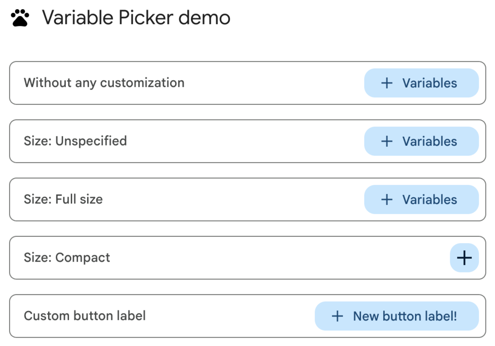
Figure 1: Variable picker button customization on the web. -
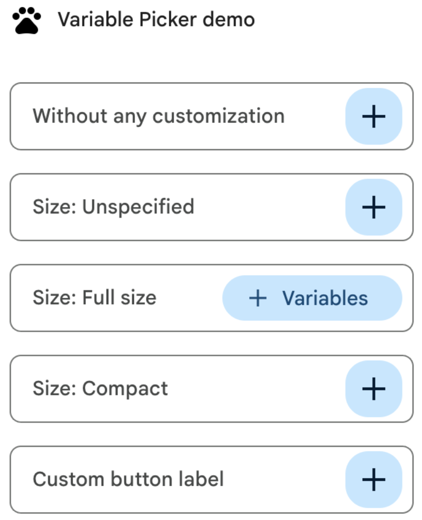
Figure 2: Variable picker button customization in an add-on side panel.
Here's the manifest file for customizing variable picker buttons:
JSON
{
  "timeZone": "America/Los_Angeles",
  "dependencies": {},
  "exceptionLogging": "STACKDRIVER",
  "runtimeVersion": "V8",
  "oauthScopes": [
    "https://www.googleapis.com/auth/script.locale"
  ],
  "addOns": {
    "common": {
      "name": "Variable button customization",
      "logoUrl": "https://www.gstatic.com/images/icons/material/system/1x/pets_black_48dp.png",
      "useLocaleFromApp": true
    },
    "flows": {
      "workflowElements": [
        {
          "id": "variable_picker_customization",
          "state": "ACTIVE",
          "name": "Variable Picker demo",
          "description": "List all possible variable picker customization options",
          "workflowAction": {
            "onConfigFunction": "onUpdateCardConfigFunction",
            "onExecuteFunction": "onUpdateCardExecuteFunction"
          }
        }
      ]
    }
  }
}
Here's the code for customizing variable picker buttons:
Apps Script
function onUpdateCardConfigFunction(event) {
  const textInput1 = CardService.newTextInput()
    .setFieldName("value1")
    .setTitle("Regular variable picker button")
    .setHostAppDataSource(
      CardService.newHostAppDataSource().setWorkflowDataSource(
        CardService.newWorkflowDataSource()
          .setIncludeVariables(true)
          .setVariableButtonSize(CardService.VariableButtonSize.UNSPECIFIED)
      )
    );

  const textInput2 = CardService.newTextInput()
    .setFieldName("value2")
    .setTitle("Size: Unspecified")
    .setHostAppDataSource(
      CardService.newHostAppDataSource().setWorkflowDataSource(
        CardService.newWorkflowDataSource()
          .setIncludeVariables(true)
          .setVariableButtonSize(CardService.VariableButtonSize.UNSPECIFIED)
      )
    );

  const textInput3 = CardService.newTextInput()
    .setFieldName("value3")
    .setTitle("Size: Full size")
    .setHostAppDataSource(
      CardService.newHostAppDataSource().setWorkflowDataSource(
        CardService.newWorkflowDataSource()
          .setIncludeVariables(true)
          .setVariableButtonSize(CardService.VariableButtonSize.FULL_SIZE)
      )
    );

  const textInput4 = CardService.newTextInput()
    .setFieldName("value4")
    .setTitle("Size: Compact")
    .setHostAppDataSource(
      CardService.newHostAppDataSource().setWorkflowDataSource(
        CardService.newWorkflowDataSource()
          .setIncludeVariables(true)
          .setVariableButtonSize(CardService.VariableButtonSize.COMPACT)
      )
    );

  const textInput5 = CardService.newTextInput()
    .setFieldName("value5")
    .setTitle("Custom button label")
    .setHostAppDataSource(
      CardService.newHostAppDataSource().setWorkflowDataSource(
        CardService.newWorkflowDataSource()
          .setIncludeVariables(true)
          .setVariableButtonLabel("New button label!")
      )
    );

  var cardSection = CardService.newCardSection()
    .addWidget(textInput1)
    .addWidget(textInput2)
    .addWidget(textInput3)
    .addWidget(textInput4)
    .addWidget(textInput5)
    .setId("section_1");

  var card = CardService.newCardBuilder().addSection(cardSection).build();

  return card;
}

function onUpdateCardExecuteFunction(event) {
}
Configure Google Workspace data autocomplete
You can also populate autocomplete suggestions from data within the user's Google Workspace environment:
- Google Workspace users: Populate users within the same Google Workspace organization.
- Google Chat spaces: Populate Google Chat spaces that the user is a member of.
To configure this, set the
PlatformDataSource
in the
SelectionInput
widget, specifying the
WorkflowDataSourceType
as either USER or SPACE.
Apps Script
// User Autocomplete
var multiSelect2 =
  CardService.newSelectionInput()
    .setFieldName("value2")
    .setTitle("User Autocomplete")
    .setType(CardService.SelectionInputType.MULTI_SELECT)
    .setMultiSelectMaxSelectedItems(3)
    .setPlatformDataSource(
      CardService.newPlatformDataSource()
        .setHostAppDataSource(
          CardService.newHostAppDataSource()
            .setWorkflowDataSource(
              CardService.newWorkflowDataSource()
                .setIncludeVariables(true)
                .setType(CardService.WorkflowDataSourceType.USER)
            ))
    );

// Chat Space Autocomplete
var multiSelect3 =
  CardService.newSelectionInput()
    .setFieldName("value3")
    .setTitle("Chat Space Autocomplete")
    .setType(CardService.SelectionInputType.MULTI_SELECT)
    .setMultiSelectMaxSelectedItems(3)
    .setPlatformDataSource(
      CardService.newPlatformDataSource()
        .setHostAppDataSource(
          CardService.newHostAppDataSource()
            .setWorkflowDataSource(
              CardService.newWorkflowDataSource()
                .setIncludeVariables(true)
                .setType(CardService.WorkflowDataSourceType.SPACE)
            ))
    );
Example: Combining autocomplete types
The following example shows an onConfig function that creates a card with
three SelectionInput
widgets, demonstrating server-side, user, and space autocomplete:
JSON
{
  "timeZone": "America/Los_Angeles",
  "exceptionLogging": "STACKDRIVER",
  "runtimeVersion": "V8",
  "addOns": {
    "common": {
      "name": "Autocomplete Demo",
      "logoUrl": "https://www.gstatic.com/images/icons/material/system/1x/pets_black_48dp.png",
      "useLocaleFromApp": true
    },
    "flows": {
      "workflowElements": [
        {
          "id": "autocomplete_demo",
          "state": "ACTIVE",
          "name": "Autocomplete Demo",
          "description": "Provide autocompletion in input fields",
          "workflowAction": {
            "inputs": [
              {
                "id": "value1",
                "description": "A multi-select field with autocompletion",
                "cardinality": "SINGLE",
                "dataType": {
                  "basicType": "STRING"
                }
              }
            ],
            "onConfigFunction": "onConfigAutocomplete",
            "onExecuteFunction": "onExecuteAutocomplete"
          }
        }
      ]
    }
  }
}
Apps Script
function onConfigAutocompleteTest(event) {
  // Handle autocomplete request
  if (event.workflow && event.workflow.elementUiAutocomplete) {
    return handleAutocompleteRequest(event);
  }

  // Server-side autocomplete widget
  var multiSelect1 =
    CardService.newSelectionInput()
      .setFieldName("value1")
      .setTitle("Server Autocomplete")
      .setType(CardService.SelectionInputType.MULTI_SELECT)
      .setMultiSelectMaxSelectedItems(3)
      .addDataSourceConfig(
        CardService.newDataSourceConfig()
          .setRemoteDataSource(
            CardService.newAction().setFunctionName('getAutocompleteResults')
          )
      )
      .addDataSourceConfig(
        CardService.newDataSourceConfig()
          .setPlatformDataSource(
            CardService.newPlatformDataSource()
              .setHostAppDataSource(
                CardService.newHostAppDataSource()
                  .setWorkflowDataSource(
                    CardService.newWorkflowDataSource()
                      .setIncludeVariables(true)
                  ))
          )
      );

  // User autocomplete widget
  var multiSelect2 =
    CardService.newSelectionInput()
      .setFieldName("value2")
      .setTitle("User Autocomplete")
      .setType(CardService.SelectionInputType.MULTI_SELECT)
      .setMultiSelectMaxSelectedItems(3)
      .setPlatformDataSource(
        CardService.newPlatformDataSource()
          .setHostAppDataSource(
            CardService.newHostAppDataSource()
              .setWorkflowDataSource(
                CardService.newWorkflowDataSource()
                  .setIncludeVariables(true)
                  .setType(CardService.WorkflowDataSourceType.USER)
              ))
      );

  // Space autocomplete widget
  var multiSelect3 =
    CardService.newSelectionInput()
      .setFieldName("value3")
      .setTitle("Chat Space Autocomplete")
      .setType(CardService.SelectionInputType.MULTI_SELECT)
      .setMultiSelectMaxSelectedItems(3)
      .setPlatformDataSource(
        CardService.newPlatformDataSource()
          .setHostAppDataSource(
            CardService.newHostAppDataSource()
              .setWorkflowDataSource(
                CardService.newWorkflowDataSource()
                  .setIncludeVariables(true)
                  .setType(CardService.WorkflowDataSourceType.SPACE)
              ))
      );

  var sectionBuilder =
    CardService.newCardSection()
      .addWidget(multiSelect1)
      .addWidget(multiSelect2)
      .addWidget(multiSelect3);

  var card =
    CardService.newCardBuilder()
      .addSection(sectionBuilder)
      .build();
  return card;
}

function handleAutocompleteRequest(event) {
  var invokedFunction = event.workflow.elementUiAutocomplete.invokedFunction;
  var query = event.workflow.elementUiAutocomplete.query;

  if (invokedFunction != "getAutocompleteResults" || query == undefined || query == "") {
    return {};
  }

  // Query your data source to get results
  let autocompleteResponse = AddOnsResponseService.newUpdateWidget()
    .addSuggestion(
      query + " option 1",
      query + "_option1",
      false,
      "https://developers.google.com/workspace/add-ons/images/person-icon.png",
      "option 1 bottom text"
    )
    .addSuggestion(
      query + " option 2",
      query + "_option2",
      false,
      "https://developers.google.com/workspace/add-ons/images/person-icon.png",
      "option 2 bottom text"
    ).addSuggestion(
      query + " option 3",
      query + "_option3",
      false,
      "https://developers.google.com/workspace/add-ons/images/person-icon.png",
      "option 3 bottom text"
    );

  const modifyAction = AddOnsResponseService.newAction()
    .addModifyCard(
      AddOnsResponseService.newModifyCard()
        .setUpdateWidget(autocompleteResponse)
    );

  return AddOnsResponseService.newRenderActionBuilder()
    .setAction(modifyAction)
    .build();
}
Validate the input variable
As a best practice, validate that the user enters an appropriate value. See Validate an input variable.
Related topics
- Validate an input variable
- Output variables
- Dynamic variables
- Log activity and errors
- Workspace Studio event objects