このドキュメントでは、Glass のスタイルに従う方法について説明します。 GDK を使用する際の一般的な UI のベスト プラクティスを実装できます。
Glass のテーマ
Glass では、Glassware に標準のテーマが適用されるため、 他の管理画面との一貫性が保たれます。「 テーマには次の特徴があります。
- Roboto 書体を使用
- ステータスバーやアクションバーなしでアクティビティを全画面表示する
- 黒一色の背景を適用します
Glass のテーマを適用するには、Android マニフェストでテーマを宣言しないでください。
Glassware の一部にカスタム スタイルがある場合
それ以外はデフォルトの
Glass テーマにしたい場合は
parent 属性を使用して Theme.DeviceDefault から継承します。
<resources>
    <style name="CustomTheme" parent="@android:style/Theme.DeviceDefault">
        <!-- Theme customization goes here. -->
    </style>
</resources>
詳しくは、Android デベロッパー ガイド スタイルとテーマ をご覧ください。
ガラススタイルのカード
CardBuilder
クラスは、指定された一連のプロパティに基づいて、正しい形式のカードを作成します。レイアウトを使用する
提供元: CardBuilder.Layout
そうすれば、他のコンテンツと同じような見た目や使い心地を
ガラス。
CardBuilder を使用するには:
CardBuilderのインスタンスを作成し、任意のレイアウトを指定します。CardBuilder.Layout。- テキスト、脚注、タイムスタンプなどのカードのプロパティを設定します。
CardBuilder.getView()を呼び出す カードを Android スマートフォンに変換し、View、またはCardBuilder.getRemoteViews()変換し、RemoteViews渡されます。Viewは、アクティビティ、レイアウト、またはCardScrollView、またはLiveCardのRemoteViews。
一般的な UI 機能
CardBuilder が提供するレイアウトの多くは、共通のユーザー インターフェースをサポートしています。
以下で説明します。個別のレイアウトについては、
CardBuilder.Layout
をご覧ください。
アトリビューション アイコン
帰属表示アイコンは、Google Play に表示されるオプションの 36×36 ピクセルのアイコンです。
タイムスタンプの右下に表示されます。これを設定
アイコンを
CardBuilder.setAttributionIcon()
特にライブカードでアプリケーションを識別できるため、
そのカードの情報源を見ます
スタック インジケーター
スタック インジケーターは、
CardBuilder.showStackIndicator()
カードの右上に表示される角の折り目です。次の用途で使用
そのカードは、同じカードが関連付けられた
直接アクセスできます。
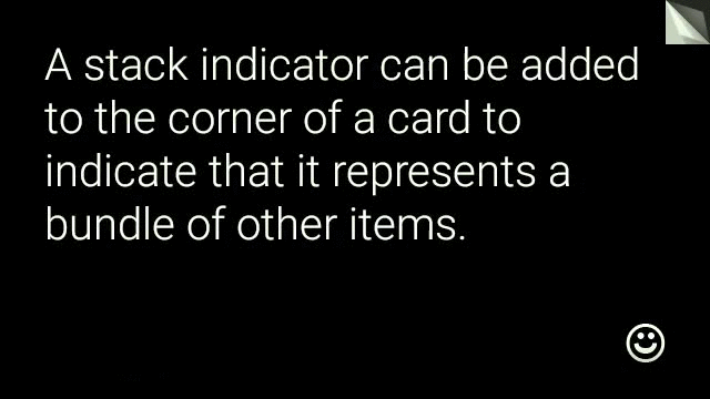
View view = new CardBuilder(context, CardBuilder.Layout.TEXT)
    .setText("A stack indicator can be added to the corner of a card...")
    .setAttributionIcon(R.drawable.ic_smile)
    .showStackIndicator(true)
    .getView();
レイアウト
次の例は、
CardBuilder。
TEXT、TEXT_FIXED
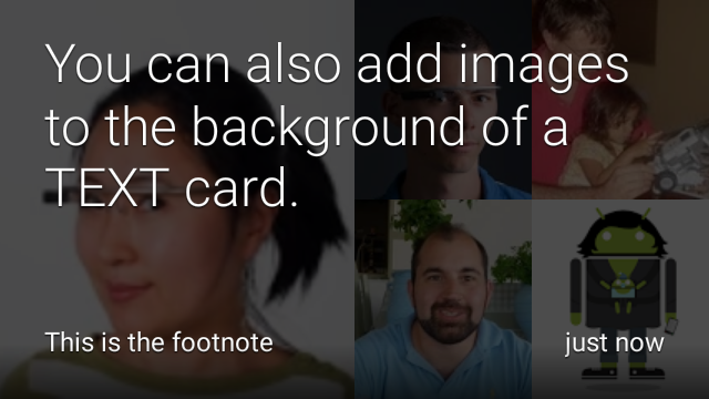
CardBuilder.Layout.TEXT
フルブリード テキストが表示され、必要に応じて
背景に画像モザイクを配置しますテキストは、画面に合わせてサイズが動的に
できます。
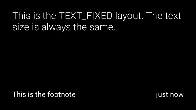
CardBuilder.Layout.TEXT_FIXED
は類似していますが、テキストのサイズを小さくしています。
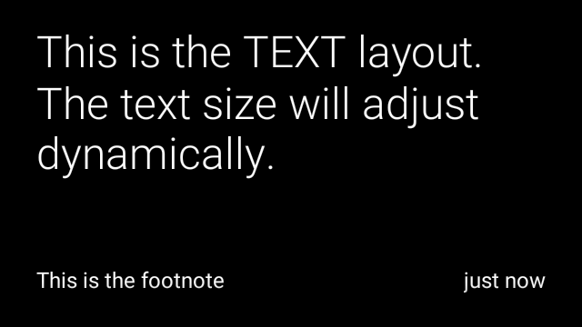
View view1 = new CardBuilder(context, CardBuilder.Layout.TEXT)
    .setText("This is the TEXT layout. The text size will adjust dynamically.")
    .setFootnote("This is the footnote")
    .setTimestamp("just now")
    .getView();
View view2 = new CardBuilder(context, CardBuilder.Layout.TEXT)
    .setText("You can also add images to the background of a TEXT card.")
    .setFootnote("This is the footnote")
    .setTimestamp("just now")
    .addImage(R.drawable.image1)
    .addImage(R.drawable.image2)
    .addImage(R.drawable.image3)
    .addImage(R.drawable.image4)
    .addImage(R.drawable.image5)
    .getView();
View view3 = new CardBuilder(context, CardBuilder.Layout.TEXT_FIXED)
    .setText("This is the TEXT_FIXED layout. The text size is always the same.")
    .setFootnote("This is the footnote")
    .setTimestamp("just now")
    .getView();
COLUMNS、COLUMNS_FIXED
「
CardBuilder.Layout.COLUMNS
画面上に画像モザイクまたはアイコンが
右側にテキストを配置しますテキストのサイズを動的に変更する
スペースに合わせて最適なサイズを選択しますテキストサイズを固定するには、次のコマンドを使用します。
CardBuilder.Layout.COLUMNS_FIXED。
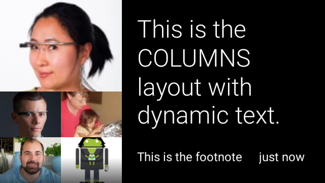
View view1 = new CardBuilder(context, CardBuilder.Layout.COLUMNS)
.setText("This is the COLUMNS layout with dynamic text.")
.setFootnote("This is the footnote")
.setTimestamp("just now")
.addImage(R.drawable.image1)
.addImage(R.drawable.image2)
.addImage(R.drawable.image3)
.addImage(R.drawable.image4)
.addImage(R.drawable.image5)
.getView();
View view2 = new CardBuilder(context, CardBuilder.Layout.COLUMNS)
.setText("You can even put a centered icon on a COLUMNS card instead of a mosaic.")
.setFootnote("This is the footnote")
.setTimestamp("just now")
.setIcon(R.drawable.ic_wifi)
.getView();
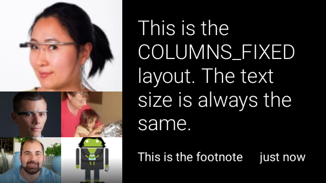
View view3 = new CardBuilder(context, CardBuilder.Layout.COLUMNS_FIXED)
.setText("This is the COLUMNS_FIXED layout. The text size is always the same.")
.setFootnote("This is the footnote")
.setTimestamp("just now")
.addImage(R.drawable.image1)
.addImage(R.drawable.image2)
.addImage(R.drawable.image3)
.addImage(R.drawable.image4)
.addImage(R.drawable.image5)
.getView();
CAPTION
「
CardBuilder.Layout.CAPTION
背景に画像モザイクがあるレイアウト
短いキャプションがカードの下部に揃えられます。アイコンは
たとえば、個人の ID などを表す
関連する情報が示されます。
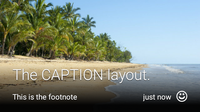
View view1 = new CardBuilder(context, CardBuilder.Layout.CAPTION)
.setText("The caption layout.")
.setFootnote("This is the footnote")
.setTimestamp("just now")
.addImage(R.drawable.beach)
.setAttributionIcon(R.drawable.ic_smile)
.getView();
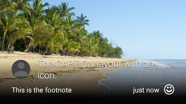
View view2 = new CardBuilder(context, CardBuilder.Layout.CAPTION)
.setText("The caption layout with an icon.")
.setFootnote("This is the footnote")
.setTimestamp("just now")
.addImage(R.drawable.beach)
.setIcon(R.drawable.ic_avatar)
.setAttributionIcon(R.drawable.ic_smile)
.getView();
TITLE
「
CardBuilder.Layout.TITLE
背景に画像モザイクがあるレイアウト
カードの下部にタイトルとオプションのアイコンが中央に配置されます。このレイアウト
連絡先や共有ターゲットを表すためによく使用されます。脚注とタイムスタンプは、
このレイアウトではサポートされていません。

View view = new CardBuilder(context, CardBuilder.Layout.TITLE)
    .setText("TITLE Card")
    .setIcon(R.drawable.ic_phone)
    .addImage(R.drawable.beach)
    .getView();
AUTHOR
こちらの
CardBuilder.Layout.AUTHOR
メッセージや会話を表示するレイアウト
作成者に焦点が当てられています背景は画像モザイクに対応しており
作成者のアバターとして使用されるアイコン、見出しと小見出しがあります。
取得します。
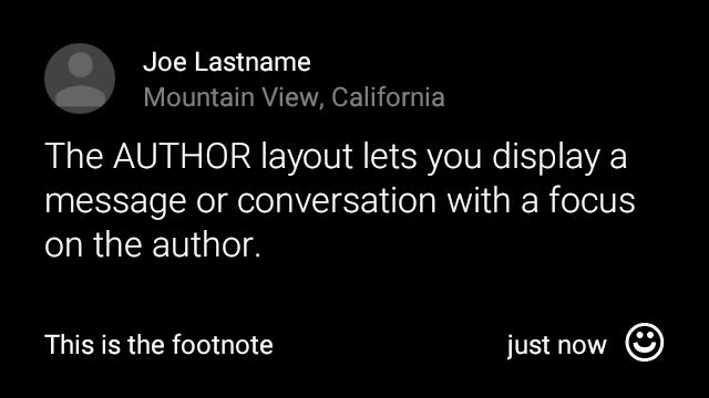
View view = new CardBuilder(context, CardBuilder.Layout.AUTHOR)
    .setText("The AUTHOR layout lets you display a message or conversation "
            + " with a focus on the author.")
    .setIcon(R.drawable.ic_avatar)
    .setHeading("Joe Lastname")
    .setSubheading("Mountain View, California")
    .setFootnote("This is the footnote")
    .setTimestamp("just now")
    .getView();
MENU
「
CardBuilder.Layout.MENU
表示することもできます。機能
中央揃えのアイコンとタイトル、任意で脚注を追加できます。このレイアウトを使用する
確認画面(ユーザーの操作後に「削除」から「削除済み」に移行)
メニュー アイテムを選択する場合などです)。実際のメニューが必要な場合は、
標準のオプション メニューを使用してください。
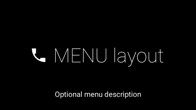
View view = new CardBuilder(context, CardBuilder.Layout.MENU)
    .setText("MENU layout")
    .setIcon(R.drawable.ic_phone)
    .setFootnote("Optional menu description")
    .getView();
EMBED_INSIDE
「
CardBuilder.Layout.EMBED_INSIDE
レイアウトを使用すると、独自のデザインのカスタム レイアウト XML を標準の Glass に埋め込むことができます。
カード テンプレート。これにより、アプリのカスタム UI を設計できますが、
カードの脚注、タイムスタンプ、帰属表示アイコンが正しく配置されていること。
スタック インジケーターを確認できます。
通話中
CardBuilder.getView()
findViewById()
埋め込みレイアウト内のビューにアクセスできます。同様に
発信
CardBuilder.getRemoteViews()
埋め込みレイアウトのビューを操作するには、埋め込みレイアウトのビューに ID を直接渡します。
新しい
RemoteViews
setter メソッドを使用します。
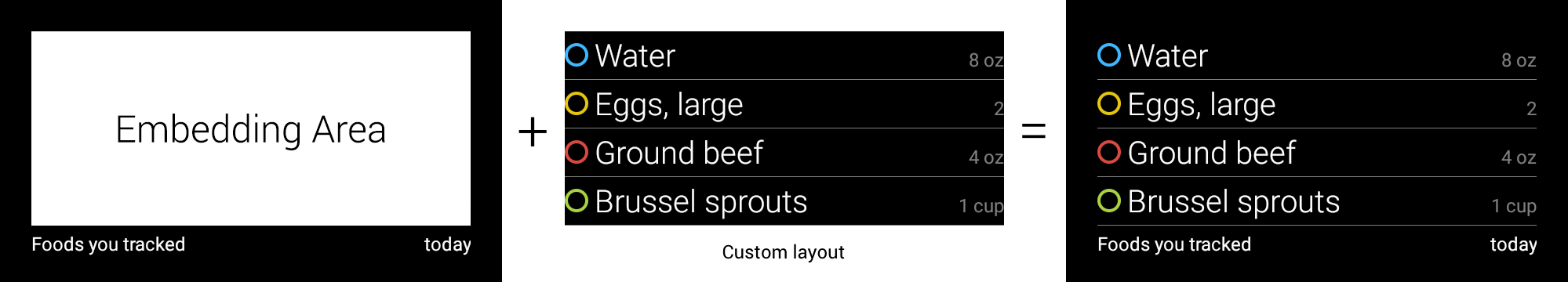
View view = new CardBuilder(context, CardBuilder.Layout.EMBED_INSIDE)
    .setEmbeddedLayout(R.layout.food_table)
    .setFootnote("Foods you tracked")
    .setTimestamp("today")
    .getView();
TextView textView1 = (TextView) view.findViewById(R.id.text_view_1);
textView1.setText("Water");
// ...and so on
より詳細な例については、 ApiDemo プロジェクト。
ALERT
「
CardBuilder.Layout.ALERT
中央に配置された大きなアイコンで、
主要なメッセージと脚注が表示されますこのレイアウトを
Dialog~
Glassware に重要な情報メッセージ、警告、エラーが表示されます。

次の例は、AlertDialog の実装を示しており、
カードをタップすると、Wi-Fi 設定が開きます。
Dialogを拡張するクラスを作成します。CardBuilderを使用してCardBuilder.Layout.ALERTレイアウトでカードを作成し、このカードでコンテンツ ビューを設定します。(省略可)このカードでのユーザー ジェスチャーを処理するための
GestureDetectorを作成します。public class AlertDialog extends Dialog { private final DialogInterface.OnClickListener mOnClickListener; private final AudioManager mAudioManager; private final GestureDetector mGestureDetector; /** * Handles the tap gesture to call the dialog's * onClickListener if one is provided. */ private final GestureDetector.BaseListener mBaseListener = new GestureDetector.BaseListener() { @Override public boolean onGesture(Gesture gesture) { if (gesture == Gesture.TAP) { mAudioManager.playSoundEffect(Sounds.TAP); if (mOnClickListener != null) { // Since Glass dialogs do not have buttons, // the index passed to onClick is always 0. mOnClickListener.onClick(AlertDialog.this, 0); } return true; } return false; } }; public AlertDialog(Context context, int iconResId, int textResId, int footnoteResId, DialogInterface.OnClickListener onClickListener) { super(context); mOnClickListener = onClickListener; mAudioManager = (AudioManager) context.getSystemService(Context.AUDIO_SERVICE); mGestureDetector = new GestureDetector(context).setBaseListener(mBaseListener); setContentView(new CardBuilder(context, CardBuilder.Layout.ALERT) .setIcon(iconResId) .setText(textResId) .setFootnote(footnoteResId) .getView()); } /** Overridden to let the gesture detector handle a possible tap event. */ @Override public boolean onGenericMotionEvent(MotionEvent event) { return mGestureDetector.onMotionEvent(event) || super.onGenericMotionEvent(event); } }(省略可)アクティビティに以下を実装します。
OnClickListenerユーザーがタップしたときに追加のフローを処理できます。このモジュールの Wi-Fi などの設定アクティビティを開始する方法については、 開始時の設定。AlertDialogコンストラクタを呼び出してアラートカードを表示します。public class MyActivity extends Activity { ... private final DialogInterface.OnClickListener mOnClickListener = new DialogInterface.OnClickListener() { @Override public void onClick(DialogInterface dialog, int button) { // Open WiFi Settings startActivity(new Intent(Settings.ACTION_WIFI_SETTINGS)); } }; @Override protected void onCreate(Bundle bundle) { ... new AlertDialog(context, R.drawable.ic_cloud_sad_150, R.string.alert_text, R.string.alert_footnote_text, mOnClickListener).show(); ... } }
XML レイアウト
CardBuilder クラスで使用できる基本的なカード レイアウトを 2 つ紹介します。 ニーズに合わないこともあります
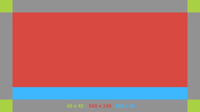
メイン レイアウト
このレイアウトでは、カードの標準のパディングとフッターを定義します。独自に設定
空の RelativeLayout にあるビュー。
<?xml version="1.0" encoding="utf-8"?>
<FrameLayout xmlns:android="http://schemas.android.com/apk/res/android"
    xmlns:tools="http://schemas.android.com/tools"
    android:id="@+id/layout"
    android:layout_width="match_parent"
    android:layout_height="match_parent"
    >

    <RelativeLayout
        android:id="@+id/body_layout"
        android:layout_width="match_parent"
        android:layout_height="@dimen/glass_card_body_height"
        android:layout_marginLeft="@dimen/glass_card_margin"
        android:layout_marginTop="@dimen/glass_card_margin"
        android:layout_marginRight="@dimen/glass_card_margin"
        tools:ignore="UselessLeaf"
        >

        <!-- Put your widgets inside this RelativeLayout. -->

    </RelativeLayout>

    <LinearLayout
        android:id="@+id/footer_container"
        android:layout_width="match_parent"
        android:layout_height="wrap_content"
        android:layout_gravity="bottom|left"
        android:layout_marginLeft="@dimen/glass_card_margin"
        android:layout_marginBottom="@dimen/glass_card_footer_margin"
        android:layout_marginRight="@dimen/glass_card_margin"
        android:orientation="horizontal"
        >

        <!-- The footer view will grow to fit as much content as possible while the
             timestamp view keeps a fixed width. If the footer text is too long, it
             will be ellipsized with a 40px margin between it and the timestamp. -->

        <TextView
            android:id="@+id/footer"
            android:layout_width="0dip"
            android:layout_height="wrap_content"
            android:layout_weight="1"
            android:ellipsize="end"
            android:singleLine="true"
            android:textAppearance="?android:attr/textAppearanceSmall"
            />

        <TextView
            android:id="@+id/timestamp"
            android:layout_width="wrap_content"
            android:layout_height="wrap_content"
            android:layout_marginLeft="@dimen/glass_card_margin"
            android:ellipsize="end"
            android:singleLine="true"
            android:textAppearance="?android:attr/textAppearanceSmall"
            />

    </LinearLayout>

</FrameLayout>
左の列レイアウト
左の 240 ピクセルと右の 400 ピクセルの列を 2 つの RelativeLayout の形式で定義します。
ビューを投入できます
<?xml version="1.0" encoding="utf-8"?>
<RelativeLayout xmlns:android="http://schemas.android.com/apk/res/android"
    xmlns:tools="http://schemas.android.com/tools"
    android:layout_width="match_parent"
    android:layout_height="match_parent"
    >

    <RelativeLayout
        android:id="@+id/left_column"
        android:layout_width="@dimen/glass_card_left_column_width"
        android:layout_height="match_parent"
        >

        <!-- Put widgets for the left column inside this RelativeLayout. -->

    </RelativeLayout>

    <RelativeLayout
        android:layout_width="wrap_content"
        android:layout_height="@dimen/glass_card_body_height"
        android:layout_alignParentRight="true"
        android:layout_alignParentTop="true"
        android:layout_marginLeft="@dimen/glass_card_two_column_margin"
        android:layout_marginRight="@dimen/glass_card_margin"
        android:layout_marginTop="@dimen/glass_card_margin"
        android:layout_toRightOf="@+id/left_column"
        tools:ignore="UselessLeaf"
        >

        <!-- Put widgets for the right column inside this RelativeLayout. -->

    </RelativeLayout>

    <LinearLayout
        android:id="@+id/footer_container"
        android:layout_width="wrap_content"
        android:layout_height="wrap_content"
        android:layout_alignParentBottom="true"
        android:layout_alignParentRight="true"
        android:layout_gravity="bottom|left"
        android:layout_marginBottom="@dimen/glass_card_footer_margin"
        android:layout_marginLeft="@dimen/glass_card_two_column_margin"
        android:layout_marginRight="@dimen/glass_card_margin"
        android:layout_toRightOf="@+id/left_column"
        android:orientation="horizontal"
        >

        <!--
             The footer view will grow to fit as much content as possible while the
             timestamp view keeps a fixed width. If the footer text is too long, it
             will be ellipsized with a 40px margin between it and the timestamp.
        -->

        <TextView
            android:id="@+id/footer"
            android:layout_width="0dip"
            android:layout_height="wrap_content"
            android:layout_weight="1"
            android:ellipsize="end"
            android:singleLine="true"
            android:textAppearance="?android:attr/textAppearanceSmall"
            />

        <TextView
            android:id="@+id/timestamp"
            android:layout_width="wrap_content"
            android:layout_height="wrap_content"
            android:layout_marginLeft="@dimen/glass_card_margin"
            android:ellipsize="end"
            android:singleLine="true"
            android:textAppearance="?android:attr/textAppearanceSmall"
            />

    </LinearLayout>

</RelativeLayout>
標準寸法
このファイルを以前のレイアウトまたは独自のレイアウトと組み合わせて使用し、
標準 Glass スタイルに合わせます。このファイルを次のように作成する
Android プロジェクトの res/values/dimens.xml。
<?xml version="1.0" encoding="utf-8"?>

<resources>

    <!-- The recommended margin for the top, left, and right edges of a card. -->
    <dimen name="glass_card_margin">40px</dimen>

    <!-- The recommended margin between the bottom of the card and the footer. This is
         an adjusted value so that the baseline of the text in the footer sits 40px
         from the bottom of the card, matching the other margins. -->
    <dimen name="glass_card_footer_margin">33px</dimen>

    <!-- The recommended margin for the left column of the two-column card. -->
    <dimen name="glass_card_two_column_margin">30px</dimen>

    <!-- The maximum height of the body content inside a card. -->
    <dimen name="glass_card_body_height">240px</dimen>

    <!-- The width of the left column in the two-column layout. -->
    <dimen name="glass_card_left_column_width">240px</dimen>

</resources>