请遵循以下推荐做法,更好地触达用户,提升商家的宣传效果。虽然其中许多指南属于最佳实践,因此并非强制性要求,但所有广告和素材资源都必须遵守 Google Ads 政策。
照片质量是推荐活动非常重要的元素。这些图片将用于推荐活动广告和推荐活动体验模块。以下指南可帮助您巧妙辨别推荐活动所用图片的优劣,避开会影响效果的常见错误和误区。
格式要求

分辨率
格式要求通常与其他图片广告或购物广告相同。系统会根据需要缩小或剪裁图片,但图片必须足够大,才能填满相应空间。
虽然图片大小下限为 300x300,但我们建议提供至少 1024 x 683 像素的内容,最好是 2048 x 1366 像素。这样可以确保在剪裁和调整大小后保持清晰度。

比率
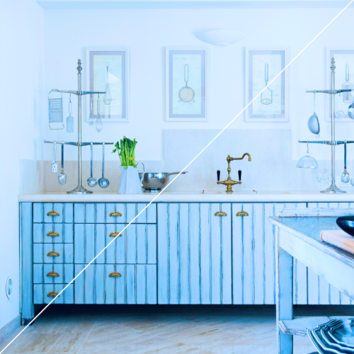
宽高比可以是任意值,但我们建议采用 4:3 或 1:1,首选 1:1 宽高比,这样可以更灵活地剪裁图片。纵向或横向拍摄的正文应始终居中且对焦准确。

格式
图片不得带有动画效果。支持的格式为 JPG 和 PNG。图片顺序
默认情况下,Google 会从您为特定商品提供的一组图片中选择画质最高的图片。如果您想指明图片顺序的偏好设置,可以将 product/use_media_order 设置为 true。
映像更新
如果需要更新或替换图片,请务必同时更改新图片的网址,以确保 Google 能够了解更改并重新抓取更新后的图片。
如果您要同时更新大量商品的图片,强烈建议您先将包含新图片网址的 Feed 上传到沙盒环境。这样,您就可以在将新映像推送到生产环境之前验证更改并确保新映像已正确处理。
质量最佳实践
在当今这个以视觉效果为导向的世界,优质照片已不再是锦上添花。 它们是必不可少的,尤其是对于新一代旅客而言。提升照片画质对商家有诸多益处,具体有以下几点。图片有助于用户了解您的商家、产品和品牌,对于提升广告效果也至关重要。为用户提供尽可能高品质的视觉内容对取得成功至关重要。对我们而言,质量包含多种含义,从概念层面(讲述真实的故事)到技术层面(展示聚焦的正文)。
摄影是用户了解 Google 推荐活动的主要途径之一。这意味着,房源照片在旅客决定是否预订时起着至关重要的作用。遵循一些摄影基本原则,可以将普通照片转变为出色的照片。Google 编写了本指南,为您详细介绍了这些要求。

真诚

:选择看起来自然、真实且富有人情味的内容。就像是当下拍摄的。 光线和编辑效果也应逼真自然。

选择感觉做作或有过度摆拍之嫌的内容,也不要选择自拍照。
锐度

:使用清晰、对焦准确的图片。

使用模糊的图片或正文未对焦的内容。
曝光

:选择亮度看起来恰到好处的图片。确保夜间或低光图像足够亮,以显示较浅的色调和细节,反之亦然。

使用过于模糊或因光线昏暗而无法看清细节的内容(过曝或欠曝)。最好不要使用过于明亮或过于昏暗的照片。
色彩平衡和饱和度
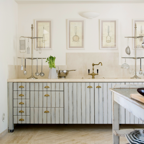
:确保颜色看起来逼真。 始终力求色彩平衡。调整照片的白色,使其看起来中性:既不太黄(暖色),也不太蓝(冷色)。
使用色调过于冷或过于暖的内容。避免过度提高饱和度。
乐曲

:让您的产品或服务成为图片的焦点。

在画面中将商品缩小,因为缩小后商品在缩略图中会变得难以辨认。

:使用图片的自然线条。

使用看起来歪斜或扭曲的图片,例如鱼眼镜头或极广角镜头拍摄的图片。

:保持横平竖直。 拉直照片,使墙壁或地面线条看起来平整。

扭曲或拉伸照片。
主题

在呈现体验或社交空间时展示人物。确保内容看起来是自然而非刻意摆拍的。

突出展示人物,除非展示体验或社交空间时需要。

:选择看起来自然、真实且富有人情味的内容。就像是当下拍摄的一样。光线和编辑效果应逼真自然。

请勿使用夜间拍摄的内容,除非夜间活动与内容相关。

应按实际情况显示活动。

请勿添加或移除元素。 移除或添加元素会导致照片不准确,并可能会让潜在客户产生错误的预期。

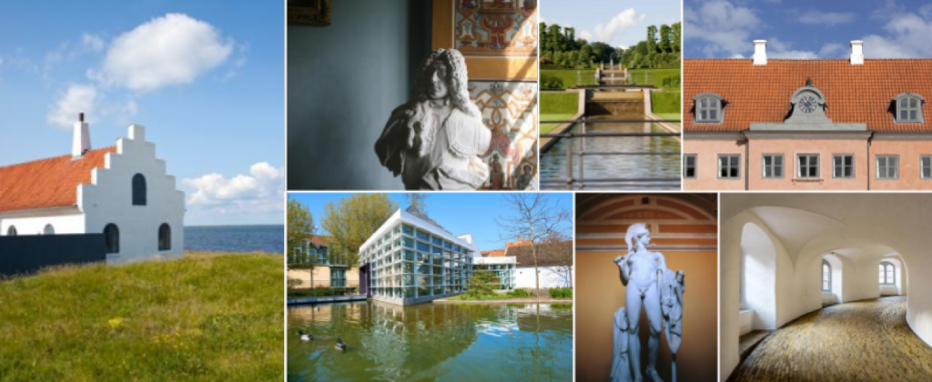
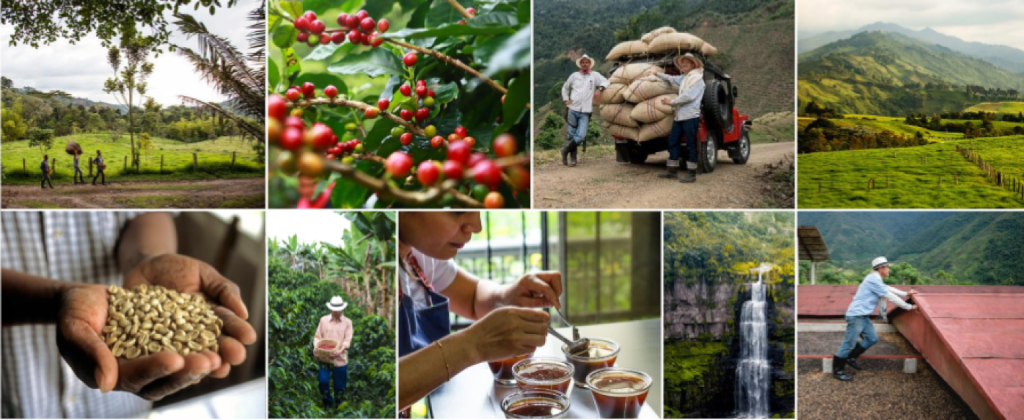
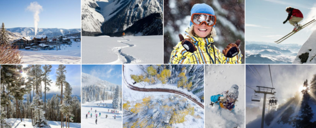
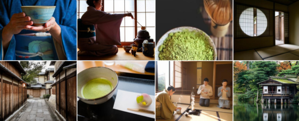
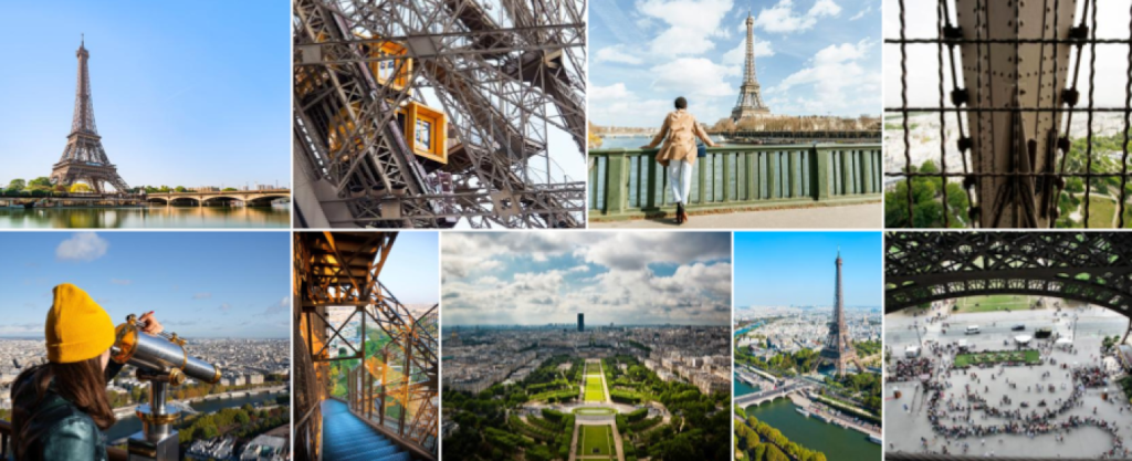
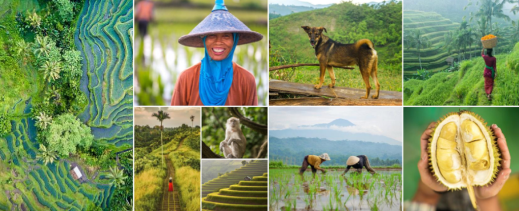
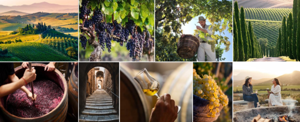
请使用单一图片。让每张照片独立呈现有助于用户更轻松地了解拍摄主题。

请勿使用拼图,因为在移动设备上,单个图片会变得很小。

:保留原图,确保它才是焦点。

添加图形或叠加层。 请勿在照片中添加边框、文字、按钮或徽标。

:让色彩和色调逼真自然。

使用 HDR 或夸张滤镜,因为图片可能会看起来粗糙且不自然。可以使用浅色滤镜,但颜色应保持真实。
最佳实践示例