The toolbox is the place where users get blocks. Usually it is displayed on one side of the workspace. Sometimes it has categories, and sometimes it does not.
This page mainly focuses on how to specify the structure of your toolbox (i.e. what categories it has, and what blocks they contain). If you want more details about how to change the UI of your toolbox, check out the Customizing a Blockly toolbox codelab and the 2021 Toolbox APIs talk.
Formats
Blockly allows you to specify your toolbox's structure using a few different formats. The new recommended format uses JSON, and the old format uses XML.
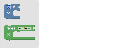
Here are the different ways you could specify the above toolbox:
As of the September 2020 release toolboxes can be defined using JSON.
var toolbox = {
    "kind": "flyoutToolbox",
    "contents": [
      {
        "kind": "block",
        "type": "controls_if"
      },
      {
        "kind": "block",
        "type": "controls_whileUntil"
      }
    ]
  };
var workspace = Blockly.inject('blocklyDiv', {toolbox: toolbox});
<xml id="toolbox" style="display: none">
  <block type="controls_if"></block>
  <block type="controls_whileUntil"></block>
</xml>
<script>
  var workspace = Blockly.inject('blocklyDiv',
      {toolbox: document.getElementById('toolbox')});
</script>
var toolbox = '<xml>' +
    '<block type="controls_if"></block>' +
    '<block type="controls_whileUntil"></block>' +
    '</xml>';
var workspace = Blockly.inject('blocklyDiv', {toolbox: toolbox});
Categories
The blocks in the toolbox may be organized in categories.
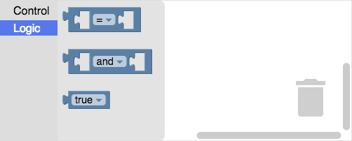
Here are the ways you could define the above toolbox, which has two categories ('Control' and 'Logic'), each of which contain blocks:
{
  "kind": "categoryToolbox",
  "contents": [
    {
      "kind": "category",
      "name": "Control",
      "contents": [
        {
          "kind": "block",
          "type": "controls_if"
        },
      ]
    },
    {
      "kind": "category",
      "name": "Logic",
      "contents": [
        {
          "kind": "block",
          "type": "logic_compare"
        },
        {
          "kind": "block",
          "type": "logic_operation"
        },
        {
          "kind": "block",
          "type": "logic_boolean"
        }
      ]
    }
  ]
}
<xml id="toolbox" style="display: none">
  <category name="Control">
    <block type="controls_if"></block>
  <category name="Logic">
    <block type="logic_compare"></block>
    <block type="logic_operation"></block>
    <block type="logic_boolean"></block>
  </category>
</xml>
Nested categories
Categories may be nested within other categories. Here are two top-level categories ('Core' and 'Custom'), the second of which contains two sub-categories, each of which contain blocks:
Note that it is possible for a category to contain both sub-categories and blocks. In the above example, 'Custom' has two sub-categories ('Move' and 'Turn'), as well as a block of its own ('start').
{
  "kind": "categoryToolbox",
  "contents": [
    {
      "kind": "category",
      "name": "Core",
      "contents": [
        {
          "kind": "block",
          "type": "controls_if"
        },
        {
          "kind": "block",
          "type": "logic_compare"
        },
      ]
    },
    {
      "kind": "category",
      "name": "Custom",
      "contents": [
        {
          "kind": "block",
          "type": "start"
        },
        {
          "kind": "category",
          "name": "Move",
          "contents": [
            {
              "kind": "block",
              "type": "move_forward"
            }
          ]
        },
        {
          "kind": "category",
          "name": "Turn",
          "contents": [
            {
              "kind": "block",
              "type": "turn_left"
            }
          ]
        }
      ]
    }
  ]
}
<xml id="toolbox" style="display: none">
  <category name="Core">
    <block type="controls_if"></block>
    <block type="logic_compare"></block>
  </category>
  <category name="Custom">
    <block type="start"></block>
    <category name="Move">
      <block type="move_forward"></block>
    </category>
    <category name="Turn">
      <block type="turn_left"></block>
    </category>
  </category>
</xml>
Dynamic categories
Dynamic categories are categories that are dynamically repopulated based on a function each time they are opened.
Blockly supports this by allowing you to associate a category with a function via a registered string key. The function should return a definition of a category's contents (including blocks, buttons, labels, etc). The contents can be specified as JSON or XML, although JSON is recommended.
Also note that the function is provided the target workspace as a parameter, so the blocks in your dynamic category can be based on the state of the workspace.
As of the September 2021 release, you can specify the state of blocks without
using 'blockxml'.
// Returns an array of objects.
var coloursFlyoutCallback = function(workspace) {
  // Returns an array of hex colours, e.g. ['#4286f4', '#ef0447']
  var colourList = getPalette();
  var blockList = [];
  for (var i = 0; i < colourList.length; i++) {
    blockList.push({
      'kind': 'block',
      'type': 'colour_picker',
      'fields': {
        'COLOUR': colourList[i]
      }
    });
  }
  return blockList;
};

// Associates the function with the string 'COLOUR_PALETTE'
myWorkspace.registerToolboxCategoryCallback(
    'COLOUR_PALETTE', coloursFlyoutCallback);
Before the September 2021 release, you had to use the 'blockxml' property to
specify the state of blocks.
// Returns an array of objects.
var coloursFlyoutCallback = function(workspace) {
  // Returns an array of hex colours, e.g. ['#4286f4', '#ef0447']
  var colourList = getPalette();
  var blockList = [];
  for (var i = 0; i < colourList.length; i++) {
    blockList.push({
      'kind': 'block',
      'type': 'colour_picker', // Type is optional if you provide blockxml
      'blockxml': '<block type="colour_picker">' +
          '<field name="COLOUR">' + colourList[i] + '</field>' +
          '</block>'
    });
  }
  return blockList;
};

// Associates the function with the string 'COLOUR_PALETTE'
myWorkspace.registerToolboxCategoryCallback(
    'COLOUR_PALETTE', coloursFlyoutCallback);
// Returns an arry of XML nodes.
var coloursFlyoutCallback = function(workspace) {
  // Returns an array of hex colours, e.g. ['#4286f4', '#ef0447']
  var colourList = getPalette();
  var blockList = [];
  for (var i = 0; i < colourList.length; i++) {
    var block = document.createElement('block');
    block.setAttribute('type', 'colour_picker');
    var field = document.createElement('field');
    field.setAttribute('name', 'COLOUR');
    field.innerText = colourList[i];
    block.appendChild(field);
    blockList.push(block);
  }
  return blockList;
};

// Associates the function with the string 'COLOUR_PALETTE'
myWorkspace.registerToolboxCategoryCallback(
    'COLOUR_PALETTE', coloursFlyoutCallback);
After the dynamic category functions are associated with a string key (aka
registered) you can assign this string key to the custom property of
your category definition to make the category dynamic.
{
  "kind": "category",
  "name": "Colours",
  "custom": "COLOUR_PALETTE"
}
<category name="Colours" custom="COLOUR_PALETTE"></category>
Built-in dynamic categories
Blockly provides three built-in dynamic categories.
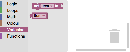
'VARIABLE'creates a category for untyped variables.'VARIABLE_DYNAMIC'creates a category for typed variables. It has buttons to create strings, numbers, and colours.'PROCEDURE'creates a category for function blocks.
{
  "kind": "category",
  "name": "Variables",
  "custom": "VARIABLE"
},
{
  "kind": "category",
  "name": "Variables",
  "custom": "VARIABLE_DYNAMIC"
},
{
  "kind": "category",
  "name": "Functions",
  "custom": "PROCEDURE"
}
<category name="Variables" custom="VARIABLE"></category>
<category name="Variables" custom="VARIABLE_DYNAMIC"></category>
<category name="Functions" custom="PROCEDURE"></category>
Note: The word 'procedure' is used throughout the Blockly codebase, but the word 'function' has found to be more understandable by students. Sorry for the mismatch.
Disabling
A disabled category will not allow a user to open the category and it will be skipped during keyboard navigation.
var category = toolbox.getToolboxItems()[0];
category.setDisabled('true');
When a category is disabled, a 'disabled' property is added to the DOM element,
which allows you to control the look of a disabled category.
.blocklyToolboxCategory[disabled="true"] {
  opacity: .5;
}
Hiding
A hidden category will not be shown as part of the toolbox. Hidden categories can later be shown via JavaScript.
{
  "kind": "category",
  "name": "...",
  "hidden": "true"
}
<category name="..." hidden="true"></category>
var category = toolbox.getToolboxItems()[0];
category.hide();
// etc...
category.show();
Expanding
This only applies to categories which contain other nested categories.
An expanded category will show you its sub categories. By default, nested categories are collapsed, and need to be clicked to be expanded.
{
  "kind": "category",
  "name": "...",
  "expanded": "true"
}
<category name="..." expanded="true"></sep>
Styling
Blockly provides a default categories UI, and with it some basic options for styling. If you want information about how to do more advanced styling/configuration of the UI check out the Customizing a Blockly toolbox codelab and the 2021 Toolbox APIs talk.
Themes
Themes allow you to specify all of the colours of your workspace at once, including the colours of our categories.
To use them, you have to associate your category with a particular category style:
{
  "kind": "category",
  "name": "Logic",
  "categorystyle": "logic_category"
}
<category name="Logic" categorystyle="logic_category"></category>
Colours
You can also specify the colour directly, but this is not recommended. The colour is a stringified number (0-360) specifying the hue. Note the British spelling.
{
  "contents": [
    {
      "kind": "category",
      "name": "Logic",
      "colour": "210"
    },
    {
      "kind": "category",
      "name": "Loops",
      "colour": "120"
    }
  ]
}
<xml id="toolbox" style="display: none">
  <category name="Logic" colour="210">...</category>
  <category name="Loops" colour="120">...</category>
  <category name="Math" colour="230">...</category>
  <category name="Colour" colour="20">...</category>
  <category name="Variables" colour="330" custom="VARIABLE"></category>
  <category name="Functions" colour="290" custom="PROCEDURE"></category>
</xml>
Note that we also support using localizable colour references.
Category CSS
If you want more powerful customization, Blockly also allows you to specify CSS classes for different elements of the default UI. You can then use CSS to style these.
The following elements types can have CSS classes applied to them:
- container - The class for the parent div for the category. Default
blocklyToolboxCategory. - row - The class for the div containing the category label and icon. Default
blocklyTreeRow. - icon - The class for the category icon. Default
blocklyTreeIcon. - label - The class for the category label. Default
blocklyTreeLabel. - selected - The class that is added to the category when it is selected. Default
blocklyTreeSelected. - openicon - The class added to an icon when the category has nested categories
and is open. Default
blocklyTreeIconOpen. - closedicon - The class added to an icon when the category has nested categories
and is closed. Default
blocklyTreeIconClosed.
And here is how you specify the classes using either format:
Set the CSS class of a particular element type using the cssConfig property.
{
  "kind": "category",
  "name": "...",
  "cssConfig": {
    "container": "yourClassName"
  }
}
Set the CSS class of a particular element type by prepending 'css-' to it.
<category name="..." css-container="yourClassName"></category>
Accessing
There are two ways you can access a category programmatically. You can either access it by index (where 0 is the top category):
var category = toolbox.getToolboxItems()[0];
Or by ID:
var category = toolbox.getToolboxItemById('categoryId');
Where the ID is specified in the toolbox definition:
{
  "kind": "category",
  "name": "...",
  "toolboxitemid": "categoryId"
}
<category name="..." toolboxitemid="categoryId"></category>
Preset Blocks
The toolbox definition may contain blocks that have fields set to a default value, or have blocks that are already connected together.
Here are four blocks:
- A simple
logic_booleanblock with no preset values:

- A
math_numberblock that has been modified to display the number 42 instead of the default of 0:

- A
controls_forblock that has threemath_numberblocks connected to it:

- A
math_arithmeticblock that has twomath_numbershadow blocks connected to it:

Here is a toolbox definition containing these four blocks:
As of the September 2021 release, you can specify the state of blocks wthout
using 'blockxml'.
{
  "kind": "flyoutToolbox",
  "contents": [
    {
      "kind": "block",
      "type": "logic_boolean"
    },
    {
      "kind": "block",
      "type": "math_number",
      "fields": {
        "NUM": 42
      }
    },
    {
      "kind": "block",
      "type": "controls_for",
      "inputs": {
        "FROM": {
          "block": {
            "type": "math_number",
            "fields": {
              "NUM": 1
            }
          }
        },
        "TO": {
          "block": {
            "type": "math_number",
            "fields": {
              "NUM": 10
            }
          }
        },
        "BY": {
          "block": {
            "type": "math_number",
            "fields": {
              "NUM": 1
            }
          }
        },
      }
    },
    {
      "kind": "block",
      "type": "math_arithmetic",
      "fields": {
        "OP": "ADD"
      },
      "inputs": {
        "A": {
          "shadow": {
            "type": "math_number",
            "fields": {
              "NUM": 1
            }
          }
        },
        "B": {
          "shadow": {
            "type": "math_number",
            "fields": {
              "NUM": 1
            }
          }
        }
      }
    },
  ]
}
Before the September 2021 release, you had to use the 'blockxml' property to
specify the state of blocks.
{
  "kind": "flyoutToolbox",
  "contents": [
    {
      "kind": "block",
      "type": "logic_boolean"
    },
    {
      "kind": "block",
      "blockxml":
          '<block type="math_number">' +
          '<field name="NUM">42</field>' +
          '</block>'
    },
    {
      "kind": "block",
      "blockxml":
          '<block type="controls_for">' +
            '<value name="FROM">' +
              '<block type="math_number">' +
                '<field name="NUM">1</field>' +
              '</block>' +
            '</value>' +
            '<value name="TO">' +
              '<block type="math_number">' +
                '<field name="NUM">10</field>' +
              '</block>' +
            '</value>' +
            '<value name="BY">' +
              '<block type="math_number">' +
                '<field name="NUM">1</field>' +
              '</block>' +
            '</value>' +
          '</block>'
    },
    {
      "kind": "block",
      "blockxml":
          '<block type="math_arithmetic">' +
            '<field name="OP">ADD</field>' +
            '<value name="A">' +
              '<shadow type="math_number">' +
                '<field name="NUM">1</field>' +
              '</shadow>' +
            '</value>' +
            '<value name="B">' +
              '<shadow type="math_number">' +
                '<field name="NUM">1</field>' +
              '</shadow>' +
            '</value>' +
          '</block>'
    },
  ]
}
<xml id="toolbox" style="display: none">
  <block type="logic_boolean"></block>

  <block type="math_number">
    <field name="NUM">42</field>
  </block>

  <block type="controls_for">
    <value name="FROM">
      <block type="math_number">
        <field name="NUM">1</field>
      </block>
    </value>
    <value name="TO">
      <block type="math_number">
        <field name="NUM">10</field>
      </block>
    </value>
    <value name="BY">
      <block type="math_number">
        <field name="NUM">1</field>
      </block>
    </value>
  </block>

  <block type="math_arithmetic">
    <field name="OP">ADD</field>
    <value name="A">
      <shadow type="math_number">
        <field name="NUM">1</field>
      </shadow>
    </value>
    <value name="B">
      <shadow type="math_number">
        <field name="NUM">1</field>
      </shadow>
    </value>
  </block>
</xml>
Writing these definitions out by hand can be... a bit of a pain. Instead you can load your blocks into a workspace, and then run the following code to get the definitions. These calls work because the toolbox uses the same format for blocks as the serialization system.
console.log(Blockly.serialization.workspaces.save(Blockly.getMainWorkspace()));
console.log(Blockly.Xml.workspaceToDom(Blockly.getMainWorkspace()));
You can also remove the x, y and id properties, because those are ignored
by the toolbox.
Shadow blocks
Shadow blocks are placeholder blocks that perform several functions:
- They indicate the default values for their parent block.
- They allow users to type values directly without needing to fetch a number or string block.
- Unlike a regular block, they get replaced if the user drops a block on top of them.
- They inform the user of the type of value expected.
Disabled blocks
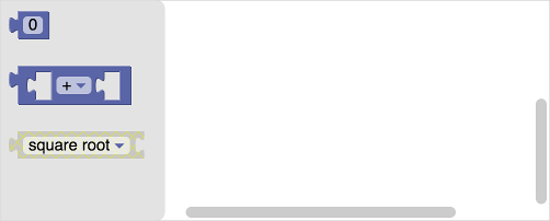
Disabled blocks cannot be dragged from the toolbox. Blocks can be individually
disabled using the optional disabled property.
{
  "kind": "flyoutToolbox",
  "contents": [
    {
      "kind": "block",
      "type":"math_number"
    },
    {
      "kind": "block",
      "type": "math_arithmetic"
    },
    {
      "kind": "block",
      "type": "math_single",
      "disabled": "true"
    }
  ]
}
<xml id="toolbox" style="display: none">
  <block type="math_number"></block>
  <block type="math_arithmetic"></block>
  <block type="math_single" disabled="true"></block>
</xml>
You can also programmatically disable or enable a block by using setEnabled.
Variable fields
Variable fields may need to be specified differently when they are in a toolbox vs when they are simply serialized.
In particular, when variable fields are normally serialized to JSON, they only contain the ID of the variable they represent, because the variable's name and type are serialized separately. However, toolboxes do not contain that information, so it needs to be included in the variable field directly.
{
  "kind": "flyoutToolbox",
  "content": [
    {
      "type": "controls_for",
      "fields": {
        "VAR": {
          "name": "index",
          "type": "Number"
        }
      }
    }
  ]
}
Separators
Adding a separator between any two categories will create a line and extra space between the two categories.

You can change the class for the separator in your JSON or XML toolbox definition.
{
  "kind": "sep",
  "cssConfig": {
    "container": "yourClassName"
  }
}
<sep css-container="yourClassName"></sep>
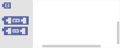
Adding a separator between any two blocks will create a gap between the blocks. By default every block is separated from its lower neighbour by 24 pixels. This separation may be changed using the 'gap' attribute, which will replace the default gap.
This allows you to create logical groups of blocks in the toolbox.
{
  "kind": "flyoutToolbox",
  "contents": [
    {
      "kind": "block",
      "type":"math_number"
    },
    {
      "kind": "sep",
      "gap": "32"
    },
    {
      "kind": "block",
      "blockxml": "<block type='math_arithmetic'><field name='OP'>ADD</field></block>"
    },
    {
      "kind": "sep",
      "gap": "8"
    },
    {
      "kind": "block",
      "blockxml": "<block type='math_arithmetic'><field name='OP'>MINUS</field></block>"
    }
  ]
}
<xml id="toolbox" style="display: none">
  <block type="math_number"></block>
  <sep gap="32"></sep>
  <block type="math_arithmetic">
    <field name="OP">ADD</field>
  </block>
  <sep gap="8"></sep>
  <block type="math_arithmetic">
    <field name="OP">MINUS</field>
  </block>
</xml>
Buttons and Labels
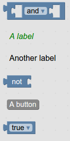
You can put a button or label anywhere you can put a block in the toolbox.
{
  "kind": "flyoutToolbox",
  "contents": [
    {
      "kind": "block",
      "type":"logic_operation"
    },
    {
      "kind": "label",
      "text": "A label",
      "web-class": "myLabelStyle"
    },
    {
      "kind": "label",
      "text": "Another label"
    },
    {
      "kind": "block",
      "type": "logic_negate"
    },
    {
      "kind": "button",
      "text": "A button",
      "callbackKey": "myFirstButtonPressed"
    },
    {
      "kind": "block",
      "type": "logic_boolean"
    }
  ]
}
<xml id="toolbox" style="display: none">
  <block type="logic_operation"></block>
  <label text="A label" web-class="myLabelStyle"></label>
  <label text="Another label"></label>
  <block type="logic_negate"></block>
  <button text="A button" callbackKey="myFirstButtonPressed"></button>
  <block type="logic_boolean"></block>
</xml>
    <style>
    .myLabelStyle>.blocklyFlyoutLabelText {
      font-style: italic;
      fill: green;
    }
    </style>
You may specify a CSS class name to apply to your button or label. In the above example, the first label uses a custom style, while the second label uses the default style.
Buttons should have callback functions; labels should not. To set the callback for a given button click, use
yourWorkspace.registerButtonCallback(yourCallbackKey, yourFunction).
Your function should accept as an argument the button that was clicked. The "Create variable..." button in the variable category is a good example of a button with a callback.
Changing the Toolbox
The application may change the blocks available in the toolbox at any time with a single function call:
workspace.updateToolbox(newTree);
As was the case during initial configuration, newTree may either be a tree of
nodes, a string representation, or a JSON object. The only restriction is that
the mode cannot be changed; that is if there were categories in the
initially-defined toolbox then the new toolbox must also have categories
(though the categories may change). Likewise, if the initially-defined toolbox
did not have any categories, then the new toolbox may not have any categories.
The contents of a single category can be updated by:
var category = workspace.getToolbox().getToolboxItems()[0];
category.updateFlyoutContents(flyoutContents);
Where flyoutContents can be a list of blocks defined using JSON, a tree of nodes, or a string representation.
Be aware that at this time updating the toolbox causes some minor UI resets:
- In a toolbox without categories, any fields changed by the user (such as a dropdown) will revert to the default.
Here is a live demo of a tree with categories and block groups.
