Page Summary
-
Workspace comments are graphical elements used for documenting code, similar to comments in text-based languages, and they cannot be added to the flyout toolbox.
-
Workspace comments can be enabled by providing users a way to create them, for example, by registering default context menu items.
-
The visual appearance of workspace comments can be customized using CSS variables and classes to control colors, sizes, and other styling.
-
CSS classes are applied to different elements of the comment view, allowing specific styling modifications, and special considerations are needed for styling text and selected highlights.
-
Default comment size and icons can also be customized, with the delete icon requiring CSS to be made visible.
A workspace comment is a graphical element that you can enter text into. Usually it's used to document things about your code, just like comments in a text-based programming language.
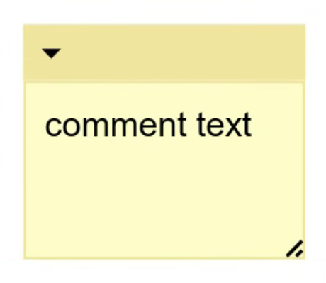
Enable workspace comments
To enable workspace comments in your application, you need to give users some way to create them. One way to do this is to add a context menu item that creates a workspace comment. You can register default context menu items to create, delete, and duplicate workspace comments with the following code:
// This should be called on page load. It can be called before or after
// you inject your workspace.
Blockly.ContextMenuItems.registerCommentOptions();
You could also create your own context menu options, or add another way for the user to add workspace comments. For more information about context menu options, see Context menus.
Visually customize comments
There are several ways for you to customize the look of workspace comments. These use CSS and not themes. It is possible to control most of the colours and sizes of different parts of the comment, but not how they are positioned.
Colour CSS variables
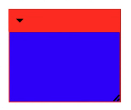
You can set the commentFillColour css variable to change the background colour
of the text area. You can set the commentBorderColour css variable to change
the colour of the comment top bar and the border of the comment.
.blocklyWorkspace {
  --commentFillColour: blue;
  --commentBorderColour: red;
}
CSS classes
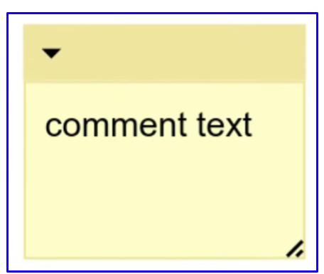
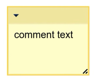
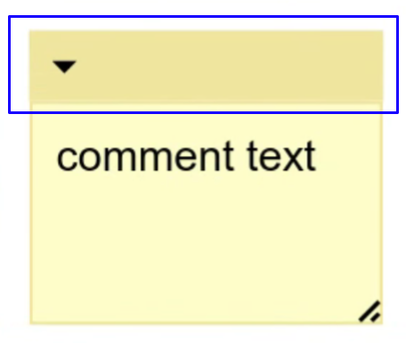
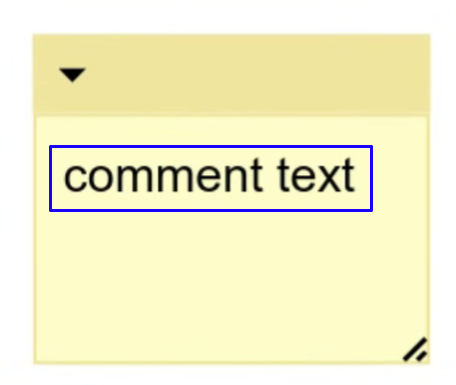
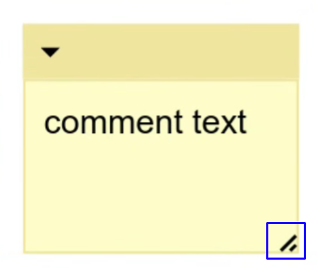
There are different css classes assigned to different elements of the comment view, which allow you to modify the elements' styling.
| CSS class(es) | Image |
|---|---|
blocklyComment, blocklyDraggable |
 |
blocklySelected, blocklyCommentHighlight |
  |
blocklyCollapsed |
 |
blocklyCommentTopbar |
 |
blocklyFoldoutIcon |
|
blocklyCommentPreview, blocklyText |
 |
blocklyDeleteIcon |
|
blocklyText |
 |
blocklyResizeHandle |
 |
Basic CSS use
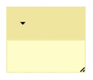
In most cases you can apply your custom attributes with the appropriate CSS class:
.blocklyCommentTopbarBackground {
  height: 50px;
}
CSS for text
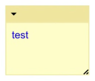
However, for text you need to be more specific to override the CSS generated by the renderer.
/* Modifies the preview text. */
.blocklyComment .blocklyCommentPreview.blocklyText {
  fill: blue;
}

/* Modifies the input text. */
.blocklyComment .blocklyText {
  color: blue;
}

CSS for selected highlights
And for highlighting the comment when its selected, the object the CSS should be
applied to changes depending on whether the comment is collapsed or not. When
it's collapsed, you apply the CSS to the blocklyCommentTopbarBackground,
otherwise apply it to the blocklyCommentHighlight.
/* Highlight when expanded. */
.blocklySelected .blocklyCommentHighlight {
  stroke: #fc3;
  stroke-width: 3px;
}

/* Hide normal highlight when collapsed. */
.blocklyCollapsed.blocklySelected .blocklyCommentHighlight {
  stroke: none;
}

/* Instead apply the collapsed highlight to the top bar. */
.blocklyCollapsed.blocklySelected .blocklyCommentTopbarBackground {
  stroke: #fc3;
  stroke-width: 3px;
}
Icons
The blocklyFoldoutIcon, blocklyDeleteIcon, and blocklyResizeHandle classes
are all applied to <image> elements. This means that if
you want to change the colour or shape of an icon, you can include a different
image in your media folder.
| Image name | Image |
|---|---|
foldout-icon.svg |
|
delete-icon.svg |
|
resize-handle.svg |
 |
Delete icon
The delete icon is hidden by default. If you want to enable it, you need to use CSS to make it visible:
.blocklyDeleteIcon {
  display: block;
}
Default size
To set the default comment size, set the static property
Blockly.comments.CommentView.defaultCommentSize:
Blockly.comments.CommentView.defaultCommentSize = new Blockly.utils.Size(200, 200);
