The previous section presented a set of model metrics, all calculated at a single classification threshold value. But if you want to evaluate a model's quality across all possible thresholds, you need different tools.
Receiver-operating characteristic curve (ROC)
The ROC curve is a visual representation of model performance across all thresholds. The long version of the name, receiver operating characteristic, is a holdover from WWII radar detection.
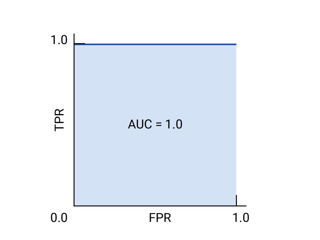
The ROC curve is drawn by calculating the true positive rate (TPR) and false positive rate (FPR) at every possible threshold (in practice, at selected intervals), then graphing TPR over FPR. A perfect model, which at some threshold has a TPR of 1.0 and a FPR of 0.0, can be represented by either a point at (0, 1) if all other thresholds are ignored, or by the following:
Area under the curve (AUC)
The area under the ROC curve (AUC) represents the probability that the model, if given a randomly chosen positive and negative example, will rank the positive higher than the negative.
The perfect model above, containing a square with sides of length 1, has an area under the curve (AUC) of 1.0. This means there is a 100% probability that the model will correctly rank a randomly chosen positive example higher than a randomly chosen negative example. In other words, looking at the spread of data points below, AUC gives the probability that the model will place a randomly chosen square to the right of a randomly chosen circle, independent of where the threshold is set.

In more concrete terms, a spam classifier with AUC of 1.0 always assigns a random spam email a higher probability of being spam than a random legitimate email. The actual classification of each email depends on the threshold that you choose.
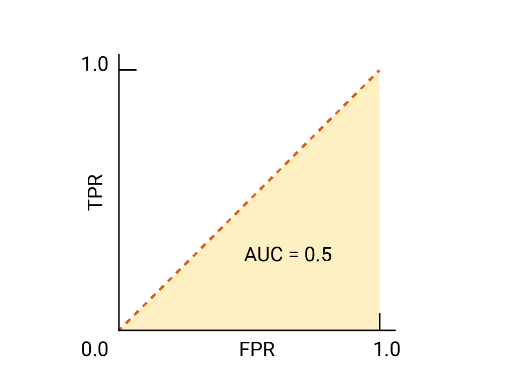
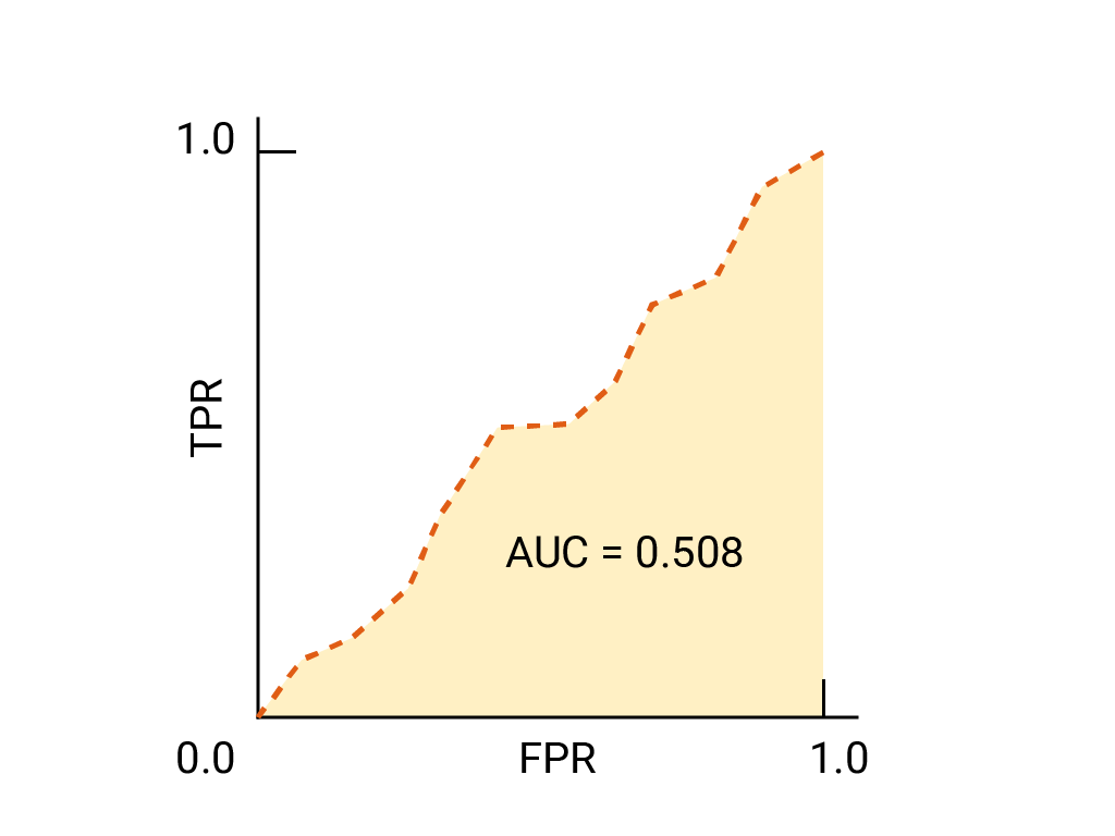
For a binary classifier, a model that does exactly as well as random guesses or coin flips has a ROC that is a diagonal line from (0,0) to (1,1). The AUC is 0.5, representing a 50% probability of correctly ranking a random positive and negative example.
In the spam classifier example, a spam classifier with AUC of 0.5 assigns a random spam email a higher probability of being spam than a random legitimate email only half the time.
(Optional, advanced) Precision-recall curve
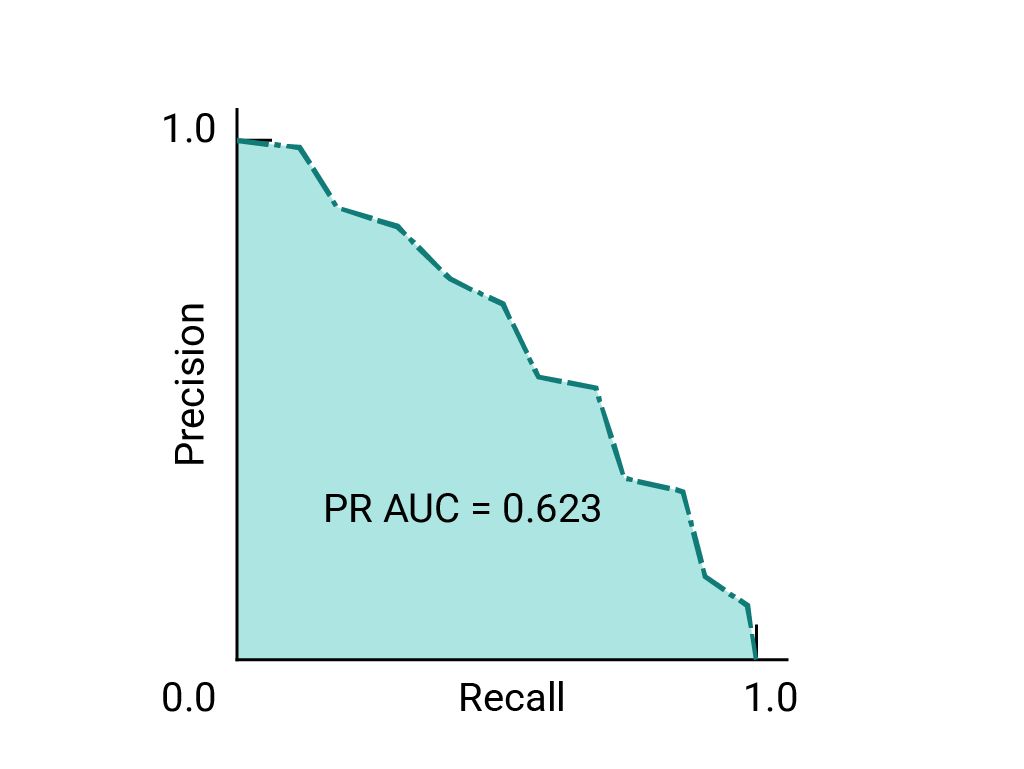
AUC and ROC work well for comparing models when the dataset is roughly balanced between classes. When the dataset is imbalanced, precision-recall curves (PRCs) and the area under those curves may offer a better comparative visualization of model performance. Precision-recall curves are created by plotting precision on the y-axis and recall on the x-axis across all thresholds.
AUC and ROC for choosing model and threshold
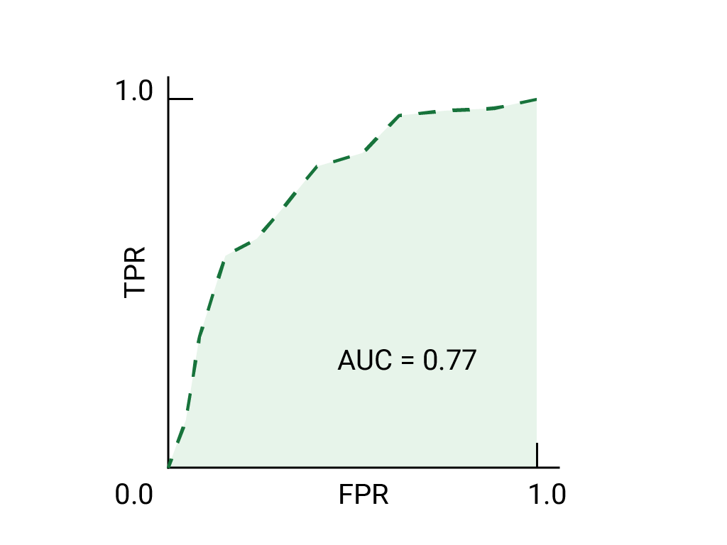
AUC is a useful measure for comparing the performance of two different models, as long as the dataset is roughly balanced. The model with greater area under the curve is generally the better one.
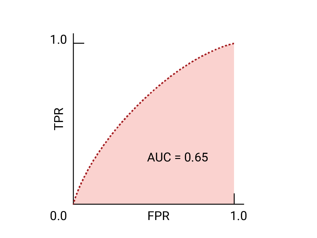
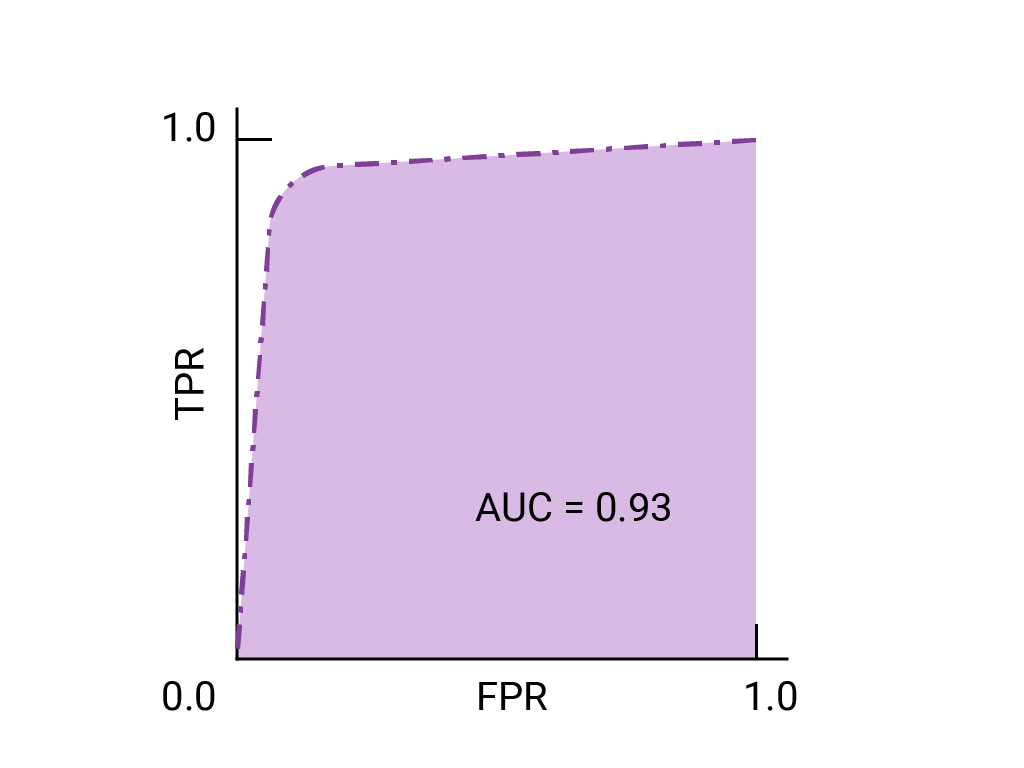
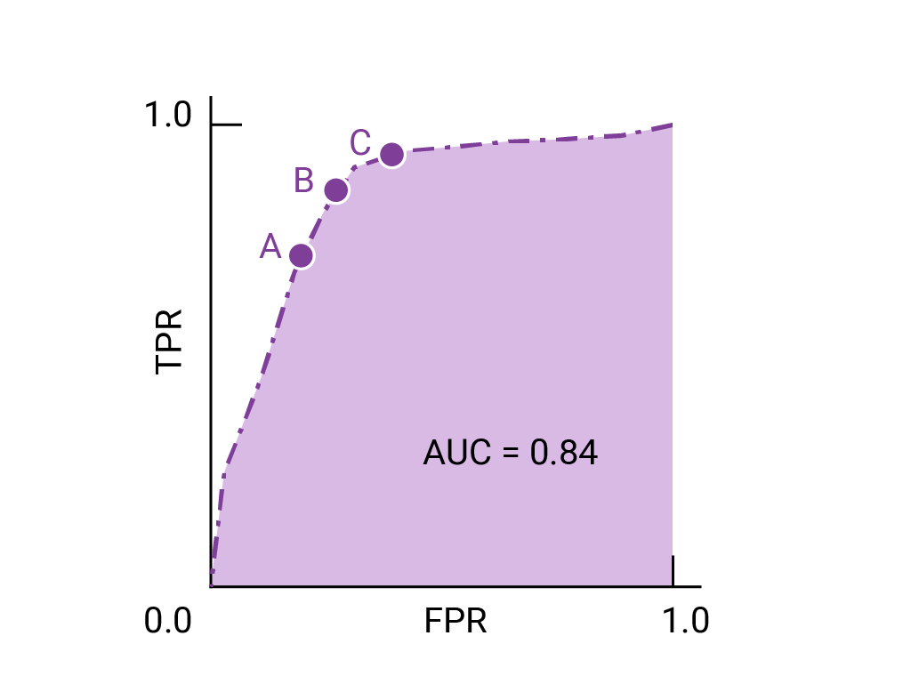
The points on a ROC curve closest to (0,1) represent a range of the best-performing thresholds for the given model. As discussed in the Thresholds, Confusion matrix and Choice of metric and tradeoffs sections, the threshold you choose depends on which metric is most important to the specific use case. Consider the points A, B, and C in the following diagram, each representing a threshold:

If false positives (false alarms) are highly costly, it may make sense to choose a threshold that gives a lower FPR, like the one at point A, even if TPR is reduced. Conversely, if false positives are cheap and false negatives (missed true positives) highly costly, the threshold for point C, which maximizes TPR, may be preferable. If the costs are roughly equivalent, point B may offer the best balance between TPR and FPR.
Here is the ROC curve for the data we have seen before:
Exercise: Check your understanding
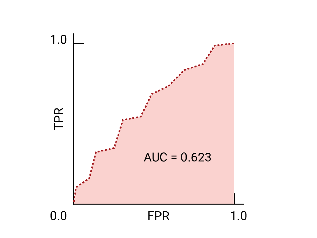
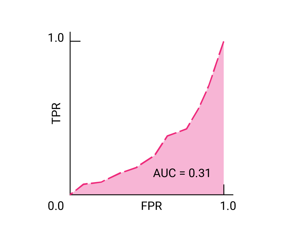
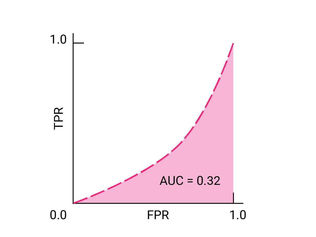


(Optional, advanced) Bonus question
Imagine a situation where it's better to allow some spam to reach the inbox than to send a business-critical email to the spam folder. You've trained a spam classifier for this situation where the positive class is spam and the negative class is not-spam. Which of the following points on the ROC curve for your classifier is preferable?
