Page Summary
-
Binning is a feature engineering technique used to group numerical data into categories (bins) to improve model performance when a linear relationship is weak or data is clustered.
-
Binning can be beneficial when features exhibit a "clumpy" distribution rather than a linear one, allowing the model to learn separate weights for each bin.
-
While creating multiple bins is possible, it's generally recommended to avoid an excessive number as it can lead to insufficient training examples per bin and increased feature dimensionality.
-
Quantile bucketing is a specific binning technique that ensures each bin contains a roughly equal number of examples, which can be particularly useful for datasets with skewed distributions.
-
Binning offers an alternative to scaling or clipping and is particularly useful for handling outliers and improving model performance on non-linear data.
Binning (also called bucketing) is a
feature engineering
technique that groups different numerical subranges into bins or
buckets.
In many cases, binning turns numerical data into categorical data.
For example, consider a feature
named X whose lowest value is 15 and
highest value is 425. Using binning, you could represent X with the
following five bins:
- Bin 1: 15 to 34
- Bin 2: 35 to 117
- Bin 3: 118 to 279
- Bin 4: 280 to 392
- Bin 5: 393 to 425
Bin 1 spans the range 15 to 34, so every value of X between 15 and 34
ends up in Bin 1. A model trained on these bins will react no differently
to X values of 17 and 29 since both values are in Bin 1.
The feature vector represents the five bins as follows:
| Bin number | Range | Feature vector |
|---|---|---|
| 1 | 15-34 | [1.0, 0.0, 0.0, 0.0, 0.0] |
| 2 | 35-117 | [0.0, 1.0, 0.0, 0.0, 0.0] |
| 3 | 118-279 | [0.0, 0.0, 1.0, 0.0, 0.0] |
| 4 | 280-392 | [0.0, 0.0, 0.0, 1.0, 0.0] |
| 5 | 393-425 | [0.0, 0.0, 0.0, 0.0, 1.0] |
Even though X is a single column in the dataset, binning causes a model
to treat X as five separate features. Therefore, the model learns
separate weights for each bin.
Binning is a good alternative to scaling or clipping when either of the following conditions is met:
- The overall linear relationship between the feature and the label is weak or nonexistent.
- When the feature values are clustered.
Binning can feel counterintuitive, given that the model in the previous example treats the values 37 and 115 identically. But when a feature appears more clumpy than linear, binning is a much better way to represent the data.
Binning example: number of shoppers versus temperature
Suppose you are creating a model that predicts the number of shoppers by the outside temperature for that day. Here's a plot of the temperature versus the number of shoppers:
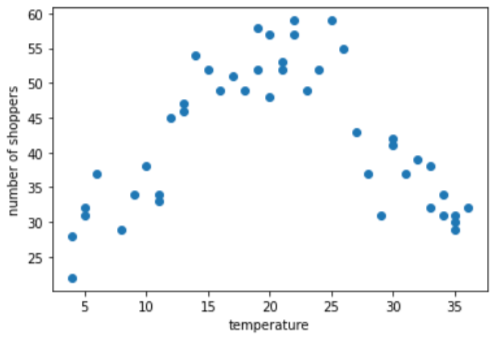
The plot shows, not surprisingly, that the number of shoppers was highest when the temperature was most comfortable.
You could represent the feature as raw values: a temperature of 35.0 in the dataset would be 35.0 in the feature vector. Is that the best idea?
During training, a linear regression model learns a single weight for each feature. Therefore, if temperature is represented as a single feature, then a temperature of 35.0 would have five times the influence (or one-fifth the influence) in a prediction as a temperature of 7.0. However, the plot doesn't really show any sort of linear relationship between the label and the feature value.
The graph suggests three clusters in the following subranges:
- Bin 1 is the temperature range 4-11.
- Bin 2 is the temperature range 12-26.
- Bin 3 is the temperature range 27-36.
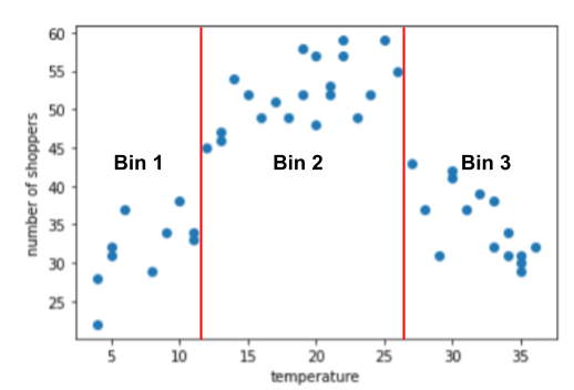
The model learns separate weights for each bin.
While it's possible to create more than three bins, even a separate bin for each temperature reading, this is often a bad idea for the following reasons:
- A model can only learn the association between a bin and a label if there are enough examples in that bin. In the given example, each of the 3 bins contains at least 10 examples, which might be sufficient for training. With 33 separate bins, none of the bins would contain enough examples for the model to train on.
- A separate bin for each temperature results in 33 separate temperature features. However, you typically should minimize the number of features in a model.
Exercise: Check your understanding
The following plot shows the median home price for each 0.2 degrees of latitude for the mythical country of Freedonia:
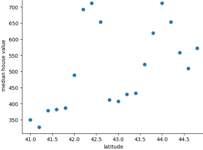
The graphic shows a nonlinear pattern between home value and latitude, so representing latitude as its floating-point value is unlikely to help a model make good predictions. Perhaps bucketing latitudes would be a better idea?
- 41.0 to 41.8
- 42.0 to 42.6
- 42.8 to 43.4
- 43.6 to 44.8
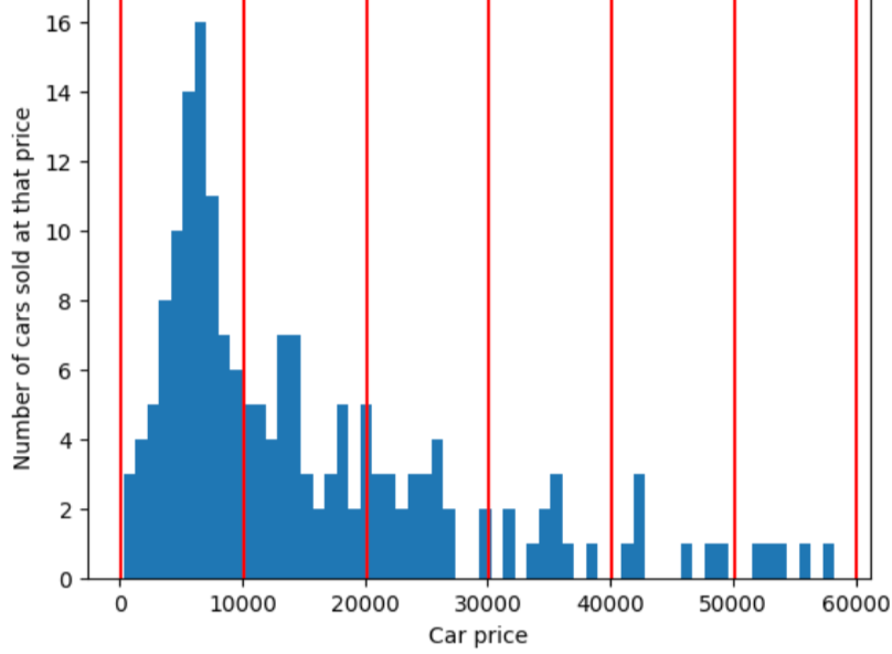
Quantile Bucketing
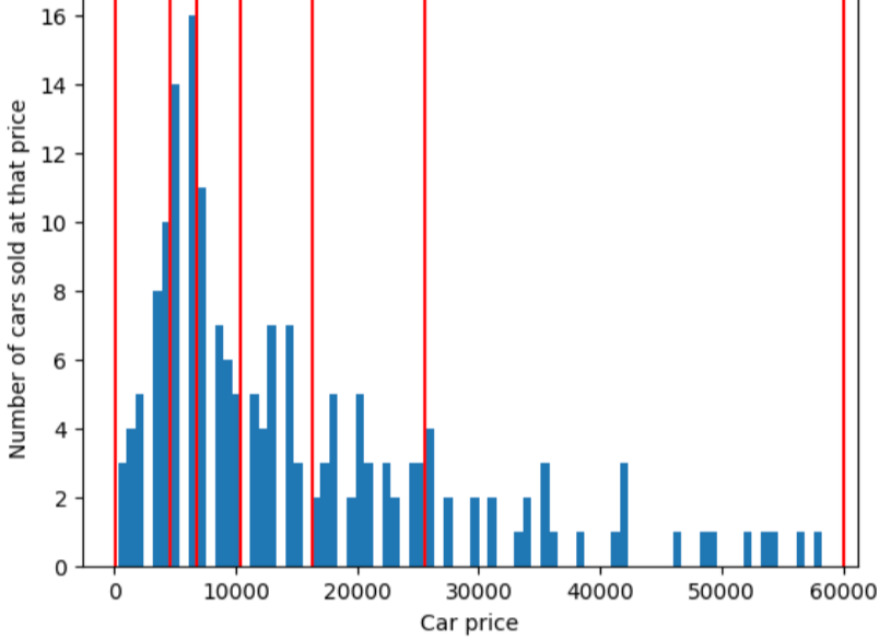
Quantile bucketing creates bucketing boundaries such that the number of examples in each bucket is exactly or nearly equal. Quantile bucketing mostly hides the outliers.
To illustrate the problem that quantile bucketing solves, consider the equally spaced buckets shown in the following figure, where each of the ten buckets represents a span of exactly 10,000 dollars. Notice that the bucket from 0 to 10,000 contains dozens of examples but the bucket from 50,000 to 60,000 contains only 5 examples. Consequently, the model has enough examples to train on the 0 to 10,000 bucket but not enough examples to train on for the 50,000 to 60,000 bucket.
In contrast, the following figure uses quantile bucketing to divide car prices into bins with approximately the same number of examples in each bucket. Notice that some of the bins encompass a narrow price span while others encompass a very wide price span.