Page Summary
-
Loss is a numerical value indicating the difference between a model's predictions and the actual values.
-
The goal of model training is to minimize loss, bringing it as close to zero as possible.
-
Two common methods for calculating loss are Mean Absolute Error (MAE) and Mean Squared Error (MSE), which differ in their sensitivity to outliers.
-
Choosing between MAE and MSE depends on the dataset and how you want the model to handle outliers, with MSE penalizing them more heavily.
Loss is a numerical metric that describes how wrong a model's predictions are. Loss measures the distance between the model's predictions and the actual labels. The goal of training a model is to minimize the loss, reducing it to its lowest possible value.
In the following image, you can visualize loss as arrows drawn from the data points to the model. The arrows show how far the model's predictions are from the actual values.
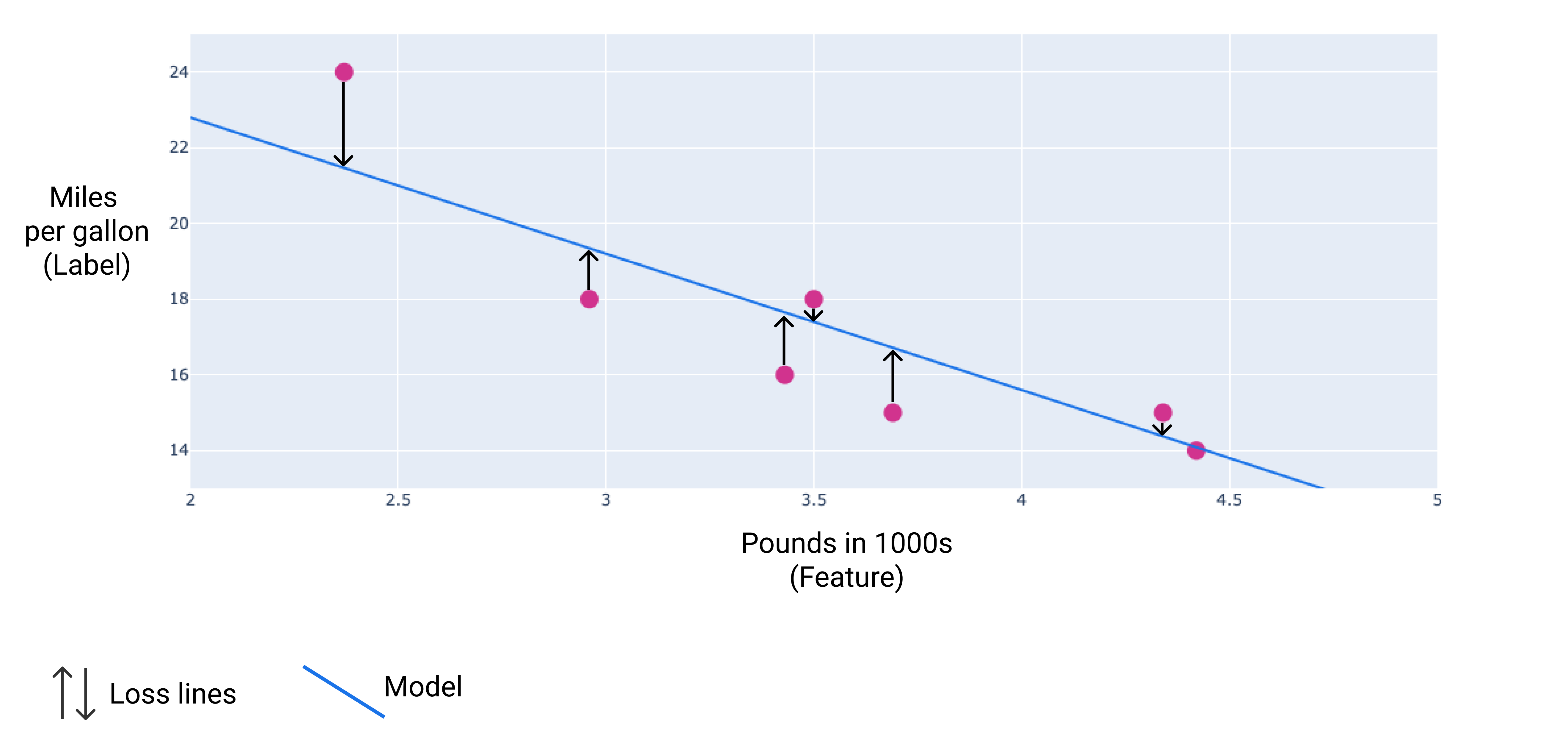
Figure 8. Loss is measured from the actual value to the predicted value.
Distance of loss
In statistics and machine learning, loss measures the difference between the predicted and actual values. Loss focuses on the distance between the values, not the direction. For example, if a model predicts 2, but the actual value is 5, we don't care that the loss is negative (2 – 5= –3). Instead, we care that the distance between the values is 3. Thus, all methods for calculating loss remove the sign.
The two most common methods to remove the sign are the following:
- Take the absolute value of the difference between the actual value and the prediction.
- Square the difference between the actual value and the prediction.
Types of loss
In linear regression, there are five main types of loss, which are outlined in the following table.
| Loss type | Definition | Equation |
|---|---|---|
| L1 loss | The sum of the absolute values of the difference between the predicted values and the actual values. | $ ∑ | actual\ value - predicted\ value | $ |
| Mean absolute error (MAE) | The average of L1 losses across a set of N examples. | $ \frac{1}{N} ∑ | actual\ value - predicted\ value | $ |
| L2 loss | The sum of the squared difference between the predicted values and the actual values. | $ ∑(actual\ value - predicted\ value)^2 $ |
| Mean squared error (MSE) | The average of L2 losses across a set of N examples. | $ \frac{1}{N} ∑ (actual\ value - predicted\ value)^2 $ |
| Root mean squared error (RMSE) | The square root of the mean squared error (MSE). | $ \sqrt{\frac{1}{N} ∑ (actual\ value - predicted\ value)^2} $ |
The functional difference between L1 loss and L2 loss (or between MAE/RMSE and MSE) is squaring. When the difference between the prediction and label is large, squaring makes the loss even larger. When the difference is small (less than 1), squaring makes the loss even smaller.
Loss metrics like MAE and RMSE may be preferable to L2 loss or MSE in some use cases because they tend to be more human-interpretable, as they measure error using the same scale as the model's predicted value.
When processing multiple examples at once, we recommend averaging the losses across all the examples, whether using MAE, MSE, or RMSE.
Calculating loss example
In the previous section, we created the following model to predict fuel efficiency based on car heaviness:
- Model: $ y' = 34 + (-4.6)(x_1) $
- Weight: $ –4.6 $
- Bias: $ 34 $
If the model predicts that a 2,370-pound car gets 23.1 miles per gallon, but it actually gets 24 miles per gallon, we would calculate the L2 loss as follows:
| Value | Equation | Result |
|---|---|---|
| Prediction | $\small{bias + (weight * feature\ value)}$ $\small{34 + (-4.6*2.37)}$ |
$\small{23.1}$ |
| Actual value | $ \small{ label } $ | $ \small{ 24 } $ |
| L2 loss | $ \small{ (actual\ value - predicted\ value)^2 } $ $\small{ (24 - 23.1)^2 }$ |
$\small{0.81}$ |
In this example, the L2 loss for that single data point is 0.81.
Choosing a loss
Deciding whether to use MAE or MSE can depend on the dataset and the way you want to handle certain predictions. Most feature values in a dataset typically fall within a distinct range. For example, cars are normally between 2000 and 5000 pounds and get between 8 to 50 miles per gallon. An 8,000-pound car, or a car that gets 100 miles per gallon, is outside the typical range and would be considered an outlier.
An outlier can also refer to how far off a model's predictions are from the real values. For instance, 3,000 pounds is within the typical car-weight range, and 40 miles per gallon is within the typical fuel-efficiency range. However, a 3,000-pound car that gets 40 miles per gallon would be an outlier in terms of the model's prediction because the model would predict that a 3,000-pound car would get around 20 miles per gallon.
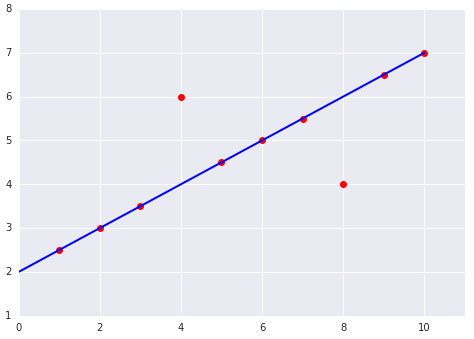
When choosing the best loss function, consider how you want the model to treat outliers. For instance, MSE moves the model more toward the outliers, while MAE doesn't. L2 loss incurs a much higher penalty for an outlier than L1 loss. For example, the following images show a model trained using MAE and a model trained using MSE. The red line represents a fully trained model that will be used to make predictions. The outliers are closer to the model trained with MSE than to the model trained with MAE.
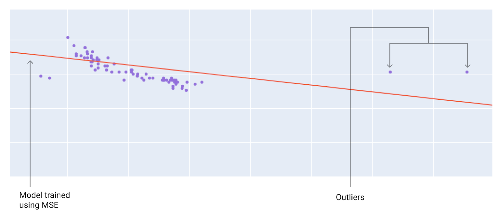
Figure 9. MSE loss moves the model closer to the outliers.
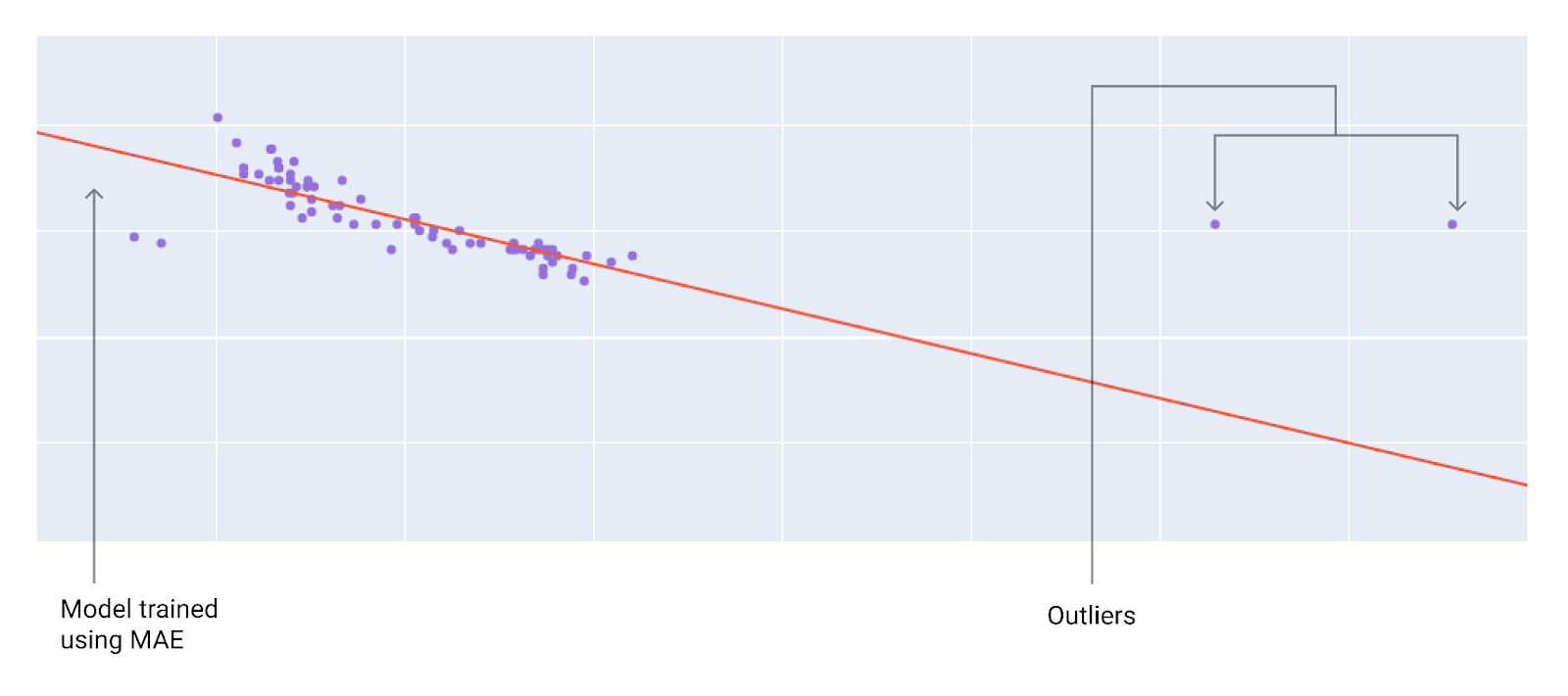
Figure 10. MAE loss keeps the model farther from the outliers.
Note the relationship between the model and the data:
MSE. The model is closer to the outliers but further away from most of the other data points.
MAE. The model is further away from the outliers but closer to most of the other data points.
Check Your Understanding
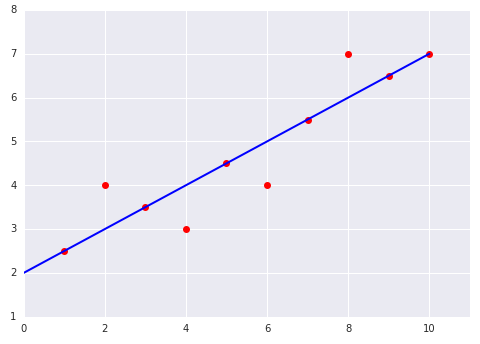
Consider the following two plots of a linear model fit to a dataset:
|
|