
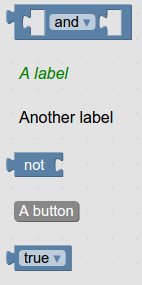
您可以在工具箱中放置區塊的任何位置放置按鈕或標籤。
JSON
{
  "kind": "flyoutToolbox",
  "contents": [
    {
      "kind": "block",
      "type":"logic_operation"
    },
    {
      "kind": "label",
      "text": "A label",
      "web-class": "myLabelStyle"
    },
    {
      "kind": "label",
      "text": "Another label"
    },
    {
      "kind": "block",
      "type": "logic_negate"
    },
    {
      "kind": "button",
      "text": "A button",
      "callbackKey": "myFirstButtonPressed"
    },
    {
      "kind": "block",
      "type": "logic_boolean"
    }
  ]
}
XML
<xml id="toolbox" style="display: none">
  <block type="logic_operation"></block>
  <label text="A label" web-class="myLabelStyle"></label>
  <label text="Another label"></label>
  <block type="logic_negate"></block>
  <button text="A button" callbackKey="myFirstButtonPressed"></button>
  <block type="logic_boolean"></block>
</xml>
<style>
.myLabelStyle>.blocklyFlyoutLabelText {
  font-style: italic;
  fill: green;
}
</style>
您可以指定要套用至按鈕或標籤的 CSS 類別名稱。 在上述範例中,第一個標籤使用自訂樣式,第二個標籤則使用預設樣式。
按鈕應有回呼函式,標籤則不應有。如要為特定按鈕點擊設定回呼,請使用
yourWorkspace.registerButtonCallback(yourCallbackKey, yourFunction).
函式應接受做為引數的按鈕 (已點選)。變數類別中的「建立變數...」按鈕,就是具有回呼的按鈕。