
块的外观提供了有关其使用方式的重要线索。在为自己的代码块设置样式时,请注意以下事项。
使用可见边框
2000 年代流行的是“水蓝”风格,屏幕上的每个对象都装饰有亮点和阴影。2010 年代,“Material Design”风格开始流行,屏幕上的每个对象都被简化为干净、扁平、无边框的形状。大多数基于块的编程环境都会在每个代码块周围添加突出显示和阴影,因此当当今的平面设计师看到这些时,他们总是会去除这些过时的装饰。

如上方五个代码块示例(来自 scriptr.io)所示,这些“过时装饰”对于区分颜色相同的连接代码块至关重要。
建议:如果重新设计 Blockly 的外观,请勿让当下的时尚元素破坏您的应用。
添加方向箭头
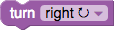
美国儿童(但有趣的是,其他国家/地区的儿童没有出现这种情况)的反馈显示,他们经常会将左右搞混。通过添加箭头,此问题已得到解决。如果方向是相对的(例如相对于头像),箭头的样式很重要。当头像朝向相反方向时,向右箭头或向左箭头会造成混淆。最有帮助的是 ⟳ 圆形箭头,即使转弯角度小于箭头所指示的角度也是如此。
建议:尽可能使用 Unicode 图标来补充文本。
使用不同的水平和垂直连接器
Blockly 有两种不同的连接类型:水平拼图形状和垂直堆叠凹槽。良好的界面应尽量减少设计元素的数量。因此,许多设计师都尝试让这两种连接类型看起来一样(如下所示)。

结果是,新用户在寻找旋转块以使其适应不兼容的连接方式时会感到困惑。Blockly 可将编程元素直观化,因此必须注意避免无意中建议用户执行不受支持的互动。
因此,Blockly 使用紧密贴合的拼图形状来表示值连接,并使用视觉上明显不同的对齐缺口来表示语句堆叠。
建议:如果重新设计 Blockly,请确保水平连接和垂直连接的外观不同。
显示嵌套语句可以堆叠
“C”形积木的内部顶部始终有一个连接器,但某些环境的内部底部也有连接器(例如 Wonder Workshop),而另一些环境则没有(例如 Blockly 和 Scratch)。由于大多数语句块都有顶部和底部连接器,因此有些用户无法立即看出语句可以放入没有底部连接器的“C”中。

用户了解一个语句块可以放入“C”中后,还需要了解多个语句也可以放入“C”中。有些环境会将第一个语句的下方连接嵌套到“C”的底部(例如 Wonder Workshop 和 Scratch),而其他环境会留下一个小间隙(例如 Blockly)。紧密嵌套没有任何提示,表明可以堆叠更多块。

这两个问题会相互影响。如果存在内部底部连接器(Wonder Workshop),则初始语句的连接会更明显,但会牺牲发现堆叠的功能。如果不存在内部底部连接器(Blockly),则初始语句的连接不明显,但可以发现堆叠。在使用 Blockly 进行测试时,没有内部底部连接器且嵌套语句的底部连接器 (Scratch) 的易发现性最差。
我们的经验是,与发现堆叠相比,初始语句的关联对用户来说更容易理解。一旦发现前者,便永远不会忘记,而后者则需要提示。Blockly 尝试过 Wonder Workshop 和 Scratch 两种方法,直到有一天出现了渲染 bug,导致出现了小间隔。在用户研究中,我们发现 Blockly 的用户体验因这个 bug(现在已成为我们引以为傲的“功能”)而显著提升。
建议:如果重新设计 Blockly,请保留现有的堆叠界面。