2015年2月12日木曜日
スマートフォンが普及するにつれ、モバイルでの閲覧に対応したサイトを作ることは、ますます重要になってきています。今回は、先日
ウェブマスター ツール
に追加されました、
モバイル ユーザビリティを確認できる機能
をご紹介いたします。
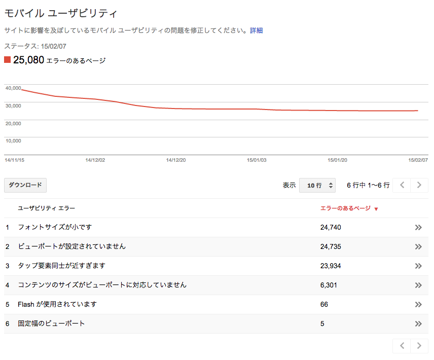
この新機能によって、あなたのサイトがモバイルで閲覧される際に問題となりうる点が表示されるようになりました。進捗を確認するために、時系列でのグラフもついています。
ここでは、スマートフォンでの閲覧の際、上下のスクロールのみによって簡単に読むことのできるサイトをモバイル フレンドリーと定義しています。左右へのスワイプやズームイン、ズームアウトが必要となる場合、スマートフォンで気軽に閲覧することは難しくなってしまいます。ここで指摘される問題は以下のようなものです。
 これらの問題がウェブマスター ツール内で表示されている場合、ぜひ解決法を探ってみてください。テンプレートを変えるだけで直ってしまうこともままあります。詳しい情報は、
モバイルガイド
を御覧ください。
これらの問題がウェブマスター ツール内で表示されている場合、ぜひ解決法を探ってみてください。テンプレートを変えるだけで直ってしまうこともままあります。詳しい情報は、
モバイルガイド
を御覧ください。
ご不明な点やご質問がありましたら、 ウェブマスター ヘルプ フォーラム までお寄せください。
この新機能によって、あなたのサイトがモバイルで閲覧される際に問題となりうる点が表示されるようになりました。進捗を確認するために、時系列でのグラフもついています。
ここでは、スマートフォンでの閲覧の際、上下のスクロールのみによって簡単に読むことのできるサイトをモバイル フレンドリーと定義しています。左右へのスワイプやズームイン、ズームアウトが必要となる場合、スマートフォンで気軽に閲覧することは難しくなってしまいます。ここで指摘される問題は以下のようなものです。
- Flash を利用している
- viewport が存在しない (モバイル ページにとっては非常に重要な meta タグです)
- フォントが小さい
- viewport が固定幅
- コンテンツが viewport のサイズに合っていない
- リンクやボタンがお互いに近すぎる位置に配置されている
ご不明な点やご質問がありましたら、 ウェブマスター ヘルプ フォーラム までお寄せください。