Wednesday, October 29, 2014
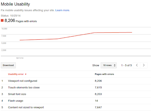
Mobile is growing at a fantastic pace—in usage, not just in screen size. To keep you informed of issues mobile users might be seeing across your website, we've added the Mobile Usability feature to Webmaster Tools.
The new feature shows mobile usability issues we've identified across your website, complete with graphs over time so that you see the progress that you've made.
A mobile-friendly site is one that you can easily read and use on a smartphone, by only having to
scroll up or down. Swiping left/right to search for content, zooming to read text and use UI
elements, or not being able to see the content at all make a site harder to use for users on
mobile phones. To help, the Mobile Usability reports show the following issues: Flash content,
missing viewport
(a critical meta-tag for mobile pages),
tiny fonts, fixed-width viewports,
content not sized to viewport,
and
clickable links/buttons too close
to each other.

We strongly recommend you take a look at these issues in Webmaster Tools, and think about how they might be resolved; sometimes it's just a matter of tweaking your site's template! More information on how to make a great mobile-friendly website can be found in our Web Fundamentals website (with more information to come soon).
If you have any questions, you can join us in our webmaster help forums (on your phone too)!
